


前言
之前简单学习了一下canvas,现在再简单学习一下svg,为以后工作使用先入个门
svg学习教程:菜鸟教程
基础学习可以看菜鸟教程,如果比较复杂的使用可以找一些svg库
推荐文章: 阮一峰 SVG 图像入门教程
svg
SVG 意为可缩放矢量图形(Scalable Vector Graphics)。
SVG 使用 XML 格式定义图像。
SVG大小默认 300 * 150 如果大于这个值是要进行设置
<svg
   xmlns="http://www.w3.org/2000/svg"
   version="1.1"
   width="600"
   height="300"
 >
   <rect width="550" height="200" style="fill: red; stroke: black" />
 </svg>
在html中使用
教程中介绍了下面这几种用法
使用 <embed> 标签
优势:所有主要浏览器都支持,并允许使用脚本
缺点:不推荐在HTML4和XHTML中使用(但在HTML5允许)
<embed src="circle1.svg" type="image/svg+xml" />
使用 <object>标签
优势:所有主要浏览器都支持,并支持HTML4,XHTML和HTML5标准
缺点:不允许使用脚本
<object data="circle1.svg" type="image/svg+xml"></object>
使用 <iframe> 标签
优势:所有主要浏览器都支持,并允许使用脚本
缺点:不推荐在HTML4和XHTML中使用(但在HTML5允许)
<iframe src="circle1.svg"></iframe>
直接在HTML嵌入SVG代码
在主流浏览器中可以
<svg xmlns="http://www.w3.org/2000/svg" version="1.1">
   <circle cx="100" cy="50" r="40" stroke="black" stroke-width="2" fill="red" />
</svg>
基础
矩形
rect标签可用来创建矩形,以及矩形的变种
常用属性:
- width 、height:设置宽高
- x、y定价矩形距离浏览器左侧的距离
- rx 和 ry 属性可使矩形产生圆角
- style 属性用来定义 CSS 属性:
- fill 属性定义矩形的填充颜色(rgb 值、颜色名或者十六进制值)
- stroke-width 属性定义矩形边框的宽度
- stroke 属性定义矩形边框的颜色
- fill-opacity 属性定义填充颜色透明度(合法的范围是:0 - 1)
- stroke-opacity 属性定义轮廓颜色的透明度(合法的范围是:0 - 1)
实例
<svg xmlns="http://www.w3.org/2000/svg" version="1.1">
  <rect width="150" height="150"
		style="fill:red;stroke:black;stroke-width:5;opacity:0.5" />
</svg>
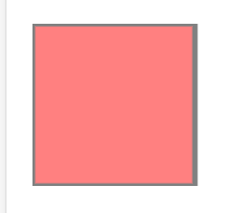
简单测试了一下,rx和 ry 的效果一致,写一个和写两个效果都一样。
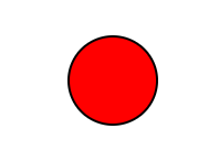
圆形
circle可以用来创建圆形
<svg xmlns="http://www.w3.org/2000/svg" version="1.1">
    <circle cx="100" cy="50" r="40" stroke="black" stroke-width="2" fill="red" />
</svg>
- cx和cy属性定义圆点的x和y坐标。如果省略cx和cy,圆的中心会被设置为(0, 0)
- r属性定义圆的半径
- 矩形里的相关属性也可以使用
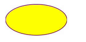
椭圆
ellipse 元素是用来创建一个椭圆
<svg xmlns="http://www.w3.org/2000/svg" version="1.1">
  <ellipse cx="300" cy="80" rx="100" ry="50"
  style="fill:yellow;stroke:purple;stroke-width:2"/>
</svg>
- cx cy定义圆心
- rx 水平半径、ry垂直半径
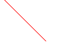
直线
<line> 元素是用来创建一个直线:
<svg xmlns="http://www.w3.org/2000/svg" version="1.1">
  <line x1="0" y1="0" x2="200" y2="200"
  style="stroke:rgb(255,0,0);stroke-width:2"/>
</svg>
- x1,y1 线的起点
- x2,y2 线的终点
多边形
<polygon> 标签用来创建含有不少于三个边的图形。
多边形是由直线组成,其形状是"封闭"的(所有的线条 连接起来)。
<svg  height="210" width="500">
  <polygon points="200,10 250,190 160,210"
  style="fill:lime;stroke:purple;stroke-width:1"/>
</svg>
说是线,其实是多个点,连接构成一个封闭图形。按照顺时针的属性写点的坐标,点之间用空格分隔,点的x和y用逗号分隔

这里有一个填充规则fill-rule属性,内容较多,可以看一下文档
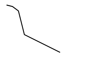
多线段
<polyline> 元素是用于创建任何只有直线的形状:
<svg xmlns="http://www.w3.org/2000/svg" version="1.1">
  <polyline points="20,20 40,25 60,40 80,120 120,140 200,180"
  style="fill:none;stroke:black;stroke-width:3" />
</svg>
与多边形基本一致,多个点连接成一条线
路径
<path> 元素用于定义一个路径。
下面的命令可用于路径数据:
- M = moveto
- L = lineto
- H = horizontal lineto
- V = vertical lineto
- C = curveto
- S = smooth curveto
- Q = quadratic Bézier curve
- T = smooth quadratic Bézier curveto
- A = elliptical Arc
- Z = closepath
注意:以上所有命令均允许小写字母。大写表示绝对定位,小写表示相对定位。
这个比较复杂,文档建议使用SVG编辑器,这里分享一个在线编辑器
<svg xmlns="http://www.w3.org/2000/svg" version="1.1">
    <path d="M150 0 L75 200 L225 200 Z" />
</svg>
文本
<text> 元素用于定义文本。
- 基础文本
<svg xmlns="http://www.w3.org/2000/svg" version="1.1">
  <text x="0" y="15" fill="red">I love SVG</text>
</svg>
- 旋转文本
<svg xmlns="http://www.w3.org/2000/svg" version="1.1">
  <text x="0" y="15" fill="red" transform="rotate(30 20,40)">I love SVG</text>
</svg>
rotate参数:角度 旋转中心,角度和旋转中心间用空格隔开,坐标之间加逗号
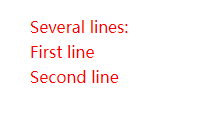
- 分组
元素可以安排任何分小组与
<svg xmlns="http://www.w3.org/2000/svg" version="1.1">
  <text x="10" y="20" style="fill:red;">Several lines:
    <tspan x="10" y="45">First line</tspan>
    <tspan x="10" y="70">Second line</tspan>
  </text>
</svg>
- 文本链接
<svg xmlns="http://www.w3.org/2000/svg" version="1.1"
xmlns:xlink="http://www.w3.org/1999/xlink">
  <a xlink:href="https://www.runoob.com/svg/svg-text.html" target="_blank">
    <text x="0" y="15" fill="red">I love SVG</text>
  </a>
</svg>
模糊效果
<defs> 和 <filter>
所有互联网的SVG滤镜定义在<defs>元素中。<defs>元素定义短并含有特殊元素(如滤镜)定义。
<filter>标签用来定义SVG滤镜。<filter>标签使用必需的id属性来定义向图形应用哪个滤镜?
<svg xmlns="http://www.w3.org/2000/svg" version="1.1">
  <defs>
    <filter id="f1" x="0" y="0">
      <feGaussianBlur in="SourceGraphic" stdDeviation="15" />
    </filter>
  </defs>
  <rect width="90" height="90" stroke="green" stroke-width="3"
  fill="yellow" filter="url(#f1)" />
</svg>
<filter>元素id属性定义一个滤镜的唯一名称<feGaussianBlur>元素定义模糊效果- in="SourceGraphic"这个部分定义了由整个图像创建效果
- stdDeviation属性定义模糊量
<rect>元素的滤镜属性用来把元素链接到"f1"滤镜
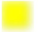
其他滤镜效果:滤镜效果
线性渐变
<linearGradient>元素用于定义线性渐变。
<linearGradient>标签必须嵌套在<defs>的内部。<defs>标签是definitions的缩写,它可对诸如渐变之类的特殊元素进行定义。
线性渐变可以定义为水平,垂直或角渐变:
- 当y1和y2相等,而x1和x2不同时,可创建水平渐变
- 当x1和x2相等,而y1和y2不同时,可创建垂直渐变
- 当x1和x2不同,且y1和y2不同时,可创建角形渐变
<svg xmlns="http://www.w3.org/2000/svg" version="1.1">
  <defs>
    <linearGradient id="grad1" x1="0%" y1="0%" x2="100%" y2="0%">
      <stop offset="0%" style="stop-color:rgb(255,255,0);stop-opacity:1" />
      <stop offset="100%" style="stop-color:rgb(255,0,0);stop-opacity:1" />
    </linearGradient>
  </defs>
  <text fill="url(#grad1)" font-size="45" font-family="Verdana" x="150" y="86">SVG</text>
</svg>

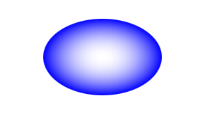
放射渐变
<radialGradient>元素用于定义放射性渐变。
<radialGradient>标签必须嵌套在<defs>的内部。<defs>标签是definitions的缩写,它可对诸如渐变之类的特殊元素进行定义。
<svg xmlns="http://www.w3.org/2000/svg" version="1.1">
  <defs>
    <radialGradient id="grad1" cx="50%" cy="50%" r="50%" fx="50%" fy="50%">
      <stop offset="0%" style="stop-color:rgb(255,255,255);stop-opacity:0" />
      <stop offset="100%" style="stop-color:rgb(0,0,255);stop-opacity:1" />
    </radialGradient>
  </defs>
  <ellipse cx="200" cy="70" rx="85" ry="55" fill="url(#grad1)" />
</svg>
svg动画
<animate>
通过<animate>标签来实现简单的动画效果,比较重要的属性如下
- attributeName 需要动画的属性名称
- from 属性的初始值
- to 属性的终止值
- values :只有两个值时,与from和to的写法一致;当多个值时可以实现循环往复的效果
- repeatCount:动画重复次数;number指定固定次数,indefinite 无限重复
- dur:动画的持续时间
实例
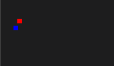
<svg xmlns="http://www.w3.org/2000/svg" version="1.1" width="600" height="300">
    <rect width="20" height="20" x="20" y="10" style="fill:red">
        <animate attributeName="x" values="10;50;10" dur="2s" repeatCount="indefinite" />
    </rect>
    <rect width="20" height="20" x="20" y="40" style="fill:blue">
        <animate attributeName="x" from="10" to="50" dur="2s" repeatCount="indefinite" />
    </rect>
</svg>
效果图好像,稍微有点问题,可以自己试一下。
如果你想要让该元素的更多属性具有动画效果,只要添加更多的<animate> 元素到该元素内部即可
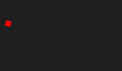
<svg xmlns="http://www.w3.org/2000/svg" version="1.1" width="600" height="300">
    <rect width="20" height="20" x="20" y="10" style="fill:red">
        <animate attributeName="x" values="10;100;10" dur="3s" repeatCount="indefinite" />
        <animate attributeName="y" values="10;100;10" dur="3s" repeatCount="indefinite" />
    </rect>
</svg>

<animateTransform>
<animateTransform>元素可以执行变换属性的动画。比较重要的属性如下:
- attributeName=“transform” 这个是固定的
- begin和dur 开始时间和持续时间
- type类型:rotate(旋转)、scale(缩放)、translate(位移)、skewX(X轴方向偏移)、skewY(Y轴方向偏移)
- from=“0 50 100” : 第一个参数代表开始角度,第二个参数代表X轴开始坐标,第三个参数代表Y轴开始坐标;
- to=“90 150 100” :第一个参数代表结束角度,第二个参数代表X轴结束坐标,第三个参数代表Y轴结束坐标;
- repeatCount 执行次数
给个简单的例子,感觉真正难的地方在于想法
<svg xmlns="http://www.w3.org/2000/svg" version="1.1" width="600" height="300">
    <rect width="20" height="20" x="20" y="10" style="fill:red">
        <animateTransform attributeName="transform" begin="0s" dur="5s" type="rotate" from="0 50 100" to="90 150 100"
            repeatCount="indefinite" />
    </rect>
</svg>
<animateMotion>
animateMotion可以控制控件更加线性的操作。
比较重要的属性如下:
- path 这个path,就可以想到
标签,就可以利用曲线,让控件按照指定曲线的位置做动画; - dur 持续时长;
- repeatCount 重复次数,默认是一次,使用indefinite参数做永动;
<animateMotion>标签用法,还是放到需要动画的标签中。
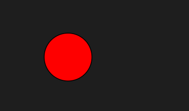
<svg xmlns="http://www.w3.org/2000/svg" version="1.1" width="400" height="400">
    <circle r="30" cx="150" cy="100" style="fill: red; stroke: black">
        <animateMotion path="M-50 0H50 0Z" dur="3s" repeatCount="indefinite" />
    </circle>
</svg>
svg与css和js
如果 SVG 代码直接写在 HTML 网页之中,它就成为网页 DOM 的一部分,可以直接用 DOM 操作。
<svg
  id="mysvg"
  xmlns="http://www.w3.org/2000/svg"
  viewBox="0 0 800 600"
  preserveAspectRatio="xMidYMid meet"
>
  <circle id="mycircle" cx="400" cy="300" r="50" />
<svg>
css
circle {
  stroke-width: 5;
  stroke: #f00;
  fill: #ff0;
}

circle:hover {
  stroke: #090;
  fill: #fff;
}
js
var mycircle = document.getElementById('mycircle');

mycircle.addEventListener('click', function(e) {
  console.log('circle clicked - enlarging');
  mycircle.setAttribute('r', 60);
}, false);


 488
488


 被折叠的 条评论
为什么被折叠?
被折叠的 条评论
为什么被折叠?
 到【灌水乐园】发言


