


1. 前言
基础篇:
进阶篇: - 听说你还不会 Tailwind CSS(进阶·上篇)
经过初始化后,在根目录下有一个 tailwind.config.ts 文件:
```ts import type { Config } from "tailwindcss";
const config: Config = { content: [ "./pages//.{js,ts,jsx,tsx,mdx}", "./components//.{js,ts,jsx,tsx,mdx}", "./app/*/.{js,ts,jsx,tsx,mdx}", ], theme: { extend: { backgroundImage: { "gradient-radial": "radial-gradient(var(--tw-gradient-stops))", "gradient-conic": "conic-gradient(from 180deg at 50% 50%, var(--tw-gradient-stops))", }, }, }, plugins: [], }; export default config; ```
上面就是 Tailwind CSS 的配置文件,这篇文章主要讲解 theme 配置项,利用它来实现样式的扩展。
2. content
content 配置项将会接收一个数组,表示应用 Tailwind CSS 的文件范围:
"./pages/**/*.{js,ts,jsx,tsx,mdx}"👉 ./pages 目录下无限级别子目录中的所有以 js、ts、jsx、tsx、mdx 结尾的文件"./components/**/*.{js,ts,jsx,tsx,mdx}"👉 ./components 下无限级别子目录中的所有以 js、ts、jsx、tsx、mdx 结尾的文件"./app/**/*.{js,ts,jsx,tsx,mdx}"👉 ./app 下无限级别子目录中的所有以 js、ts、jsx、tsx、mdx 结尾的文件
其中,**/* 表示该目录下的无限级别子目录。
3. theme
theme 在之前已经遇到过,使用 theme() 函数可以获取 Tailwind 默认的样式变量,比如:颜色搭配、字体、边框、响应式断点等等内容。
3.1 覆盖原样式
默认情况下,初始化时就会生成默认的配置内容,具体看这里。
如果说要覆盖掉默认的样式,比如,覆盖掉默认颜色:
```ts import type { Config } from 'tailwindcss';
const config: Config = { // ... theme: { colors: { blue: '#1fb6ff', purple: '#7e5bef', pink: '#ff49db', orange: '#ff7849', green: '#13ce66', yellow: '#ffc82c', 'gray-dark': '#273444', gray: '#8492a6', 'gray-light': '#d3dce6', }, }, }; export default config; ```
colors 用于定义默认颜色,因此想要使用的颜色应该写在那里。使用看看:
```html
blue: '#1fb6ff'
purple: '#7e5bef'
purple: '#ff49db'
```
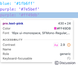
上面代码中的 ' 表示 HTML 中的 ' 。
由于覆盖了 colors 对象的配置,原来的默认颜色就不起作用了,比如下面的 red-200 就不起作用:
```html
text-red-200 没有效果
```

尽管 colors 的值被覆盖了,但是其他的配置不受影响,比如 spacing,它们继续继承默认值。
3.2 扩展原样式
更多的时候,我们希望使用 Tailwind 的便利,同时添加更多的选择。比如,想要追加一些新的颜色,那么就在 extend 对象中添加:
```ts import type { Config } from 'tailwindcss';
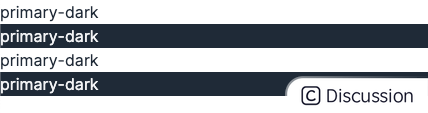
const config: Config = { // ... theme: { // ... extend: { colors: { 'primary-dark': '#1f2937', 'primary-light': '#f3f4f6', 'secondary-dark': '#1f2937', 'secondary-light': '#f3f4f6', }, }, }, }; export default config; ```
然后使用这些新增的颜色:
```html
primary-dark
primary-dark
primary-dark
primary-dark
```
3.3 可扩展的关键词
除了 colors,之前的文章中提到的 spacing,又或者是控制响应式 screens,也都可以被覆盖或扩展。下面是一张完整的样式声明配置及其对应关系的描述表格:
| 关键词 | 描述 | | -------------------------- | ------------------------------------------------------ | | accentColor | Values for the accent-color property | | animation | Values for the animation property | | aria | Values for the aria property | | aspectRatio | Values for the aspect-ratio property | | backdropBlur | Values for the backdropBlur plugin | | backdropBrightness | Values for the backdropBrightness plugin | | backdropContrast | Values for the backdropContrast plugin | | backdropGrayscale | Values for the backdropGrayscale plugin | | backdropHueRotate | Values for the backdropHueRotate plugin | | backdropInvert | Values for the backdropInvert plugin | | backdropOpacity | Values for the backdropOpacity plugin | | backdropSaturate | Values for the backdropSaturate plugin | | backdropSepia | Values for the backdropSepia plugin | | backgroundColor | Values for the background-color property | | backgroundImage | Values for the background-image property | | backgroundOpacity | Values for the background-opacity property | | backgroundPosition | Values for the background-position property | | backgroundSize | Values for the background-size property | | blur | Values for the blur plugin | | borderColor | Values for the border-color property | | borderOpacity | Values for the borderOpacity plugin | | borderRadius | Values for the border-radius property | | borderSpacing | Values for the border-spacing property | | borderWidth | Values for the borderWidth plugin | | boxShadow | Values for the box-shadow property | | boxShadowColor | Values for the boxShadowColor plugin | | brightness | Values for the brightness plugin | | caretColor | Values for the caret-color property | | colors | Your project's color palette | | columns | Values for the columns property | | container | Configuration for the container plugin | | content | Values for the content property | | contrast | Values for the contrast plugin | | cursor | Values for the cursor property | | divideColor | Values for the divideColor plugin | | divideOpacity | Values for the divideOpacity plugin | | divideWidth | Values for the divideWidth plugin | | dropShadow | Values for the dropShadow plugin | | fill | Values for the fill plugin | | flex | Values for the flex property | | flexBasis | Values for the flex-basis property | | flexGrow | Values for the flex-grow property | | flexShrink | Values for the flex-shrink property | | fontFamily | Values for the font-family property | | fontSize | Values for the font-size property | | fontWeight | Values for the font-weight property | | gap | Values for the gap property | | gradientColorStops | Values for the gradientColorStops plugin | | gradientColorStopPositions | Values for the gradient-color-stop-positions property | | grayscale | Values for the grayscale plugin | | gridAutoColumns | Values for the grid-auto-columns property | | gridAutoRows | Values for the grid-auto-rows property | | gridColumn | Values for the grid-column property | | gridColumnEnd | Values for the grid-column-end property | | gridColumnStart | Values for the grid-column-start property | | gridRow | Values for the grid-row property | | gridRowEnd | Values for the grid-row-end property | | gridRowStart | Values for the grid-row-start property | | gridTemplateColumns | Values for the grid-template-columns property | | gridTemplateRows | Values for the grid-template-rows property | | height | Values for the height property | | hueRotate | Values for the hueRotate plugin | | inset | Values for the top, right, bottom, and left properties | | invert | Values for the invert plugin | | keyframes | Keyframe values used in the animation plugin | | letterSpacing | Values for the letter-spacing property | | lineHeight | Values for the line-height property | | listStyleType | Values for the list-style-type property | | listStyleImage | Values for the list-style-image property | | margin | Values for the margin property | | lineClamp | Values for the line-clamp property | | maxHeight | Values for the max-height property | | maxWidth | Values for the max-width property | | minHeight | Values for the min-height property | | minWidth | Values for the min-width property | | objectPosition | Values for the object-position property | | opacity | Values for the opacity property | | order | Values for the order property | | outlineColor | Values for the outline-color property | | outlineOffset | Values for the outline-offset property | | outlineWidth | Values for the outline-width property | | padding | Values for the padding property | | placeholderColor | Values for the placeholderColor plugin | | placeholderOpacity | Values for the placeholderOpacity plugin | | ringColor | Values for the ringColor plugin | | ringOffsetColor | Values for the ringOffsetColor plugin | | ringOffsetWidth | Values for the ringOffsetWidth plugin | | ringOpacity | Values for the ringOpacity plugin | | ringWidth | Values for the ringWidth plugin | | rotate | Values for the rotate plugin | | saturate | Values for the saturate plugin | | scale | Values for the scale plugin | | screens | Your project's responsive breakpoints | | scrollMargin | Values for the scroll-margin property | | scrollPadding | Values for the scroll-padding property | | sepia | Values for the sepia plugin | | skew | Values for the skew plugin | | space | Values for the space plugin | | spacing | Your project's spacing scale | | stroke | Values for the stroke property | | strokeWidth | Values for the stroke-width property | | supports | Values for the supports property | | data | Values for the data property | | textColor | Values for the text-color property | | textDecorationColor | Values for the text-decoration-color property | | textDecorationThickness | Values for the text-decoration-thickness property | | textIndent | Values for the text-indent property | | textOpacity | Values for the textOpacity plugin | | textUnderlineOffset | Values for the text-underline-offset property | | transformOrigin | Values for the transform-origin property | | transitionDelay | Values for the transition-delay property | | transitionDuration | Values for the transition-duration property | | transitionProperty | Values for the transition-property property | | transitionTimingFunction | Values for the transition-timing-function property | | translate | Values for the translate plugin | | size | Values for the size property | | width | Values for the width property | | willChange | Values for the will-change property | | zIndex | Values for the z-index property |
4. 预处理器的使用
在上一篇中有朋友评论:

4.1 postcss-nesting
官方推荐的 postcss-nesting 插件可以满足嵌套的需求。首先安装依赖:
bash npm install -D postcss-nesting
然后放进 postcss 处理器配置中(postcss.config.mjs):
```js /** @type {import('postcss-load-config').Config} */ const config = { plugins: { 'tailwindcss/nesting': 'postcss-nesting', tailwindcss: {}, }, };
export default config; ```
现在使用一下子,在 global.css 中添加以下代码:
```css /* ... */
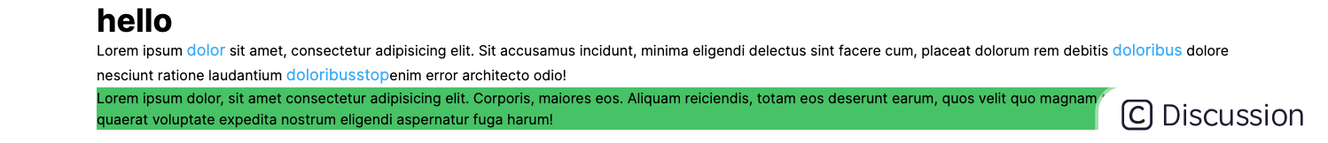
@layer utilities { .container { @apply w-[1280px] mx-auto; span { @apply text-lg text-blue; } } } ```
.container 用于控制容器内容居中,span 元素嵌套在其中。
```html
Lorem ipsum dolor sit amet, consectetur adipisicing elit. Sit accusamus incidunt, minima eligendi delectus sint facere cum, placeat dolorum rem debitis doloribus dolore nesciunt ratione laudantium doloribusstopenim error architecto odio!
```

实测有效。
4.2 就是想用 Sass
笔者头铁,笔者就是想用 Sass!

也不是不行,不过需要知道一件事:预处理器(Sass 之类的)和 Tailwind CSS 是在不同的阶段处理的。预处理器首先处理其输入文件并生成 CSS,然后 Tailwind CSS 和 PostCSS 在预处理器生成的 CSS 上继续处理。
也就是说,不能把 Tailwind 的 theme() 函数的输出传给一个 Sass 的颜色函数,比如:
css .error { background-color: darken(theme('colors.red.500'), 10%); } .btn:hover { background-color: light(theme('colors.red.500'), 10%); }
darken($color, $amount) 和 lighten($color, $amount) 就是 Sass 中的颜色函数。由于 Sass 在 Tailwind 之前运行,还未生成 CSS,因此 theme() 并不可用。
以 React 和 Sass 为例,有 Demo.module.scss 如下:
```css .container { @apply w-[1280px] mx-auto; span { @apply text-lg text-blue; } }
.title { // @apply text-4xl font-bold; font-size: 36px; line-height: 40px; font-weight: bold; }
.success { background-color: theme('colors.green'); } ```
引入到组件中使用:
```typescript import styles from './Demo.module.scss';
export default function Page() { return (
Lorem ipsum dolor sit amet, consectetur adipisicing elit. Sit accusamus incidunt, minima eligendi delectus sint facere cum, placeat dolorum rem debitis doloribus dolore nesciunt ratione laudantium doloribusstopenim error architecto odio!
5. 总结
除此以外, Tailwind 还有更多的配置项,如 plugins、presets、prefix 等等,这些内容不需要特别去看,只要知道它们可以做什么,用到时检索即可。下面用一句话分别概括:
- plugins:添加自定义插件以扩展 Tailwind 的功能。
- presets:自定义预设样式,多个项目可共享一套配置。
- prefix:为所有 Tailwind 生成的 utilities 类添加前缀,帮助避免命名冲突。
- important:配置所有 utilities 类标记为**
!important**,确保它们优先应用。 - corePlugins:禁用某些不想用的样式,减小 CSS 体积。
总结一下,想要覆盖样式使用 theme.key 去覆盖,想要扩展更多则使用 theme.extend.key ,可用的 key 在 3.3 节中;另外使用嵌套语法,还是推荐 postcss-nesting 而不是直接使用 Sass 等预处理器,一方面它的构建速度更快,另一方面仅通过 @tailwind、@apply、theme() 等 Tailwind 关键词的组合就能达到相同的效果。反之,使用预处理器就要考虑语法、执行顺序等等情况,变相增加了开发者的心智负担。
以上就是进阶篇的所有内容,掌握了这些在一般的项目开发已经完全够用了,下篇将讲解响应式相关内容,让你用一套代码搞定多端的 UI 显示。


 扫一扫
扫一扫


 2317
2317

 被折叠的 条评论
为什么被折叠?
被折叠的 条评论
为什么被折叠?
 到【灌水乐园】发言


