


一、 线型图
import matplotlib.pyplot as plt
import numpy as np
import seaborn as sns
import warnings
warnings.filterwarnings("ignore")
x = [1,2,3,4,5,6,7,8,9,10,11,12,13,14,15]
y = [102,134,154,122,143,243,355,342,276,299,241,287,260,231,100]

plt.figure(figsize=(10,5))
plt.plot(x,y)
plt.title('Weight change in 15 months')
plt.xlabel('Month')
plt.ylabel('kg')
plt.show() 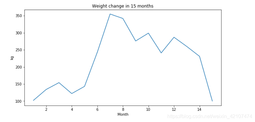
import matplotlib.pyplot as plt
import numpy as np
import seaborn as sns
import warnings
warnings.filterwarnings("ignore")
y1 = [102,134,154,122,143,243,355,342,276,299,241,287,260,231,100]
y2 = [244,250,245,256,234,241,230,267,266,255,248,239,233,221,227]
plt.figure(figsize=(10,5))
plt.plot(x,y1,label = 'A')
plt.plot(x,y2,label = 'B')
plt.title('Weight change in 15 months')
plt.xlabel('Month')
plt.ylabel('kg')
plt.legend(fontsize = 10)
plt.show()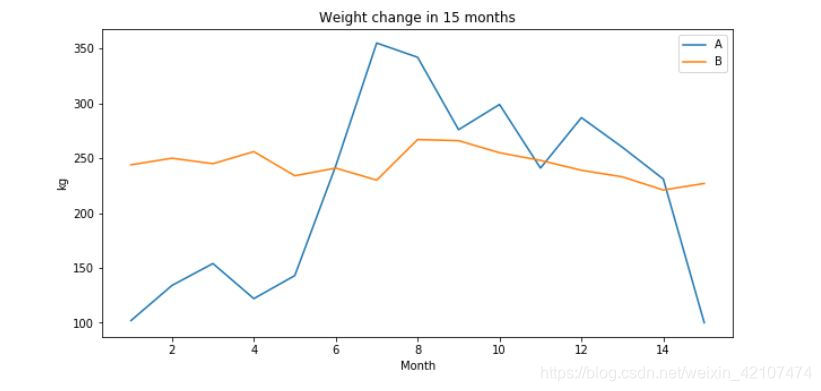 还可以用 loc 设置标签所在的位置,1表示右上角,2表示左上角,3表示左下角,4表示右下角
二、 柱状图
plt.figure(figsize=(10,5))
plt.bar(x,y,color = '#9999ff',width = 0.5)
plt.title('Weight change in 15 months')
plt.xlabel('Month')
plt.ylabel('kg')
plt.show() 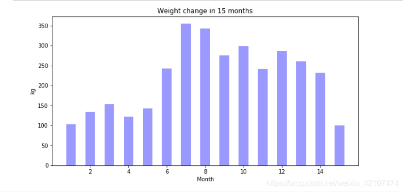
x1 = [0.25,1.25,2.25,3.25,4.25,5.25,6.25,7.25,8.25,9.25,10.25,11.25,12.25,13.25,14.25]
x2 = [0.75,1.75,2.75,3.75,4.75,5.75,6.75,7.75,8.75,9.75,10.75,11.75,12.75,13.75,14.75]

plt.figure(figsize=(10,5))
plt.bar(x1,y1,width = 0.5,label = 'A')
plt.bar(x2,y2,width = 0.5,label = 'B')
plt.title('Weight change in 15 months')
plt.xlabel('Month')
plt.ylabel('kg')
plt.legend()
plt.show() 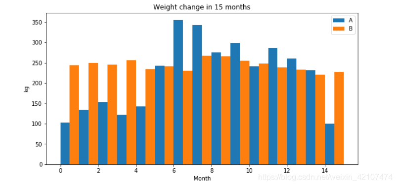
三、 点状图
plt.figure(figsize=(10,5))
plt.scatter(x,y)
plt.title('Weight change in 15 months')
plt.xlabel('Month')
plt.ylabel('kg')
plt.show() 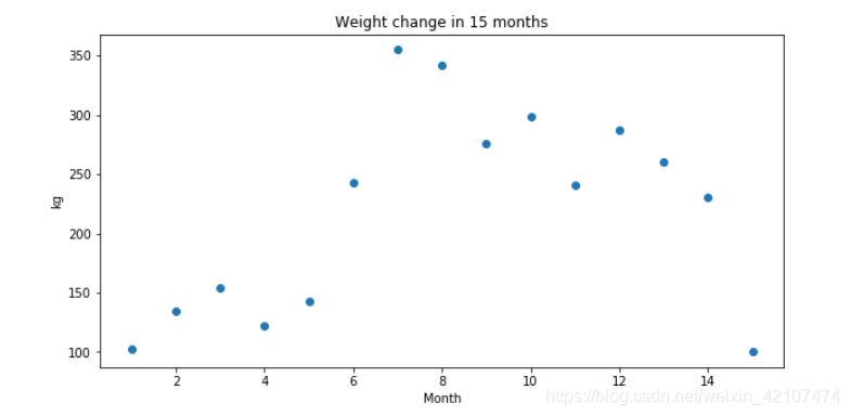
x = range(20)
y = x + np.random.randn(20)*1.05

plt.figure(figsize=(10,8))
#plt.scatter(x,y)
plt.plot(x,y,'*')
plt.plot(x,x)
plt.title('x VS y')
plt.xlabel('X')
plt.ylabel('Y')
plt.legend(('real data','fitted line'))
plt.show() 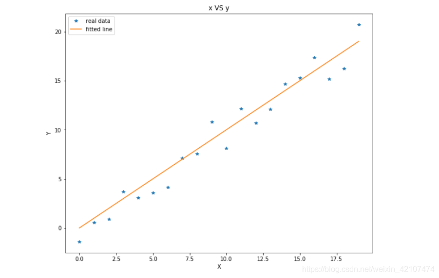
四、 盒状图
plt.figure(figsize=(10,5))
plt.boxplot([y1,y2])
plt.xticks([1,2],['A','B'])
plt.xlabel('Different objects')
plt.show() 
五、 直方图
plt.figure(figsize=(10,8))
plt.hist(y1)
plt.title('Weight change in 15 months')
plt.xlabel('Weight(kg)')
plt.ylabel('frequency')
plt.show() 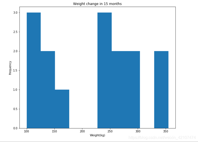
plt.figure(figsize=(10,8))
gaussian_numbers = np.random.randn(1000)
plt.hist(gaussian_numbers, 30 ,color = 'navy',alpha = 0.5)
plt.title('Gaussian Histogram')
plt.xlabel('value')
plt.ylabel('frequency')
plt.show() 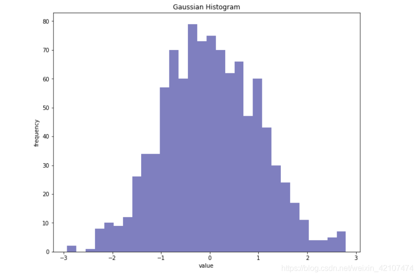


 385
385


 被折叠的 条评论
为什么被折叠?
被折叠的 条评论
为什么被折叠?
 到【灌水乐园】发言


