


在项目中要做移动和pc端的适配,所以图片需要居中显示,不论窗口如何变化,始终显示中间部分的图片。
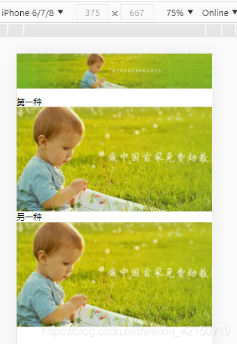
这个是图片在pc端,宽度为100%时显示的

如果图片宽度100%,放在移动端看,就会很小,显示的是一整张图片,不符合需求。经过css的设置,使得图片可以显示中间部分。
这个是图片在移动端显示。。能使图片在移动端显示图片的中间部分
思想:
第一种:采用图片在div盒子中,盒子宽度100%,给一个高度,让图片使用 相对定位+transform 移动。
第二种:使用图片做背景图片,使用背景图片的background-position:center center; 来居中显示图片。
<!DOCTYPE html>
<html lang="en">

<head>
    <meta charset="UTF-8">
    <meta name="viewport" content="width=device-width, initial-scale=1.0">
    <meta http-equiv="X-UA-Compatible" content="ie=edge">
    <title>测试</title>

    <style>
        .origin {
            width: 100%;
        }

        .bg_img {
            width: 100%;
            height: 200px;
        }

        .bg_img .c_img {
            height: 200px;
            position: relative;
            left: 50%;
            transform: translate(-50%);
        }

        .bgc {
            width: 100%;
            height: 200px;
             /*background: url(images/profile-bg.jpg) no-repeat center center;*/
            background-image: url(images/profile-bg.jpg);
            background-repeat: no-repeat;
            background-position: center center;
            background-size: cover;
        }
    </style>
</head>

<body>
    <img class="origin" src="images/profile-bg.jpg" alt="">
    <div>第一种</div>
    <div class="bg_img">
        <img class="c_img" src="images/profile-bg.jpg" alt="">
    </div>

    <div>另一种</div>
    <div class="bgc"></div>
</body>

</html>


 1万+
1万+


 被折叠的 条评论
为什么被折叠?
被折叠的 条评论
为什么被折叠?
 到【灌水乐园】发言


