


1. 响应式布局
响应式布局指的是一个网站能适应多个终端,能在不同的客户端,将网页内容以不同布局的方式完整的显示出来。
2. @media查询
@media 可以针对不同的屏幕尺寸设置不同的样式,根据屏幕的大小的不同来显示不同布局的网页的内容。
@media查询 菜鸟链接:
CSS3 @media查询 | 菜鸟教程www.runoob.com可以通过@media查询 来判断网页实时宽度来更改css样式达成响应式布局的设计
3. @ media查询 的使用方式
- 直接在css中使用
    @media 类型 and (条件1) and (条件2){
        /*css样式*/
    }
    @media screen and (max-width:1024px) {
        body{
            background-color: red;
        }
    }
2. 使用@import导入(宽度小于1024px)
@import url("css.css") screen and (max-width:1024px); 3. 使用link方式引入(宽度小于1024px)
<link rel="stylesheet" type="text/css" href="css.css" media="screen and (max-width:1024px)"/> 三种方式通过网页宽度来更改页面的css样式
<!doctype html>
<html>
<head>
<meta charset="utf-8"/>
<title>响应式</title>
<link rel="stylesheet" type="text/css" href="index.css"/>
<link rel="stylesheet" type="text/css" href="index01.css" media="screen and (max-width:1024px) and (min-width:720px)"/>
<link rel="stylesheet" type="text/css" href="index02.css" media="screen and (max-width:720px)"/>
</head>
<body>
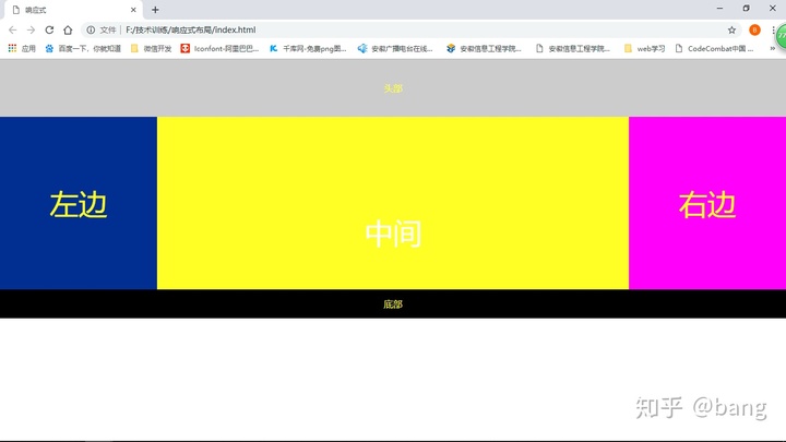
<div class="header">头部</div>
<div class="main">
<div class="left">左边</div>
<div class="center">中间</div>
<div class="right">右边</div>
</div>
<div class="footer">底部</div>
</body>
</html>css部分代码:
*{
    margin:0;
    padding:0;
    text-align:center;
    color:yellow;
}

.header{
    width:100%;
    height:100px;
    background:#ccc;
    line-height:100px;
}
.main{
    background:green;
    width:100%;
}
.left,.center,.right{
    float:left;
}
.left{
    width:20%;
    background:#112993;
    height:300px;
    font-size:50px;
    line-height:300px;
}
.center{
    width:60%;
    background:#ff0;
    height:300px;
    color:#fff;
    font-size:50px;
    line-height:400px;
}
.right{
    width:20%;
    background:#f0f;
    height:300px;
    font-size:50px;
    line-height:300px;
}
.footer{
    width:100%;
    height:50px;
    background:#000;
    line-height:50px;
    float: left;
}
720px宽度到1024px宽度的css代码:
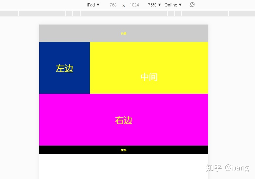
.right{
float:none;
width:100%;
background:#f0f;
clear:both;
}
.left{
width:30%;
}
.center{
width:70%;
}
.main{
height:600px;
}
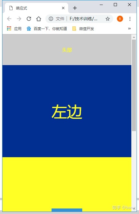
小于720px宽度的代码:
.left,.center,.right{
float:none;
width:100%;
}
全屏效果图:
宽度在720-1024px的效果图:
宽度小于720px的效果图:


 425
425


 被折叠的 条评论
为什么被折叠?
被折叠的 条评论
为什么被折叠?
 到【灌水乐园】发言


