


 这篇教程介绍了使用matplotlib库创建各种图形的方法,包括多子图、图像显示、直方图、3D表面图、流线图、条形图、饼图、散点图等。示例代码展示了如何绘制线图、设置子图、绘制图像、自定义颜色和透明度、以及使用不同类型的图像插值。此外,还涵盖了日期处理、对数图、极坐标图、图像的剪切和层叠,以及如何添加图例和使用LaTeX公式。
import matplotlib
import matplotlib.pyplot as plt
import numpy as np
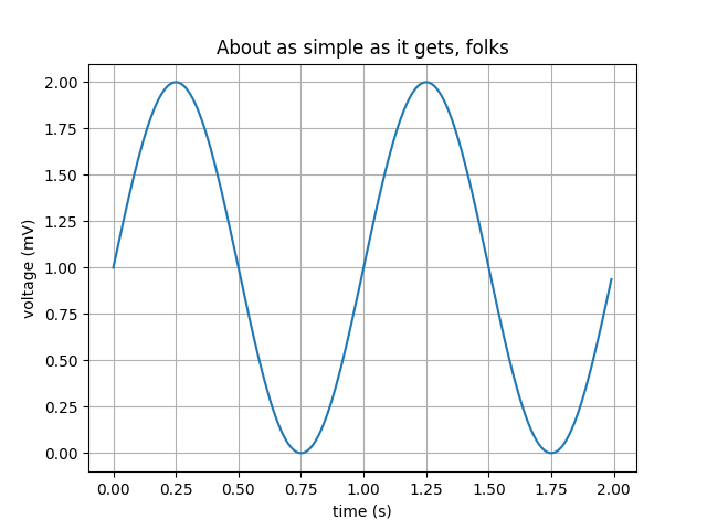
# Data for plotting
t = np.arange(0.0, 2.0, 0.01)
s = 1 + np.sin(2 * np.pi * t)
# Note that using plt.subplots below is equivalent to using
# fig = plt.figure() and then ax = fig.add_subplot(111)
fig, ax = plt.subplots()
ax.plot(t, s)
ax.set(xlabel='time (s)', ylabel='voltage (mV)',
title='About as simple as it gets, folks')
ax.grid()
fig.savefig("test.png")
plt.show()
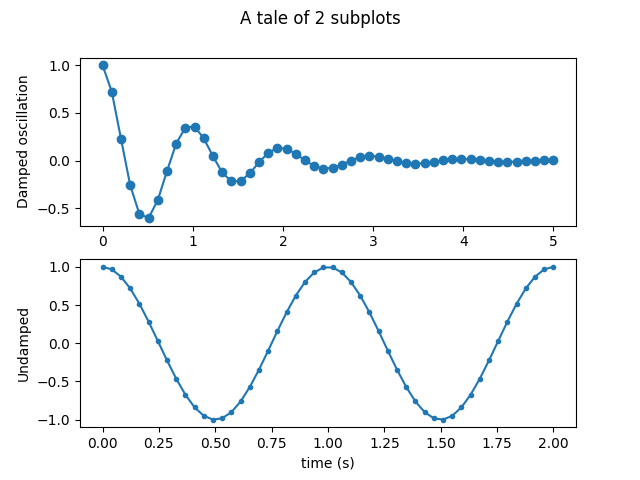
Multiple subplots
Simple demo with multiple subplots.
import numpy as np
import matplotlib.pyplot as plt


x1 = np.linspace(0.0, 5.0)
x2 = np.linspace(0.0, 2.0)

y1 = np.cos(2 * np.pi * x1) * np.exp(-x1)
y2 = np.cos(2 * np.pi * x2)

plt.subplot(2, 1, 1)
plt.plot(x1, y1, 'o-')
plt.title('A tale of 2 subplots')
plt.ylabel('Damped oscillation')

plt.subplot(2, 1, 2)
plt.plot(x2, y2, '.-')
plt.xlabel('time (s)')
plt.ylabel('Undamped')

plt.show()
Image Demo
Many ways to plot images in Matplotlib.
The most common way to plot images in Matplotlib is with imshow. The following examples demonstrate much of the functionality of imshow and the many images you can create.
First we’ll generate a simple bivariate normal distribution.
delta = 0.025
x = y = np.arange(-3.0, 3.0, delta)
X, Y = np.meshgrid(x, y)
Z1 = np.exp(-X**2 - Y**2)
Z2 = np.exp(-(X - 1)**2 - (Y - 1)**2)
Z = (Z1 - Z2) * 2

im = plt.imshow(Z, interpolation='bilinear', cmap=cm.RdYlGn,
                origin='lower', extent=[-3, 3, -3, 3],
                vmax=abs(Z).max(), vmin=-abs(Z).max())

plt.show()

It is also possible to show images of pictures.
# A sample image
with cbook.get_sample_data('ada.png') as image_file:
    image = plt.imread(image_file)

fig, ax = plt.subplots()
ax.imshow(image)
ax.axis('off')  # clear x- and y-axes


# And another image

w, h = 512, 512

with cbook.get_sample_data('ct.raw.gz', asfileobj=True) as datafile:
    s = datafile.read()
A = np.fromstring(s, np.uint16).astype(float).reshape((w, h))
A /= A.max()

fig, ax = plt.subplots()
extent = (0, 25, 0, 25)
im = ax.imshow(A, cmap=plt.cm.hot, origin='upper', extent=extent)

markers = [(15.9, 14.5), (16.8, 15)]
x, y = zip(*markers)
ax.plot(x, y, 'o')

ax.set_title('CT density')

plt.show()


Interpolating images
It is also possible to interpolate images before displaying them. Be careful, as this may manipulate the way your data looks, but it can be helpful for achieving the look you want. Below we’ll display the same (small) array, interpolated with three different interpolation methods.
The center of the pixel at A[i,j] is plotted at i+0.5, i+0.5. If you are using interpolation=’nearest’, the region bounded by (i,j) and (i+1,j+1) will have the same color. If you are using interpolation, the pixel center will have the same color as it does with nearest, but other pixels will be interpolated between the neighboring pixels.
Earlier versions of matplotlib (<0.63) tried to hide the edge effects from you by setting the view limits so that they would not be visible. A recent bugfix in antigrain, and a new implementation in the matplotlib._image module which takes advantage of this fix, no longer makes this necessary. To prevent edge effects, when doing interpolation, the matplotlib._image module now pads the input array with identical pixels around the edge. e.g., if you have a 5x5 array with colors a-y as below:
a b c d e
f g h i j
k l m n o
p q r s t
u v w x y
the _image module creates the padded array,:
a a b c d e e
a a b c d e e
f f g h i j j
k k l m n o o
p p q r s t t
o u v w x y y
o u v w x y y
does the interpolation/resizing, and then extracts the central region. This allows you to plot the full range of your array w/o edge effects, and for example to layer multiple images of different sizes over one another with different interpolation methods - see examples/layer_images.py. It also implies a performance hit, as this new temporary, padded array must be created. Sophisticated interpolation also implies a performance hit, so if you need maximal performance or have very large images, interpolation=’nearest’ is suggested.
A = np.random.rand(5, 5)

fig, axs = plt.subplots(1, 3, figsize=(10, 3))
for ax, interp in zip(axs, ['nearest', 'bilinear', 'bicubic']):
    ax.imshow(A, interpolation=interp)
    ax.set_title(interp.capitalize())
    ax.grid(True)
 最低0.47元/天 解锁文章


 被折叠的 条评论
为什么被折叠?
被折叠的 条评论
为什么被折叠?
 到【灌水乐园】发言


