


很惭愧,这竟然是老衲在csdn的首次内容输出,还请看官,高抬贵手,多喷两句, 反正我也不听~👀
首先声明,我是最近才刚开始写uniapp……
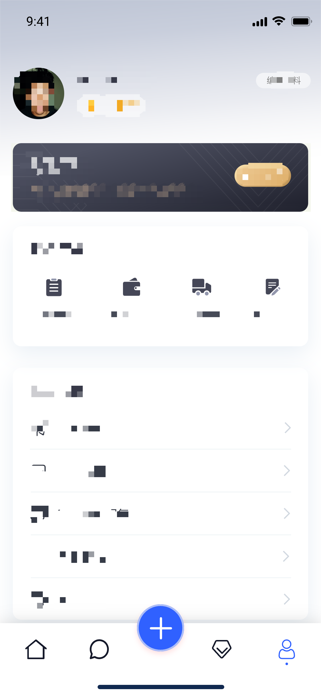
言归正传,最近给公司要做一个小程序,由于之前并没有实际从0开始构建开发经验,故记录下遇到的一些小难点,方便之后查阅,希望也能帮到其他小朋友,目标项目主界面如下图所示
如果想实现这个效果的tabbar,那我们就只能舍弃小程序本身自带的了,在网上疯狂找了一圈,没有找到相对比较满意的解决办法,尝试后基本卡在首次加载切换时,每个页面都要初始化闪烁一下,不是很美丽,程序猿的强迫症怎么能允许!!最后结合查阅的资料结合自己的一些理解,算是比较完美的解决。
思路大概是这样
首先封装一个自己用的tabbar组件
然后配置page.js
全局引用自定义tabbar
每个tabbar页面引用组件
最后进入主题:解决初次加载闪屏
话不多说,直接上代码……
首先我们先封装一个自定义的tabbar组件(配置信息自行根据业务更改)
<template>
<view class="tabbar-container">
<block>
<view class="tabbar-item" v-for="(item, index) in tabbarList" :class="[item.centerItem ? ' center-item' : '']" @click="changeItem(item)">
<view class="item-top"><image :src="currentItem == item.id ? item.selectIcon : item.icon"></image></view>
<view class="item-bottom" :class="[currentItem == item.id ? 'item-active' : '']">
<text>{{ item.text }}</text>
</view>
</view>
</block>
</view>
</template>
<script>
export default {
props: {
currentPage: {
type: Number,
default: 0
}
},
data() {
return {
currentItem: 0,
tabbarList: [
{
id: 0,
path: '/pages/index/index',
icon: '/static/home.png',
selectIcon: '/static/homeSelected.png',
text: '简介',
centerItem: false
},
{
id: 1,
path: '/pages/discount/discount',
icon: '/static/gift.png',
selectIcon: '/static/giftSelected.png',
text: '优惠',
centerItem: false
},
{
id: 2,
path: '/pages/code/code',
icon: '/static/code.png',
selectIcon: '/static/codeSelected.png',
text: '二维码',
centerItem: true
},
{
id: 3,
path: '/pages/search/search',
icon: '/static/search.png',
selectIcon: '/static/searchSelected.png',
text: '探索',
centerItem: false
},
{
id: 4,
path: '/pages/mine/mine',
icon: '/static/mine.png',
selectIcon: '/static/mineSelected.png',
text: '我的',
centerItem: false
}
]
};
},
mounted() {
this.currentItem = this.currentPage;
uni.hideTabBar();
},
methods: {
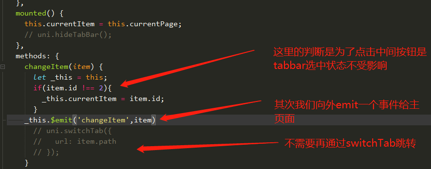
changeItem(item) {
let _this = this;
//_this.currentItem = item.id;
uni.switchTab({
url: item.path
});
}
}
};
</script>
<style>
view {
padding: 0;
margin: 0;
box-sizing: border-box;
}
.tabbar-container {
position: fixed;
bottom: 0;
left: 0;
width: 100%;
height: 110rpx;
box-shadow: 0 0 5px #999;
display: flex;
align-items: center;
padding: 5rpx 0;
color: #999999;
}
.tabbar-container .tabbar-item {
width: 20%;
height: 100rpx;
display: flex;
flex-direction: column;
justify-content: center;
align-items: center;
text-align: center;
}
.tabbar-container .item-active {
color: #f00;
}
.tabbar-container .center-item {
display: block;
position: relative;
}
.tabbar-container .tabbar-item .item-top {
width: 70rpx;
height: 70rpx;
padding: 10rpx;
}
.tabbar-container .center-item .item-top {
flex-shrink: 0;
width: 100rpx;
height: 100rpx;
position: absolute;
top: -50rpx;
left: calc(50% - 50rpx);
border-radius: 50%;
box-shadow: 0 0 5px #999;
background-color: #ffffff;
}
.tabbar-container .tabbar-item .item-top image {
width: 100%;
height: 100%;
}
.tabbar-container .tabbar-item .item-bottom {
font-size: 28rpx;
width: 100%;
}
.tabbar-container .center-item .item-bottom {
position: absolute;
bottom: 5rpx;
}
</style>2.然后我们配置下page.js
{
  "pages": [{
    "path": "pages/index/index",
    "style": {
      "navigationBarTitleText": "简介"
    }
  }, {
    "path": "pages/discount/discount",
    "style": {
      "navigationBarTitleText": "优惠"
    }

  }, {
    "path": "pages/code/code",
    "style": {
      "navigationBarTitleText": "二维码"
    }

  }, {
    "path": "pages/search/search",
    "style": {
      "navigationBarTitleText": "探索"
    }

  }, {
    "path": "pages/mine/mine",
    "style": {
      "navigationBarTitleText": "我的"
    }

  }],
  "globalStyle": {
    "navigationBarTextStyle": "black",
    "navigationBarTitleText": "CRM",
    "navigationBarBackgroundColor": "#F8F8F8",
    "backgroundColor": "#F8F8F8",
    "app-plus": {
      "background": "#efeff4"
    }
  },
  "tabBar": {
    "color": "#999999",
    "selectedColor": "#f00",
    "borderStyle": "black",
    "backgroundColor": "#ffffff",
    "midButton":{
      "text":"二维码",
      "pagePath":"pages/code/code",
      "iconPath":"static/code.png",
      "selectedIconPath":"static/codeSelected.png"
    },
    "list":[
      {
        "pagePath":"pages/index/index",
        "iconPath":"static/home.png",
        "selectedIconPath":"static/homeSelected.png",
        "text":"简介"
      },
      {
        "pagePath":"pages/discount/discount",
        "iconPath":"static/gift.png",
        "selectedIconPath":"static/giftSelected.png",
        "text":"优惠"
      },
      {
        "pagePath":"pages/code/code",
        "iconPath":"static/code.png",
        "selectedIconPath":"static/codeSelected.png",
        "text":"二维码"
      },
      {
        "pagePath":"pages/search/search",
        "iconPath":"static/search.png",
        "selectedIconPath":"static/searchSelected.png",
        "text":"探索"
      },
      {
        "pagePath":"pages/mine/mine",
        "iconPath":"static/mine.png",
        "selectedIconPath":"static/mineSelected.png",
        "text":"我的"
      }
    ]
  }
}
3.注册全局组件tabbar在main.js文件中,配置如下:
import Vue from 'vue'
import App from './App'
import diyTabbar from "components/zdy-tabbar.vue"

// 注册全局组件
Vue.component('diy-tabbar', diyTabbar)

Vue.config.productionTip = false

App.mpType = 'app'

const app = new Vue({
  ...App
})
app.$mount()
4.所有的tabbar页面引入自定义tabbar:
<diy-tabbar :current-page="0"></diy-tabbar> // current-page 对应的就是tabbar的index至此,我们完成了第一步这个伟大的壮举,兴冲冲的启动程序,激动的心,颤抖的手点击第一个tabbar~
咦?是什么在闪烁呀,于是我们疯狂的点击了每一个却发现都在闪,当我们再次点击每个一个tabbar,又都好了...
于是我们心安理得的想,这样就可以了,毕竟整个这个确实没有原生的用着爽,老子已经尽力了....
然后只过了两分钟,我那份强迫症就犯了,这也太丑了,与我前端大神的身份不搭啊
对于初次加载闪屏问题的资料网上一大堆假的,这个有这么难吗?为啥连个像样的资料都找不到,...
于是只能自己造小三轮车了,思路就是
创建一个主页面
将所有tabbar组件和页面都引入其中,
这样共用一个tabbar就不会出现闪屏的问题
这样就能稍微优雅的坐上三轮车,诶?不对,我在说什么...
1.首先,我们先建一个主页面,将所有tabbar页面引入
<template>
    <view>
        <view class="main_box">
            <index v-if="currentIndex === 0"></index>
            <message v-if="currentIndex === 1"></message>
            <!-- <midBtn v-if="currentIndex === 2"></midBtn> -->
            <member v-if="currentIndex === 3"></member>
            <my v-if="currentIndex === 4"></my>
        </view>
        <view class="foot_box">
            <diy-tabbar :current-page="currentIndex" @changeItem="changeItem"></diy-tabbar>
        </view>
        <u-popup class="firstPagePopup" :show="active" :closeable="true" @close="close" @open="open">
            <view>
                <view class="tabbar-box-wrap">
                    <view class="tabbar-box">
                        <view class="tabbar-box-item" @click="goToPage('/pages/tabbar-3-detial/tabbar-3-release/tabbar-3-release')">
                            <image class="box-image" src="@/static/img/mid_btn1.png" mode="aspectFit"></image>
                            <text class="explain">发文章</text>
                        </view>
                        <view class="tabbar-box-item" @click="goToPage('/pages/tabbar-3-detial/tabbar-3-video/tabbar-3-video')">
                            <image class="box-image" src="@/static/img/mid_btn2.png" mode="aspectFit"></image>
                            <text class="explain">发图文</text>
                        </view>
                        <view class="tabbar-box-item" @click="goToPage('/pages/tabbar-3-detial/tabbar-3-qa/tabbar-3-qa')">
                            <image class="box-image" src="@/static/img/mid_btn3.png" mode="aspectFit"></image>
                            <text class="explain">发视频</text>
                        </view>
                    </view>
                </view>
            </view>
        </u-popup>
    </view>
</template>

<script>
    import index  from '@/pages/index/index.vue'
    import my  from '@/pages/my/index.vue'
    import message  from '@/pages/message/index.vue'
    import member from '@/pages/memberCenter/index.vue'
    export default {
        components:{
            index,
            my,
            message,
            member
        },
        data() {
            return {
                active:false,
                currentIndex:4
            }
        },
        onLoad() {
        },
        methods: {
            // 如果
            changeItem(item){
                if(item.id === 2){
                    this.active = true
                }else{
                    this.currentIndex = item.id
                }
                // uni.switchTab({
                //   url: item.path
                // });
                // console.log(item)
            },
            close(){
                debugger
                this.active=false
            },
            open(){}
        }
    }
</script>

<style lang="scss" scoped>
.main_box{
    height: calc(100vh - 110rpx);
    overflow: scroll;
}
.foot_box{
    height: 110rpx;
}
.content {
    display: flex;
    align-items: center;
    justify-content: center;
    width: 100%;
    /* #ifdef H5 */
    height: calc(100vh - var(--window-bottom) - var(--window-top));
    /* #endif */
    /* #ifndef H5 */
    height: 100vh;
    /* #endif */
    transition: opacity 0.3s;
    background: #999;
    opacity: 0;
    &.active {
        opacity: 1;
    }
    .logo {
        position: relative;
        margin-top: -400upx;
        width: 200upx;
        height: 200upx;
        // z-index: -1;
        opacity: 0;
        transition: opacity 0.3s;
        &.active {
            opacity: 1;
        }
    }
}
.tabbar-box-wrap {
    width: 100%;
    padding: 50upx;
    box-sizing: border-box;
    .tabbar-box {
        display: flex;
        width: 100%;
        background: #fff;
        border-radius: 20upx;
        padding: 15upx 20upx;
        box-sizing: border-box;
        z-index: 2;
        .tabbar-box-item {
            // position: relative;
            width: 100%;
            z-index: 3;
            margin: 10upx;
            color: $uni-color-subtitle;
            text-align: center;
            font-size: $uni-font-size-base;
            .box-image {
                width: 100%;
                height: $uni-img-size-lg;
            }
        }
    }
}

/deep/ .u-popup__content{
    border-radius: 30rpx 30rpx 0 0;
}
</style>
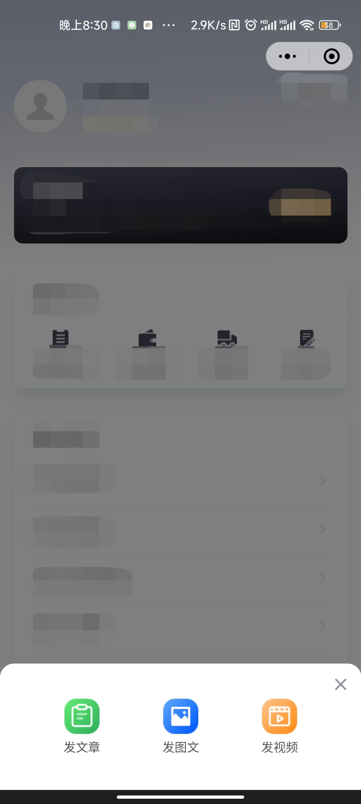
其中中间按钮我是做一个底部弹窗所以就不要组件了,大家自行根据情况改动,这里我们不需要再通过switchTab来进行跳转,只用currentIndex来切换组件即可,下面的u-popup,是底部弹窗,效果如下
2.接下来我们来改动,tabbar中的代码
修改page.js
首先我们先将主页面放到page.js的第一个,作为入口文件
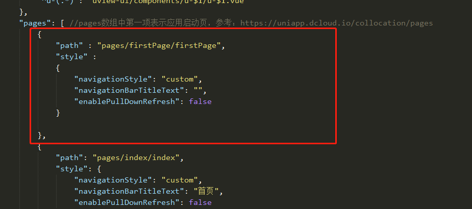
补充:到这一步,page.js中的tabbar整个就可以删除了
大功告成,目前这种方式,我还没有遇到什么问题和坑,希望评论区大神可以指点一二,初次分享,不吝赐教,谢谢大家,如果大家喜欢,多点赞评论,这也是我继续创作的强劲动力~


 扫一扫
扫一扫


 3886
3886

 被折叠的 条评论
为什么被折叠?
被折叠的 条评论
为什么被折叠?
 到【灌水乐园】发言


