


整理 PySimpleGUI 官方网站
原文google翻译过来的
https://pysimplegui.readthedocs.io/en/latest/
您将找到有关Elements的信息,所有其他类和函数都位于本手册结尾处。它们位于自述文件的大部分中,按字母顺序排列以便于查找。本节对Elements的讨论旨在教您如何工作。另一部分包含详细的呼叫签名和参数定义。
元素和功能调用参考-按钮元素
该参考部分以前与文本说明,图表,代码示例等混合使用。这在早期就可以,但是现在有更多的Elements和频繁地添加更多的方法,这意味着保持此列表的更新。如果周围有很多文字,这是一项艰巨的任务。
希望这是一个更好的改变,希望用户能够更快地找到他们想要的信息。
注意,本文档部分是使用GitHUB发布的PySimpleGUI.py文件创建的。您或您的端口(Qt,Wx,Web)可能无法使用某些呼叫。并且某些参数可能不同。我们正在努力将文档字符串添加到所有端口,这将使此类文档可用于每个端口。
**注意-某些功能/方法可能仅在内部存在,而在本文档中尚未公开
文档的此部分直接从源代码生成。**因此,有时不应该在本文档中显示您不应调用的仅内部函数或方法。希望这些事故不会经常发生。
无需再拖延…这是所有Elements和Window类
按钮元素
Button Element - Defines all possible buttons. The shortcuts such as Submit, FileBrowse, ... each create a Button
Button(button_text="",
    button_type=7,
    target=(None, None),
    tooltip=None,
    file_types=(('ALL Files', '*.*'),),
    initial_folder=None,
    disabled=False,
    change_submits=False,
    enable_events=False,
    image_filename=None,
    image_data=None,
    image_size=(None, None),
    image_subsample=None,
    border_width=None,
    size=(None, None),
    auto_size_button=None,
    button_color=None,
    disabled_button_color=None,
    use_ttk_buttons=None,
    font=None,
    bind_return_key=False,
    focus=False,
    pad=None,
    key=None,
    visible=True,
    metadata=None)
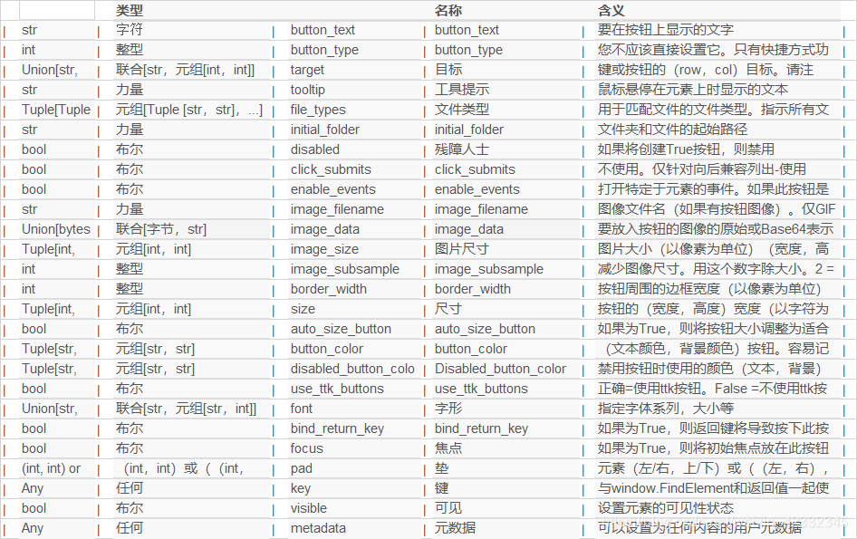
参数说明:
| 参数类型 | 参数名 | 说明 | ||
|---|---|---|---|---|
| str | 字符 | button_text | button_text | 要在按钮上显示的文字 |
| int | 整型 | button_type | button_type | 您不应该直接设置它。只有快捷方式功能可以设置 |
| Union[str, Tuple[int, int]] | 联合[str,元组[int,int]] | target | 目标 | 键或按钮的(row,col)目标。请注意,列的-1表示该元素左侧的1个元素。常量ThisRow用于指示当前行。Button本身是某些类型的按钮的有效目标 |
| str | 力量 | tooltip | 工具提示 | 鼠标悬停在元素上时显示的文本 |
| Tuple[Tuple[str, str], …] | 元组[Tuple [str,str],…] | file_types | 文件类型 | 用于匹配文件的文件类型。指示所有文件:((“” ALL Files“,” 。 “),)。注意-MAC上不支持 |
| str | 力量 | initial_folder | initial_folder | 文件夹和文件的起始路径 |
| bool | 布尔 | disabled | 残障人士 | 如果将创建True按钮,则禁用 |
| bool | 布尔 | click_submits | click_submits | 不使用。仅针对向后兼容列出-使用enable_events代替 |
| bool | 布尔 | enable_events | enable_events | 打开特定于元素的事件。如果此按钮是目标,则在填写时是否应生成事件 |
| str | 力量 | image_filename | image_filename | 图像文件名(如果有按钮图像)。仅GIF和PNG。 |
| Union[bytes, str] | 联合[字节,str] | image_data | image_data | 要放入按钮的图像的原始或Base64表示形式。选择文件名或数据 |
| Tuple[int, int] | 元组[int,int] | image_size | 图片尺寸 | 图片大小(以像素为单位)(宽度,高度) |
| int | 整型 | image_subsample | image_subsample | 减少图像尺寸。用这个数字除大小。2 = 1 / 2、3 = 1 / 3、4 = 1/4等 |
| int | 整型 | border_width | border_width | 按钮周围的边框宽度(以像素为单位) |
| Tuple[int, int] | 元组[int,int] | size | 尺寸 | 按钮的(宽度,高度)宽度(以字符为单位,高为行) |
| bool | 布尔 | auto_size_button | auto_size_button | 如果为True,则将按钮大小调整为适合文本的大小 |
| Tuple[str, str] | 元组[str,str] | button_color | button_color | (文本颜色,背景颜色)按钮。容易记住,如果您在颜色之间说“开”,那是哪个。“红色”代表“绿色”。 |
| Tuple[str, str] | 元组[str,str] | disabled_button_color | Disabled_button_color | 禁用按钮时使用的颜色(文本,背景)。如果不想更改,请为颜色使用无。仅ttk按钮同时支持文本和背景颜色。tk按钮仅支持更改文本颜色 |
| bool | 布尔 | use_ttk_buttons | use_ttk_buttons | 正确=使用ttk按钮。False =不使用ttk按钮。无(默认)=仅在Mac上使用ttk按钮,而不在按钮图像上使用 |
| Union[str, Tuple[str, int]] | 联合[str,元组[str,int]] | font | 字形 | 指定字体系列,大小等 |
| bool | 布尔 | bind_return_key | bind_return_key | 如果为True,则返回键将导致按下此按钮 |
| bool | 布尔 | focus | 焦点 | 如果为True,则将初始焦点放在此按钮上 |
| (int, int) or ((int, int),(int,int)) or (int,(int,int)) or ((int, int),int) | (int,int)或((int,int),(int,int))或(int,(int,int))或((int,int),int) | pad | 垫 | 元素(左/右,上/下)或((左,右),(上,下))周围的填充量 |
| Any | 任何 | key | 键 | 与window.FindElement和返回值一起使用,以唯一标识此元素,以唯一标识此元素 |
| bool | 布尔 | visible | 可见 | 设置元素的可见性状态 |
| Any | 任何 | metadata | 元数据 | 可以设置为任何内容的用户元数据 |
请点击
产生按钮的点击,就像用户单击按钮一样。调用按钮的tkinter调用方法
Click()
GetText
返回按钮上显示的当前文本
GetText()
| 参数类型 | 参数名 | 说明 |
|---|---|---|
| Type | Name | Meaning |
| — | return | The text currently displayed on the button |
设定焦点
将当前焦点设置在此元素上
SetFocus(force=False)
参数说明:
| 参数类型 | 参数名 | 说明 |
|---|---|---|
| 布尔 | 力 | 如果为True,则将调用focus_force;否则,将调用focus_set |
| bool | force | if True will call focus_force otherwise calls focus_set |
设定工具提示
由应用程序调用以更改元素的工具提示文本。通常使用Element Object调用,例如:window.Element(‘key’)。SetToolTip(‘New tip’)。
SetTooltip(tooltip_text)
参数说明:
| 参数类型 | 参数名 | 说明 |
|---|---|---|
| 力量 | tooltip_text | 要在工具提示中显示的文本。 |
| str | tooltip_text | the text to show in tooltip. |
更新资料
更改按钮元素的某些设置。必须致电Window.Read或Window.Finalize事先
Update(text=None,
    button_color=(None, None),
    disabled=None,
    image_data=None,
    image_filename=None,
    visible=None,
    image_subsample=None,
    disabled_button_color=(None, None),
    image_size=None)
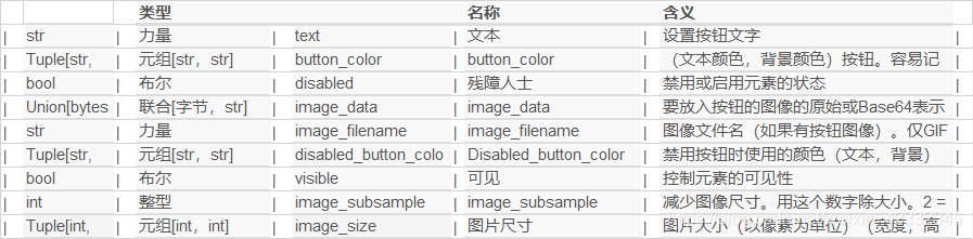
参数说明:
| 参数类型 | 参数名 | 说明 | ||
|---|---|---|---|---|
| str | 力量 | text | 文本 | 设置按钮文字 |
| Tuple[str, str] | 元组[str,str] | button_color | button_color | (文本颜色,背景颜色)按钮。容易记住,如果您在颜色之间说“开”,那是哪个。“红色”上的“绿色” |
| bool | 布尔 | disabled | 残障人士 | 禁用或启用元素的状态 |
| Union[bytes, str] | 联合[字节,str] | image_data | image_data | 要放入按钮的图像的原始或Base64表示形式。选择文件名或数据 |
| str | 力量 | image_filename | image_filename | 图像文件名(如果有按钮图像)。仅GIF和PNG。 |
| Tuple[str, str] | 元组[str,str] | disabled_button_color | Disabled_button_color | 禁用按钮时使用的颜色(文本,背景)。如果不想更改,请为颜色使用无。仅ttk按钮同时支持文本和背景颜色。tk按钮仅支持更改文本颜色 |
| bool | 布尔 | visible | 可见 | 控制元素的可见性 |
| int | 整型 | image_subsample | image_subsample | 减少图像尺寸。用这个数字除大小。2 = 1 / 2、3 = 1 / 3、4 = 1/4等 |
| Tuple[int, int] | 元组[int,int] | image_size | 图片尺寸 | 图片大小(以像素为单位)(宽度,高度) |
捆绑
用于将tkinter事件添加到Element。tkinter特定数据位于Element的成员变量user_bind_event中
bind(bind_string, key_modifier)
点击
产生按钮的点击,就像用户单击按钮一样。调用按钮的tkinter调用方法
click()
扩大
使元素扩展以填充X和Y方向上的可用空间。可以指定哪个或两个方向
expand(expand_x=False,
    expand_y=False,
    expand_row=True)
get_size
返回像素的大小。必须小心,因为某些元素使用字符来指定其大小,但是在调用此get_size方法时将返回像素。
get_size()
| 参数类型 | 参数名 | 说明 |
|---|---|---|
| — | 返回 | 元素的宽度和高度 |
| — | return | width and height of the element |
get_text
返回按钮上显示的当前文本
get_text()
| 参数类型 | 参数名 | 说明 |
|---|---|---|
| — | 返回 | 当前显示在按钮上的文本 |
| — | return | The text currently displayed on the button |
hide_row
隐藏元素所在的整行。如果在隐藏元素(包括行容器)时必须删除所有空间,请使用此选项
hide_row()
set_cursor
设置当前元素的光标。
set_cursor(cursor)
set_focus
将当前焦点设置在此元素上
set_focus(force=False)
参数说明:
| 参数类型 | 参数名 | 说明 |
|---|---|---|
| — | 返回 | 当前显示在按钮上的文本 |
| 布尔 | 力 | 如果为True,则将调用focus_force;否则,将调用focus_set |
| bool | force | if True will call focus_force otherwise calls focus_set |
set_size
将元素的大小更改为特定大小。可以为其中一种尺寸指定“无”,以便仅更改元素尺寸之一。
set_size(size=(None, None))
参数说明:
| 参数类型 | 参数名 | 说明 |
|---|---|---|
| 元组[int,int] | 尺寸 | 字符大小,通常为行。在某些情况下,它们是像素 |
| Tuple[int, int] | size | The size in characters, rows typically. In some cases they are pixels |
set_tooltip
由应用程序调用以更改元素的工具提示文本。通常使用Element Object调用,例如:window.Element(‘key’)。SetToolTip(‘New tip’)。
set_tooltip(tooltip_text)
参数说明:
| 参数类型 | 参数名 | 说明 |
|---|---|---|
| 力量 | tooltip_text | 要在工具提示中显示的文本。 |
| str | tooltip_text | the text to show in tooltip. |
解除绑定
从Element中移除先前绑定的tkinter事件。
unbind(bind_string)
unhide_row
取消隐藏(再次显示)Element所在的行容器。请注意,它很可能会重新出现在窗口/容器的底部。
unhide_row()
更新
更改按钮元素的某些设置。必须致电Window.Read或Window.Finalize事先
update(text=None,
    button_color=(None, None),
    disabled=None,
    image_data=None,
    image_filename=None,
    visible=None,
    image_subsample=None,
    disabled_button_color=(None, None),
    image_size=None)
参数说明:
| 参数类型 | 参数名 | 说明 | ||
|---|---|---|---|---|
| str | 力量 | text | 文本 | 设置按钮文字 |
| Tuple[str, str] | 元组[str,str] | button_color | button_color | (文本颜色,背景颜色)按钮。容易记住,如果您在颜色之间说“开”,那是哪个。“红色”上的“绿色” |
| bool | 布尔 | disabled | 残障人士 | 禁用或启用元素的状态 |
| Union[bytes, str] | 联合[字节,str] | image_data | image_data | 要放入按钮的图像的原始或Base64表示形式。选择文件名或数据 |
| str | 力量 | image_filename | image_filename | 图像文件名(如果有按钮图像)。仅GIF和PNG。 |
| Tuple[str, str] | 元组[str,str] | disabled_button_color | Disabled_button_color | 禁用按钮时使用的颜色(文本,背景)。如果不想更改,请为颜色使用无。仅ttk按钮同时支持文本和背景颜色。tk按钮仅支持更改文本颜色 |
| bool | 布尔 | visible | 可见 | 控制元素的可见性 |
| int | 整型 | image_subsample | image_subsample | 减少图像尺寸。用这个数字除大小。2 = 1 / 2、3 = 1 / 3、4 = 1/4等 |
| Tuple[int, int] | 元组[int,int] | image_size | 图片尺寸 | 图片大小(以像素为单位)(宽度,高度) |


 1万+
1万+


 被折叠的 条评论
为什么被折叠?
被折叠的 条评论
为什么被折叠?
 到【灌水乐园】发言


