


需求:pdf生成时内容有个折现图展示
自定义Y轴显示间距
自定义X轴多行展示
自定义折线图颜色思路:利用jfreechart 动态生成多轴折线图(时序图),保存为图片,pdf插入该图片即可
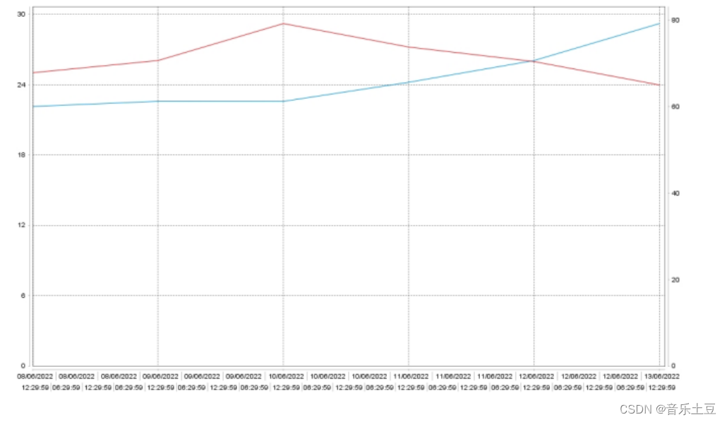
效果如下:
生成折线图
fileName : 生成后折线图名字
map : 模拟数据
public static boolean createChart(String fileName,Map<String, XYDataset> map) {
        try {
            // 解决中文乱码问题 -- begin
            StandardChartTheme standardChartTheme = new StandardChartTheme("CN");// 创建主题样式
            standardChartTheme.setExtraLargeFont(new java.awt.Font("Arial", java.awt.Font.BOLD, 6));// 设置标题字体
            standardChartTheme.setRegularFont(new java.awt.Font("Arial", java.awt.Font.PLAIN, 6));// 设置图例的字体
            standardChartTheme.setLargeFont(new java.awt.Font("Arial", java.awt.Font.PLAIN, 6));// 设置(时间)轴向的字体
            ChartFactory.setChartTheme(standardChartTheme);// 应用主题样式

            // 创建chart对象
            JFreeChart jfreechart = ChartFactory.createTimeSeriesChart(
                    null, // 图标标题
                    null, // 横轴标题
                    null, // 纵轴标题
                    null, // 数据集
                    false, // 是否显示图例标识
                    false, // 是否显示toolTips
                    false // 是否支持超链接
            );
            // 获取绘图区对象 设置属性
            XYPlot plot = (XYPlot) jfreechart.getPlot();
            jfreechart.setBackgroundPaint(Color.white);
            plot.setOrientation(PlotOrientation.VERTICAL); // 数据区的方向 垂直
            plot.setBackgroundPaint(Color.white); // 背景色
            plot.setDomainGridlinePaint(Color.black); // 分类轴网格线条颜色 竖向
            plot.setRangeGridlinePaint(Color.black); // 数据轴网格线条颜色 横向
            plot.setAxisOffset(new RectangleInsets(5D, 5D, 5D, 5D)); // 坐标轴到数据区的间距
            plot.getRangeAxis().setFixedDimension(40D); // 坐标轴距左边距离

            // 自定义新的时间轴,用于显示多重时间标签
            PeriodAxis periodAxis = new PeriodAxis("");   // 自定义X时间轴
//            periodAxis.setTimeZone(TimeZone.getDefault());  // 使用默认时区
            periodAxis.setAutoRangeTimePeriodClass(Hour.class); // 设置该时间轴默认自动增长时间单位
            // 设置不同重的时间显示格式
            PeriodAxisLabelInfo[] arrayOfPeriodAxisLabelInfo = new PeriodAxisLabelInfo[2];
            arrayOfPeriodAxisLabelInfo[0] = new PeriodAxisLabelInfo(Hour.class, new SimpleDateFormat("dd/MM/yyyy")); // 第一行显示天
//            arrayOfPeriodAxisLabelInfo[1] = new PeriodAxisLabelInfo(Month.class, new SimpleDateFormat("MMM"), new RectangleInsets(2.0D, 2.0D, 2.0D, 2.0D), new Font("SansSerif", 1, 10), Color.blue, false, new BasicStroke(0.0F), Color.lightGray); // 第二行显示月
            arrayOfPeriodAxisLabelInfo[1] = new PeriodAxisLabelInfo(Hour.class, new SimpleDateFormat("hh:mm:ss")); // 第三行显示年

            periodAxis.setLabelInfo(arrayOfPeriodAxisLabelInfo); // 设置时间轴上的时间显示格式
            plot.setDomainAxis(periodAxis);   // 设置X时间轴

            // 第一个Y轴
            NumberAxis tempAxis = new NumberAxis();
            tempAxis.setTickUnit(new NumberTickUnit(6D));
            tempAxis.setTickLabelFont(new java.awt.Font("Arial", java.awt.Font.PLAIN, 10));// y轴字体
            plot.setRangeAxis(0, tempAxis);
            plot.mapDatasetToRangeAxis(0, 0);
            // 第二个Y轴
            NumberAxis rhAxis = new NumberAxis();
            rhAxis.setTickUnit(new NumberTickUnit(20D));
            rhAxis.setTickLabelFont(new java.awt.Font("Arial", Font.PLAIN, 10));
            plot.setRangeAxis(1, rhAxis);
            plot.mapDatasetToRangeAxis(1, 1);

            //第一个曲线颜色
            StandardXYItemRenderer tempColor = new StandardXYItemRenderer();
            tempColor.setSeriesPaint(0, red_color);
            plot.setRenderer(0, tempColor);
            //第二个曲线颜色
            StandardXYItemRenderer rhColor = new StandardXYItemRenderer();
            rhColor.setSeriesPaint(0, blue_color);
            plot.setRenderer(1, rhColor);

            // 生成需要格式的数据集
            plot.setDataset(0, map.get("tempData"));
            plot.setDataset(1, map.get("rhData"));

            //保存chart图标
            OutputStream out = null;
            int width = 1023;
            int height = 600;
            out = new BufferedOutputStream(new FileOutputStream(fileName));
            ChartUtilities.writeChartAsJPEG(out, 1.0f, jfreechart, width, height, null);
            out.close();
        } catch (Exception e) {
            e.printStackTrace();
        }
        return true;
    }
模拟数据
private static Map<String, XYDataset> createDataset() {
        Map<String, XYDataset> map = new HashMap<String, XYDataset>();
        TimeSeriesCollection tempData = new TimeSeriesCollection();
        TimeSeriesCollection rhData = new TimeSeriesCollection();

        TimeSeries tempMock = new TimeSeries("C", Day.class);
        setSeriesData(tempMock, 25, new Day(8,6,2022), 6);

        TimeSeries rhMock = new TimeSeries("RH", Day.class);
        setSeriesData(rhMock, 60, new Day(8,6,2022), 6);

        tempData.addSeries(tempMock);
        rhData.addSeries(rhMock);

        map.put("tempData", tempData);
        map.put("rhData", rhData);
        return map;
    }
生成折线图后,PDF已保存图片的方式插入折线图即可
Image image = Image.getInstance(chartName);
            image.setAlignment(Image.ALIGN_CENTER);
            image.scalePercent(50);//缩放比例
            document.add(image);


 2512
2512


 被折叠的 条评论
为什么被折叠?
被折叠的 条评论
为什么被折叠?
 到【灌水乐园】发言


