


一 块元素与行内元素
常见的块元素:div p h1~h6 p hr ul ol
常见的行元素: span strong em
特点:
块元素一独占一行,可以对其设置height和width可以定义四个方向的margin值。
行元素可以与其他元素位于一行,无法设置height和width,可以定义margin-left和margin-right。
inline-block元素具有block和inline的特性。
二 display介绍
display:none|block|inline-block|table|table-cell等
display:none可以用来隐藏元素。
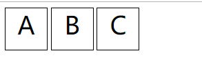
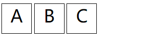
列子
<!DOCTYPE html>
<html lang="en">
<head>
    <meta charset="UTF-8">
    <title>display</title>
    <style>
     .div1,
     .div2,
     .div3
       {
           display: inline-block;
           text-align: center;
           width: 60px;
           height: 60px;
           font-size: 36px;
           border: 1px solid black;
       }

    </style>
</head>
<body>
<div class="warp">
    <div class="div1">A</div>
    <div class="div2">B</div>
    <div class="div3">C</div>
</div>
</body>
</html>
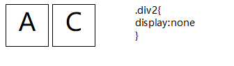
设置div2的display为none。
display:none和visibility:hidden的区别
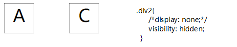
display:none隐藏后不占据原来的未知也就是说元素直接消失了。
visibility:hidden 隐藏后元素依然占据原来的位置。
display:table-cell
该设置可以让元素以表格单元的形式出现,也就是说tabel-cell元素具备td的特点。
display:table-cell可以实现以下功能
- 图片垂直居中于元素
父元素{
display:table-cell;
vertical-align:middle;
}
子元素{
vertical-align:middle;
}
<!DOCTYPE html>
<html lang="en">
<head>
    <meta charset="UTF-8">
    <title>display:table-cell</title>
    <style>
        div{
            display: table-cell;
            height: 500px;
            width: 800px;
            border: 1px solid red;
            vertical-align: middle;
            text-align: center;
        }
        div img{
            vertical-align: middle;
            text-align: center;
        }


    </style>
</head>
<body>
<div><img src="./美女.jpg" alt="美女"></div>
</body>
</html>

- 图片等高布局
我们知道同一行的td元素的高度是相等的,table-cell也具备这个特性
<!DOCTYPE html>
<html lang="en">
<head>
    <meta charset="UTF-8">
    <title>等高布局</title>
    <style>
        .div0{
            display: table-row;
        }
        .div1{
            display:table-cell;
            vertical-align: middle;
            text-align: center;
            width: 150px;
            border: 1px solid black;
        }
        .div2{
            display: table-cell;
          width: 400px;
            border: 1px solid deeppink;
            border-left: none;
            padding: 10px;
        }
    </style>
</head>
<body>
<div class="div0">
    <div class="div1"><img src="./美女.jpg" alt="美女"></div>
    <div class="div2"><span>《盗墓笔记》是一本最初连载在起点中文网上的小说,后由中国友谊、时代文艺、上海文化于2007年-2011年陆续出版发行,作者南派三叔。 [1]  《盗墓笔记捌:大结局(上、下)》于2011年12月19日上市,至此《盗墓笔记》系列完结,共出版实体书九本。《盗墓笔记》系列是南派三叔的代表作,其堪称近年来中国出版界的经典之作,获得百万读者狂热追捧。南派三叔也凭此作名满天下,跻身中国超级畅销书作家行列。
2015年,《盗墓笔记》由欢瑞世纪影视传媒股份有限公司改编成为网络剧 [2]  。2016年11月,《盗墓笔记》荣登2016中国泛娱乐指数盛典“中国IP价值榜-网络文学榜top10” [3]  。2017年7月12日,《2017猫片 胡润原创文学IP价值榜》发布,《盗墓笔记》排名第二。 [4] </span></div>
</div>
</body>
</html>

在该列子中我们没有设置高度,可见display:table-cell可以实现等高布局。
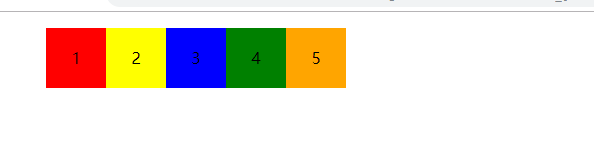
- 自动平均划分元素
父元素{display:table}
子元素{display:table-cell}
<!DOCTYPE html>
<html lang="en">
<head>
    <meta charset="UTF-8">
    <title>自动平均划分元素</title>
    <style>
        ul{
            display: table;


        }
        li{
            display: table-cell;
            list-style: none;
            height: 60px;
            width: 60px;
            text-align: center;
            line-height: 60px;
        }
        ul li:nth-child(1){background-color: red}
        ul li:nth-child(2){background-color: yellow}
        ul li:nth-child(3){background-color: blue}
        ul li:nth-child(4){background-color: green}
        ul li:nth-child(5){background-color: orange}


    </style>
</head>
<body>
<ul>
    <li>1</li>
    <li>2</li>
    <li>3</li>
    <li>4</li>
    <li>5</li>
</ul>
</body>
</html>
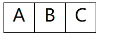
- 去除inline-block之间的空格
设置完inline-block后会出现这种情况
父元素{font-size:0}
<!DOCTYPE html>
<html lang="en">
<head>
    <meta charset="UTF-8">
    <title>display</title>
    <style>
        .warp{
            font-size: 0;
        }
     .div1,
     .div2,
     .div3
       {
           display: inline-block;
           text-align: center;
           width: 60px;
           height: 60px;
           font-size: 36px;
           border: 1px solid black;
       }

    </style>
</head>
<body>
<div class="warp">
    <div class="div1">A</div>
    <div class="div2">B</div>
    <div class="div3">C</div>
</div>
</body>
</html>


 1万+
1万+


 被折叠的 条评论
为什么被折叠?
被折叠的 条评论
为什么被折叠?
 到【灌水乐园】发言


