


大致对弹性盒分为两个类别弹性容器和弹性子项,分别对应了不同的属性。在关于一维布局时,弹性盒使用起来十分方便。
1. flex容器
-
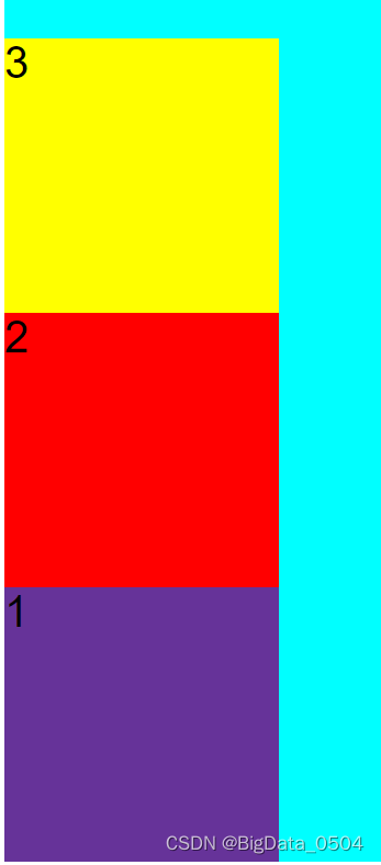
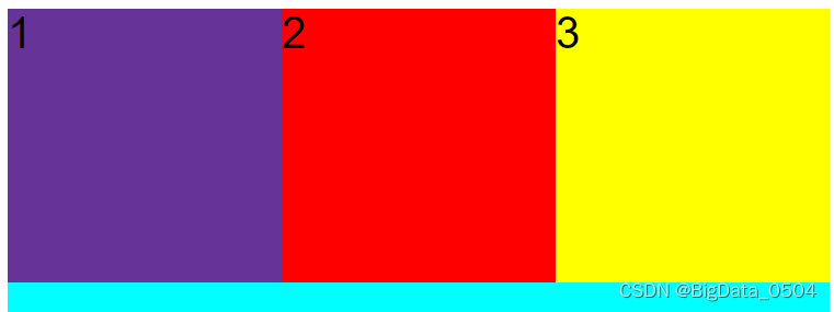
flex-direction(设置元素排列方向)
row:从左到右横向排列

row-reverse:从右边至左横向排列
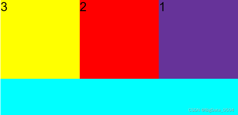
column:从上到下纵向排列
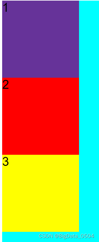
column-reverse:从下到上纵向排列
-
flex-wrap(控制元素是否自动换行)
nowrap:默认值,不换行
wrap:自动换行
wrap-reverse:换行后反向排列
-
justify-content(主轴元素设置)
flex-start:从父容器顶部开始一次紧紧挨着排列
flex-end:从父容器主轴底部开始仅仅排列
space-between:左右各一个元素,中间元素将平分
space-around:类比space-around可以看到该属性会对父容器主轴空间进行均分
space-evenly:看起来和space-around差别不大,但还是有细微差别存在的
-
align-contenet(与主轴垂直的轴,辅轴)
属性生效时必须存在换行的情况下才能生效,类似的时align-items,align-items应用更加广泛针对单行元素也可以生效。(flex-wrap: wrap)设置自动换行
stretch:默认值
flex-start
flex-end
center
space-between
space-around
space-evenly
-
align-items(辅轴,单行)
stretch
flex-start
flex-end
center
baseline
2. flex子项
-
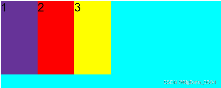
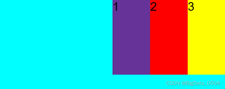
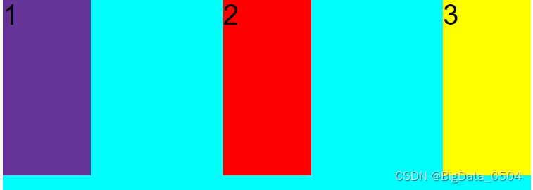
flex-grow
默认值为零,不会自动扩展父容器剩余的空间;flex的值会按照比例扩展(取值大于1是按照1处理)
<!DOCTYPE html>
<html lang="en">
<head>
    <meta charset="UTF-8">
    <meta http-equiv="X-UA-Compatible" content="IE=edge">
    <meta name="viewport" content="width=device-width, initial-scale=1.0">
    <title>Document</title>
    <style>
        .main{
            width: 300px;
            height: 300px;
            display: flex;
            background-color: aqua;
        }
        .main div{
            width: 150px;
            height: 150px;
            flex-grow: 1;
            background-color: beige;
        }


    </style>
</head>
<body>
    <div class="main">
        <div></div>
    </div>
</body>
</html>-
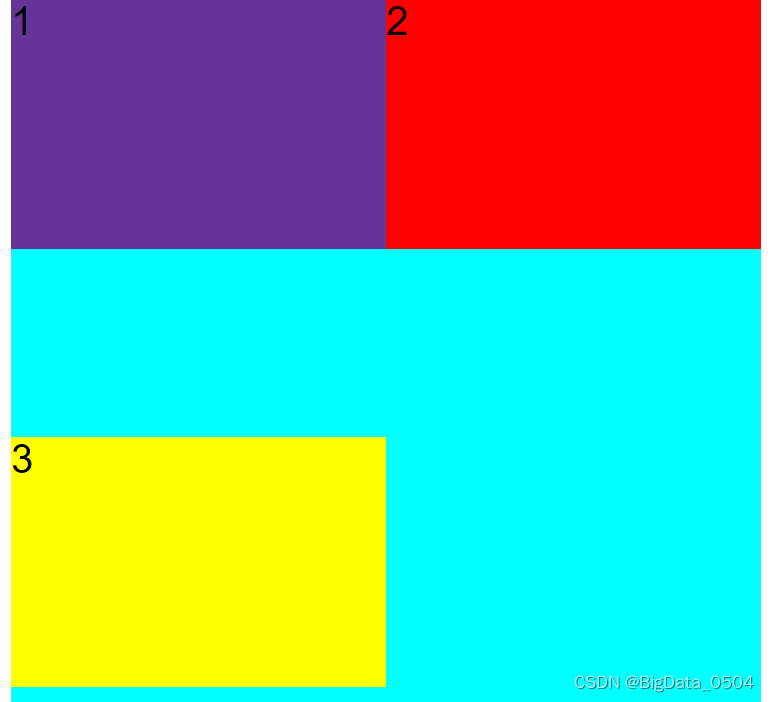
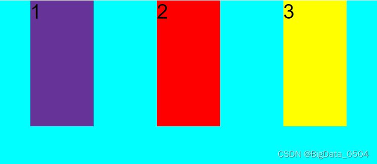
flex-shrink
默认值为1,当flex容器空间不足时,元素会按比例进行收缩。0表示不会收缩。是flex容器不足时,元素会按比例进行收缩。
<!DOCTYPE html>
<html lang="en">
<head>
    <meta charset="UTF-8">
    <meta http-equiv="X-UA-Compatible" content="IE=edge">
    <meta name="viewport" content="width=device-width, initial-scale=1.0">
    <title>Document</title>
    <style>
        .main{
            width: 300px;
            height: 300px;
            display: flex;
            background-color: aqua;
        }
        .main div{
            width: 350px;
            height: 250px;
            /* flex-grow: 1; */
            flex-shrink: 0;
            background-color: beige;
        }
    </style>
</head>
<body>
    <div class="main">
        <div></div>
    </div>
</body>
</html>-
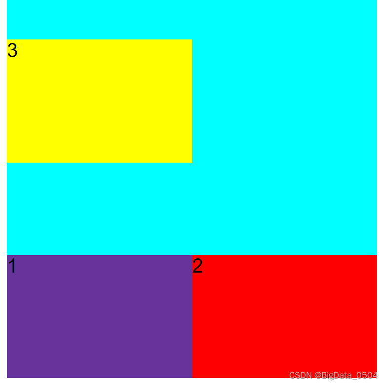
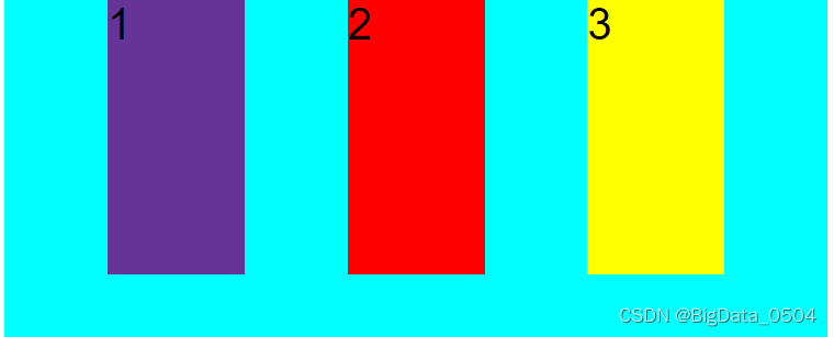
flex-basis
默认值为auto,指定了flex元素在主轴方向上的初始大小,flex-dircetion:column,设置的高度优先级大于height;flex-dircetion:row设置的宽度优先级大于width
-
flex
flex-grow和flex-shrink以及flex-basis的缩写,不推荐使用
-
order
默认值为0,改变某一个子项的排序位置
-
align-self
默认值为auto,控制子项保持垂直对齐的方式,默认的和父容器对齐方式一致
3.弹性盒的应用
- 内联元素与块级元素实现水平垂直居中
<!DOCTYPE html>
<html lang="en">
<head>
  <meta charset="UTF-8">
  <meta http-equiv="X-UA-Compatible" content="IE=edge">
  <meta name="viewport" content="width=device-width, initial-scale=1.0">
  <title>Document</title>
  <style>
    .main{
      width: 300px;
      height: 300px;
      background-color: aqua;
      display: flex;
      justify-content: center;
      align-items: center;
    }
    .main div{
      width: 100px;
      height: 100px;
      background-color: yellow;
    }
  </style>
</head>
<body>
  <div class="main">
    <div></div>
  </div>
</body>
</html>- 不定项居中(轮播图)
<!DOCTYPE html>
<html lang="en">
<head>
  <meta charset="UTF-8">
  <meta http-equiv="X-UA-Compatible" content="IE=edge">
  <meta name="viewport" content="width=device-width, initial-scale=1.0">
  <title>Document</title>
  <style>
    .main{
      width: 300px;
      height: 300px;
      background-color: aqua;
      display: flex;
      justify-content: center;
      align-items: flex-end;
    }
    .main div{
      width: 20px;
      height: 20px;
      background-color: pink;
      border-radius: 50%;
      margin: 0 10px 10px 0;
    }
  </style>
</head>
<body>
  <div class="main">
    <div></div>
    <div></div>
    <div></div>
    <div></div>
    <div></div>
  </div>
</body>
</html>- 均分列布局(例如手机端淘宝)
<!DOCTYPE html>
<html lang="en">
<head>
  <meta charset="UTF-8">
  <meta http-equiv="X-UA-Compatible" content="IE=edge">
  <meta name="viewport" content="width=device-width, initial-scale=1.0">
  <title>Document</title>
  <style>
    .main{
      width: 300px;
      height: 300px;
      background-color: aqua;
      display: flex;
      justify-content: space-between;
      align-items: flex-end;
    }
    .main div{
      width: 20px;
      height: 20px;
      background-color: pink;
      border-radius: 50%;
      margin: 0 10px
    }
  </style>
</head>
<body>
  <div class="main">
    <div></div>
    <div></div>
    <div></div>
    <div></div>
    <div></div>
  </div>
</body>
</html>- 子项分组布局
<!DOCTYPE html>
<html lang="en">
<head>
  <meta charset="UTF-8">
  <meta http-equiv="X-UA-Compatible" content="IE=edge">
  <meta name="viewport" content="width=device-width, initial-scale=1.0">
  <title>Document</title>
  <style>
    .main{
      width: 300px;
      height: 300px;
      background-color: aqua;
      display: flex;
    }
    .main div:nth-of-type(2){
      margin-right: auto;
    }
    .main div{
      width: 20px;
      height: 20px;
      background-color: pink;
    }
  </style>
</head>
<body>
  <div class="main">
    <!-- 左边三个div,右边设置两个div -->
    <div></div>
    <div></div>
    <div></div>
    <div></div>
    <div></div>
  </div>
</body>
</html>


 818
818


 被折叠的 条评论
为什么被折叠?
被折叠的 条评论
为什么被折叠?
 到【灌水乐园】发言


