列表页面的展开以及收起

列表页面的展开以及收起

需求

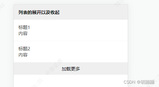
由于公司新需求 ,写一个列表页 ,不上拉加载 ,点击加载更多去加载 还会有收起按钮 。大概效果如下图所示:
在这里插入图片描述

想法

1,一开始想的是直接对数组进行切割 。然后每次点击加载更多重新加载 。但是这样之前加载的 又会重新加载一遍 。
2,最终决定 采用 将 之前的数据 保存下来 每次点击更多的时候 先回到原来的数据 。

好了 废话不多说了 上代码

关键代码

template部分

<template>
  <div class="list">
      <div class="title">列表的展开以及收起</div>
      <div class="list">
          <div v-for="(item,index) in showList" :key="index" class="box">
              <div>{{item.title}}{{index+1}}</div>
              <div>{{item.type}}</div>
          </div>
      </div> 
      <div class="load-more" @click="getList">
          <div>加载更多</div>
          <div class="put-on" @click.stop="putOn" v-show="showList.length>2">收起</div>
      </div>
      
  </div>
</template>

js部分

export default {
    name:'collspan' ,
    data(){
        return{
            resList:[] ,//接口获取的数组
            showList:[] ,//展示的数组
            showAll:true ,//展示全部?
        }
    } ,
    methods:{
        getList(){
            if(!this.showAll){
                this.showAll = true ;
                this.showList = this.resList ;
                return ;
            }
            let obj = {
            'title': '标题',
            'type': '内容'
            };
            console.log('调借口');
            this.resList.push(obj) ;
            this.resList.push(obj) ;
            this.showList = this.resList;
        },
        // 收起
        putOn(){
            //  切割数组 。 
            this.showList= this.showList.slice(0,2) ;
            this.showAll = false ;
        }
    },
    created(){
        this.getList(true) ;
    }
}
</script>

css部分

<style scoped>
.title{
    font-weight: 600;
    padding: 15px;
}
.list{
    background-color: #efefef;
     font-size: 15px;
}
.box{
    padding: 15px;
    background-color: #fff;
    color: #333;
    border-bottom: 1px solid #eeeeee;
}
.load-more{
    text-align: center;
    padding: 10px;
    position: relative;
}
.put-on{
    position: absolute;
    right: 15px;
    bottom: 10px;
    color: red;
}
</style>

结尾

希望能够好使吧 ,明日继续 !!!

### 使用CSS实现页面展开收起动画效果 为了实现页面元素的展开收起动画效果,可以通过多种方法来达到目的。以下是一些常见的解决方案: #### 方法一:使用 `max-height` 和 `transition` 这种方法适用于内容高度不确定的情况。通过调整 `max-height` 属性,并配合 `transition` 创建平滑的高度变化。 ```css /* 默认状态下隐藏内容 */ .collapse-content { max-height: 0; overflow: hidden; transition: max-height 0.5s ease-in-out; /* 设置过渡效果 */ } /* 当激活显示时,设定一个足够的最大高度 */ .collapse-content.active { max-height: 100px; /* 可根据实际情况调整 */ } ``` 在这个例子中,当 `.collapse-content` 被赋予 `active` 类名时,其 `max-height` 值会逐渐增加到指定值,从而形成展开动画[^3]。 #### 方法二:利用 `transform` 和 `opacity` 进行淡入淡出加位移组合动画 这种技术不仅可以提供视觉上的渐变效果,还可以让对象看起来像是从屏幕外进入视野一样。 ```css /* 初始化折叠状态 */ .toggle-element { opacity: 0; transform: translateY(-20px); transition: all 0.4s cubic-bezier(.68,-0.55,.27,1.55); /* 自定义缓动函数 */ } /* 显示后的最终状态 */ .toggle-element.show { opacity: 1; transform: translateY(0); } ``` 这里不仅改变了透明度 (`opacity`) ,还应用了垂直方向的位置偏移 (`translateY`) 。两者共同作用下产生了既优雅又吸引人的动画效果[^2]。 #### 方法三:基于Flexbox布局的伸缩行为模拟开关门式的开闭过程 如果整个区域是由两个部分组成(比如左侧固定导航条加上右侧主要内容区),那么可以尝试用flexible box model (简称 Flexbox ) 来管理它们之间的比例分配逻辑。 ```css .container { display: flex; } .sidebar { flex-grow: 0; flex-shrink: 0; width: 200px; background-color: lightblue; transition: width 0.3s linear; } .main { flex-grow: 1; padding: 20px; background-color: white; } /* 收缩侧边栏 */ .hide-sidebar .sidebar { width: 0; } /* 扩展主内容区占据更多空间 */ .hide-sidebar .main { margin-left: -200px; /* 对应于原来 sidebar 的宽度 */ } ``` 这段代码描述了一种典型的双列布局结构,在点击按钮触发`.hide-sidebar`类添加/删除操作后即可看到相应的关闭打开现象发生[^1]。 ---
评论
添加红包

请填写红包祝福语或标题

红包个数最小为10个

红包金额最低5元

当前余额3.43前往充值 >
需支付:10.00
成就一亿技术人!
领取后你会自动成为博主和红包主的粉丝 规则
hope_wisdom
发出的红包
实付
使用余额支付
点击重新获取
扫码支付
钱包余额 0

抵扣说明:

1.余额是钱包充值的虚拟货币,按照1:1的比例进行支付金额的抵扣。
2.余额无法直接购买下载,可以购买VIP、付费专栏及课程。

余额充值