


subplot(arg1, arg2, arg3)
arg1: 在垂直方向同时画几张图
arg2: 在水平方向同时画几张图
arg3: 当前命令修改的是第几张图
plt.figure()另起一张新的画布
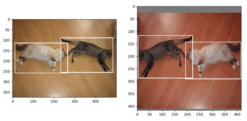
from PIL import Image
import matplotlib.pyplot as plt
image1 = Image.open("1.jpg")
image2 = Image.open("2.jpg")
plt.subplot(121)
plt.imshow(image1)
plt.subplot(122)
plt.imshow(image2)
plt.show()
补充:matplotlib 同一个画布绘制多张图,主次刻度,竖线
我就废话不多说了,大家还是直接看代码吧~
import matplotlib.pyplot as plt
import seaborn as sns
sns.set()
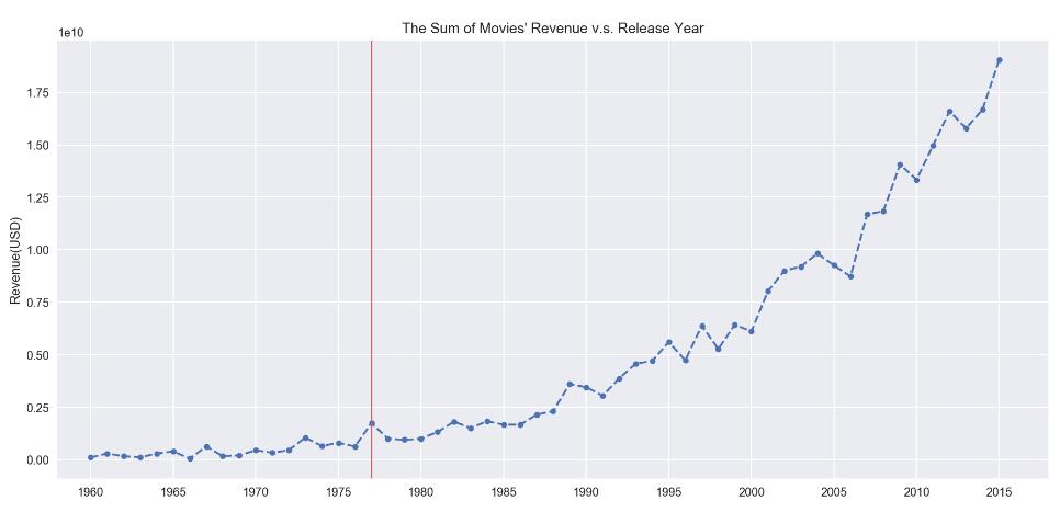
# 要分析的数据
profit = df_profit.groupby("release_year")["profit"].agg(["mean","sum","count"])
# 在同一个画布中绘制两张图
plt.figure(figsize=(15,15))
# 图一:每年上映电影的总收入
ax = plt.subplot(211)
# 设置x轴 范围
ax.set_xlim(1958,2018)
# 设置x轴 主刻度,(次刻度设置minor=True)
ax.set_xticks(np.arange(1960,2018,5), minor=False)
# 画图
ax.plot(profit["sum"], linestyle="--", marker="o", markersize=5)
ax.set_title("The Sum of Movies" Revenue v.s. Release Year")
ax.set_ylabel("Revenue(USD)")
# 增加竖线
ax.axvline(x=1977, color="#d46061", linewidth=1);
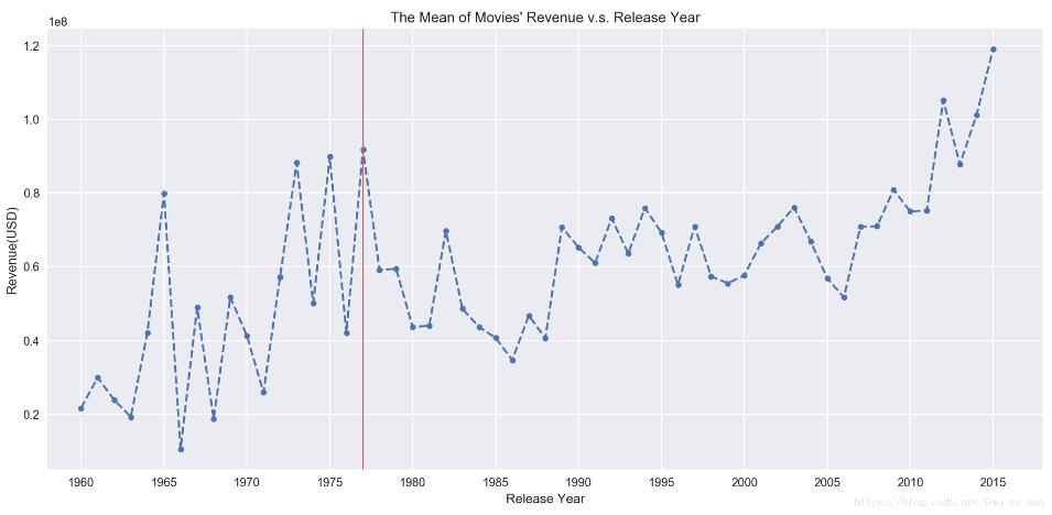
# 图二:每年上映电影的平均收入
ax = plt.subplot(212)
# 设置x轴 范围
ax.set_xlim(1958,2018)
# 设置x轴 主刻度
ax.set_xticks(np.arange(1960,2018,5))
# 画图
ax.plot(profit["mean"], linestyle="--", marker="o", markersize=5);
ax.set_title("The Mean of Movies" Revenue v.s. Release Year")
ax.set_xlabel("Release Year")
ax.set_ylabel("Revenue(USD)")
# 增加竖线
ax.axvline(x=1977, color="#d46061", linewidth=1);
以上为个人经验,希望能给大家一个参考,也希望大家多多支持云海天教程。如有错误或未考虑完全的地方,望不吝赐教。


 554
554


 被折叠的 条评论
为什么被折叠?
被折叠的 条评论
为什么被折叠?
 到【灌水乐园】发言


