


组件是构建页面的核心,每个组件通过对数据和方法的简单封装,实现独立的可视、可交互功能单元。组件之间相互独立,随取随用,也可以在需求相同的地方重复使用。
一、文本组件
1.1.Text定义介绍
Text 是显示文本的基础组件之一,它可以包含子组件 Span ,当包含 Span 时不生效,只显示 Span 的内容。接口如下:、
Text(content?: string | Resource)
说明:
①.string格式,直接填写文本内容
Text("图片宽度")
②.Resource格式,读取本地资源文件
Text($r('app.string.width_label'))
需要注意的使由于国际化的问题,读取本地资源文件的时候,需要分别base/element、en_US和zh_CN下的setting.json进行配置,先会根据语言在对应的zh_CN或者en_CN下读取,最后才会在base目录下加载
1.2.Text属性介绍
text除支持通用属性外,还支持以下属性参考网址 https://developer.harmonyos.com/cn/docs/documentation/doc-references-V3/ts-basic-components-text-0000001477981201-V3,下面列出部分常用的属性:
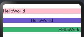
①.textAlign:设置文本的对其方式,对齐参考系是 Text 组件本身,只有 Text 组件本身的宽度大于文本内容长度, textAlign 属性才起作用, TextAlign 定义了以下 3 种类型:
- Start(默认值):根据文字书写相同的方向对齐,比如中文从左往右排版,那么文本则靠左对齐。
- Center:文本居中对齐。
- End:根据文字书写相反的方向对齐,比如中文从左往右排版,那么文本则靠右对齐。
案例如下:
@Entry
@Component
struct TextPage {
  build() {
    Column({space:20}){
      //默认Start:靠左对齐
      Text("HelloWorld")
        .backgroundColor("#FFC0CB")
        .width("100%")//默认Start
        .fontSize("20fp")

      //文字居中
      Text("HelloWorld")
        .textAlign(TextAlign.Center)
        .backgroundColor("#6A5ACD")
        .width("100%")
        .fontSize("20fp")

      //文字靠右
      Text("HelloWorld")
        .textAlign(TextAlign.End)
        .backgroundColor("#3CB371")
        .width("100%")
        .fontSize("20fp")
    }
    .width("100%")
    .height("100%")
    .padding({top:20})
  }
}
执行预览效果如下:
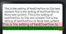
②.maxLines、textOverflow:设置文本显示的最大行数和截取方式,默认折行显示不截取,如果设置了此参数,则文本最多显示到指定的行,如果有多余的文本,可以通过 textOverflow 来指定截取方式,有两种方式:
- Clip:超出maxLines展示行截断内容展示
- Ellipsis:超出maxLines展示行省略号
案例如下:
@Entry
@Component
struct TextMaxLinesPage {
  build() {
    Column(){
      //不设置不会截断
      Text('This is the setting of textOverflow to Clip text content This is the setting of textOverflow to None text content. This is the setting of textOverflow to Clip text content This is the setting of textOverflow to None text content.')

      // 超出maxLines展示行截断内容展示
      Text('This is the setting of textOverflow to Clip text content This is the setting of textOverflow to None text content. This is the setting of textOverflow to Clip text content This is the setting of textOverflow to None text content.')
        .maxLines(1)
        .textOverflow({overflow: TextOverflow.Clip})
        .fontSize("20fp")
        .backgroundColor(Color.Pink)

      // 超出maxLines展示行省略号
      Text('This is the setting of textOverflow to Clip text content This is the setting of textOverflow to None text content. This is the setting of textOverflow to Clip text content This is the setting of textOverflow to None text content.')
        .maxLines(1)
        .textOverflow({overflow: TextOverflow.Ellipsis})
        .fontSize("20fp")
        .backgroundColor(Color.Green)
    }
    .width("100%")
    .height("100%")
    .padding({top:20})
  }
}
执行后如下:
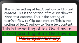
③.fontSize、fontColor、fontStyle、 fontWeight:分别表示设置文字的大小,颜色,样式以及粗细,我们可以组合起来设置文本的富样式,先看一个样例:
Text('Hello, OpenHarmony')
        .fontSize("20fp")              //字体大小
        .fontColor('#ff0000')          //字体颜色
        .fontWeight(FontWeight.Bold)   //Bold加粗
        .fontStyle(FontStyle.Italic)   //字体样式:Italic style是斜体风格
        .decoration({type: TextDecorationType.LineThrough, color: Color.Black}) //decoration 表示给文本添加装饰线,Underline是下划线,LineThrough表示中划线
执行后如下:
1.3.案例练习
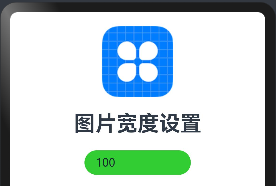
在屏幕输入图片宽度,让图片随着输入的宽度进行改变,代码如下:
@Entry
@Component
struct TextPage {
  //定义变量,控制图片的宽度
  @State imageWidth:number = 20;

  build() {
    Column({space:20}){
      //加载图片
      Image($r('app.media.icon'))
        .width(this.imageWidth)
        //图像插值,High高使用率,Medium:中度使用,Low低使用率
        .interpolation(ImageInterpolation.High)

      //加载文字
      Text($r('app.string.width_new_label'))
        .fontSize("30fp")
        .fontWeight(FontWeight.Bold)

      //让图片的大小随着text的值改变大小
      TextInput({'text': '100'})
        .width(150)
        .backgroundColor("#32CD32")
        .type(InputType.Number)
        .onChange((value:string)=>{
          this.imageWidth = parseInt(value)
        })
    }
    .width("100%")
    .padding(20)
  }
}
注意:
图像插值是指在图像处理中使用已知像素值来估计未知像素值的过程。高质量的插值通常意味着使用更复杂的算法来估计像素值,以获得更平滑、更真实的图像结果。这种设置通常会增加计算成本,但可以提高图像的视觉质量。
上面的图片由于放大,会出现锯齿状,采用图像插值就可以解决这个问题
执行后如下:
二、按钮组件
Button 组件也是基础组件之一,和其它基础组件不同的是 Button 组件允许添加一个子组件来实现不同的展示样式。
2.1.Button定义
接口如下:
Button(label?: ResourceStr, options?: { type?: ButtonType, stateEffect?: boolean })
说明:
①.文字型按钮
Button('登录')
②.自定义按钮,在Button内嵌套其它组件
Button(){
        Image($r('app.media.search')).width(20).margin(10)
}
2.2.添加属性和事件
Button("登录")
        .width(100)
        .height(30)
        .type(ButtonType.Normal) //按钮类型
        .onClick(()=>{
          //点击事件
        })
type:设置 Button 按钮的显示样式, ButtonType 定义了以下3种样式:
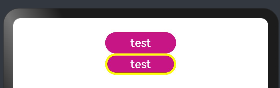
①.Capsule(默认值):胶囊类型,圆角值默认为 Button 高度的一半,并且不允许修改,此时通过设置 borderRadius() 的方式设置圆角则无效。案例如下:
@Entry
@Component
struct ButtoPage {
  build() {
    Column(){
      Button("test").height(30).width(100).backgroundColor("#C71585")

      //默认值Capsule
      Button("test")
        .height(30)
        .width(100)
        .backgroundColor("#C71585") //背景色
        .borderRadius(20)           //设置圆角,但是没有效果
        .borderWidth(3)             //设置边框宽度
        .borderColor(Color.Yellow)  //设置边框颜色
    }
    .width("100%")
    .height("100%")
    .padding(20)
  }
}
执行后如下:
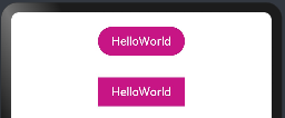
②.Normal:矩形按钮,无圆角,可以通过 borderRadius() 设置圆角大小,不支持通过 border() 的方式设置圆角
@Entry
@Component
struct ButtonPage02 {
  build() {
    Column(){
      //默认胶囊类型
      Button("HelloWorld")
        .height(40)
        .width(120)
        .backgroundColor("#C71585")


      Button("HelloWorld")
        .height(40)
        .width(120)
        .backgroundColor("#C71585")
        .type(ButtonType.Normal) //按钮为矩形
        .margin({top:30})

    }
    .width("100%")
    .height("100%")
    .padding(20)
  }
}
执行后如下:
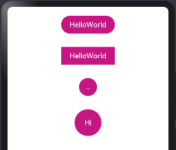
③.Circle:圆形按钮,当按钮类型为Circle时,borderRadius即为按钮半径,若未设置borderRadius按钮半径则为宽、高中较小值的一半
@Entry
@Component
struct ButtonPage02 {
  build() {
    Column(){
      //默认胶囊类型
      Button("HelloWorld")
        .height(40)
        .width(120)
        .backgroundColor("#C71585")


      Button("HelloWorld")
        .height(40)
        .width(120)
        .backgroundColor("#C71585")
        .type(ButtonType.Normal) //按钮为矩形
        .margin({top:30})

      //按钮设置为圆角,borderRadius(20)设置元素的边框圆角半径,不支持百分比。
      Button("Hi")
        .backgroundColor("#C71585")
        .type(ButtonType.Circle)
        .margin({top:30})
        .borderRadius(20)

      //若未设置borderRadius按钮半径则为宽、高中较小值的一半
      Button("Hi")
        .height(60)
        .width(120)
        .backgroundColor("#C71585")
        .type(ButtonType.Circle) //按钮设置为圆角,没有设置宽和高,则不会显示
        .margin({top:30})

    }
    .width("100%")
    .padding(20)
  }
}
执行后如下:
2.3.Button自定义样式
①.包含 Text 组件
案例如下:
@Entry
@Component
struct ButtonPage02 {
  build() {
    Column(){

      //设置圆角矩形按钮,文字通过Text实现
      Button(){
        Text("HelloWorld").fontSize(20).fontColor("#FFFFF0")
      }
      .height(40)
      .width(120)
      .backgroundColor("#C71585")
      .type(ButtonType.Normal) //设置为圆角矩形
      .borderRadius(8) //设置圆角半径

      //设置圆形按钮,文字通过Text实现
      Button(){
        Text("Hi").fontSize(20).fontColor("#FFFFF0")
      }
      .height(40)
      .width(120)
      .backgroundColor("#C71585")
      .margin(20)
      .type(ButtonType.Circle) //设置为圆角矩形
      .borderRadius(8) //设置圆角半径
    }
    .width("100%")
    .padding(20)
  }
}
预览如下:
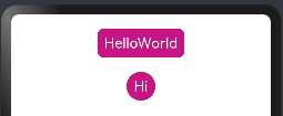
上面给 Button 添加了一个 Text 子组件,通过设置 Text 的文本样式达到修改 Button 文字的效果。
②.包含Image组件
@Entry
@Component
struct ButtonPage02 {
  build() {
    Column(){

      //设置圆形按钮,加载图片按钮
      Button(){
        Image($r('app.media.more'))
          .width(30)
          .height(30)
      }
      .height(40)
      .width(120)
      .backgroundColor("#D3D3D3")
      .margin(20)
      .type(ButtonType.Circle) //设置为圆角矩形
      .borderRadius(8) //设置圆角半径

      //设置圆形按钮,加载图片按钮
      Button(){
        Image($r('app.media.remove'))
          .width(30)
          .height(30)
      }
      .height(40)
      .width(120)
      .backgroundColor("#D3D3D3")
      .margin(20)
      .type(ButtonType.Circle) //设置为圆角矩形
      .borderRadius(8) //设置圆角半径

    }
    .width("100%")
    .padding(20)
  }
}
预览结果如下:
上面使用了 Image 组件,后续会详细讲解
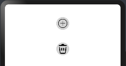
③.包含复杂组件
@Entry
@Component
struct ButtonPage02 {
  build() {
    Column(){

      //设置圆形按钮,加载图片按钮
      Button(){
        Image($r('app.media.more'))
          .width(30)
          .height(30)
      }
      .height(40)
      .width(120)
      .backgroundColor("#D3D3D3")
      .margin(20)
      .type(ButtonType.Circle) //设置为圆角矩形
      .borderRadius(8) //设置圆角半径

      //设置圆形按钮,加载图片按钮
      Button(){
        Image($r('app.media.remove'))
          .width(30)
          .height(30)
      }
      .height(40)
      .width(120)
      .backgroundColor("#D3D3D3")
      .margin(20)
      .type(ButtonType.Circle) //设置为圆角矩形
      .borderRadius(8) //设置圆角半径

      //设置圆形按钮,加载图片按钮和文字按钮
      Button(){
        Row(){
          Image($r('app.media.loading'))
            .width(30)
            .height(30)
          Text("loading")
            .fontSize(20)
            .fontColor("#ffffff")
            .margin({left:12})
        }
      }
      .height(40)
      .width(140)
      .backgroundColor("#0099FF")
      .margin(20)
      .type(ButtonType.Normal) //设置为圆角矩形
      .borderRadius(8)

    }
    .width("100%")
    .padding(20)
  }
}
预览结果如下图所示:
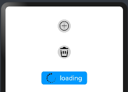
上面使用 Row 作为子组件, Row 组件属于线性容器组件,可以添加多个子组件,后续章节详细会讲解。
三、图片组件
Image 用来加载并显示图片的基础组件,它支持从内存、本地和网络加载图片,支持png、jpg、bmp、svg和gif类型的图片格式。当从网络加载图片的时候,需要申请网络访问权限。
3.1.Image定义
接口如下:
Image(src: string | PixelMap | Resource)
说明如下:
①string格式,通常用来加载网络图片,需要申请网络访问权限:ohos.permission.INTERNET
Image("https://xxx.png')
②Pixel Map格式,可以加载像素图,常用在图片编辑中
Image(pixel Map Object)
③Resource格式,加载本地图片,推荐使用
Image($r('app.media.mate60'))
Image($rawfile('mate60.png'))
3.2.Image属性
1)alt:设置占位图,图片显示之前先显示占位图,比如在加载网络图片或者图片加载失败时的场景。
2)objectFit:设置图片的放缩类型,当 Image 组件大小和图片大小不同时指定图片的放缩类型, ImageFit 提供了以下5种匹配模式:
- Cover(默认值):保持图片宽高比进行放缩显示,使得图片完全显示在显示边界外。
- Contain:保持图片宽高比进行放缩显示,使得图片完全显示在显示边界内。
- Fill:不保持图片宽高比显示,是图片完全充满显示边界。
- None:保持图片原有尺寸显示,通常配合
objectRepeat属性一起使用。 - ScaleDown:保持图片宽高比显示,使图片缩小或者保持不变的显示出来。
3)renderMode:设置图片的渲染模式, ImageRenderMode 定义了以下2种渲染模式:
- Original(默认值):按照原图进行渲染。
- Template:将图像渲染为模板图像,忽略图片的颜色信息。
@Entry
@Component
struct ImagePage {
  build() {
    Column(){
      Image($r("app.media.Sns"))
        .width(200)
        .height(90)
        .renderMode(ImageRenderMode.Original) // 原图渲染

      Image($r("app.media.Sns"))
        .width(200)
        .height(90)
        .renderMode(ImageRenderMode.Template) // 模板渲染
    }
    .width("100%")
    .height("100%")
    .padding(20)
  }
}
执行如下:

4)sourceSize:设置图片解码尺寸,降低图片的分辨率,常用于需要让图片显示尺寸比组件尺寸更小的场景。和ImageFit.None配合使用时可在组件内显示小图。单位:px
@Entry
@Component
struct ImagePage {
  build() {
    Column(){
      Image($r("app.media.Snip"))
        .width(200)
        .height(90)

      Image($r("app.media.Snip"))
        .width(200)
        .height(90)
        .margin({top:20})
        .sourceSize({width:10,height:10}) //设置解码的宽度
    }
    .width("100%")
    .height("100%")
    .padding(20)
  }
}
预览效果如下:

3.3.Image加载方式
1)从本地加载
- 拷贝 Snip.png 图片到工程的 resources/main/base/media 目录下
- 加载图片,直接使用系统提供的资源访问符
$()或者本地文件加载 - 加载图片,从本地的rawfile中加载图片通过$rawfile(“scenery.png”)方式加载
案例如下:
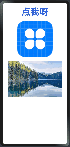
@Entry
@Component
struct ImagePage03 {
  @State message:string = '点我呀';
  build() {
    Column(){
      Text(this.message)
        .fontSize(50)
        .fontWeight(FontWeight.Bold)
        .fontColor("#36D")
        .onClick(()=>{
          this.message = "HelloWorld!" //点击替换文字
        })

      //加载本地media下的图片
      Image($r('app.media.icon'))
        .width(200)
        .height(200)
        .margin({top:20})
        .interpolation(ImageInterpolation.High) //设置图片的插值效果,即减轻低清晰度图片在放大显示的时候出现的锯齿问题,仅针对图片放大插值。

      //从本地的rawfile中加载图片
      Image($rawfile("scenery.png"))
        .width(300)
        .height(200)
        .margin({top:20})
    }
    .width("100%")
    .height("100%")
    .padding(20)
    .alignItems(HorizontalAlign.Center)
  }
}
ImageInterpolation:图片插值:从API version 9开始,该接口支持在ArkTS卡片中使用。
| 名称 | 描述 |
|---|---|
| None | 不使用图片插值。 |
| High | 高图片插值,插值质量最高,可能会影响图片渲染的速度。 |
| Medium | 中图片插值。 |
| Low | 低图片插值。 |
执行后如下:
2)从网络加载
- 限制与约束说明:
当加载网络图片时需要申请 ohos.permission.INTERNET 权限。具体申请方式请参考权限申请声明。
应用需要在工程配置文件中,对需要的权限逐个声明,未在配置文件中声明的权限,应用将无法获得授权。HarmonyOS提供了两种应用模型,分别为FA模型和Stage模型,更多信息可以参考应用模型解读。不同的应用模型的应用包结构不同,所使用的配置文件不同。
配置文件标签说明如下表所示。
| 标签 | 是否必填 | 说明 |
|---|---|---|
| name | 是 | 权限名称。 |
| reason | 否 | 描述申请权限的原因。> 说明:当申请的权限为user_grant权限时,此字段必填。 |
| usedScene | 否 | 描述权限使用的场景和时机。> 说明:当申请的权限为user_grant权限时,此字段必填。 |
| abilities | 否 | 标识需要使用到该权限的Ability,标签为数组形式。适用模型:Stage模型 |
| ability | 否 | 标识需要使用到该权限的Ability,标签为数组形式。适用模型:FA模型 |
| when | 否 | 标识权限使用的时机,值为inuse/always。- inuse:表示为仅允许前台使用。- always:表示前后台都可使用。 |
Stage模型
使用Stage模型的应用,需要在module.json5配置文件中声明权限。添加这一段即可
"requestPermissions": [
      {"name":  "ohos.permission.INTERNET"}
    ],
如下图所示

- 案例演示
@Entry
@Component
struct ImagePage04 {
  @State message:string = '点我呀';

  build() {
    Column(){
      //加载网络图片
      Image('https://imgservice.suning.cn/uimg1/b2c/image/XyeIzII8UlaDgw0xp0YIpA.png_800w_800h_4e')
    }
    .width("100%")
    .height("100%")
    .padding(20)
  }
}
执行后如下:
3)从内存加载
Image(pixel Map object)
四、输入框组件
ArkUI开发框架提供了 2 种类型的输入框:
TextInput:只支持单行输入TextArea:支持多行输入
下面我们分别做下介绍
4.1.TextInput定义
接口如下:
TextInput(value?:{placeholder?: ResourceStr, text?: ResourceStr, controller?: TextInputController})
value:输入框的提示样式设置, TextInputOptions 参数类型说明如下:
- text:设置输入框的初始显示文本,不设置时显示
placeholder的内容。 - placeholder:占位提示文本,当不设置 text 时,则会显示该文本。
- controller:光标控制器,设置光标的下标位置。
案例如下:
@Entry
@Component
struct TextInputPage01 {
build() {
Column(){
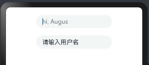
TextInput({
placeholder: "hi, Augus"
}).margin({top:20})
.width(200)
TextInput({
placeholder: "Augus",
text: "请输入用户名"
}).margin({top:20})
.width(200)
}.width("100%")
}
}
执行后效果如下:
4.2.TextInput属性介绍
TextInput 组件用于文本输入,它只能单行文本输入,若文本超出自身长度则使用 ... 在末尾替代。 TextInput 组件除了公共属性外,它还提供了很多常用的属性:
- type:表示输入框的类型,比如设置为
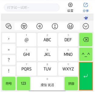
Number,则表示输入框只能输入数字, password表示输入的密码,会使用遮挡符遮挡。 - enterKeyType:表示设置输入法回车键类型,主要用来控制回车键的显示样式。例如设置
enterKeyType为Search,type为Number时,结果如下图所示:
- maxLength:设置输入框允许输入多少字符。
- caretColor:设置光标的颜色。
案例如下:
@Entry
@Component
struct TextInputPage01 {
build() {
Column(){
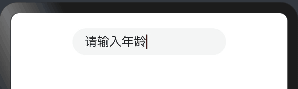
TextInput({
text: "请输入年龄"
})
.margin({top:20})
.width(200)
.type(InputType.Number) //设置类型
.caretColor(Color.Red) //设置光标颜色
//.enterKeyType(EnterKeyType.Search) //例如 这个是搜索框
}.width("100%")
}
}
结果如下:
4.3.TextInput事件介绍
TextInput 除了具有公共事件外,它还提供了自己独有的事件回调。
- onChange:当输入框的内容变化时,触发该回调并把输入框的值回调出来
- onSubmit:回车键或者软键盘回车键触发该回调,参数为当前软键盘回车键类型。
- onEditChanged:输入状态变化时,触发回调。
TextInput 的一个案例如下:
@Entry
@Component
struct TextInputPage02 {
@State value:string = "";
build() {
Column(){
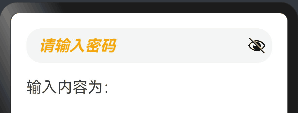
TextInput({placeholder: "请输入密码"})
.width("100%") //设置输入框宽度为100%
.height(45) //设置输入框高度为45
.type(InputType.Password) //设置输入框类型为密码输入
.enterKeyType(EnterKeyType.Done) //设置按下回车键的行为,表示完成输入
.caretColor(Color.Red) //设置光标颜色为红色
.placeholderColor(Color.Orange) //设置占位符文本颜色为绿色
.placeholderFont({
size:20, // 字体大小为20
style:FontStyle.Italic, // 字体样式为斜体
weight:FontWeight.Bold // 字体粗细为粗体
})
.onChange((value)=>{
this.value = value;
})
Text("输入内容为:"+this.value)
.fontSize(20)
.width("100%")
.margin({top:20})
}
.width("100%")
.height("100%")
.padding(20)
.alignItems(HorizontalAlign.Center) //表示将子元素在水平方向上的对齐方式设置为居中对齐。这意味着子元素将在其父容器的水平中心位置进行对齐。
}
}
预览效果如下:
4.4.TextArea简单介绍
TextArea 和 TextInput 都属于输入框,只是 TextArea 允许多行输入,它们的属性也都大致是一样的,只是目前 TextArea 还不支持 maxLength 属性,这里就不再介绍 TextArea 的属性了
案例说明 TextInput 和 TextArea 的使用,如下所示:
@Entry
@Component
struct TextInputPage02 {
  @State value:string = "";

  build() {
    Column(){
      Row(){
        Text("联系方式:").fontSize(20)

        TextInput({placeholder:"QQ或者邮箱"})
          .layoutWeight(1)
          .height(45)
          .type(InputType.Normal)
          .fontColor(Color.Blue)
          .enterKeyType(EnterKeyType.Next)
          .caretColor(Color.Black)
          .placeholderFont({
            size: 18,
            style: FontStyle.Italic,
            weight: FontWeight.Bold
          })
      }
      .width("100%")
      .height(60)

      Row(){

        Text("反馈意见:").fontSize(20)

        Stack({alignContent:Alignment.BottomEnd}){
          TextArea({placeholder:"请输入反馈意见内容"})
            .width("100%")
            .height(500)
            .fontColor(Color.Green)
            .fontStyle(FontStyle.Italic)
            .caretColor(Color.Red)
            .placeholderColor(Color.Black)
            .placeholderFont({
              size: 18,
              style: FontStyle.Italic,
              weight: FontWeight.Bold
            })
            .onChange((value) => {
              this.value = value;
            })

          Text(this.value.length + "/1000")
            .fontSize(15)
            .margin(10)
        }
        .layoutWeight(1)
        .width("100%")
        .height(300)
      }
    }
    .width("100%")
    .height("100%")
    .padding(20)
    .alignItems(HorizontalAlign.Center) //表示将子元素在水平方向上的对齐方式设置为居中对齐。这意味着子元素将在其父容器的水平中心位置进行对齐。
  }
}
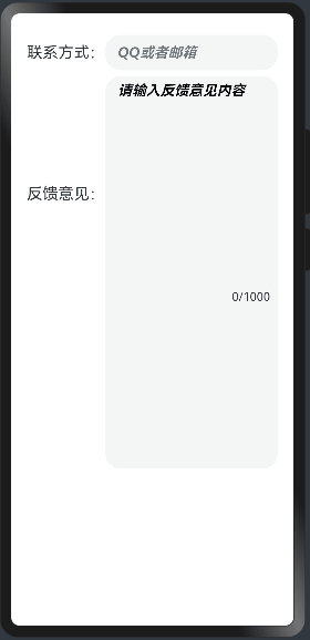
运行结果如下图所示:
@Entry  // 标记为入口组件
@Component  // 声明为组件
struct TextInputPage02 {
  @State value:string = "";  // 声明一个状态变量 value,初始值为空字符串

  build() {  // 组件的构建方法
    Column(){  // 创建一个垂直布局的列
      Row(){  // 在列中创建一行
        Text("联系方式:").fontSize(20)  // 显示文本“联系方式:”,设置字体大小为20

        TextInput({placeholder:"QQ或者邮箱"})  // 创建一个文本输入框,设置占位符为"QQ或者邮箱"
          .layoutWeight(1)  // 设置布局权重为1,占据剩余空间
          .height(45)  // 设置输入框高度为45
          .type(InputType.Normal)  // 设置输入框类型为普通文本输入
          .fontColor(Color.Blue)  // 设置文本颜色为蓝色
          .enterKeyType(EnterKeyType.Next)  // 设置按下回车键的行为为切换到下一个输入框
          .caretColor(Color.Black)  // 设置光标颜色为黑色
          .placeholderFont({  // 设置占位符文本字体样式
            size: 18,  // 字体大小为18
            style: FontStyle.Italic,  // 字体样式为斜体
            weight: FontWeight.Bold  // 字体粗细为粗体
          })
      }
      .width("100%")  // 设置行的宽度为100%
      .height(60)  // 设置行的高度为60

      Row(){  // 在列中创建另一行

        Text("反馈意见:").fontSize(20)  // 显示文本“反馈意见:”,设置字体大小为20

        Stack({alignContent:Alignment.BottomEnd}){  // 创建一个堆叠布局,并设置子元素在底部右侧对齐
          TextArea({placeholder:"请输入反馈意见内容"})  // 创建一个文本域,设置占位符为"请输入反馈意见内容"
            .width("100%")  // 设置文本域宽度为100%
            .height(500)  // 设置文本域高度为500
            .fontColor(Color.Green)  // 设置文本颜色为绿色
            .fontStyle(FontStyle.Italic)  // 设置字体样式为斜体
            .caretColor(Color.Red)  // 设置光标颜色为红色
            .placeholderColor(Color.Black)  // 设置占位符文本颜色为黑色
            .placeholderFont({  // 设置占位符文本字体样式
              size: 18,  // 字体大小为18
              style: FontStyle.Italic,  // 字体样式为斜体
              weight: FontWeight.Bold  // 字体粗细为粗体
            })
            .onChange((value) => {  // 监听文本域内容变化事件
              this.value = value;  // 将文本域的值赋给状态变量 value
            })

          Text(this.value.length + "/1000")  // 显示当前文本域内容长度和最大长度的提示
            .fontSize(15)  // 设置字体大小为15
            .margin(10)  // 设置外边距为10
        }
        .layoutWeight(1)  // 设置布局权重为1,占据剩余空间
        .width("100%")  // 设置堆叠布局宽度为100%
        .height(300)  // 设置堆叠布局高度为300
      }
    }
    .width("100%")  // 设置列宽度为100%
    .height("100%")  // 设置列高度为100%
    .padding(20)  // 设置内边距为20
    .alignItems(HorizontalAlign.Center)  // 设置子元素在水平方向上的对齐方式为居中对齐
  }
}
预览效果如下:


 850
850


 被折叠的 条评论
为什么被折叠?
被折叠的 条评论
为什么被折叠?
 到【灌水乐园】发言


