


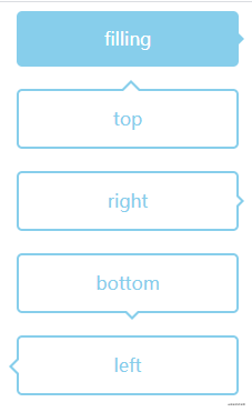
气泡框
气泡框的小三角可以通过伪元素 ::before ::after 来实现:
html代码:
<div class="box">
    <div class="publickStyle back">filling</div>
    <div class="publickStyle emptyPub top">top</div>
    <div class="publickStyle emptyPub right">right</div>
    <div class="publickStyle emptyPub bottom">bottom</div>
    <div class="publickStyle emptyPub left">left</div>
  </div>
css部分:
 .box {
    width: 100%;
    height: 100%;
    padding-left: 50px;
  }
  .publickStyle {
    width: 200px;
    height: 50px;
    border-radius: 5px 5px;
    text-align: center;
    line-height: 50px;
    position: relative;
  }
  .back {
    background: skyblue;
    color: #fff;
  }
  .back::after {
    position: absolute;
    left: 100%;
    top: 50%;
    border: 5px solid transparent;
    border-left-color: skyblue;
    content: '';
    margin-top: -5px;
  }
  .emptyPub {
    width: 196px;
    border:2px solid skyblue;
    color: skyblue;
    margin-top: 20px;
  }
  .top::before {
    position: absolute;
    top: -18px;
    left: 50%;
    border: 8px solid transparent;
    border-bottom-color: skyblue;
    content: '';
    margin-left: -5px;
  }
  .top::after {
    position: absolute;
    top: -14px;
    left: 50%;
    border: 7px solid transparent;
    border-bottom-color: #fff;
    content: '';
    margin-left: -4px;
  }
  .right::before {
    position: absolute;
    left: 100%;
    top: 50%;
    border: 5px solid transparent;
    border-left-color: skyblue;
    margin: -5px 0 0 2px;
    content: '';
  }
  .right::after {
    position: absolute;
    left: 100%;
    top: 50%;
    border: 4px solid transparent;
    border-left-color: #fff;
    content: '';
    margin-top: -4px;
  }
  .bottom::before {
    position: absolute;
    left: 50%;
    top: 100%;
    border: 8px solid transparent;
    border-top-color: skyblue;
    margin-left: -4px;
    content: '';
  }
  .bottom::after {
    position: absolute;
    left: 50%;
    top: 100%;
    border: 5px solid transparent;
    border-top-color: #fff;
    margin-left: -1px;
    content: '';
  }
  .left::before {
    position: absolute;
    top: 50%;
    left: 0;
    border: 7px solid transparent;
    border-right-color: skyblue;
    content: '';
    margin-left: -16px;
    margin-top: -6px;
  }
  .left::after {
    position: absolute;
    top: 50%;
    left: 0;
    border: 6px solid transparent;
    border-right-color: #fff;
    content: '';
    margin-left: -12px;
    margin-top: -5px;
  }
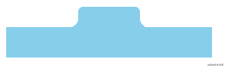
内凹的圆角
我在刚开始工作的时候实现内凹的圆角一般用SVG来实现,虽然效果也不错,但是当时也是想过是否可以通过纯CSS来实现呢,后来看了很多大佬的文章,发现原来通过CSS来实现如此巧妙和有趣。正巧通过这个更文的活动记录一下。
主要通过radial-gradient实现,通过调整参数的比例来达到想要的效果。
html代码:
<div class="box">
    <div class="tab">
      <div class="yuanjiao yuanjiao_left"></div>
      <div class="tab1"></div>
      <div class="yuanjiao yuanjiao_right"></div>
    </div>
    <div class="bottom"></div>
  </div>
主要的css代码:
.box {
  width: 200px;
  height: 100px;
}
.tab {
  width: 80px;
  height: 20px;
  margin: 0 auto;
  display: flex;
}
.tab1 {
  width: 60px;
  height: 100%;
  background: skyblue;
  border-radius: 5px 5px 0 0;
}
.yuanjiao {
  width: 10px;
  height: 10px;
  background: skyblue;
  margin-top: 10px;
}
.yuanjiao_left {
  background: skyblue;
  background: radial-gradient(circle at -5% 0%, transparent 60%, transparent 75%, skyblue 35%);
}
.yuanjiao_right {
  background: radial-gradient(circle at 100% 10%, transparent 50%, transparent 75%, skyblue 35%);
}
.bottom {
  width: 100%;
  height: 30px;
  background: skyblue;
}
参考资料:
https://github.com/cssmagic/blog
https://codepen.io/JowayYoung/pen/GRZBKJd
https://cssarrowplease.com/


 615
615


 被折叠的 条评论
为什么被折叠?
被折叠的 条评论
为什么被折叠?
 到【灌水乐园】发言


