


HTML之flex布局
flex布局是什么
flex布局,中文意思为弹性布局,用来为盒模型提供最大的支持,如果靠简单的float,position,很难将页面做的好看。flex灵活性非常的好,任何一个容器都可以定义为flex布局。下面通过案例来演示flex的属性
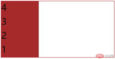
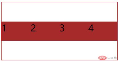
1.flex-direction
代码(这里只将属性部分写出):
flex-direction:row;
/* 从右至左 */
flex-direction:row-reverse;
/* 从上至下 */
flex-direction:column;
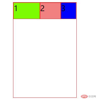
/* 从下至上 */
flex-direction:column-reverse;
效果图:
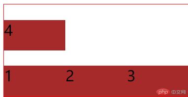
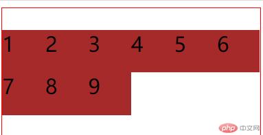
2.flex-wrap
代码
flex-wrap:nowrap;
flex-wrap:wrap;
flex-wrap:wrap-reverse;
`
效果图:
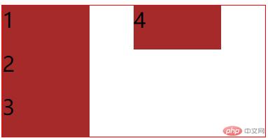
3.flex-fow
代码
flex-direction:row;
flex-wrap:wrap;
flex-flow:row nowrap;
flex-flow:column wrap;
效果图:
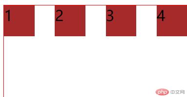
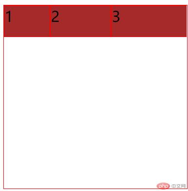
4.justify-content
代码:
justify-content:center;
justify-content:space-evenly;
justify-content:space-around;
justify-content:space-between;
效果图:
5.align-items
代码:
.container{
align-items:flex-end;
/* align-items: flex-start; */
align-items:center;
}
效果图:
6.flex-content
代码:
.container{
align-content:flex-start;
align-content:flex-end;
align-content:center;
}
效果图:
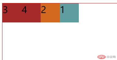
7.flex-order
代码:
.item:nth-of-type(2){
order:1;
background-color:chocolate;
}
.item:nth-last-of-type(){
order:3;
background-color:coral;
}
效果图:
8.align-self
代码
.item:first-of-type{
width:50px;
height:50px;
background-color:lightslategray;
align-self:center;
}
效果图:

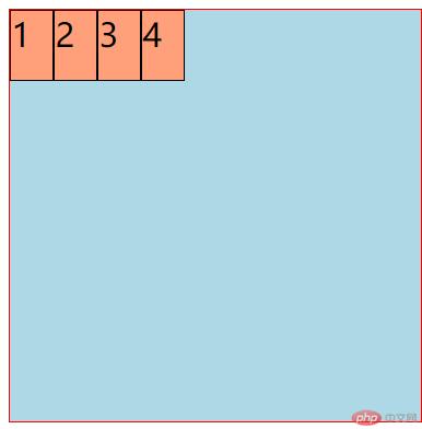
9.flex-grow
代码
.item:first-of-type{
flex-grow:1;
}
.item:nth-of-type(2){
flex-grow:2;
}
.item:nth-of-type(3){
flex-grow:3
}
效果图:
10.flex-shrink
代码
.item:first-of-type{
background-color:lawngreen;
flex-shrink:1;
}
.item:nth-of-type(2){
background-color:lightcoral;
flex-shrink:2;
}
.item:last-of-type{
background-color:blue;
flex-shrink:3;
}
效果图
11.flex-basis
代码:
.item{
flex-basis:auto;
flex-basis:70px;
flex-basis:20%;
max-width:30px;
/* 权重关系:min-width/max-width>flex-basis>width */
/* width < flex-basis < min/max-width; */
}
效果图:
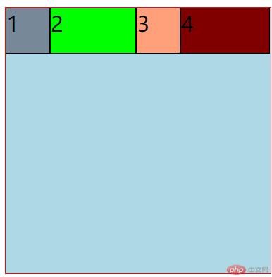
12.flex简写
代码:
.item:first-of-type{
background-color:lightslategrey;
flex:01auto;
}
.item:nth-of-type(2){
background-color:lime;
flex:01200px;
}
.item:last-of-type{
background-color:maroon;
flex:auto;
flex:none;
}
效果图:
总结
通过上课的十二个案例讲解,已经大概明白了flex属性的用法,整个属性大概了解了50%,剩下的还需要温故而知新,台上一分钟,台下十年攻,上课看似很轻松,下课却需要仔细揣摩,每个属性的用法,以及组合产生的作用,对于flex属性的用法,还需要加强,做完案例后,脑袋里还是非常的模糊,没有确切的认知,这也说明了老师说上课说能明白50%就不错了,还需要通过案例来巩固基本知识,做项目来加强认知与理解。


 1万+
1万+


 被折叠的 条评论
为什么被折叠?
被折叠的 条评论
为什么被折叠?
 到【灌水乐园】发言


