


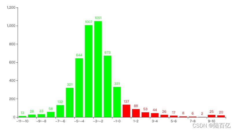
从tushare获取某一天的交易数据,按照1%涨跌幅统计股票数量。了解当日行情
参考文章:pyecharts官方文档
【python量化交易学习】pandas获取mysql数据,使用pyecharts画K线图,ma移动均线。
import tushare as ts
import pandas as pd
from pyecharts.charts import Bar
from pyecharts import options as opts

# 初始化pro接口。替换成自己的token
pro = ts.pro_api('d4371**********72')

# 拉取数据
df = pro.daily(**{
    "ts_code": "",
    "trade_date": "20220314",
    "start_date": "",
    "end_date": "",
    "offset": "",
    "limit": ""
}, fields=[
    "ts_code",
    "trade_date",
    "open",
    "high",
    "low",
    "close",
    "pre_close",
    "change",
    "pct_chg",
    "vol",
    "amount"
])

#按涨跌幅统计
bins = list(range(-11, 12))
cuts = pd.cut(df['pct_chg'], bins=bins)
pct_chg_list = df.groupby(cuts)['pct_chg'].count().tolist()

#将数据转换为pyecharts需要的格式
x = []
y = []

for i in range(-11, 11):
    x.append([str(i) + "~" + str(i + 1)])

    if i < 0:
        y.append(
            opts.BarItem(
                name=str(i) + "~" + str(i + 1),
                value=pct_chg_list[i + 11],
                itemstyle_opts=opts.ItemStyleOpts(color="#00ff00"),
            )
        )
    else:
        y.append(
            opts.BarItem(
                name=str(i) + "~" + str(i + 1),
                value=pct_chg_list[i + 11],
                itemstyle_opts=opts.ItemStyleOpts(color="#ff0000"),
            )
        )

c = (
    Bar()
        .add_xaxis(x)
        .add_yaxis("", y)
        .render("大盘.html")
)
生成柱状图:


 被折叠的 条评论
为什么被折叠?
被折叠的 条评论
为什么被折叠?
 到【灌水乐园】发言


