


目录结构
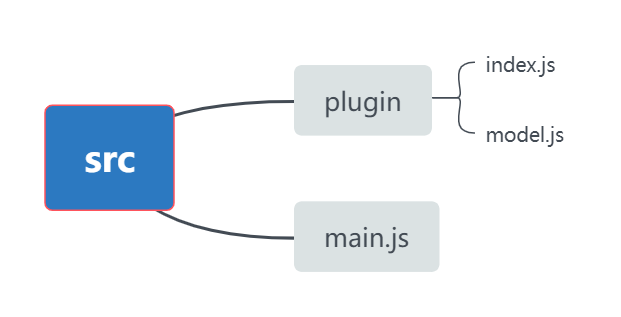
main.js
import plugins from './plugins'
Vue.use(plugins)
index.js
import modal from './modal'

export default {
  install(Vue) {
    /**
     * 同理,可在此配置自己想封装的其他全局模块功能
    */
    // 模态框对象
    Vue.prototype.$modal = modal
  }
}
model.js
import { Message, MessageBox, Notification, Loading } from 'element-ui'

let loadingInstance;

export default {
  // 消息提示
  msg(content) {
    Message.info(content)
  },
  // 错误消息
  msgError(content) {
    Message.error(content)
  },
  // 成功消息
  msgSuccess(content) {
    Message.success(content)
  },
  // 警告消息
  msgWarning(content) {
    Message.warning(content)
  },
  // 弹出提示
  alert(content) {
    MessageBox.alert(content, "系统提示")
  },
  // 错误提示
  alertError(content) {
    MessageBox.alert(content, "系统提示", { type: 'error' })
  },
  // 成功提示
  alertSuccess(content) {
    MessageBox.alert(content, "系统提示", { type: 'success' })
  },
  // 警告提示
  alertWarning(content) {
    MessageBox.alert(content, "系统提示", { type: 'warning' })
  },
  // 通知提示
  notify(content) {
    Notification.info(content)
  },
  // 错误通知
  notifyError(content) {
    Notification.error(content);
  },
  // 成功通知
  notifySuccess(content) {
    Notification.success(content)
  },
  // 警告通知
  notifyWarning(content) {
    Notification.warning(content)
  },
  // 确认窗体
  confirm(content) {
    return MessageBox.confirm(content, "系统提示", {
      confirmButtonText: '确定',
      cancelButtonText: '取消',
      type: "warning",
    })
  },
  // 提交内容
  prompt(content) {
    return MessageBox.prompt(content, "系统提示", {
      confirmButtonText: '确定',
      cancelButtonText: '取消',
      type: "warning",
    })
  },
  // 打开遮罩层
  loading(content) {
    loadingInstance = Loading.service({
      lock: true,
      text: content,
      spinner: "el-icon-loading",
      background: "rgba(0, 0, 0, 0.7)",
    })
  },
  // 关闭遮罩层
  closeLoading() {
    loadingInstance.close();
  }
}
使用
// 举例
this.$modal.msgError(“错误提示”)

this.$modal.loading("页面加载文字...")

this.$modal.closeLoading() // 关闭加载状态

// 二次确认方法
this.$modal.confirm('是否确认删除文件名为"' + name + '"的数据项?').then(() => {
  return delete(id);
}).then(() => {
  this.getList();
  this.$modal.msgSuccess("删除成功");
}).catch(() => {});


 298
298


 被折叠的 条评论
为什么被折叠?
被折叠的 条评论
为什么被折叠?
 到【灌水乐园】发言


