


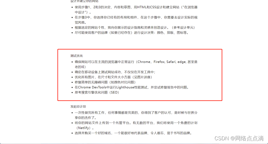
在我们之前的文章中,我们介绍了测试的步骤
虽然现在大部分新版本的浏览器都能支持99%的CSS属性,但是不排除的是仍然有一些用户使用老的IE浏览器或者版本较低的浏览器去浏览我们的网页,这样我们的网站可能无法按照我们的预期工作;
● 我们可以使用工具去检测浏览器是否可以支持某些CSS属性
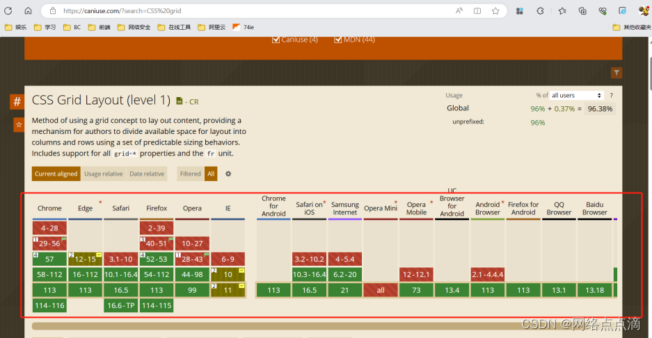
● 我们只需要输入相关的CSS属性就能给我们结果
● 例如,现在我们在导航添加一个很新的CSS属性,这个会让背景变得模糊
background-color: rgba(255, 255, 255, 0.6);
backdrop-filter: blur(10px);

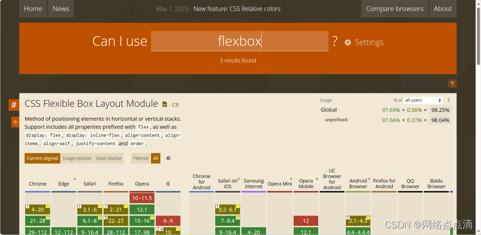
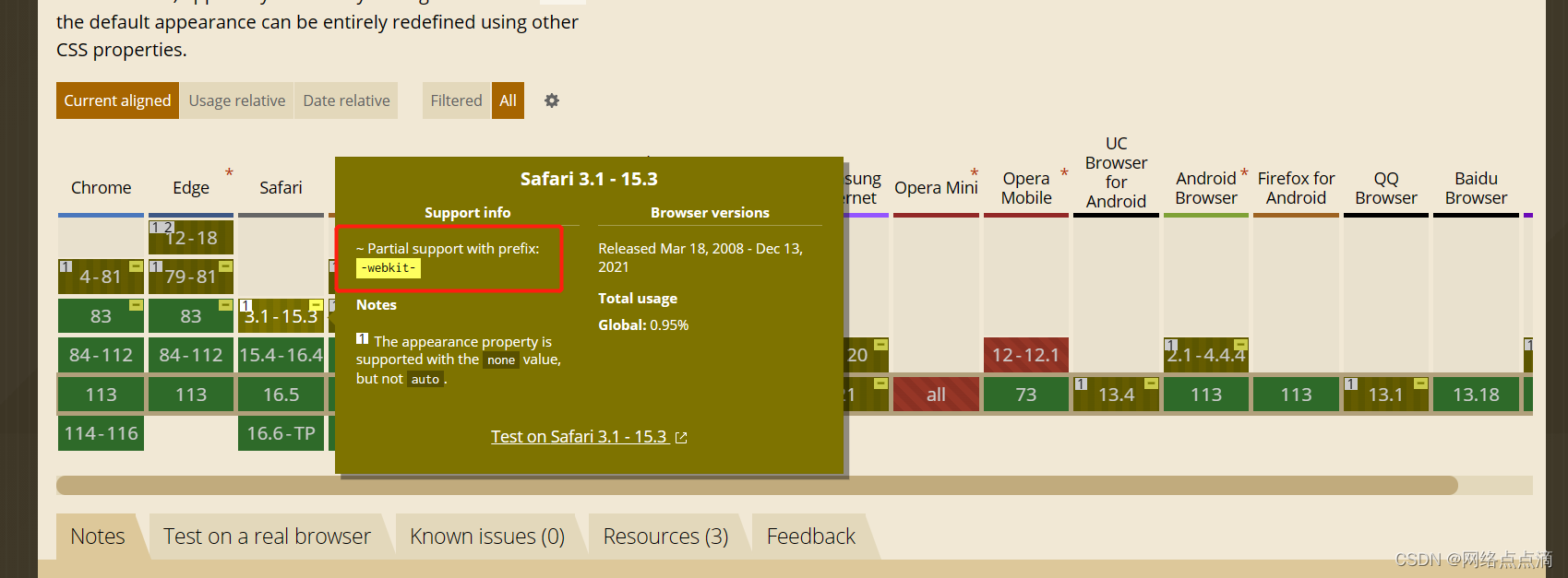
● 但是例如老版本的safari浏览器不支持,我们需要加另外的参数
   -webkit-backdrop-filter: blur(10px);
        backdrop-filter: blur(10px);
● 这里我们没有苹果设备,无法测试,但是理论上是没问题的
我们可以看到有些CSS属性,需要添加供应商参数才能使其生效
● 除此之外,我们可以添加一段JS来实现兼容的效果
function checkFlexGap() {
  var flex = document.createElement("div");
  flex.style.display = "flex";
  flex.style.flexDirection = "column";
  flex.style.rowGap = "1px";

  flex.appendChild(document.createElement("div"));
  flex.appendChild(document.createElement("div"));

  document.body.appendChild(flex);
  var isSupported = flex.scrollHeight === 1;
  flex.parentNode.removeChild(flex);
  console.log(isSupported);

  if (!isSupported) document.body.classList.add("no-flexbox-gap");
}
checkFlexGap();

这是一个 JavaScript 函数,用于检测浏览器是否支持 flexbox 的 row-gap 和 column-gap 属性。该函数创建了一个 div 元素,并将其样式设置为 flex 布局,然后将两个 div 元素添加到该元素中。接着,将该元素添加到文档中,并检查其 scrollHeight 是否为 1。如果 scrollHeight 为 1,则表示浏览器支持 flexbox 的 row-gap 和 column-gap 属性,否则将在文档的 body 元素上添加一个类名为 "no-flexbox-gap",用于标识浏览器不支持该属性。最后,该函数会将创建的 div 元素从文档中移除。
● 还需要再媒体查询中添加一段CSS代码
.no-flexbox-gap .main-nav-list li:not(:last-child) {
  margin-right: 4.8rem;
}

.no-flexbox-gap .list-item:not(:last-child) {
  margin-bottom: 1.6rem;
}

.no-flexbox-gap .list-icon:not(:last-child) {
  margin-right: 1.6rem;
}

.no-flexbox-gap .delivered-faces {
  margin-right: 1.6rem;
}

.no-flexbox-gap .meal-attribute:not(:last-child) {
  margin-bottom: 2rem;
}

.no-flexbox-gap .meal-icon {
  margin-right: 1.6rem;
}

.no-flexbox-gap .footer-row div:not(:last-child) {
  margin-right: 6.4rem;
}

.no-flexbox-gap .social-links li:not(:last-child) {
  margin-right: 2.4rem;
}

.no-flexbox-gap .footer-nav li:not(:last-child) {
  margin-bottom: 2.4rem;
}

@media (max-width: 75em) {
  .no-flexbox-gap .main-nav-list li:not(:last-child) {
    margin-right: 3.2rem;
  }
}

@media (max-width: 59em) {
  .no-flexbox-gap .main-nav-list li:not(:last-child) {
    margin-right: 0;
    margin-bottom: 4.8rem;
  }
}
这段 CSS 代码是用来解决 flexbox 的 row-gap 和 column-gap 属性在某些浏览器中不被支持的问题。它使用了一个类名 .no-flexbox-gap,然后为这个类名下的一些元素设置了间距,以达到类似 row-gap 和 column-gap 的效果。其中使用了 margin-right 和 margin-bottom 属性来分别控制元素之间的水平和垂直间距。另外,它还使用了媒体查询来在不同的屏幕尺寸下改变间距的大小。


 7575
7575


 被折叠的 条评论
为什么被折叠?
被折叠的 条评论
为什么被折叠?
 到【灌水乐园】发言


