


1.整理一下元素居中常用的方法
1.1 使用单元格的方法,将父元素设为display:table-cell,通过设置text-align:center实现元素的水平居中,设置vertical-align:middle实现子元素的垂直居中;对于子元素,则需要设置display: inline-block,这就可以将它转为内联块元素了.
1.2使用flex布局的方法,将父元素设置display: flex; justify-content: center(水平居中); align-items: center(垂直居中);这样就可以实现子元素水平方向和垂直方向居中了。
1.3通过flex布局实现还有另外一种方法,具体为:将父元素设置为:display: flex;子元素设置为:margin:auto;这种方法也可以实现相同的效果。
1.4通过定位的方法,具体为:将父元素设置为相对定位:position: relative;子元素设置为绝对定位: position:absolute;
接下来再对子元素实现移位,其中一种方法可以为:
left: 50%;
top:50%;
transform:translate(-50%,-50%);
其中通过设置left和top可以实现元素左顶点在父容器的正中心,然后再通过分别向左和向上移动子元素自身宽度和高度的一半就可以刚好实现居中,具体的实现是 transform:translate(-50%,-50%);这一技巧比较巧妙!
1.5使用css grid 布局,这种方面多使用于二维的情况,但同样也可以实现子元素的居中效果,具体操作为:将父元素设置为 display: grid;子元素设置为:justify-self: center(水平居中); align-self: center; (垂直居中)
2.具体代码如下:
<div class="par1">
    <div class="child1">1.单元格</div>
</div>
<div class="par2">
    <div class="child2">2.flex</div>
</div>
<div class="par3">
    <div class="child3">3.flex</div>
</div>
<div class="par4">
    <div class="child4">4.定位</div>
</div>
<div class="par5">
        <div class="child5">5.css grid</div>
    </div>
样式部分如下:
<style>
    .par1,.par2,.par3,.par4,.par5{
        width: 200px;
        height: 100px;
        background-color: #ccc;
        border: 1px orange solid;
    }
    .child1,.child2,.child3,.child4,.child5{
        width: 160px;
        height: 60px;

        /* 设置子元素内容居中 */
        text-align: center;
        line-height: 60px;
    }

    .par1{
        display: table-cell;
        text-align: center;
        vertical-align:middle;
    }
    .par2{
        display: flex;
        justify-content: center;
        align-items: center;
    }
    .par3{
        display: flex;
    }
    .par4{
        position: relative;
    }
    .par5{
         /* 设置为grid布局 */
        display: grid;
    }
    .child1{

        background-color: #44ffaa;
        display: inline-block;
    }
    .child2{
        background-color: #ab3;
    }
    .child3{
        margin:auto;
        background-color: #af1;
    }
    .child4{
        background-color: #bfc;
        position:absolute;
        left: 50%;
        top:50%;
        /* translate位移是相对元素自身长度的 */
        transform: translate(-50%,-50%);

    }
    .child5{
        background-color: #f24;
        justify-self: center;
        align-self: center;
    }

</style>
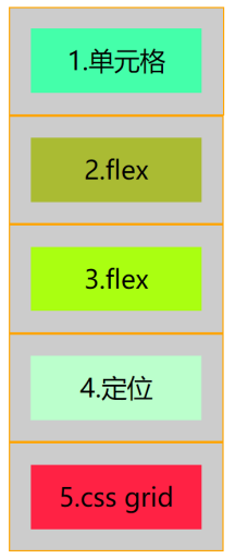
3.运行结果


 934
934


 被折叠的 条评论
为什么被折叠?
被折叠的 条评论
为什么被折叠?
 到【灌水乐园】发言


