


 文章介绍了项目中使用的不同TabBar实现,包括系统自带的TabBar、基于buttons_tabbar第三方插件以及自定义的按钮容器。作者分享了代码示例,并表示会持续更新以适应新样式。
总结了一下项目中用到的几种TabBar,针对不同的样式,有采用系统提供的,也有三方插件提供的,也有自定义的,效果如下(后续如果遇到新的样式,会不间断地记录更新,避免重复造轮子…)
用到的三方插件:
buttons_tabbar: ^1.3.8
flutter_easyloading: ^3.0.5
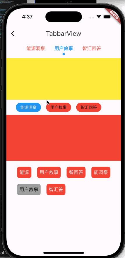
1、先看第一种系统的
代码如下:
class CustomTabBar extends StatelessWidget {
  final TabController tabController;
  final List<String> tabs;
  final TextStyle labelStyle;
  final Color labelColor;
  final Color unselectedLabelColor;
  final TextStyle unselectedLabelStyle;
  final Color indicatorColor;
  final double indicatorWeight;
  const CustomTabBar({
    super.key,
    required this.tabController,
    required this.tabs,
    this.labelStyle = const TextStyle(
      fontSize: 16.0,
      fontWeight: FontWeight.w700,
    ),
    this.labelColor = Colors.blue,
    this.unselectedLabelColor = Colors.red,
    this.unselectedLabelStyle = const TextStyle(
      fontSize: 16.0,
      fontWeight: FontWeight.w400,
    ),
    this.indicatorColor = Colors.blue,
    this.indicatorWeight = 5.0,
  });

  @override
  Widget build(BuildContext context) {
    return TabBar(
      controller: tabController,
      tabs: tabs.map((e) => Tab(text: e)).toList(),
      isScrollable: true,
      labelPadding: const EdgeInsets.symmetric(horizontal: 16.0),
      labelStyle: labelStyle,
      labelColor: labelColor,
      unselectedLabelColor: unselectedLabelColor,
      unselectedLabelStyle: unselectedLabelStyle,
      indicatorWeight: indicatorWeight,
      indicator: DotTabIndicator(
        color: indicatorColor,
        radius: 4,
      ),
      onTap: (value) {},
      dividerColor: Colors.transparent, //去除tabBar下面的那根线的颜色
    );
  }
}

class DotTabIndicator extends Decoration {
  final Color color;
  final double radius;

  const DotTabIndicator({required this.color, required this.radius});

  @override
  BoxPainter createBoxPainter([VoidCallback? onChanged]) {
    return _DotTabIndicatorPainter(this, onChanged!);
  }
}

class _DotTabIndicatorPainter extends BoxPainter {
  final DotTabIndicator decoration;

  _DotTabIndicatorPainter(this.decoration, VoidCallback onChanged)
      : super(onChanged);

  @override
  void paint(Canvas canvas, Offset offset, ImageConfiguration configuration) {
    final Rect rect = offset & configuration.size!;
    final Paint paint = Paint();
    paint.color = decoration.color;
    paint.style = PaintingStyle.fill;
    final Offset circleOffset =
        Offset(rect.center.dx, rect.bottomCenter.dy - decoration.radius);
    canvas.drawCircle(circleOffset, decoration.radius, paint);
  }
}
使用方法:
late final TabController _tabController;
final List<String> _tabs = [
    "能源洞察",
    "用户故事",
    "智汇回答",
  ];
  final List<Widget> _tabViews = [
    Container(color: Colors.red),
    Container(color: Colors.yellow),
    Container(color: Colors.orange),
  ];
@override
  void initState() {
    super.initState();
    _tabController = TabController(
      initialIndex: 1,
      length: _tabs.length,
      vsync: this,
    );
  }

  @override
  void dispose() {
    _tabController.dispose();
    super.dispose();
  }

Container(
            height: 200,
            child: Column(
              children: [
                CustomTabBar(
                  tabController: _tabController,
                  indicatorWeight: 1,
                  tabs: _tabs,
                ),
                const SizedBox(height: 10.0),
                Expanded(
                  child: TabBarView(
                    controller: _tabController,
                    children: _tabViews,
                  ),
                ),
              ],
            ),
          ),
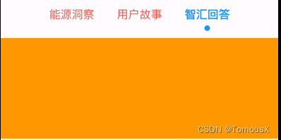
第二种采用的三方插件buttons_tabbar: ^1.3.8
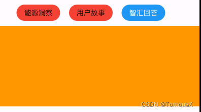
代码如下:
  late final TabController _tabController;
  final List<String> _tabs = [
    "能源洞察",
    "用户故事",
    "智汇回答",
  ];
  final List<Widget> _tabViews = [
    Container(color: Colors.red),
    Container(color: Colors.yellow),
    Container(color: Colors.orange),
  ];
@override
  void initState() {
    super.initState();
    _tabController = TabController(
      initialIndex: 0,
      length: _tabs.length,
      vsync: this,
    );
  }

  @override
  void dispose() {
    _tabController.dispose();
    super.dispose();
  }

SizedBox(
            height: 200,
            child: Column(
              children: [
                SizedBox(
                  height: 32.0,
                  child: ButtonsTabBar(
                    tabs: _tabs.map((e) => Tab(text: e)).toList(),
                    controller: _tabController,
                    backgroundColor: Colors.blue,
                    unselectedBackgroundColor: Colors.red,
                    labelStyle: const TextStyle(color: Colors.white),
                    unselectedLabelStyle: const TextStyle(color: Colors.black),
                    buttonMargin: const EdgeInsets.only(right: 35),
                    contentPadding:
                        const EdgeInsets.symmetric(horizontal: 15.0),
                    radius: 18,
                  ),
                ),
                const SizedBox(height: 10.0),
                Expanded(
                  child: TabBarView(
                    controller: _tabController,
                    children: _tabViews,
                  ),
                ),
              ],
            ),
          ),
第三种自定义
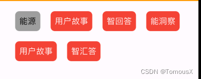
代码如下:
class ButtonContainer extends StatelessWidget {
  final int containerIndex;
  final ValueChanged<int> onContainerSelected;
  final bool isSelected;
  final List data;
  final Color backgroundColor;
  final Color unBackgroundColor;
  final TextStyle labelStyle;
  final TextStyle unLabelStyle;
  const ButtonContainer({
    super.key,
    required this.containerIndex,
    required this.onContainerSelected,
    required this.isSelected,
    required this.data,
    this.backgroundColor = Colors.grey,
    this.unBackgroundColor = Colors.red,
    this.labelStyle = const TextStyle(
      color: Colors.black,
      fontSize: 16,
    ),
    this.unLabelStyle = const TextStyle(
      color: Colors.white,
      fontSize: 16,
    ),
  });

  @override
  Widget build(BuildContext context) {
    return GestureDetector(
      onTap: () {
        onContainerSelected(containerIndex);
      },
      child: Container(
        padding: const EdgeInsets.all(8.0),
        margin: const EdgeInsets.all(10),
        decoration: BoxDecoration(
          color: isSelected ? backgroundColor : unBackgroundColor,
          borderRadius: BorderRadius.circular(8.0),
        ),
        child: Text(
          data[containerIndex],
          style: isSelected ? labelStyle : unLabelStyle,
        ),
      ),
    );
  }
}
使用方法:
int selectedContainerIndex = 4; //默认选中第几个
final List<String> dataList = [
    "能源",
    "用户故事",
    "智回答",
    "能洞察",
    "用户故事",
    "智汇答",
  ];
  Wrap(
              children: List.generate(dataList.length, (index) {
                return ButtonContainer(
                  containerIndex: index,
                  onContainerSelected: (index) {
                    setState(() {
                      // 更新选中状态
                      selectedContainerIndex = index;
                    });
                    EasyLoading.showToast("Click---${dataList[index]}");
                  },
                  isSelected: index == selectedContainerIndex,
                  data: dataList,
                );
              }),
            ),


 1233
1233


 被折叠的 条评论
为什么被折叠?
被折叠的 条评论
为什么被折叠?
 到【灌水乐园】发言


