


<div style="display: inline-block;">
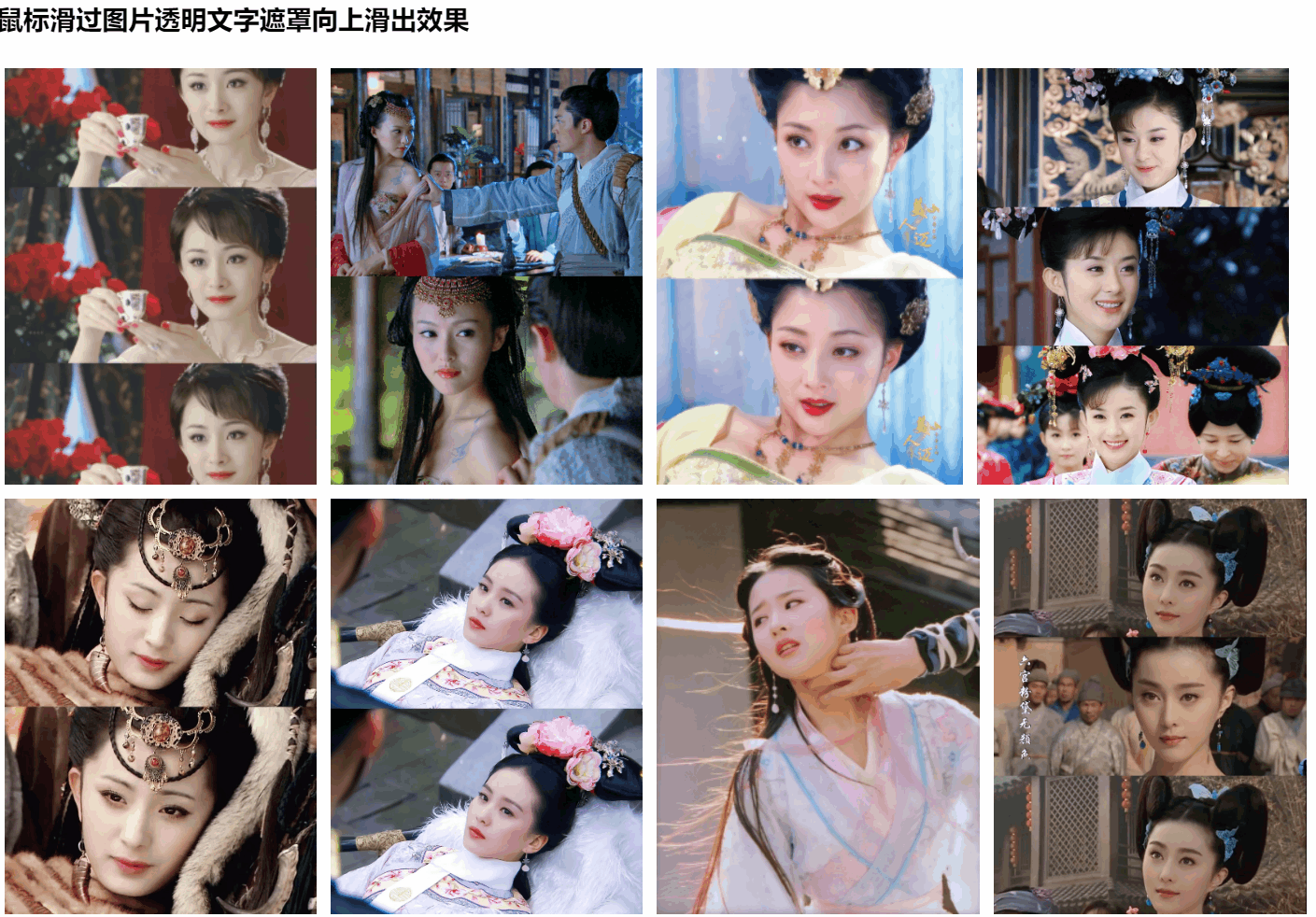
<h3>鼠标滑过图片透明文字遮罩向上滑出效果</h3>
<div
class="parent-hover-class"
@mouseenter="clickShow(item, true)"
@mouseleave="clickShow(item, false)"
v-for="(item, index) in imageList"
:key="index"
>
<img :src="item.url" style="max-width:396px;height: 297px;" />
<div class="hover-class" v-show="item.isShow">
{{ item.content }}
</div>
</div>
</div>
data() {
return {
imageList: [
{ url: image3, isShow: false, content: "殷白雪" },
{ url: image4, isShow: false, content: "紫萱" },
{ url: image12, isShow: false, content: "杨玉环" },
{ url: image13, isShow: false, content: "晴儿" },
{ url: image8, isShow: false, content: "王昭君" },
{ url: image9, isShow: false, content: "马尔泰·若曦" },
{ url: image7, isShow: false, content: "王语嫣" },
{ url: image11, isShow: false, content: "杨玉环" },
]
}
},
methods: {
clickShow(item, val) {
item.isShow = val;
}
}
<style scoped>
.parent-hover-class {
max-width: 396px;
height: 297px;
cursor: pointer;
display: inline-block;
margin: 5px;
float: left;
}
.hover-class {
background: rgba(255, 90, 88, 0.7);
max-width: 396px;
height: 297px;
display: flex;
align-items: center;
justify-content: center;
color: #fff;
cursor: pointer;
position: relative;
top: -301px;
}
@keyframes slider {
0% {
height: 0px;
position: relative;
top: 0;
}
100% {
height: 297px;
position: relative;
top: -301px;
}
}
.hover-class {
animation: slider 0.5s;
}
</style>


 3115
3115


 被折叠的 条评论
为什么被折叠?
被折叠的 条评论
为什么被折叠?
 到【灌水乐园】发言


