


前几天做小程序和后台管理项目的时候,产品说能否换一种loading,官方的不太好看,emmmmmmmmmmmm,那还能怎么办,只能搞了。这里的loading大部分都是基于css实现
1、通过普通的div标签实现
<div class="loading-container"></div>
css
	.loading-container{
            width: 50px; /*先将loading区域变成正方形*/
            height: 50px;
            animation: loading-animation0.8s infinite linear;
            display: inline-block; /*将loading区域变成行内元素,防止旋转的时候,100%宽度都在旋转*/
            border: 3px solid #f3f3f3; /*设置四周边框大小,并将颜色设置为浅白色*/
            border-top: 3px solid red; /*将上边框颜色设置为红色高亮,以便旋转的时候能够看到旋转的效果*/
            border-radius: 50%; /*将边框和内容区域都变成圆形*/
        }
        @keyframes loading-animation{
            0% {
                transform: rotate(0deg); /*动画起始的时候旋转了0度*/
            }
            100% {
                transform: rotate(360deg); /*动画结束的时候旋转了360度*/
            }
        }
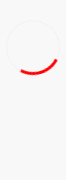
来看下效果:
这个可以用在小程序里面,考虑到复用性,可以封装成组件,动态传入颜色和显示的文字
2、使用svg绘制
	<svg viewBox="0 0 50 50" class="loading-svg-container">
        <circle cx="25" cy="25" r="20" fill="none" class="path"></circle>
    </svg>
	.loading-svg-container {
            width: 50px; /*设置svg显示区域大小*/
            height: 50px;
        }
        .path {
            stroke: #409eff; /*给画笔设置一个颜色*/
            stroke-width: 2; /*设置线条的宽度*/
            stroke-dasharray: 95, 126; /*设置实现长95,虚线长126*/
            stroke-dashoffset: 0; /*设置虚线的偏移位置*/
            animation: loading-dash 1.5s ease-in-out infinite;
        }
        @keyframes loading-dash {
            0% {
                stroke-dasharray: 1, 126; /*实线部分1,虚线部分126*/
                stroke-dashoffset: 0; /*前面1/126显示实线,后面125显示空白*/
            }

            50% {
                stroke-dasharray: 95, 126; /*实线部分95,虚线部分126*/
                stroke-dashoffset: -31px /*顺时针偏移31/126,即前31/126显示空白,后面3/4显示线条*/
            }

            to {
                stroke-dasharray: 6, 120; /*实线部分6,虚线部分120*/
                stroke-dashoffset: -120px; /*最后顺时针偏移120/126,即前120/126显示空白,后面6点显示线条部分*/
            }
        }

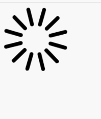
3、通过img图片或者字体
去网站上下载完loading的图标或者字体后,直接丢到页面上展示,我选择的是一张图片,这时候是这样的,只是一张普通的图片,只需要让他转起来就可以

<img src="loading.png" class="loading-icon">
	.loading-icon{
            animation: rotating 3s infinite linear;
        }
        @keyframes rotating {
            0% {
                transform: rotate(0deg) /*动画起始位置为旋转0度*/
            }

            to {
                transform: rotate(1turn) /*动画结束位置为旋转1圈*/
            }
        }
4、封装loading组件
效果

<template>
	<view class="container"  v-if="isShowLoading">
		<view class="mask"></view>
		<view class="loading-container common">
			<view class="rect1"></view>
			<view class="rect2"></view>
			<view class="rect3"></view>
			<view class="rect4"></view>
			<view class="rect5"></view>
		</view>
	</view>
</template>

<script>
	export default {
		props: {
			isShowLoading: {
				type: Boolean,
				default: true
			}
		},
		watch: {
			isShowLoading:{
				deep: true,
				handler(newVal,oldVal) {
					setTimeout(() => {
						this.isShowLoading = false
					}, 300)
				}
			}
		}
	}
</script>

<style lang="scss">
	.container{
		.mask{
			position: fixed;
			top: 0;
			left: 0;
			right: 0;
			z-index: 900;
			width: 100vw;
			height: 100vh;
			background-color: rgba(75, 74, 74, 0.5);
		}
		.loading-container {
			position: fixed;
			top: 25%;
			left: 45%;
			z-index: 1000;
			justify-content: center;
			width: 50px;
			height: 40px;
			font-size: 10px;
			margin: 100px auto;
			text-align: center;
			.rect2 {
				-webkit-animation-delay: -1.1s;
				animation-delay: -1.1s;
			}
			.rect3 {
				animation-delay: -1.0s;
			}
			.rect4 {
				animation-delay: -0.9s;
			}
			.rect5 {
				animation-delay: -0.8s;
			}
			@keyframes sk-stretchdelay {
				0%,
				40%,
				100% {
					transform: scaleY(0.4);
				}
				20% {
					transform: scaleY(1.0);
				}
			}
		}
		.loading-container view {
			height: 100%;
			width: 12rpx;
			margin-right: 10rpx;
			display: inline-block;
			background-color: #fff;
			animation: sk-stretchdelay 1.2s infinite ease-in-out;
		}
	}
</style>


 3616
3616


 被折叠的 条评论
为什么被折叠?
被折叠的 条评论
为什么被折叠?
 到【灌水乐园】发言


