


vue写的pc端项目缩放到手机端整体布局不变
文章目录
前言
vue写的pc端项目缩放到手机端整体布局不变:
一、解决方法如下:
这里写的是针对vue2的版本,使用lodash插件实现屏幕移动端自适应。
二、使用步骤
1.安装lodash插件
npm i lodash -S
2.在app.vue中导入
import _ from 'lodash'
3.在app的容器绑定ref=‘app’
<template>
    <div id="app" ref="app">
      <router-view />
    </div>
</template>
4.然后在mounted使用如下方法(其中的1080以及1920为定义的画布尺寸):
mounted() {

    this.$nextTick(() => {
      const $app = this.$refs.app
      const standardScale = 1080 / 1920

      window.addEventListener(
          'resize',
          _.debounce(function () {
            const docHeight = document.body.clientHeight
            const docWidth = document.body.clientWidth
            if (docWidth < 1920) {
              const currentScale = docHeight / docWidth
              let [scale, translate] = [0, 0]
              if (currentScale < standardScale) {
                // 以高度计算
                scale = docHeight / 1080
                const shouleWidth = 1920 * scale
                const offsetWidth = docWidth - shouleWidth
                console.log('6666')
                translate = offsetWidth > 0 ? `translate(${offsetWidth / 2}px, 0)` : ''
              } else {
                // 以宽度计算
                scale = docWidth / 1920
                const shouleHeight = 1080 * scale
                const offsetHeight = docHeight - shouleHeight
                translate = offsetHeight > 0 ? `translate(0, ${offsetHeight / 2}px)` : ''
              }
              $app.style.cssText = `
            transform: scale(${scale});
            transform-origin: top left;
            width: 1920px;
            min-height: 1080px;
          `
            } else {
            //适配1920以上的分辨率
              let [scale, translate] = [0, 0]
              // 以宽度计算
              scale = docWidth / 1920
              const shouleHeight = 1080 * scale
              const offsetHeight = docHeight - shouleHeight
              translate = offsetHeight > 0 ? `translate(0, ${offsetHeight / 2}px)` : ''
              $app.style.cssText = `
            transform: scale(${scale});
            transform-origin: top left;
            width: 1920px;
            min-height: 1080px;
          `
            }
          }),
          300
      )

      if (document.createEvent) {
        var event = document.createEvent('HTMLEvents')
        event.initEvent('resize', true, true)
        window.dispatchEvent(event)
      } else if (document.createEventObject) {
        window.fireEvent('onresize')
      }
    })

  },
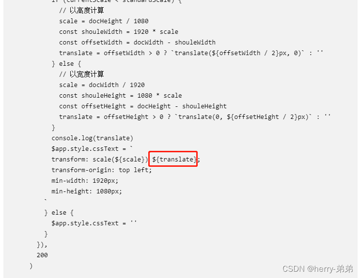
5.此处最让你头疼的是页面是缩小了,但是上下有空白,我们只需要把这个属性删掉就行,如下图


 1061
1061


 被折叠的 条评论
为什么被折叠?
被折叠的 条评论
为什么被折叠?
 到【灌水乐园】发言


