


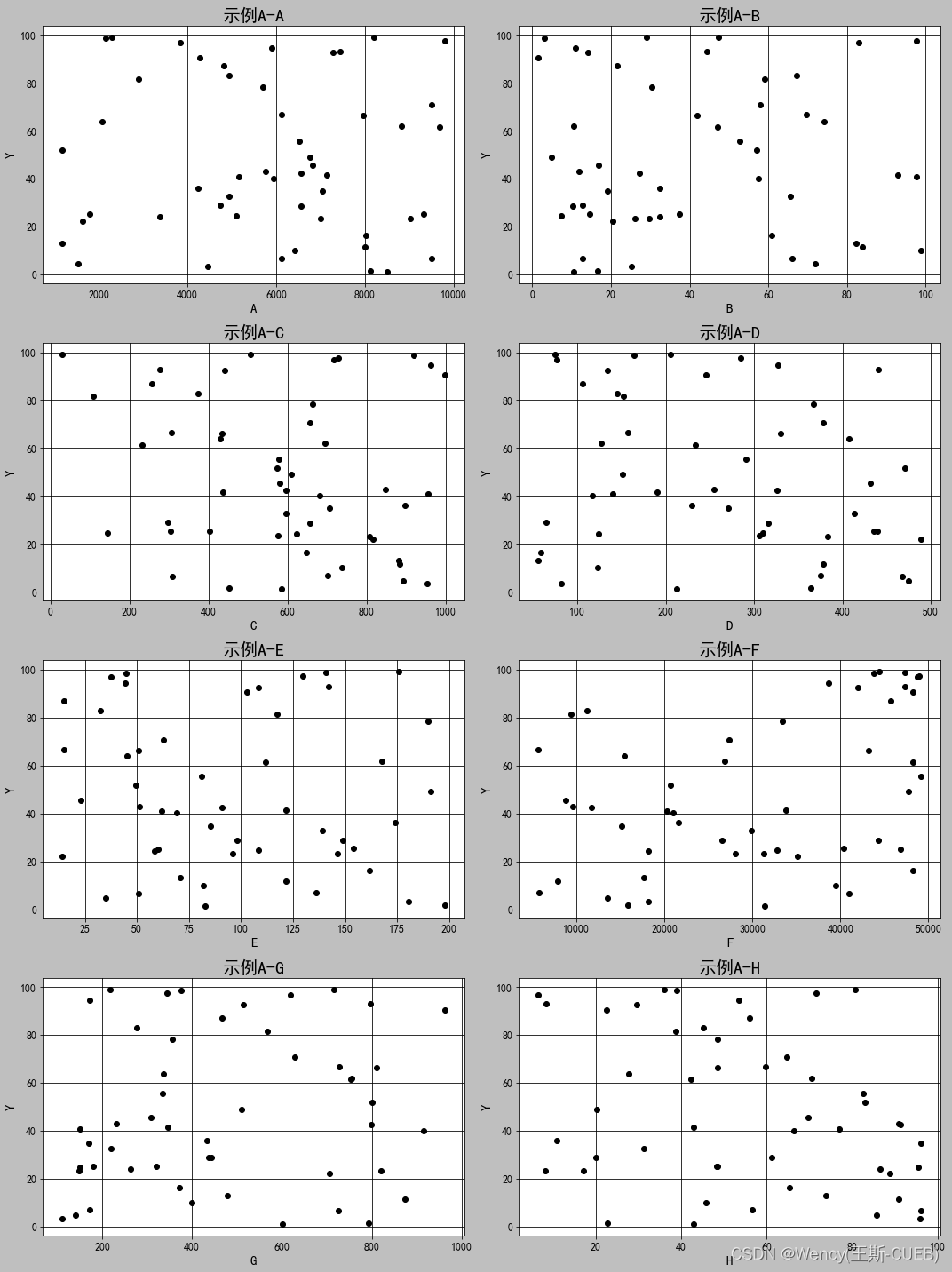
散点图
导入库
下同
import matplotlib.pyplot as plt
import pandas as pd
from io import BytesIO
import base64
准备模拟数据
# Using Chinese characters as column names
columns = ['A', 'B', 'C', 'D',
           'E', 'F', 'G', 'H']
# Since we cannot extract the actual data from the image, we will create scatter plots with mock data.
# Please note that the values used here are randomly generated and do not correspond to any real dataset.

# We'll use numpy to generate the random data
import numpy as np

# Number of observations
n = 50

# Mock data generation
np.random.seed(0)  # For reproducibility
mock_data = {
    'A': np.random.uniform(1000, 10000, n),
    'B': np.random.uniform(1, 100, n),
    'C': np.random.uniform(10, 1000, n),
    'D': np.random.uniform(50, 500, n),
    'E': np.random.uniform(10, 200, n),
    'F': np.random.uniform(5000, 50000, n),
    'G': np.random.uniform(100, 1000, n),
    'H': np.random.uniform(5, 100, n),
    'I': np.random.uniform(0, 100, n)
}

# Create a DataFrame from the mock data
df_mock = pd.DataFrame(mock_data)
设置字体
plt.rcParams['font.sans-serif']=['SimHei'] #显示中文
# Create a scatter plot for each x variable against '省域CEI'
plt.style.use('grayscale')  # Use grayscale style
fig, axes = plt.subplots(4, 2, figsize=(15, 20))  # Prepare a grid for the plots
# 如果不想一次性出6个图,改上面的代码
# Flatten the axes array for easy iteration
axs = axes.flatten()

# Loop through each x variable and create a scatter plot
for idx, x in enumerate(columns):
    axs[idx].scatter(df_mock[x], df_mock['I'], edgecolor='black')
    axs[idx].set_title(f'示例A-{x}', fontsize=20)
    axs[idx].set_xlabel(x, fontsize=15)
    axs[idx].set_ylabel('Y', fontsize=15)
    axs[idx].tick_params(axis='both', which='major', labelsize=12)
    axs[idx].grid(True)

# Adjust layout so titles and labels don't overlap
plt.tight_layout()
plt.show()
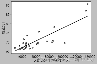
散点图+拟合曲线
# Based on the new requirement, we will add a linear regression fit line to each scatter plot.
# Additionally, we will save the plots to the local filesystem.

from sklearn.linear_model import LinearRegression

# Create a Linear Regression model
model = LinearRegression()

# Function to create scatter plot with regression line
def plot_with_fit_line(x, y, title, xlabel, ylabel):
    # Fit the model
    model.fit(x[:, np.newaxis], y)

    # Get the linear fit line
    xfit = np.linspace(x.min(), x.max(), 1000)
    yfit = model.predict(xfit[:, np.newaxis])

    # Plot the data
    plt.scatter(x, y, c='grey', edgecolors='black', label='Data')

    # Plot the fit line
    plt.plot(xfit, yfit, color='black', linewidth=2, label='Fit line')

    # Title and labels
    #plt.title(title, fontsize=20)
    plt.xlabel(xlabel, fontsize=15)
    plt.ylabel(ylabel, fontsize=15)

    # Font size for ticks
    plt.xticks(fontsize=15)
    plt.yticks(fontsize=15)

    # Grid and legend
    plt.grid(False)
    #plt.legend()

    # Save the figure
    plt.savefig(f'C:/Users/12810/Desktop/结果图/{xlabel}_vs_{ylabel}.png')
    # 取消灰色网格背景

    # Show the plot
    plt.show()

    # Return the path of the saved plot
    return f'C:/Users/12810/Desktop/结果图/{xlabel}_vs_{ylabel}.png'

# Paths where plots will be saved
saved_plots = []

# Create and save a scatter plot with a fit line for each x variable against '省域CEI'
for col in columns:
    # Generate the plot and get the path where it's saved
    plot_path = plot_with_fit_line(df_mock[col].values, df_mock['省域CEI'].values, f"{col}与省域CEI的散点图", col, '省域CEI')

    # Store the path
    saved_plots.append(plot_path)

# Show the paths where the plots are saved
saved_plots
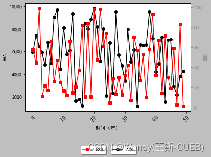
双坐标轴-折线图
import pandas as pd
import matplotlib.pyplot as plt

from matplotlib.font_manager import FontProperties

df_mock # 读取数据

# Set the font properties for displaying Chinese characters
plt.rcParams['font.sans-serif']=['SimHei'] #显示中文
# Use the 'grayscale' style
plt.style.use('grayscale')

# Create a new figure and a twin axis
fig, ax1 = plt.subplots()
x_lable=r'AAA'
y_lable = r'BBB'

# Plot the first line on the primary y-axis
ax1.plot(df_mock.index, df_mock['A'], color='black', marker='o', label=x_lable)
ax1.set_xlabel('时间(年)')
ax1.set_ylabel(x_lable, color='black')
ax1.tick_params(axis='y', colors='black')

# Rotate the x-axis labels
for label in ax1.get_xticklabels():
    label.set_rotation(45)
    label.set_fontproperties(font)

# Create a second y-axis to plot the second line
ax2 = ax1.twinx()
ax2.plot(df_mock.index, df_mock["B"], color='red', marker='s', label=y_lable)
ax2.set_ylabel(y_lable, color='grey')
ax2.tick_params(axis='y', colors='grey')

# Set the title and show the legend
# plt.title('双轴折线图', fontproperties=font)
ax1.legend(loc='upper left',bbox_to_anchor=(0.5, -0.30), fancybox=True, shadow=True, ncol=3)
ax2.legend(loc='upper right',bbox_to_anchor=(0.5, -0.30), fancybox=True, shadow=True, ncol=3)
# 显示图例,放置在图表外的底部中央

# Finally, save the figure to a file
plt.savefig(r'C:\Users\12810\【人口与绿化】.png', bbox_inches='tight',dpi=300)
plt.show()


 2718
2718


 被折叠的 条评论
为什么被折叠?
被折叠的 条评论
为什么被折叠?
 到【灌水乐园】发言


