


前言
最近工作需要,在做用户路径的分析,特此写下该篇文章记录一下
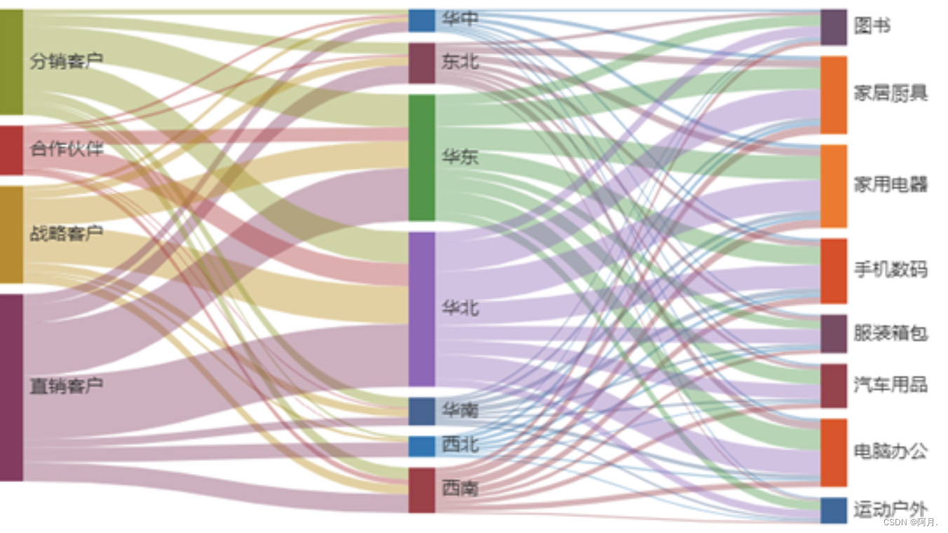
网上主流的桑葚图大概就是如下图所示,我们本篇文章也是还原如下效果
安装步骤
实现桑葚图,我借用了python的pyecharts组件
pyecharts实际上就是Echarts 与 python 的对接
- 安装python,这里不再阐述
- 安装pyecharts
pip3 install pyecharts
- 安装openpyxl
pip3 install openpyxl
附上官方文档:https://gallery.pyecharts.org/#/README
实现代码
import pandas as pd
from pyecharts.charts import Sankey
from pyecharts import options as opts
import os
from pyecharts.charts import Pie,Bar,Map,Page,Funnel
def get_data(df):
    nodes =[]
    for i in range(2):
        vales=df.iloc[:,i].unique()
        for value in vales:
            dic={}
            dic['name']=value
            nodes.append(dic)

    nodes1 = []
    for id in nodes:
        if id not in nodes1:
            nodes1.append(id)
    # print(nodes1)

    links=[]
    for i in df.values:
        dic={}
        dic['source']=i[0]
        dic['target']=i[1]
        dic['value']=i[2]
        links.append(dic)
    return nodes1,links


# print(links)
def get_tu(tablename,df):
    nodes1,links = get_data(df)
    sankey = (
        Sankey(init_opts=opts.InitOpts(width="2000px", height="800px"))
        .add(
            tablename,
            nodes1,
            links,
            pos_top="10%",
            node_width = 30,  #每个桑基图矩形的宽度
            node_gap= 12,  #桑基图中每一列任意两个矩形节点之间的间隔。
            is_draggable = True,
            layout_iterations = 5,

            # focus_node_adjacency=True,
            itemstyle_opts=opts.ItemStyleOpts(border_width=2, border_color="#aaa"),
            linestyle_opt=opts.LineStyleOpts(opacity=0.8, curve=0.5, color='source'),
            label_opts=opts.LabelOpts(position='right'),
        )
        .set_global_opts(title_opts=opts.TitleOpts(title="用户路径分析"))
    )
    return sankey
file ='/Users/superyue/Desktop/tu/user2.xlsx'
df_0826 = pd.read_excel(file,sheet_name='result')
sk1 = get_tu('tets',df_0826)
sk1.render("/Users/superyue/Desktop/tu/test.html")
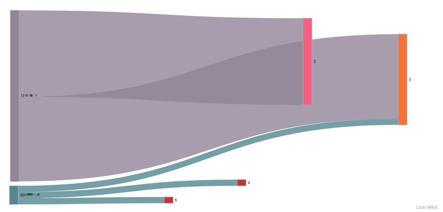
效果如下:
总结
如果出现数据丢进去了,程序也运行成功了,但是效果图出不来
那么一定是source和target对应的excel列重复了
以及source或者target列尽量不要出现INT类型的数据(当然也可以通过代码修改)


 被折叠的 条评论
为什么被折叠?
被折叠的 条评论
为什么被折叠?
 到【灌水乐园】发言


