


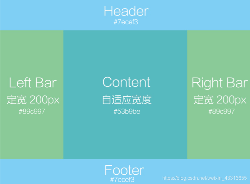
牛客网的一道面试题,要求左右宽度固定中间自适应,如下图的布局方式
一、弹性布局
父元素display:flex子元素会全部并列在一排。
子元素中flex:n的宽度会将父元素的宽度/n
如flex:1,宽度就等于父元素宽度。
*{
margin: 0;
padding: 0;
text-align: center;
font-size: 25px;
color: white;
line-height:100px;
}
.header{
width: 100%;
height: 100px;
background-color: #7ecef3;
}
.center{
display: flex;/  !
}
.content{
background-color: #53b9b1;
flex:1;/  !
}
.left_bar{
height: 700px;
width: 200px;
background-color: #89c997;
}

.right_bar{
width: 200px;
background-color: #89c997;
}
.footer{
width: 100%;
height: 100px;
background-color: #7ecef3;
}
<div class="header">header</div>
<div class="center">
 <div class="left_bar">left_bar</div>
 <div class="right_bar">right_bar</div>
 <div class="content">content</div>
</div>
<div class="footer">footer</div>
二、absolute相对定位
.header{
    width: 100%;
    height: 100px;
    background-color: #7ecef3;

}
 .center{
    position: relative;
 }
 .content{
    background-color: #53b9b1;
   position: absolute;/ !
   left: 200px; !
   right: 200px;// !
    height: 500px;
 }
  .left_bar{
      width: 200px;
      position: absolute;
      left: 0;
      background-color: #89c997;
      height: 500px;
      }

 .right_bar{
      width: 200px;
      background-color: #89c997;
      position: absolute;
      right:  0;
      height: 500px;
      }
 .footer{
    width: 100%;
    height: 100px;
    background-color: #7ecef3;
    position: absolute;
     bottom: 0;
}
三、float浮动,加margin-left、margin-right
 .header {
        width: 100%;
        height: 100px;
        background-color: #7ecef3;
    }
    .left_bar {
        width: 200px;
        background-color: #89c997;
        float: left;
        height: 500px;
    }
    .right_bar {
        width: 200px;
        background-color: #89c997;
        float: right;
        height: 500px;
    }
    .content {
        background-color: #53b9b1;
        margin-left: 200px;/  !
        margin-right: 200px;/ !
        height: 500px;
    }

    .footer {
        width: 100%;
        height: 100px;
        background-color: #7ecef3;
    }
浮动时注意先后顺序,否则会达不到效果
 <div class="left_bar">left_bar</div>
 <div class="right_bar">right_bar</div>
 <div class="content">content</div>


 1586
1586


 被折叠的 条评论
为什么被折叠?
被折叠的 条评论
为什么被折叠?
 到【灌水乐园】发言


