


flex容器中的四个属性的功能/参数
flex容器是具有:display:flex的属性元素
↓ 语法定义
 <head>
    <style type="text/css">
        #box{
            display: flex;
        }
    </style>
  </head>
  <body>
      <div id="box"></div>
  </body>
1.主轴方向与换行方式
| 元素 | 属性 | 含义 |
|---|---|---|
| flex-flow | row nowrap | 默认的,主轴水平方向排列,不换行 |
| flex-flow | row wrap | 主轴水平方向排列,进行换行 |
| flex-flow | column nowrap | 主轴垂直方向排列,不换行 |
| flex-flow | column wrap | 主轴垂直方向排列,进行换行 |
① flex-flow:row nowrap 演示

大家可以看到flex-flow:row nowrap参数,只要里面项目增加,里面原本的项目宽度就会被压缩,不会进行换行。
② flex-flow:row wrap 演示

大家可以看到flex-flow:row wrap参数,里面的项目增加了只要超过了原始设置好的宽度,那么这些项目就会进行系统自动换行,移植到下面。
③ flex-flow:column nowrap 演示
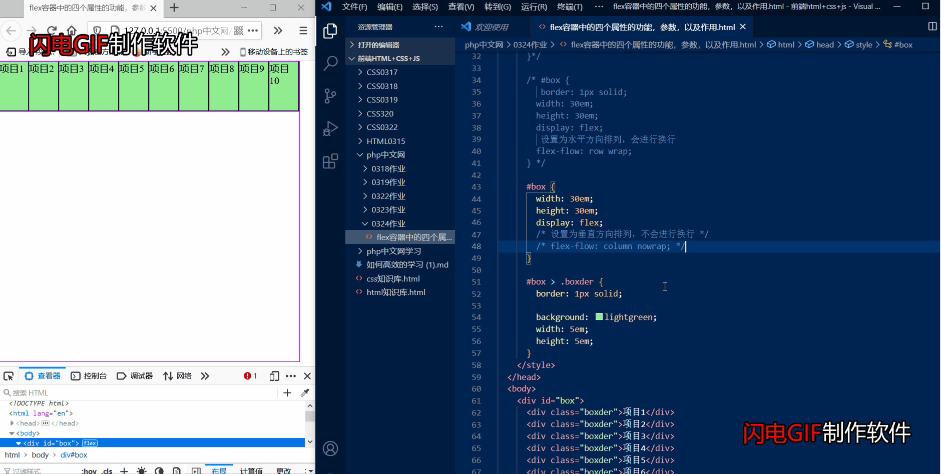
大家可以看到flex-flow:column nowrap参数,是垂直方向排列,里面项目增加,里面原本的项目宽度就会被压缩,不会进行换行。
④ flex-flow:column wrap 演示

大家可以看到flex-flow:column wrap参数,是垂直排列,会进行换行,原理都是一样的,只是排列方式不一样。
2.项目在主轴上的对齐方式
| 元素 | 属性 | 含义 |
|---|---|---|
| justify-content | flex-start | 默认起始线 |
| justify-content | flex-end | 终止线 |
| justify-content | center | 居中 |
| justify-content | space-between | 两端对齐 |
| justify-content | space-around | 分散对齐 |
| justify-content | space-evenly | 平均对齐 |
① justify-content:flex-start 演示
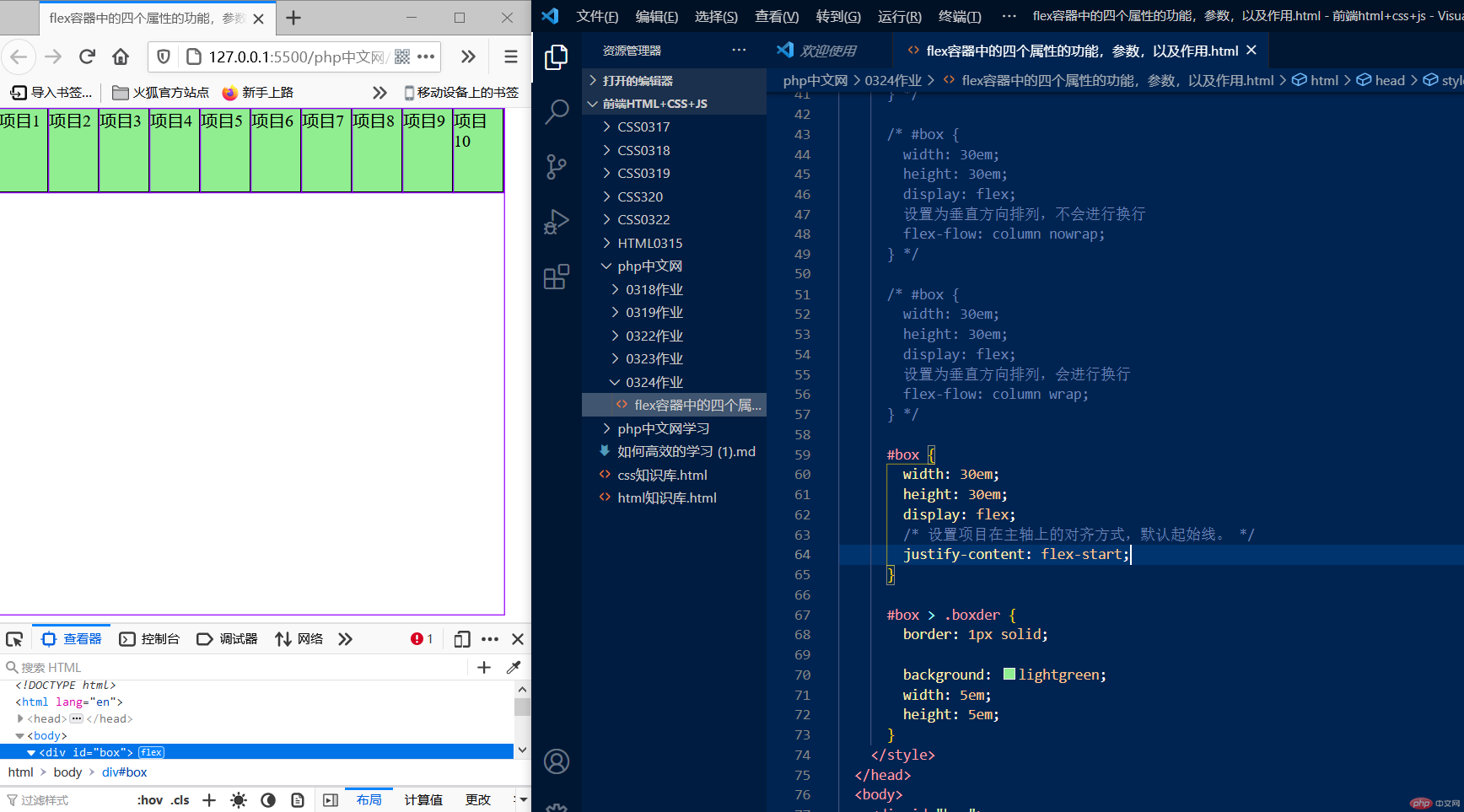
默认起始线,没有变化
② justify-content:flex-end 演示
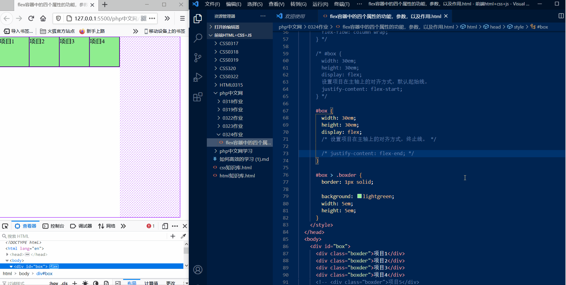
大家可以看到justify-content:flex-end参数,把项目移动到了水平排列的终止线,也就是最底部。
③ justify-content:center 演示

大家可以看到justify-content:center参数,把项目移动到了水平线的中间部位,把项目居中了!
④ justify-content:space-between 演示

大家可以看到justify-space-between参数,把项目进行了两端对齐,除了最左边和最右边的外边距,其他的外边距大小都是一致的。
⑤ justify-content:space-around 演示

大家可以看到justify-space-around参数,把项目进行了分散对齐。
⑥ justify-content:space-evenly 演示

大家可以看到justify-space-space-evenly参数,把项目进行了平均对齐,左右的外边距都是一样的。
3.项目在交叉轴的对齐方式
| 元素 | 属性 | 含义 |
|---|---|---|
| align-items | stretch | 默认拉伸 |
| align-items | flex-start | 起始线 |
| align-items | flex-end | 终止线 |
| align-items | center | 居中 |
① align-items stretch 演示

大家可以看到align-items stretch参数,默认在垂直方向是拉伸的。
② align-items flex-start 演示

大家可以看到align-items flex-start参数,上面可以看到垂直方向默认是拉伸的,用flex-start把项目的垂直方向设置在起始线,可以看到变短了。
③ align-items flex-end 演示

大家可以看到align-items flex-end参数,把项目设置在垂直方向终点线上,也就是最下面。
④ align-items center 演示

大家可以看到align-items center参数,把项目定位在了垂直方向的中间部位,把项目居中了。
4.项目在多行容器交叉轴上的对齐方式
| 元素 | 属性 | 含义 |
|---|---|---|
| align-content | flex-start | 起始线 |
| align-content | flex-end | 终止线 |
| align-content | stretch | 默认拉伸 |
| align-content | center | 居中 |
① align-content flex-start 演示

大家可以看到align-content flex-start参数,把多行项目都定位到了起始线上。下面几个参数原理都一样,就不一一演示了,下面来讲一下flex让块级元素居中的用法。
代码块
<!DOCTYPE html>
<html lang="en">
  <head>
    <meta charset="UTF-8" />
    <meta http-equiv="X-UA-Compatible" content="IE=edge" />
    <meta name="viewport" content="width=device-width, initial-scale=1.0" />
    <title>flex容器中的四个属性的功能,参数,以及作用</title>
    <style type="text/css">
      * {
        padding: 0;
        margin: 0;
        box-sizing: border-box;
      }
      /* 设置元素html字体为10px */
      :root {
        font-size: 10px;
      }
      /* body字体为16px */
      body {
        font-size: 1.6rem;
      }

      /* 定义一个flex容器
      #box {
        border: 1px solid;
        width: 30em;
        height: 30em;
         转变为flex容器
        display: flex;
        设置为水平方向排列,不换行元素
        flex-flow: row nowrap;
      }*/

      /* #box {
         border: 1px solid;
        width: 30em;
        height: 30em;
        display: flex;
         设置为水平方向排列,会进行换行
        flex-flow: row wrap;
      } */

      /* #box {
        width: 30em;
        height: 30em;
        display: flex;
        设置为垂直方向排列,不会进行换行
        flex-flow: column nowrap;
      } */

      /* #box {
        width: 30em;
        height: 30em;
        display: flex;
        设置为垂直方向排列,会进行换行
        flex-flow: column wrap;
      } */

      /* #box {
        width: 30em;
        height: 30em;
        display: flex;
        设置项目在主轴上的对齐方式,默认起始线。
        justify-content: flex-start;
      } */

      /* #box {
        width: 30em;
        height: 30em;
        display: flex;
        设置项目在主轴上的对齐方式,终止线。

        justify-content: flex-end;
      } */

      /* #box {
        width: 30em;
        height: 30em;
        display: flex;
        设置项目在主轴上的对齐方式,居中。

        justify-content: center;
      } */

      /* #box {
        width: 30em;
        height: 30em;
        display: flex;
        设置项目在主轴上的对齐方式,两端对齐。

        justify-content: space-between;
      } */

      /* #box {
        width: 30em;
        height: 30em;
        display: flex;
        设置项目在主轴上的对齐方式,分散对齐。

        justify-content: space-around;
      } */

      /* #box {
        width: 30em;
        height: 30em;
        display: flex;
        设置项目在主轴上的对齐方式,平均对齐。

        justify-content: space-evenly;
      } */
      /*
      #box {
        width: 30em;
        height: 30em;
        display: flex;
        设置项目在交叉轴的对齐方式,默认拉伸。

        align-items: stretch;
      } */

      /* #box {
        width: 30em;
        height: 30em;
        display: flex;
        设置项目在交叉轴的对齐方式,起始线。

        align-items: flex-start;
      } */

      /* #box {
        width: 30em;
        height: 30em;
        display: flex;
        设置项目在交叉轴的对齐方式,终止线。

        align-items: flex-end;
      } */

      /* #box {
        width: 30em;
        height: 30em;
        display: flex;
        设置项目在交叉轴的对齐方式,居中。

        align-items: center;
      } */

      #box {
        width: 30em;
        height: 30em;
        display: flex;
        /* 设置项目在多行容器交叉轴上的对齐方式,起始线。 */
        flex-flow: row wrap;
        align-content: flex-start;
      }

      #box > .boxder {
        border: 1px solid;

        background: lightgreen;
        width: 5em;
        height: 5em;
      }
    </style>
  </head>
  <body>
    <div id="box">
      <div class="boxder">项目1</div>
      <div class="boxder">项目2</div>
      <div class="boxder">项目3</div>
      <div class="boxder">项目4</div>
      <div class="boxder">项目5</div>
      <div class="boxder">项目6</div>
      <div class="boxder">项目7</div>
      <div class="boxder">项目8</div>
      <div class="boxder">项目9</div>
      <div class="boxder">项目10</div>
    </div>
  </body>
</html>
flex简单实现让项目居中
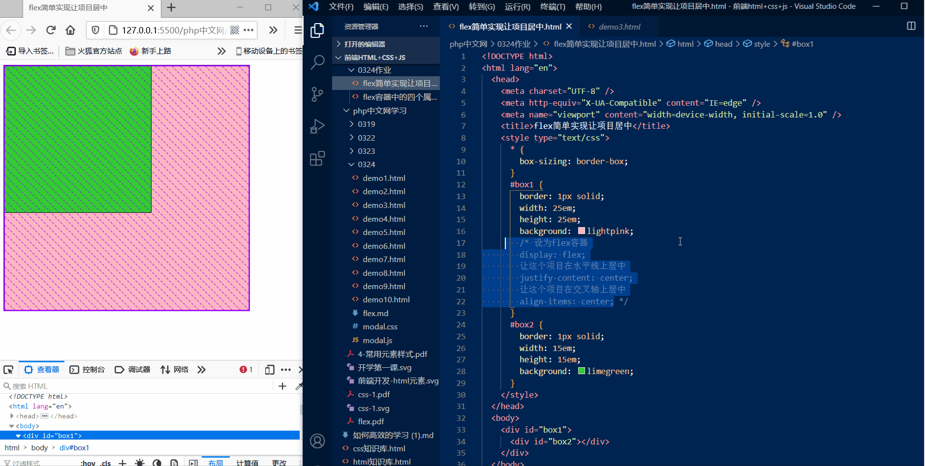
怎么样很简单吧?几行代码搞定。不像之前的定位要设置很多参数,使用flex布局会更加的简洁方便!
代码块
<!DOCTYPE html>
<html lang="en">
  <head>
    <meta charset="UTF-8" />
    <meta http-equiv="X-UA-Compatible" content="IE=edge" />
    <meta name="viewport" content="width=device-width, initial-scale=1.0" />
    <title>flex简单实现让项目居中</title>
    <style type="text/css">
      * {
        box-sizing: border-box;
      }
      #box1 {
        border: 1px solid;
        width: 25em;
        height: 25em;
        background: lightpink;
        /* 设为flex容器 */
        display: flex;
        /* 让这个项目在水平线上居中 */
        justify-content: center;
        /* 让这个项目在交叉轴上居中 */
        align-items: center;
      }
      #box2 {
        border: 1px solid;
        width: 15em;
        height: 15em;
        background: limegreen;
      }
    </style>
  </head>
  <body>
    <div id="box1">
      <div id="box2"></div>
    </div>
  </body>
</html>


 1620
1620


 被折叠的 条评论
为什么被折叠?
被折叠的 条评论
为什么被折叠?
 到【灌水乐园】发言


