


说到Python当中的可视化模块,相信大家用的比较多的还是matplotlib、seaborn等模块,今天小编来尝试用Plotly模块为大家绘制可视化图表,和前两者相比,用Plotly模块会指出来的可视化图表有着很强的交互性。
柱状图
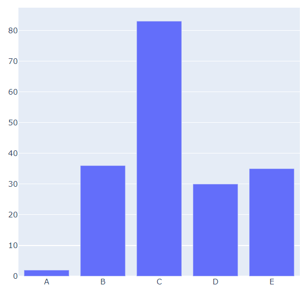
我们先导入后面需要用到的模块并且生成一批假数据,
import numpy as np
import plotly.graph_objects as go

# create dummy data
vals = np.ceil(100 * np.random.rand(5)).astype(int)
keys = ["A", "B", "C", "D", "E"]
我们基于所生成的假数据来绘制柱状图,代码如下
fig = go.Figure()
fig.add_trace(
 go.Bar(x=keys, y=vals)
)
fig.update_layout(height=600, width=600)
fig.show()
output
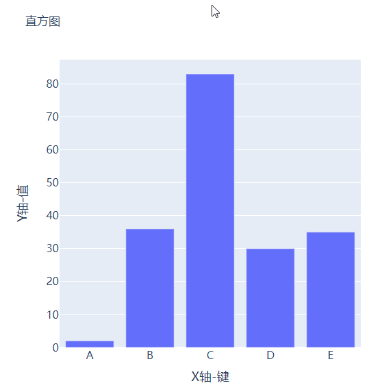
可能读者会感觉到绘制出来的图表略显简单,我们再来完善一下,添加上标题和注解,代码如下
# create figure
fig = go.Figure()
# 绘制图表
fig.add_trace(
    go.Bar(x=keys, y=vals, hovertemplate="<b>Key:</b> %{x}<br><b>Value:</b> %{y}<extra></extra>")
)
# 更新完善图表
fig.update_layout(
    font_family="Averta",
    hoverlabel_font_family="Averta",
    title_text="直方图",
    xaxis_title_text="X轴-键",
    xaxis_title_font_size=18,
    xaxis_tickfont_size=16,
    yaxis_title_text="Y轴-值",
    yaxis_title_font_size=18,
    yaxis_tickfont_size=16,
    hoverlabel_font_size=16,
    height=600,
    width=600
)
fig.show()
output
分组条形图和堆积条形图
例如我们有多
 最低0.47元/天 解锁文章


 1114
1114


 被折叠的 条评论
为什么被折叠?
被折叠的 条评论
为什么被折叠?
 到【灌水乐园】发言


