


PySimpleGUI.py原文说明
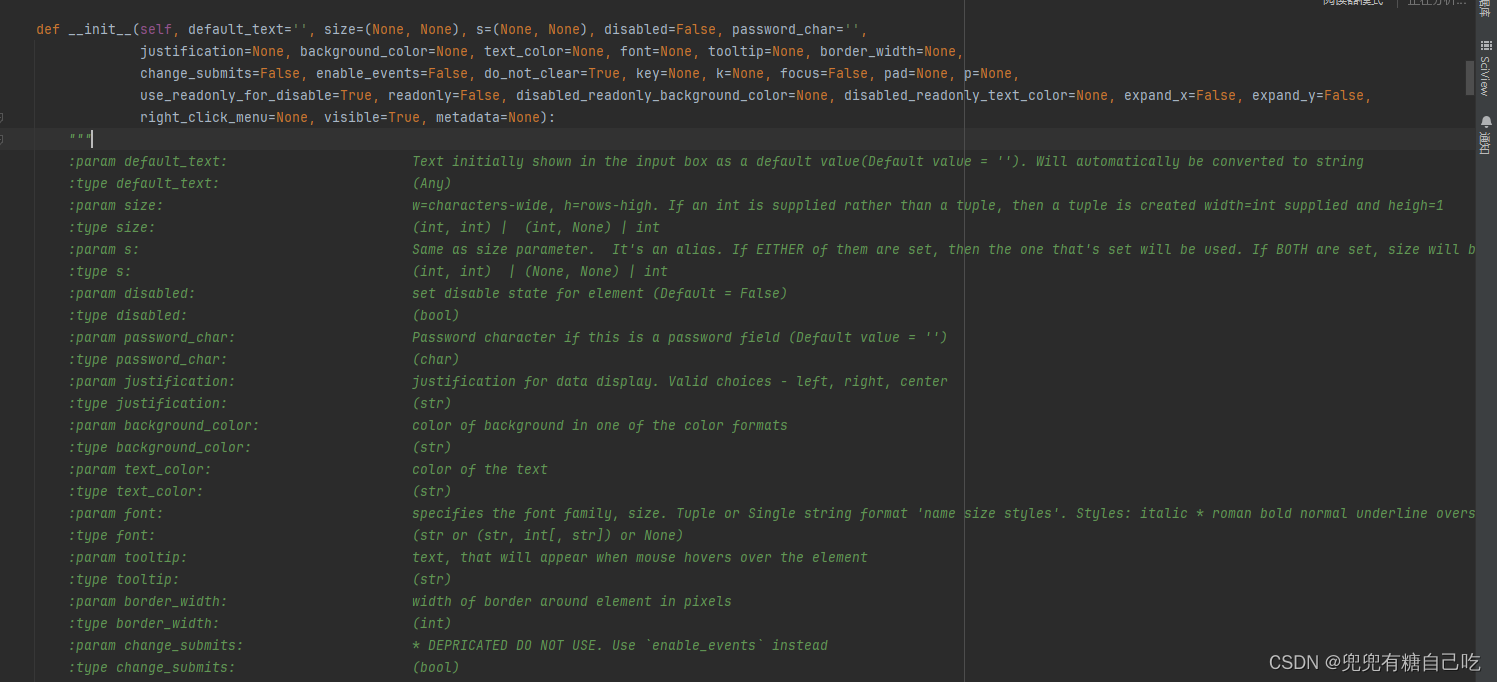
def __init__(self, default_text='', size=(None, None), s=(None, None), disabled=False, password_char='',
justification=None, background_color=None, text_color=None, font=None, tooltip=None, border_width=None,
change_submits=False, enable_events=False, do_not_clear=True, key=None, k=None, focus=False, pad=None, p=None,
use_readonly_for_disable=True, readonly=False, disabled_readonly_background_color=None, disabled_readonly_text_color=None, expand_x=False, expand_y=False,
right_click_menu=None, visible=True, metadata=None):
"""
:param default_text: Text initially shown in the input box as a default value(Default value = ''). Will automatically be converted to string
:type default_text: (Any)
:param size: w=characters-wide, h=rows-high. If an int is supplied rather than a tuple, then a tuple is created width=int supplied and heigh=1
:type size: (int, int) | (int, None) | int
:param s: Same as size parameter. It's an alias. If EITHER of them are set, then the one that's set will be used. If BOTH are set, size will be used
:type s: (int, int) | (None, None) | int
:param disabled: set disable state for element (Default = False)
:type disabled: (bool)
:param password_char: Password character if this is a password field (Default value = '')
:type password_char: (char)
:param justification: justification for data display. Valid choices - left, right, center
:type justification: (str)
:param background_color: color of background in one of the color formats
:type background_color: (str)
:param text_color: color of the text
:type text_color: (str)
:param font: specifies the font family, size. Tuple or Single string format 'name size styles'. Styles: italic * roman bold normal underline overstrike
:type font: (str or (str, int[, str]) or None)
:param tooltip: text, that will appear when mouse hovers over the element
:type tooltip: (str)
:param border_width: width of border around element in pixels
:type border_width: (int)
:param change_submits: * DEPRICATED DO NOT USE. Use `enable_events` instead
:type change_submits: (bool)
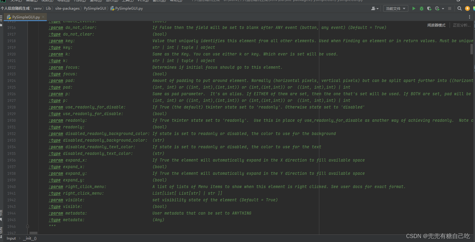
:param enable_events: If True then changes to this element are immediately reported as an event. Use this instead of change_submits (Default = False)
:type enable_events: (bool)
:param do_not_clear: If False then the field will be set to blank after ANY event (button, any event) (Default = True)
:type do_not_clear: (bool)
:param key: Value that uniquely identifies this element from all other elements. Used when Finding an element or in return values. Must be unique to the window
:type key: str | int | tuple | object
:param k: Same as the Key. You can use either k or key. Which ever is set will be used.
:type k: str | int | tuple | object
:param focus: Determines if initial focus should go to this element.
:type focus: (bool)
:param pad: Amount of padding to put around element. Normally (horizontal pixels, vertical pixels) but can be split apart further into ((horizontal left, horizontal right), (vertical above, vertical below)). If int is given, then converted to tuple (int, int) with the value provided duplicated
:type pad: (int, int) or ((int, int),(int,int)) or (int,(int,int)) or ((int, int),int) | int
:param p: Same as pad parameter. It's an alias. If EITHER of them are set, then the one that's set will be used. If BOTH are set, pad will be used
:type p: (int, int) or ((int, int),(int,int)) or (int,(int,int)) or ((int, int),int) | int
:param use_readonly_for_disable: If True (the default) tkinter state set to 'readonly'. Otherwise state set to 'disabled'
:type use_readonly_for_disable: (bool)
:param readonly: If True tkinter state set to 'readonly'. Use this in place of use_readonly_for_disable as another way of achieving readonly. Note cannot set BOTH readonly and disabled as tkinter only supplies a single flag
:type readonly: (bool)
:param disabled_readonly_background_color: If state is set to readonly or disabled, the color to use for the background
:type disabled_readonly_background_color: (str)
:param disabled_readonly_text_color: If state is set to readonly or disabled, the color to use for the text
:type disabled_readonly_text_color: (str)
:param expand_x: If True the element will automatically expand in the X direction to fill available space
:type expand_x: (bool)
:param expand_y: If True the element will automatically expand in the Y direction to fill available space
:type expand_y: (bool)
:param right_click_menu: A list of lists of Menu items to show when this element is right clicked. See user docs for exact format.
:type right_click_menu: List[List[ List[str] | str ]]
:param visible: set visibility state of the element (Default = True)
:type visible: (bool)
:param metadata: User metadata that can be set to ANYTHING
:type metadata: (Any)
"""
我将上面的信息整理了下
| 参数名 | 值类型 | 说明 |
| default_text: | (Any) | 输入框默认值 |
| size: | (int,int)|(int,None)|int | w=字符宽,h=行高。如果提供了int而不是元组,则创建一个元组,提供width=int和heigh=1 |
| s: | (int,int)|(None,None)|int | 与size参数相同。这是一个别名 |
| disabled: | (bool) | 设置元素的禁用状态(默认值为False) |
| password_char: | (char) | 密码字符(如果这是密码字段)(默认值=“”) |
| justification: | (str) | 数据显示的正当性。有效的选择-左、右、中 |
| background_color: | (str) | 背景颜色 |
| text_color: | (str) | 文本的颜色 |
| font: | (stror(str,int[,str])orNone) | 指定字体系列和大小 |
| tooltip: | (str) | 文本,当鼠标悬停在元素上时将显示 |
| border_width: | (int) | 元素周围边框的宽度(以像素为单位) |
| change_submits: | (bool) | *未经处理的请勿使用。改为使用“enable_events” |
| enable_events: | (bool) | 如果为True,则对该元素的更改将立即报告为事件。使用此项而不是change_submits(默认值为False) |
| do_not_clear: | (bool) | 如果为False,则在其他事件(按钮,任何事件)之后该字段将设置为空白(默认值=True) |
| key: | str|int|tuple|object | 从所有其他元素中唯一标识此元素的值。在查找元素或返回值时使用。必须是窗口唯一的 |
| k: | str|int|tuple|object | 与key相同。您可以使用k或key。将使用已设置的。 |
| focus: | (bool) | 确定初始焦点是否应转到要素 |
| pad: | (int,int)or((int,int),(int,int))or(int,(int,int))or((int,int),int)|int | 元素周围的填充量。通常(水平像素、垂直像素),但可以进一步拆分为((左水平、右水平)、(上垂直、下垂直))。如果给定int,则转换为元组(int,int),提供的值重复 |
| p: | (int,int)or((int,int),(int,int))or(int,(int,int))or((int,int),int)|int | 与pad参数相同。这是一个别名。 |
| use_readonly_for_disable: | (bool) | 如果为True(默认值),则tkinter-state设置为“readonly”。否则,状态设置为“已禁用” |
| readonly: | (bool) | 如果Truetkinterstate设置为“readonly”。用它代替Use_readonly_for_disable作为实现只读的另一种方式。 |
| disabled_readonly_background_color: | (str) | 如果状态设置为只读或禁用,则用于背景的颜色 |
| disabled_readonly_text_color: | (str) | 如果状态被设置为只读或禁用,用于文本的颜色 |
| expand_x: | (bool) | 如果为True,则图元将自动在X方向上展开以填充可用空间 |
| expand_y: | (bool) | 如果为True,则图元将自动在Y方向上展开以填充可用空间 |
| right_click_menu: | List[List[List[str]|str]] | 右键单击此元素时要显示的菜单项列表。有关确切格式,请参阅用户文档。 |
| visible: | (bool) | 设置图元的可见性状态(默认值为True) |
| metadata: | (Any) | 可以设置为ANYTHING的用户元数据 |
参数使用样例
    [PySimpleGUI.InputText(text,
                   key="-Text-",                # 元素唯一标识符,用于元素的定位
                   size=(None, None),           # 元素宽度,行高(int, int)
                   text_color=None,             # 输入框里的文本颜色
                   background_color=None,       # 输入框的颜色
                   justification=None,          # 对齐方式: "left", "right", "center"
                   disabled=None,               # 元素禁用,如果为True则禁用,无法输入任何值
                   disable_readonly_background_color=None,  # 元素禁用时的背景颜色设定
                   disable_readonly_text_color=None,        # 元素禁用时的文本颜色设定
                   password_char=""             # 密码字符,一般设置为*
                   font=("宋体", 20),            # 设定文字字体,大小,font="宋体",font=("宋体", int) or font["宋体", int]
                   border_width=20,             # 输入框边界线宽度设定
                   enable_events=False,         # bool: 输入框的事件属性,设定为True时,输入值会发生事件
                   do_not_clear=True,           # bool: 输入框内容不被清除,如果为False,一旦发生事件,该输入框内的值会被清楚
                   focus=False,                # 设定焦点,如果为True,则光标显示在此输入框
                   pad=None,                    # 元素间隔设定  记住左右上下((int, int), (int, int))当左右或上下值一样时(int, int)
                   right_click_menu=None,       # 右击可以调出菜单 list[list[Union[List[str],str]]]
                   grab=None,                   # 如果为真,点击此元素可以移动拖拽窗口
                   tooltip=None,                # str: 悬浮文本,当光标置于该元素上方,会显示设定的文本
                   visible=True)]               # bool: 元素可见状态
]
参数写的不对勿喷,评论告诉我改下


 6082
6082


 被折叠的 条评论
为什么被折叠?
被折叠的 条评论
为什么被折叠?
 到【灌水乐园】发言


