


 本文详细介绍了如何在Element-UI的steps组件中,通过HTML和CSS自定义进度状态图标以及完成状态的样式,包括process、success和wait状态的图标设计。
【element-ui】 steps自定义进度图标及完成等状态图标
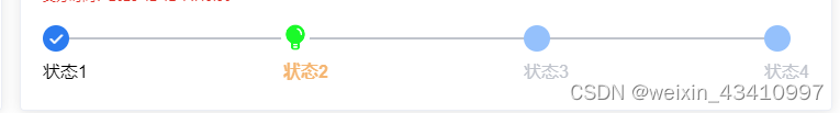
效果图
1.html部分
<el-steps :active="1" finish-status="success" class="steps">
              <el-step title="状态1">
              </el-step>
              <el-step title="状态2">
              </el-step>
              <el-step title="状态3">
              </el-step>
              <el-step title="状态4">
              </el-step>
 </el-steps>
2.css部分
.steps {
      margin-top: 20px;

      ::v-deep .el-step__title.is-process {
        color: #f5b673;
      }
     //process状态自定义图片
      ::v-deep .el-step__head.is-process {
        position: relative;
        height: 24px;

        .el-step__icon.is-text {
          border: none; //不显示圆圈
          position: absolute;
          top: -2px;
          left: -2px;
          width: 26px;
          height: 26px;
          background-color: #fff;
          background-size: 100% 100%;
          background-image: url('~@/assets/img/green-light.png');
        }

        .el-step__icon-inner {
          display: none; //不显示内部数字
        }
      }

      ::v-deep .el-step__title.is-success {
        color: #000;
      }

      ::v-deep .el-step__head.is-success {
        color: #fff;
        border-color: #2b7bf0;


        .el-step__icon.is-text {
          background: #2b7bf0;

        }
      }

      ::v-deep .el-step__head.is-wait {
        border-color: #95c1fc;

        .el-step__icon.is-text {
          background: #95c1fc;

          .el-step__icon-inner {
            color: #95c1fc;
          }

        }
      }
    }


 4万+
4万+


 被折叠的 条评论
为什么被折叠?
被折叠的 条评论
为什么被折叠?
 到【灌水乐园】发言


