


一、ToolBar
1.基本用法
android系统默认显示的是ActionBar,这个是根据项目中指定的主题来显示的,我们新建一个项目MyApplication,打开AndroidManifest.xml文件看一下:
<?xml version="1.0" encoding="utf-8"?>
<manifest xmlns:android="http://schemas.android.com/apk/res/android"
    package="com.shuting.myapplication">

    <application
        android:allowBackup="true"
        android:icon="@mipmap/ic_launcher"
        android:label="@string/app_name"
        android:roundIcon="@mipmap/ic_launcher_round"
        android:supportsRtl="true"
        android:theme="@style/Theme.MyApplication">
		...
    </application>

</manifest>
∙ \bullet ∙ 可以看到其中的android:theme属性指定了一个Theme.MyApplication的主题,定义是在res/values/themes.xml文件中,代码如下所示:
<resources xmlns:tools="http://schemas.android.com/tools">
    <!-- Base application theme. -->
    <style name="Theme.MyApplication" parent="Theme.AppCompat.Light.DarkActionBar">
        <!-- Primary brand color. -->
        <item name="colorPrimary">@color/purple_500</item>
        <item name="colorPrimaryDark">@color/purple_700</item>
        <item name="colorAccent">@color/teal_200</item>
        <!-- Customize your theme here. -->
    </style>
</resources>
∙ \bullet ∙ 在这里我们可以看到它的parent主题是Theme.AppCompat.Light.DarkActionBar,这是一个深色的ActionBar主题,我们之前的项目就是因为指定了这个主题才出现的,现在则需要用ToolBar来替代ActionBar,则将themes.xml中的代码改为下述所示:
<resources>
    <style name="Theme.MyApplication" parent="Theme.AppCompat.Light.NoActionBar">
        <!-- Customize your theme here. -->
        <item name="colorPrimary">@color/colorPrimary</item>
        <item name="colorPrimaryDark">@color/colorPrimaryDark</item>
        <item name="colorAccent">@color/colorAccent</item>
    </style>
</resources>
∙ \bullet ∙ 注意在themes.xml和AndroidManifest.xml中的style name="Theme.MyApplication"都需要是保持一致的。Theme.AppCompat.Light.NoActionBar代表淡色主题,此时我们还需要在res/values/color.xml里面定义这些颜色:
<resources>
...
    <color name="colorPrimary">#3F51B5</color>
    <color name="colorPrimaryDark">#303F9F</color>
    <color name="colorAccent">#FF4081</color>
</resources>
∙ \bullet ∙ 然后修改activity_main.xml中的代码,如下所示:
<?xml version="1.0" encoding="utf-8"?>
<LinearLayout xmlns:android="http://schemas.android.com/apk/res/android"
    xmlns:app="http://schemas.android.com/apk/res-auto"
    xmlns:tools="http://schemas.android.com/tools"
    android:layout_width="match_parent"
    android:layout_height="match_parent"
    tools:context=".MainActivity">

    <android.support.v7.widget.Toolbar
        android:id="@+id/toolbar"
        android:layout_width="match_parent"
        android:layout_height="?attr/actionBarSize"
        android:background="?attr/colorPrimary"
        android:theme="@style/ThemeOverlay.AppCompat.Dark.ActionBar"
        app:popupTheme="@style/ThemeOverlay.AppCompat.Light"/>

</LinearLayout>
∙ \bullet ∙ 然后在MainActivity活动中修改代码:
public class MainActivity extends AppCompatActivity {

    @Override
    protected void onCreate(Bundle savedInstanceState) {
        super.onCreate(savedInstanceState);
        setContentView(R.layout.activity_main);
        Toolbar toolbar=(Toolbar)findViewById(R.id.toolbar);
        setSupportActionBar(toolbar);
    }
}
∙
\bullet
∙ 最终效果如下所示:

2.ToolBar常用功能
我们可以修改标题栏上面的文字内容,需要在AndroidManifest.xml中指定:
    <application
	   ....
        android:theme="@style/Theme.MyApplication">
        <activity android:name=".MainActivity"
            android:label="Map">
		...
        </activity>
    </application>
∙ \bullet ∙ 最简单的办法就是直接在MainActivity中加载ToolBar的时候直接用:
        Toolbar toolbar=(Toolbar)findViewById(R.id.toolbar);
        toolbar.setTitle("Map");
        setSupportActionBar(toolbar);
还可以添加一些action按钮让ToolBar更加丰富一些,我们准备几张图片作为按钮的图标,图标可以从https://www.iconfinder.com/当中获取,很多都是免费的,然后将图片保存到drawable-xxhdpi中,然后在res中创建一个menu文件夹,创建一个toolbar.xml文件:
<menu xmlns:android="http://schemas.android.com/apk/res/android"
    xmlns:app="http://schemas.android.com/apk/res-auto">
    <item
        android:id="@+id/backup"
        android:icon="@drawable/cloud"
        android:title="Backup"
        app:showAsAction="always" />
    <item
        android:id="@+id/delete"
        android:icon="@drawable/trash"
        android:title="Delete"
        app:showAsAction="ifRoom" />
    <item
        android:id="@+id/settings"
        android:icon="@drawable/dot"
        android:title="Settings"
        app:showAsAction="never" />
</menu>
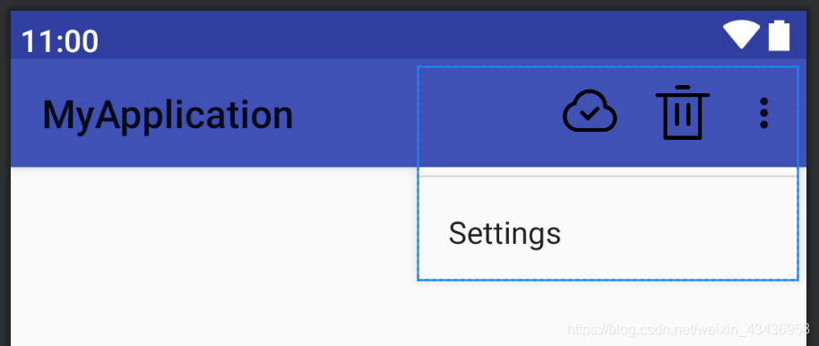
∙ \bullet ∙ 可以看到展示界面如下「icon指定图标,id指定按钮的id,title指定按钮的文字」,采用showsAction来指定按钮的显示位置,always表示永远显示在ToolBar中,如果屏幕控件不够则不显示;ifRoom表示屏幕控件足够的情况下显示,不够的话显示在菜单中;never表示永远显示在菜单中。ToolBar中只会显示图标不显示文字,而菜单中的按钮只会显示文字。
 然后在MainActivity中进行如下代码添加:
    // 这里我们用Menu传入menu,导入菜单布局
    public boolean onCreateOptionsMenu(Menu menu){
        getMenuInflater().inflate(R.menu.toolbar,menu);
        return true;
    }

    public  boolean onOptionsItemSelected(MenuItem item){//菜单的响应事件,根据不同item处理按钮的点击事件
        switch (item.getItemId()){
            case R.id.backup:
                Toast.makeText(this,"You clicked Backup",Toast.LENGTH_SHORT).show();
                break;
            case R.id.delete:
                Toast.makeText(this,"You clicked Delete",Toast.LENGTH_SHORT).show();
                break;
            case R.id.settings:
                Toast.makeText(this,"You clicked Settings",Toast.LENGTH_SHORT).show();
                break;
            default:
        }
        return true;
    }
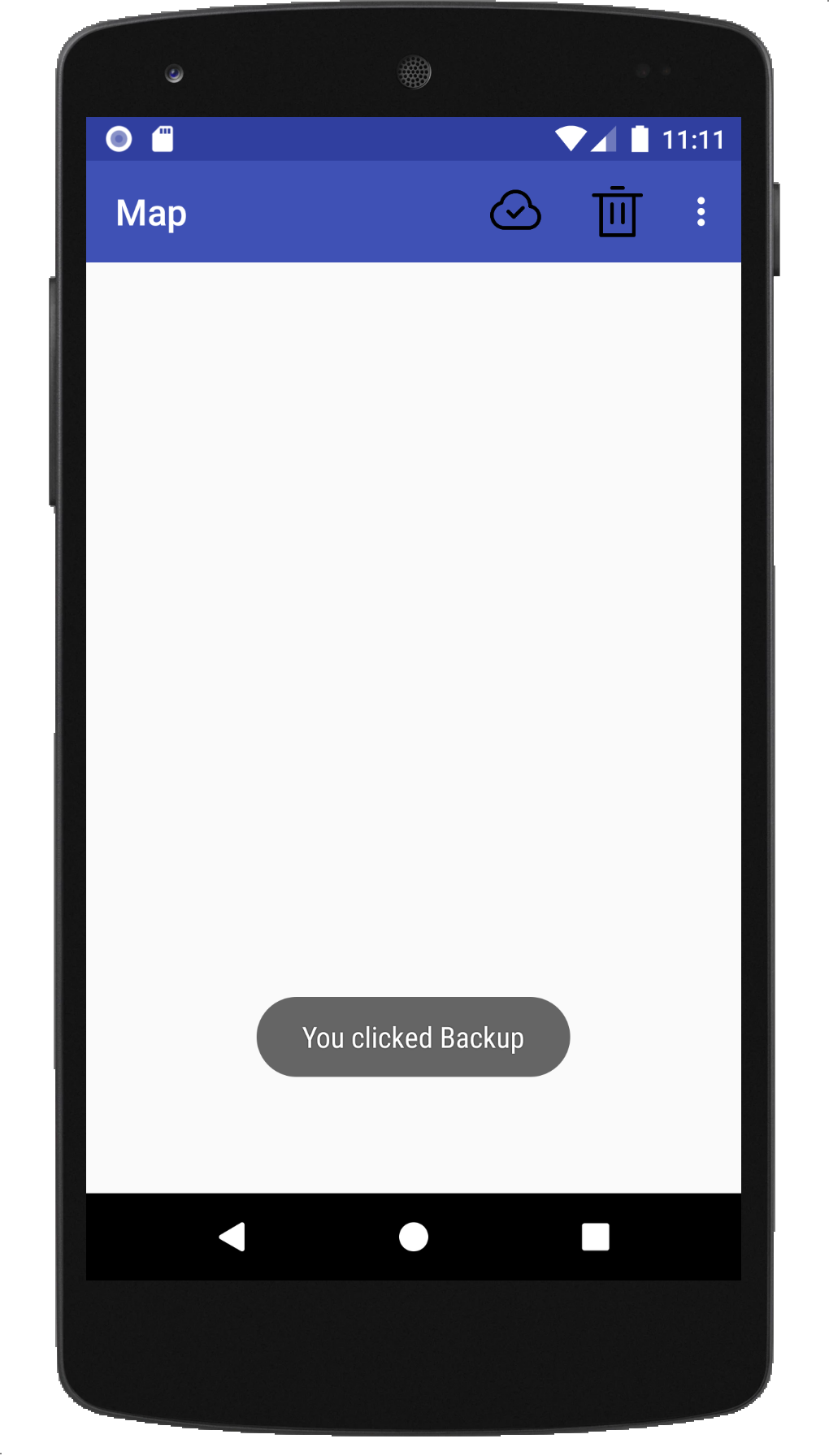
∙ \bullet ∙ 我们首先采用onCreateOptionsMenu()方法加载toolbar.xml这个菜单文件,然后在onOptionsItemSelected()方法中处理各个按钮的点击事件,效果图如下:
二、滑动菜单
1、DrawerLayout
滑动菜单就是将一些菜单选项隐藏起来,而不是放在主屏幕上,可以通过滑动的方式将菜单显示出来,DrawerLayout是一个布局,在布局中允许放入两个直接子控件,第一个子控件是主屏幕中显示的内容,第二个子控件是滑动菜单中显示的内容,我们可以对activity_main.xml代码进行如下修改:
<android.support.v4.widget.DrawerLayout xmlns:android="http://schemas.android.com/apk/res/android"
    xmlns:app="http://schemas.android.com/apk/res-auto"
    xmlns:tools="http://schemas.android.com/tools"
    android:id="@+id/drawer_layout"
    android:layout_width="match_parent"
    android:layout_height="match_parent"
    tools:context=".MainActivity">

    <LinearLayout
        android:layout_width="match_parent"
        android:layout_height="match_parent"
        android:orientation="vertical">

        <android.support.v7.widget.Toolbar
            android:id="@+id/toolbar"
            android:layout_width="match_parent"
            android:layout_height="?attr/actionBarSize"
            android:background="?attr/colorPrimary"
            android:theme="@style/ThemeOverlay.AppCompat.Dark.ActionBar"
            app:popupTheme="@style/ThemeOverlay.AppCompat.Light" />
    </LinearLayout>

    <TextView
        android:layout_width="match_parent"
        android:layout_height="match_parent"
        android:layout_gravity="start"
        android:background="@color/white"
        android:text="This is menu"
        android:textSize="30sp" />

</android.support.v4.widget.DrawerLayout>
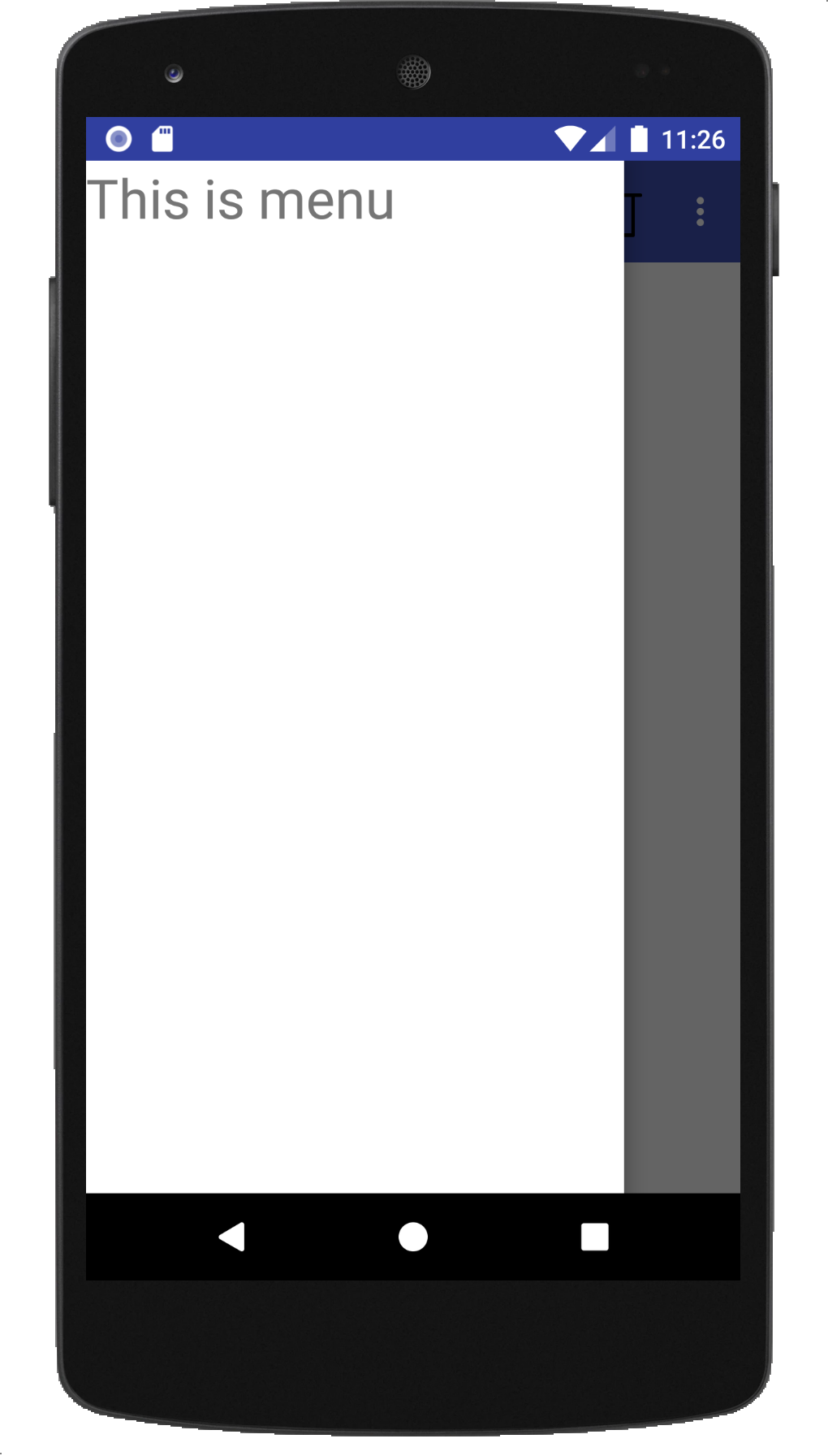
∙ \bullet ∙ 可以看到最外层使用了一个Drawlayout,第一个子控件用线性布局来装载主屏幕中的内容,然后TextView是用于作为滑动菜单中显示的内容,其中 android:layout_gravity="start"表示滑动菜单是从左边划出来,而right则表示从右边划出来,则运行图如下所所示:
但是没有提示用户可以滑动的功能,可以在Toolbar最左边加入一个导航按钮,点击了按钮也会将滑动菜单的内容展示出来,防止一些用户不知道屏幕的左侧边缘是可以滑动的。于是我们修改MainActivity中的代码:
public class MainActivity extends AppCompatActivity {
    private DrawerLayout drawerLayout;

    @Override
    protected void onCreate(Bundle savedInstanceState) {
    	....
         //设置抽屉DrawLayout
        drawerLayout = findViewById(R.id.drawer_layout);
        ActionBar actionBar=getSupportActionBar();
        if(actionBar!=null){
            actionBar.setDisplayHomeAsUpEnabled(true);
        }
    }
        public  boolean onOptionsItemSelected(MenuItem item){//菜单的响应事件,根据不同item处理按钮的点击事件
        switch (item.getItemId()){
            case android.R.id.home:
                drawerLayout.openDrawer(GravityCompat.START);
            default:
        }
        return true;
    }
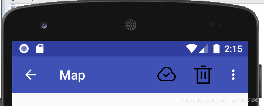
∙ \bullet ∙ 在这里我们得到Drawlayout实例,然后调用getSupportActionBar()得到ActionBar实例,再调用actionBar.setDisplayHomeAsUpEnabled()方法让导航按钮显示出来,然后在onOptionsItemSelected()中对HomeAsUp按钮(就是我们Toolbar左边出现的导航按钮,默认是个箭头)的点击事件进行处理,id号就是android.R.id.home,并用drawerLayout.openDrawer(GravityCompat.START)将滑动菜单展示出来,效果图如下:
2. NavigationView
但是滑动菜单页面比较丑,需要进行页面优化,因此我们可以使用NavigationView,我们需要添加依赖,点击最上方这个按钮:
∙ \bullet ∙ 然后按照下述步骤去找到add dependency:
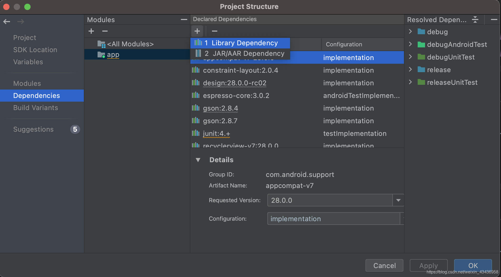
∙ \bullet ∙ 搜索design,确认添加就成功了,查看build.gradle依赖,出现design,然后navigationview就可以使用了,同时加入了一个circleimageview,能够实现图片圆形化的功能:
dependencies {
    implementation 'com.android.support:appcompat-v7:28.0.0'
    implementation 'com.android.support.constraint:constraint-layout:2.0.4'
    implementation 'com.android.support:design:28.0.0-rc02'
    implementation 'de.hdodenhof:circleimageview:3.1.0'
    testImplementation 'junit:junit:4.+'
    androidTestImplementation 'com.android.support.test:runner:1.0.2'
    androidTestImplementation 'com.android.support.test.espresso:espresso-core:3.0.2'
}
在activity_main.xml使用NavigationView如下所示:
    <android.support.design.widget.NavigationView
        android:id="@+id/nav_view"
        android:layout_width="wrap_content"
        android:layout_height="match_parent"
        android:layout_gravity="start"
        app:headerLayout="@layout/nav_header"
        app:menu="@menu/nav_menu"/>
∙ \bullet ∙ NavigationVIew控件中app:headerLayout用来在控件中显示头部布局的,app:menu用来在控件中显示具体菜单项的。
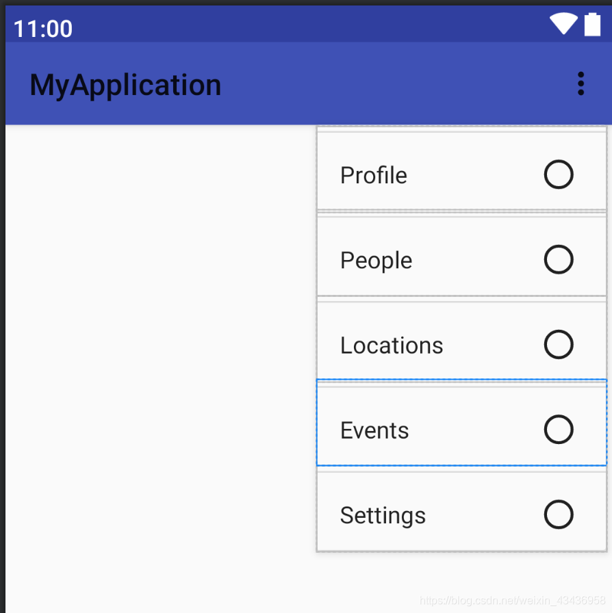
①显示具体菜单项——nav_menu.xml
我们首先在menu文件中创建一个nav_menu.xml,内容如下:
<?xml version="1.0" encoding="utf-8"?>
<menu xmlns:android="http://schemas.android.com/apk/res/android">
<group android:checkableBehavior="single">
    <item
        android:id="@+id/profile"
        android:icon="@drawable/profile"
        android:title="Profile"/>
    <item
        android:id="@+id/people"
        android:icon="@drawable/people"
        android:title="People"/>
    <item
        android:id="@+id/locations"
        android:icon="@drawable/locations"
        android:title="Locations"/>
    <item
        android:id="@+id/events"
        android:icon="@drawable/events"
        android:title="Events"/>
    <item
        android:id="@+id/settings"
        android:icon="@drawable/settings"
        android:title="Settings"/>
</group>
</menu>
∙ \bullet ∙ 我们在 < < <menu > > >中嵌套一个 < < <group > > >标签,这个表示一个组,android:checkableBehavior="single"表示组中的所有菜单项只能单选,效果图如下所示:
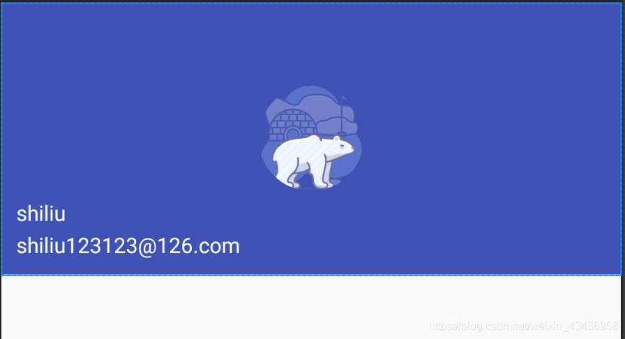
②显示头部布局——nav_header.xml
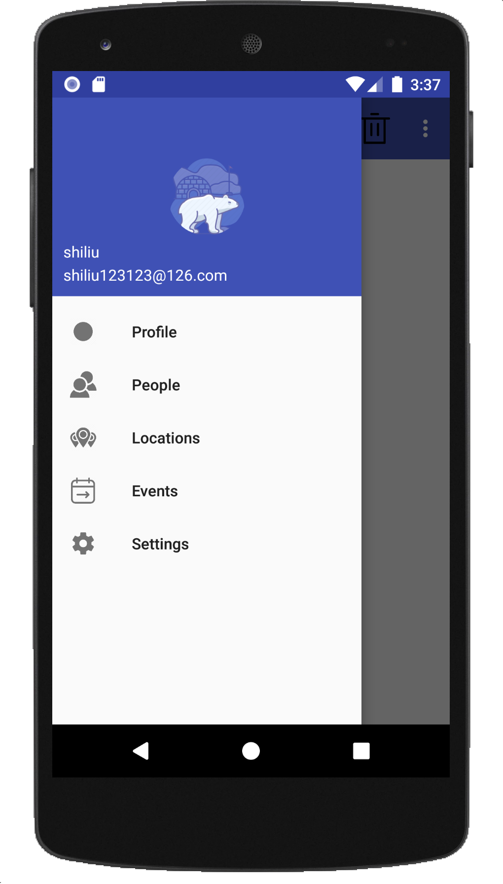
然后我们创建一个headerLayout布局用来显示头部,我们可以放置头像、用户名和邮箱地址。头像因为是圆形化,所以图片最好是正方形,我们在layout文件夹中新建一个nav_header.xml文件,内容如下:
<?xml version="1.0" encoding="utf-8"?>
<RelativeLayout xmlns:android="http://schemas.android.com/apk/res/android"
    android:layout_width="match_parent"
    android:layout_height="180dp"
    android:padding="10dp"
    android:background="?attr/colorPrimary">

    <de.hdodenhof.circleimageview.CircleImageView
        android:id="@+id/icon_image"
        android:layout_width="70dp"
        android:layout_height="70dp"
        android:src="@drawable/animal"
        android:layout_centerInParent="true"/>

    <TextView
        android:id="@+id/email"
        android:layout_width="wrap_content"
        android:layout_height="wrap_content"
        android:layout_alignParentBottom="true"
        android:text="shiliu123123@126.com"
        android:textColor="@color/white"
        android:textSize="14sp"/>

    <TextView
        android:id="@+id/user_name"
        android:layout_width="wrap_content"
        android:layout_height="wrap_content"
        android:paddingBottom="2dp"
        android:layout_above="@+id/email"
        android:text="shiliu"
        android:textColor="@color/white"
        android:textSize="14dp"/>

</RelativeLayout>
∙ \bullet ∙ 头部界面如下所示:
③处理菜单点击项
我们需要将此布局在主界面中展示出来并且设置点击事件:
public class MainActivity extends AppCompatActivity {
    private DrawerLayout drawerLayout;

    @Override
    protected void onCreate(Bundle savedInstanceState) {
        super.onCreate(savedInstanceState);
        setContentView(R.layout.activity_main);
		....
        //设置导航栏NavigationView点击事件
        NavigationView navigationView = findViewById(R.id.nav_view);

        navigationView.setNavigationItemSelectedListener(new NavigationView.OnNavigationItemSelectedListener()

        {
            @Override
            public boolean onNavigationItemSelected (@NonNull MenuItem menuItem){
                switch (menuItem.getItemId()) {
                    case R.id.profile:
                        Toast.makeText(MainActivity.this, "您点击了Profile", Toast.LENGTH_SHORT).show();
                        break;
                    case R.id.people:
                        Toast.makeText(MainActivity.this, "您点击了People", Toast.LENGTH_SHORT).show();
                    case R.id.locations:
                        Toast.makeText(MainActivity.this, "您点击了Locations", Toast.LENGTH_SHORT).show();
                        break;
                    case R.id.events:
                        Toast.makeText(MainActivity.this, "您点击了Events", Toast.LENGTH_SHORT).show();
                    case R.id.settings:
                        Toast.makeText(MainActivity.this, "您点击了Settings", Toast.LENGTH_SHORT).show();
                }
                menuItem.setChecked(true);//点击了它把它设为选中状态
                drawerLayout.closeDrawers();//关闭抽屉
                return true;
            }
        });
    }
∙ \bullet ∙ 这样我们就可以获得一个比较好看的界面了:


 6486
6486


 被折叠的 条评论
为什么被折叠?
被折叠的 条评论
为什么被折叠?
 到【灌水乐园】发言


