


依赖包
seaborn 和 matplotlib 已经提供了很多种绘制方法了,后文各种方法都是围绕着这个进行的
import itertools
import numpy as np
import pandas as pd

import seaborn as sns
import matplotlib.pyplot as plt
对比
下面将给出三种实现方法,效果图分别为:
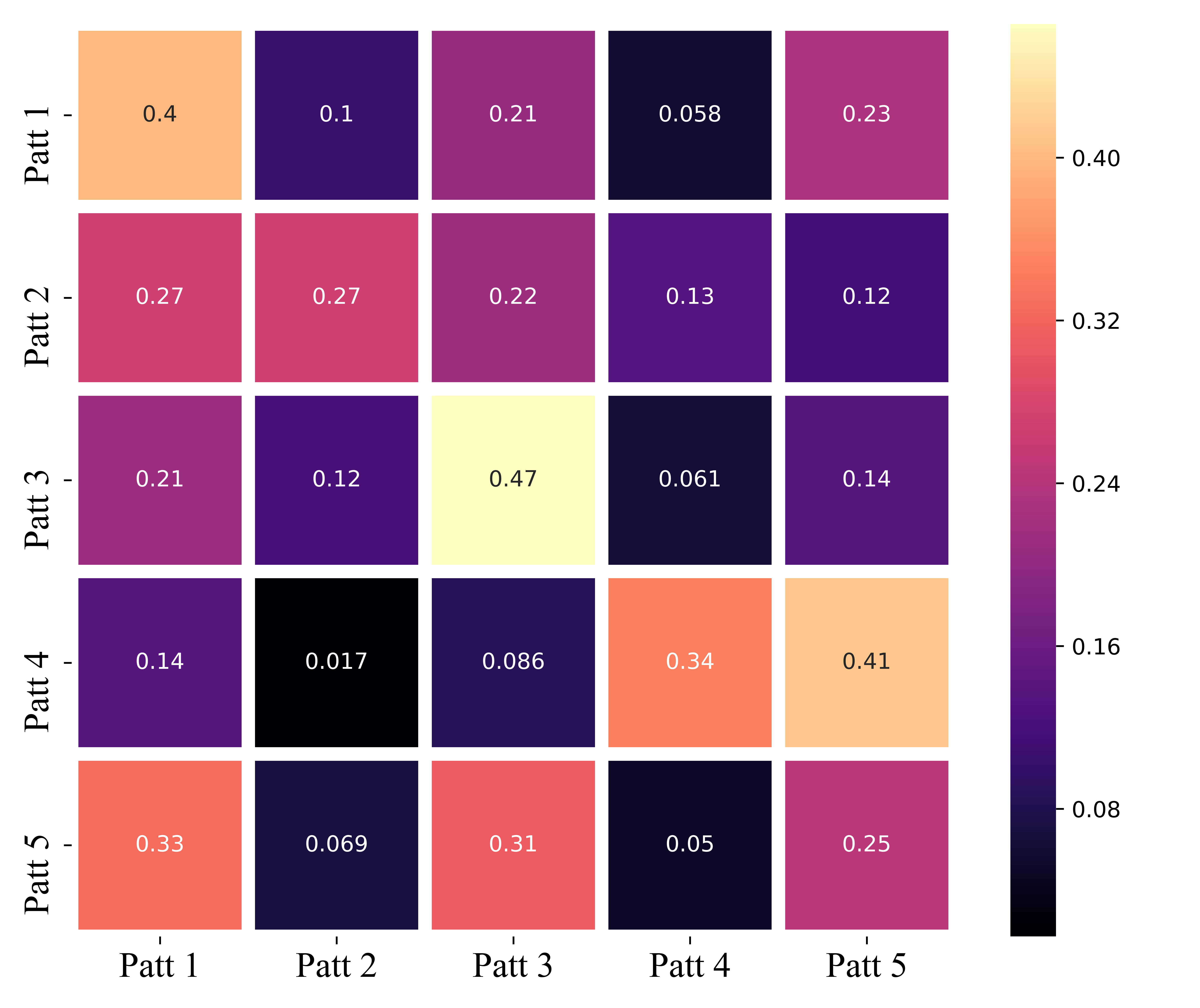
方法1:

方法2:

方法3:
【注意】 关于每个图的颜色效果(称为色彩映射),三种方法的颜色效果都是可以改变的,详情见后文的 【色彩映射】 部分。
方法1
代码:
def heatmap(data, row_labels, col_labels, ax=None,
            cbar_kw={
   }, cbarlabel="", **kwargs):
    """
    Create a heatmap from a numpy array and two lists of labels.

    Parameters
    ----------
    data
        A 2D numpy array of shape (N, M).
    row_labels
        A list or array of length N with the labels for the rows.
    col_labels
        A list or array of length M with the labels for the columns.
    ax
        A `matplotlib.axes.Axes` instance to which the heatmap is plotted.  If
        not provided, use current axes or create a new one.  Optional.
    cbar_kw
        A dictionary with arguments to `matplotlib.Figure.colorbar`.  Optional.
    cbarlabel
        The label for the colorbar.  Optional.
    **kwargs
        All other arguments are forwarded to `imshow`.
    """

    if not ax:
        ax = plt.gca()

    # Plot the heatmap
    im = ax.imshow(data, **kwargs)

    # Create colorbar
    cbar = ax.figure.colorbar(im, ax=ax, **cbar_kw)
    cbar.ax.set_ylabel(cbarlabel, rotation=-90, va="bottom",
                       fontsize=15,family='Times New Roman')

    # We want to show all ticks...
    ax.set_xticks(np.arange(data.shape[1]))
    ax.set_yticks(np.arange(data.shape[0]))
    # ... and label them with the respective list entries.
    ax.set_xticklabels(col_labels,fontsize=12,family='Times New Roman')
    ax.set_yticklabels(row_labels,fontsize=12,family='Times New Roman')

    # Let the horizontal axes labeling appear on top.
    ax.tick_params(top=True, bottom=False,
                   labeltop=True, labelbottom=False)

    # Rotate the tick labels and set their alignment.
    plt.setp(ax.get_xticklabels(), rotation=-30, ha="right",
             rotation_mode="anchor")

    # Turn spines off and create white grid.
    for edge, spine in ax.spines.items():
        spine.set_visible(False)

    ax.set_xticks(np.arange(data.shape[1]+1)-.5, minor=True)
    ax.set_yticks(np.arange(data
最低0.47元/天 解锁文章


 8078
8078


 被折叠的 条评论
为什么被折叠?
被折叠的 条评论
为什么被折叠?
 到【灌水乐园】发言


