


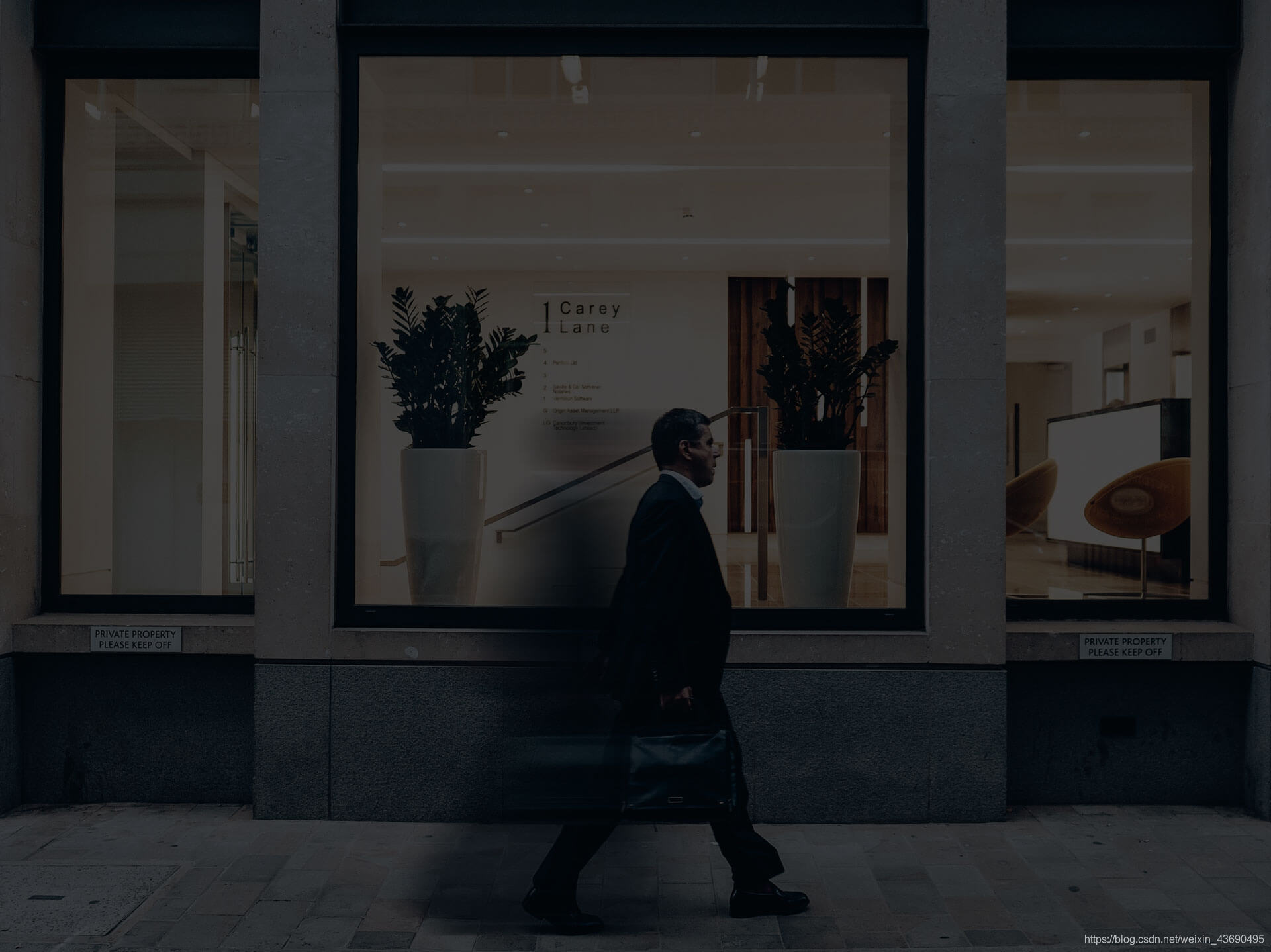
这里为了体现效果,添加了一张图片作为背景。具体效果可以根据个人需求调试。
幽灵按钮:
幽灵按钮通常采用基本的平面形状——正方形、矩形、圆形、菱形等——并且没有填充,只有简单的边框。除了边框和文字之外,其完全或几乎完全透明(所以叫“幽灵按钮”)。
幽灵按钮一般比传统的网站按钮要大一些,并且放置在显眼的位置,例如屏幕正中央。
很多不同类型的网站(和移动应用)上都会有幽灵按钮,而且其设计风格多样,但一般应用于单页式网站或采用极简抽象派主义或纯扁平化设计方案风格的网站。这种按钮风格在使用全屏图片的网页上也很流行,因为相比传统按钮,其简单的风格保证不会影响图像。
你是否曾仔细看过iPhone上的圆形按钮(iOS7上)?其中所有UI要素都是幽灵按钮。
特点:
1. 按钮应为空心
2. 使用边线环绕,边线厚度为一到两点
3. 包含简单的文字
4. 颜色一般为黑或白
5. 一般比传统按钮大
6. 幽灵按钮一般放到页面的显眼位置
7. 幽灵按钮可以单独放置也可以以一小组按钮的形式放置
8. 元素采用扁平化或几乎扁平化的设计方案
9. 幽灵按钮内部可以保守使用较小的几何形状图标
HTML
<div class="backimg">
	<img src="img/hero.jpg" />
</div>

<div class="btnBox">
   	<div class="btn">
		<div class="btn-border-top"></div>
		<div class="btn-top-left"></div>
		<a href="#">HTML5</a>
		<div class="btn-bottom-right"></div>
		<div class="btn-border-bottom"></div>
	</div>
</div>
CSS
* {
    margin: 0;
	padding: 0;
}

.backimg {
	width: 100%;
	height: 100%;
	min-height: 600px;
	position: absolute;
	top: 0;
	right: 0;
	bottom: 0;
	left: 0;
	overflow: hidden;
	z-index: -1;
}

.backimg img {
	width: 100%;
	height: 100%;
}

.btnBox {
	position: absolute;
	width: 100%;
}

.btn {
	width: 200px;
	height: 60px;
	margin: 450px 200px 0 70%;
	background-color: rgba(0,0,0,.8);
	text-align: center;
	position: relative;
}

.btn a {
	display: block;
	text-decoration: none;
	color: #FFFFFF;
	font: bold 20px arial;
	line-height: 60px;
	height: 60px;
}

.btn-border-top, .btn-border-bottom {
	height: 5px;
	background-color: #FFFFFF;
	position: absolute;
	width: 0%;
	transition: .4s;
}

.btn-top-left, .btn-bottom-right {
	height: 0;
	background-color: #FFFFFF;
	position: absolute;
	width: 5px;
	transition: .4s;
}

.btn-border-top {
	right: 0;
	top: 0;
}

.btn-border-bottom {
	left: 0;
	bottom: 0;
}

.btn-top-left {
	left: 0;
	top: 0;
}

.btn-bottom-right {
	right: 0;
	bottom: 0;
}

.btn:hover .btn-border-top {
	width: 100%;
}

.btn:hover .btn-border-bottom {
	width: 100%;
}

.btn:hover .btn-top-left {
	height: 58px;
}

.btn:hover .btn-bottom-right {
	height: 58px;
}

.btn:hover {
	background-color: rgba(0,0,0,0);
}

.btn:hover a {
	color: #FFFFFF;
	text-decoration: none;
}
img


 扫一扫
扫一扫


 2310
2310

 被折叠的 条评论
为什么被折叠?
被折叠的 条评论
为什么被折叠?
 到【灌水乐园】发言


