


问题?有时候我们会看到那种非常炫酷,又很有动画感的页面或者图标动画或者那种透明又由动画的按钮。那应该怎么做呢?
原理:运用css3中的几个属性及jquery,css3,js
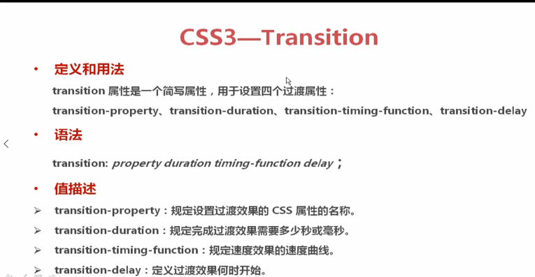
属性介绍:
举个例子:像这样的幽灵按钮。
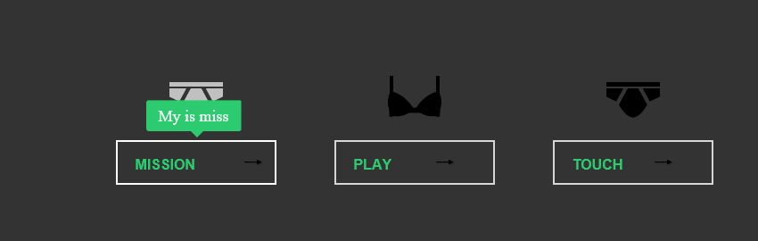
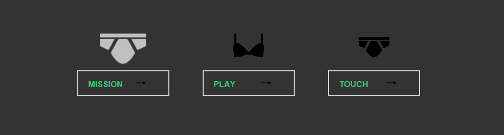
像这样的按钮怎么做呢?
例子:
例子目录
:
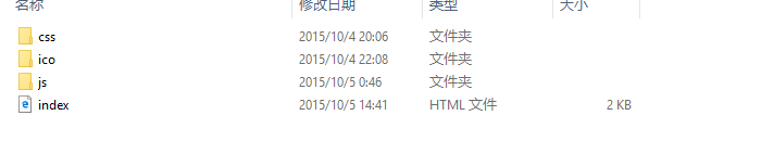
目录文件有那些:
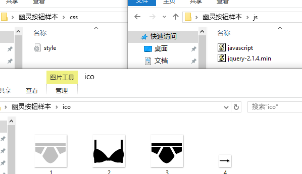
index.html文件
<<!DOCTYPE html>
<html lang="en">
<head>
	<meta charset="UTF-8">
	<title>幽灵按钮</title>
	<link rel="stylesheet" type="text/css" href="css/style.css">
	<script src="js/jquery-2.1.4.min.js"></script>
	<script src="js/javascript.js"></script>
</head>
<body>
<div class="box">
	<div class="link link-miss">
		<span class="icon"></span>
		<a href="#" class="button" data="My is miss">
			<span class="line line-top"></span>
			<span class="line line-right"></span>
			<span class="line line-bottom"></span>
			<span class="line line-left"></span>
			MISSION
		</a>
	</div>

	<div class="link link-play">
		<span class="icon"></span>
		<a href="#" class="button" data="My is play">
			<span class="line line-top"></span>
			<span class="line line-right"></span>
			<span class="line line-bottom"></span>
			<span class="line line-left"></span>
			PLAY
		</a>
	</div>

	<div class="link link-touch">
		<span class="icon"></span>
		<a href="#" class="button" data="My is touch">
			<span class="line line-top"></span>
			<span class="line line-right"></span>
			<span class="line line-bottom"></span>
			<span class="line line-left"></span>
			TOUCH
		</a>
	</div>
	<!-- 提示信息相对全局盒子来定位的 -->
	<div class="tip"><em></em><span></span></div>
</div>
</body>
</html>
/*全局初始化*/
*{
margin: 0;
padding: 0;
}
body{background: #333;}
.box{
width: 800px;
height: 280px;
margin: 50px auto;
position: relative;
/*background: #f00;*/
}
.box .link{
width: 205px;
height: 280px;
float: left;
margin: 0 20px;
}
.link .icon{
display: inline-block;
width: 100%;
height: 100px;
transition:0.5s ease-out;/*过渡属性,动画完成需要0.2秒,动画速度曲线是快到慢,如:linear是匀速*/
/*兼容支持*/
-moz-transition:0.5s ease-out;
-webkit-transition:0.5s ease-out;
-0-transition:0.5s ease-out;
}
.link-miss .icon{
background: url(../ico/1.png) no-repeat center center;
}
.link-play .icon{
background: url(../ico/2.png) no-repeat center center;
}
.link-touch .icon{
background: url(../ico/3.png) no-repeat center center;
}
.link .icon:hover{
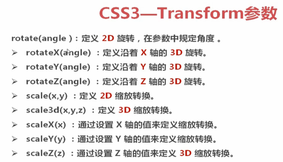
transform:rotate(360deg) scale(1.5);/*前者是旋转360度,后者是放大1.5倍*/
/*兼容支持*/
-ms-transform:rotate(360deg) scale(1.5);
-moz-transform:rotate(360deg) scale(1.5);
-webkit-transform:rotate(360deg) scale(1.5);
-o-transform:rotate(360deg) scale(1.5);
}
.button{
display: block;
width: 180px;
height: 50px;
position: relative;/*设置butto内元素是相对定位,这个不设置,线条效果就出不来*/
line-height: 50px;
text-decoration: none;
color: #2DCB70;
font-family: Arial;
font-weight: bolder;
border: 2px solid rgba(255,255,255,0.8);
padding-left: 20px;
margin: 0 auto;
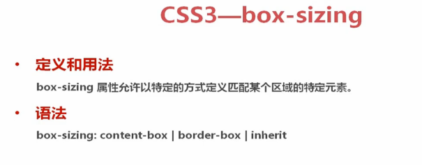
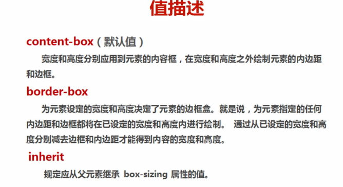
/*定义了该属性就会是其填充之类的属性不会加到设置的长宽中(width: 180px;)*//**/
/*如果不适用该属性,则就需要考虑长宽的问题了*/
box-sizing:border-box;
-ms-box-sizing:border-box;
-o-box-sizing:border-box;
-moz-box-sizing:border-box;
-webkit-box-sizing:border-box;
background: url(../ico/4.png) no-repeat 110px center;
/*过渡属性的设置*/
transition:0.3s ease;/*ease表示慢到快*/
-o-transition:0.3s ease;
-moz-transition:0.3s ease;
-webkit-transition:0.3s ease;
}
.button:hover{/*当鼠标划过button时的动画*/
border: 2px solid rgba(255,255,255,3);/*边框变亮*/
background-position: 140px center;/*箭头图片移动*/
}
/*线条设置属性
*/
.button .line{
display: block;
position: absolute;
background: none;
}
.button:hover .line{
background: #fff;
}
/*top线条的设置*/
.button .line-top{
height: 2px;
width: 0px;/*初始是点,则没有长度,又点到线*/
left: -110%;/*向左偏移盒子的长度*/
top: -2px;
transition:0.3s ease-out;
-o-transition:0.3s ease-out;
-webkit-transition:0.3s ease-out;
-moz-transition:0.3s ease-out;
}
.button:hover .line-top{
width: 100%;
left: -2px;
}
/*right线条的设置*/
.button .line-right{
width: 2px;
height: 0px;
right: -2px;
top: -110px;
transition:0.3s ease-out;
-o-transition:0.3s ease-out;
-webkit-transition:0.3s ease-out;
-moz-transition:0.3s ease-out;
}
.button:hover .line-right{
height: 100%;
top: -2px;
}
/*bottom线条的设置*/
.button .line-bottom{
height: 2px;
width: 0;
right: -110px;
bottom: -2px;
transition:0.3s ease-out;
transition:0.3s ease-out;
-o-transition:0.3s ease-out;
-webkit-transition:0.3s ease-out;
-moz-transition:0.3s ease-out;
}
.button:hover .line-bottom{
width: 100%;
right: -2px;
}
/*left*/
.button .line-left{
width: 2px;
height: 0px;
left: -2px;
bottom: -110%;
transition:0.3s ease-out;
-o-transition:0.3s ease-out;
-webkit-transition:0.3s ease-out;
-moz-transition:0.3s ease-out;
}
.button:hover .line-left{
height: 100%;
bottom: -2px;
}
/*提示信息css*/
.tip{/*提示框的原始设置*/
position: absolute;
padding:0 14px;
height: 35px;
line-height: 35px;
background: #2DCB70;
color: #fff;
font-size: 18px;
margin: 0 auto;
border-radius: 3px;/*css3中定义圆角的属性(border-right-radius:定义右边圆角)*/
-ms-border-radius: 3px;
-moz-border-radius: 3px;
-ms-border-radius: 3px;
-webkit-border-radius: 3px;
-o-border-radius: 3px;
top: 35px;
opacity: 0;/*透明度设置*/
}
.tip em{
font-style: normal;
}
.tip span{/*三角形设置*/
display: block;
width: 0;
height: 0;
overflow: hidden;
border: 7px solid transparent;/*tansparent :透明*/
border-top-color: #2DCB70;/*三角形向下*/
position: absolute;
top: 35px;
left: 50%;
margin-left: -3px;
}javascript.js文件内容
$(function(){
	$('.link .button').hover(function(){
		// 这是鼠标进入的时候设置
		var title=$(this).attr('data');// 取出data的值
		$('.tip em').text(title);// 将data值放入em标签中
		var pos=$(this).position().left+10;// 寻找定位,根据此处寻找。只找到box中的相对定位。再加一点儿距离
		// document.title=pos;// 得到三个按钮相对盒子左边的距离分别为20 265 510。
		var dis=($('.tip').outerWidth()-$(this).outerWidth())/2;// 提示框的宽减去按钮的宽,然后除以2就可以居中了。
		var l=pos-dis;
		$('.tip').css({'left':l+'px'}).animate({'top':55,'opacity':1},400);
		// 加上属性、'left':l+'px'这个是将最终移动的距离确定了、animate动画函数,属性的更改,400是时间
	},function(){
		// 这是鼠标离开的时候设置
		// $('.tip').animate({'top':35,'opacity':0},400);//到这里基本效果已经实现
		// 这个时候我们就会发现,当鼠标快速移开的时候就会出现动画连续播放的bug,我们离解决这个bug
		if(!$('.tip').is(':animated')){//当animate不执行的时候才会执行下面动画
			$('.tip').animate({'top':35,'opacity':0},400);
		}
	})
})
其中需要用到jquery框架,所以我们需要导jquery包,jquery包可以去官网下载,也可以用该例子,这个例子已经上传我的资源,可供下载。


 扫一扫
扫一扫
 2262
2262

 被折叠的 条评论
为什么被折叠?
被折叠的 条评论
为什么被折叠?
 到【灌水乐园】发言


