


 本文详细介绍了如何在微信小程序中自定义TabBar和NavBar,通过组件化实现更丰富的交互和样式。TabBar组件利用Flex布局,监听点击事件控制页面切换;NavBar则考虑了机型顶部高度,提供自定义背景色、标题和返回按钮。同时强调了在每个页面设置适当的padding-top以避免内容被遮挡。
先看效果图
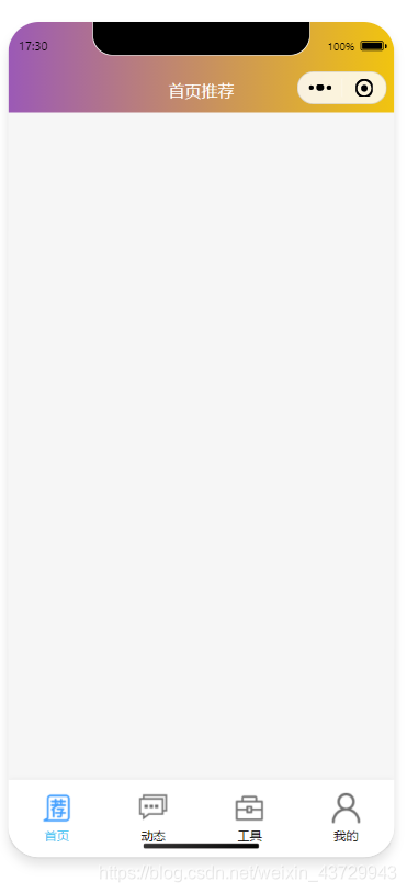
看似和正常开发的小程序布局相同,但代码却不相同,从而在自定义的代码中可以编写在默认模板中不能帮助我们完成的事情。
首先来说TabBar,这个内容的实现很容易,Flex布局嘛,除了这种很普通的样式,还可以自定义实现
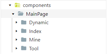
TabBar的目录结构:
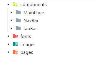
TabBar、NavBar、以及主页面都定义为组件,使用的思路是:
- 在pages目录下定义一个页面,也就是小程序的入口页面,在入口页面中调用TabBar组件,接着需要在这个页面中监听TabBar组件的点击变化。从而控制显示不同的主页面。
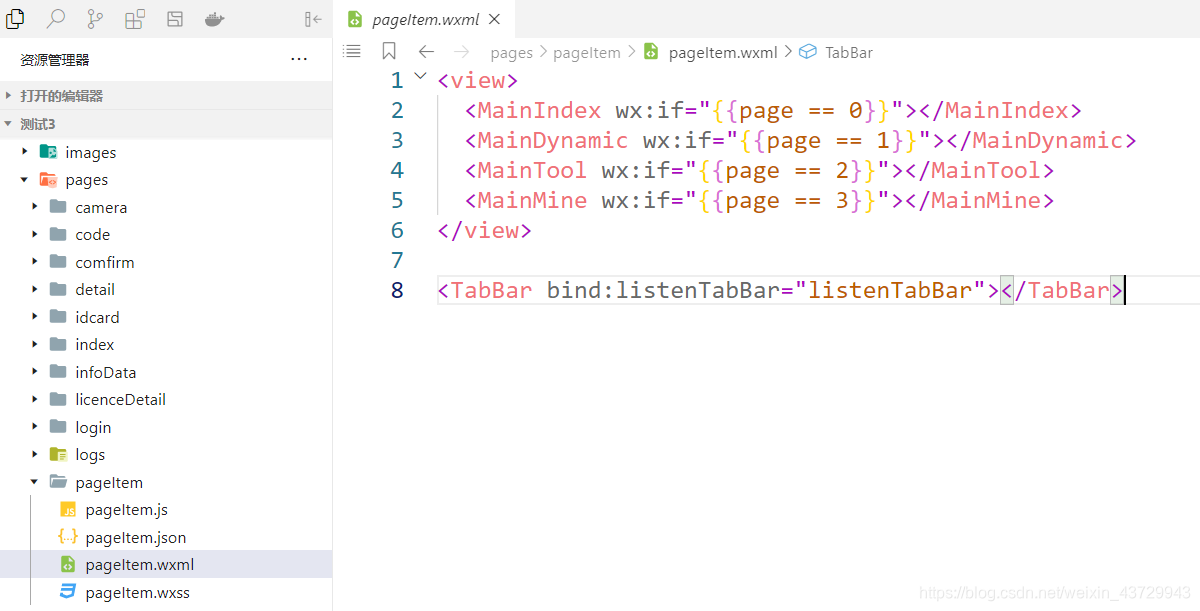 pageItem.js
Page({

  data: {
    page: 0
  },
  listenTabBar(e){
    this.setData({
      page: e.detail
    })
  },
  onShareAppMessage: function () {

  }
})
TabBar组件:
wxml
<view class="tabBarRow">
  <view wx:for="{{TabBarList}}" wx:key="key">
    <view class="tabBarItem" bindtap="chnageTabBar" data-index="{{index}}">
      <image src="{{item.isActive ? item.activeImage : item.image}}"></image>
      <text class="{{item.isActive ? 'activeColor' : ''}}">{{item.text}}</text>
    </view>
  </view>
</view>
js
// components/tabBar/tabBar.js
Component({
  /**
   * 组件的属性列表
   */
  properties: {

  },

  /**
   * 组件的初始数据
   */
  data: {
    TabBarList:[
      {
        isActive: true,
        image: '/images/tabbar/index.png',
        activeImage: '/images/tabbar/index1.png',
        text: '首页',
        key: 'Index'
      },
      {
        isActive: false,
        image: '/images/tabbar/community.png',
        activeImage: '/images/tabbar/community1.png',
        text: '动态',
        key: 'Dynamic'
      },
      {
        isActive: false,
        image: '/images/tabbar/tools.png',
        activeImage: '/images/tabbar/tools1.png',
        text: '工具',
        key: 'Tool'
      },
      {
        isActive: false,
        image: '/images/tabbar/mine.png',
        activeImage: '/images/tabbar/mine1.png',
        text: '我的',
        key: 'Mine'
      }
    ]
  },

  /**
   * 组件的方法列表
   */
  methods: {
    chnageTabBar(e) {
      let index = e.currentTarget.dataset.index
      let list = this.data.TabBarList
      list[index]['isActive'] = true
      this.triggerEvent('listenTabBar',index)
      for (let i = 0; i < list.length; i++) {
        if(i == index) continue;
        list[i]['isActive'] = false
      }
      this.setData({
        TabBarList: list
      })
    }
  }
})
wxss
.tabBarRow {
  flex-direction: row;
  display: flex;
  justify-content: space-around;
  align-items: center;
  width: 100%;
  height: 150rpx;
  background-color: white;
  position: fixed;
  bottom: 0;
  z-index: 999;
  box-shadow: 0 2px 4px rgba(0, 0, 0, .12), 0 0 6px rgba(0, 0, 0, .04)
}
.tabBarItem {
   height: 100rpx;
   width: 100rpx;
   flex-direction: column;
   display: flex;
   justify-content: space-between;
   align-items: center;
}
.tabBarItem image {
  height: 60rpx;
  width: 60rpx;
}
.tabBarItem text {
  font-size: 12px;
}
.activeColor {
  color: rgb(64, 191, 241);
}
四个主页面的目录结构:
接着就是NavBar,NavBar需要注意的就是顶部高度的问题,需要在app.js中获取机型 的顶部高度,来配合做navBar。在做NavBar之前,你首先需要在app.json文件的window对象中写入:
"navigationStyle": "custom"
app.js
// app.js
App({
  onLaunch() {
    wx.getSystemInfo({
      success: (result) => {
        this.globalData.statusBarHeight = result.statusBarHeight
        this.globalData.navBarHeight = 44 + result.statusBarHeight
      },
    })
  },
  globalData: {
    statusBarHeight: 44,
    navBarHeight: 88
  }
})
NavBar.wxml
<view class="NavBar" style="background:{{background}};">
  <view style="height:{{statusBarHeight}}px"></view>
  <view class="title" style="color: {{titleColor}};height:{{statusBarHeight}}px">
    <image wx:if="{{showReturn}}" bindtap="goBack" class="returnLeft" src="/images/arrow_left.png"></image>
    <text>{{ title }}</text>
  </view>
</view>
NavBar.js
const app = getApp()
Component({
  /**
   * 组件的属性列表
   */
  properties: {
    background: {
      type: String,
      value: 'linear-gradient(to right, #9b59b6, #f1c40f);'
    },
    title: {
      type: String,
      value: ''
    },
    titleColor: {
      type: String,
      value: '#ffffff'
    },
    showReturn: {
      type: Boolean,
      value: false
    }
  },

  ready(){
    let { statusBarHeight,navBarHeight } = app.globalData
    this.setData({
      statusBarHeight,navBarHeight
    })
  },
  methods: {
    goBack(){
      console.log(this.data.customBackReturn)
      if(this.data.customBackReturn){
        this.triggerEvent("customBackReturn")
      }else{
        if(getCurrentPages().length == 1){
          wx.reLaunch({
            url: '/pages/pageItem/pageItem',
          })
        }else {
          wx.navigateBack({
            delta: 1,
          })
        }
      }
    }
  }
})
NavBar.wxss
.NavBar {
  position: fixed;
  top: 0;
  left: 0;
  width: 750rpx;
  z-index: 999;
}
.title {
  flex-direction: row;
  display: flex;
  justify-content: center;
  align-items: center;
}
.returnLeft {
  height: 50rpx;
  width: 50rpx;
  position: fixed;
  left: 20rpx;
}
NavBar在页面中的使用
<NavBar title="首页推荐"></NavBar>
页面标题、是否有返回按钮、背景颜色、标题字体颜色等等,都可以自定义进行传参。
需要注意的是,在每个页面中开始编写内容的时候,需要给页面容器一个padding-top值,将内容不被NavBar所遮盖。


 扫一扫
扫一扫


 235
235

 被折叠的 条评论
为什么被折叠?
被折叠的 条评论
为什么被折叠?
 到【灌水乐园】发言


