


目录
一、空间转换(3d转换)
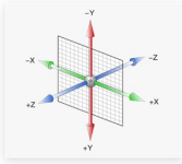
空间:是从坐标轴角度定义的。 x 、y 和z三条坐标轴构成了一个立体空间,z轴位置与视线方向相同。
1.空间位移
语法:transform:translate3d(x,y,z);
transform: translateX(值);
transform: translateY(值);
transform: translateZ(值);
<!DOCTYPE html>
<html lang="en">
<head>
  <meta charset="UTF-8">
  <title>空间位移</title>
  <style>
    .box {
      width: 200px;
      height: 200px;
      margin: 100px auto;
      background-color: pink;
      transition: all 0.5s;
    }

    .box:hover {
      transform: translate3d(50px, 100px, 200px);
      /* transform: translateX(100px);
      transform: translateY(100px);
      transform: translateZ(100px); */
    }
  </style>
</head>

<body>
  <div class="box"></div>
</body>
</html>
2. 透视效果
语法:perspective:值;
透视效果:近大远小,近实远虚
<!DOCTYPE html>
<html lang="en">
<head>
  <meta charset="UTF-8">
  <title>透视效果</title>
  <style>
    body {
      /* 添加给父级
      建议取值:800-1200 */
      perspective: 1000px;
    }

    .box {
      width: 200px;
      height: 200px;
      margin: 100px auto;
      background-color: pink;
      transition: all 0.5s;
    }

    .box:hover{
      transform: translateZ(200px);
      /* transform: translateZ(-200px); */
    }
  </style>
</head>

<body>
  <div class="box"></div>
</body>
</html>
3.空间旋转
语法:transform:rotateZ(值);
transform: rotateX(值);
transform: rotateY(值);
rotate3d(x, y, z, 角度度数) :用来设置自定义旋转轴的位置及旋转的角度
x,y,z 取值为0-1之间的数字

<!DOCTYPE html>
<html lang="en">
<head>
    <meta charset="UTF-8">
    <meta http-equiv="X-UA-Compatible" content="IE=edge">
    <meta name="viewport" content="width=device-width, initial-scale=1.0">
    <title>空间旋转</title>
    <style>
        .box {
            width: 300px;
            margin: 100px auto;
        }

        img {
            width: 300px;
            transition: all 2s;
        }
        .box {
            /* 透视效果:近大远小,近实远虚 */
            perspective: 1000px;
        }

        .box img:hover {
            transform: rotateZ(360deg);
            /* transform: rotateX(60deg); */
            /* transform: rotateY(60deg); */
        }
    </style>
</head>
<body>
    <div class="box">
        <img src="./images/hero.jpeg" alt="">
    </div>
</body>
</html>
4.立体呈现
父级添加:transform-style: preserve-3d;
<!DOCTYPE html>
<html lang="en">
<head>
    <meta charset="UTF-8">
    <meta http-equiv="X-UA-Compatible" content="IE=edge">
    <meta name="viewport" content="width=device-width, initial-scale=1.0">
    <title>立体呈现</title>
    <style>
        .cube {
            position: relative;
            width: 200px;
            height: 200px;
            margin: 100px auto;
            /* background-color: pink; */
            transition: all 2s;

            transform-style: preserve-3d;
        }

        .cube div {
            position: absolute;
            left: 0;
            top: 0;

            width: 200px;
            height: 200px;
        }

        .front {
            background-color: orange;
            transform: translateZ(200px);
        }

        .back {
            background-color: green;
        }
        .cube:hover{
            transform: rotateY(180deg);
        }

    </style>
</head>
<body>
    <div class="cube">
        <div class="front">前面</div>
        <div class="back">后面</div>
    </div>
</body>
</html>
5.3D导航

<!DOCTYPE html>
<html lang="en">
<head>
    <meta charset="UTF-8">
    <meta name="viewport" content="width=device-width, initial-scale=1.0">
    <title>3D导航</title>
    <style>
        ul {
            margin: 0;
            padding: 0;
            list-style: none;
        }

        .navs {
            width: 300px;
            height: 40px;
            margin: 50px auto;
        }

        .navs li {
            position: relative;

            float: left;
            width: 100px;
            height: 40px;
            line-height: 40px;
            transition: all .5s;

            /* 立体呈现属性 */
            transform-style: preserve-3d;
            /* 添加旋转属性 便于观察效果 */
            /* transform: rotateX(-20deg) rotateY(30deg); */
        }

        .navs li a {
            /* 1.定位 */
            position: absolute;
            top: 0;
            left: 0;

            display: block;
            width: 100%;
            height: 100%;
            text-align: center;
            text-decoration: none;
            color: #fff;
        }

        /* 3.中文部分添加位移 */
        .navs li a:first-child {
            background-color: green;
            transform: translateZ(20px);
        }
        /* 2.英文部分添加旋转和位移 */
        .navs li a:last-child {
            background-color: orange;
            transform: rotateX(90deg) translateZ(20px) ;
        }

        .navs li:hover{
            transform: rotateX(-90deg);
        }

    </style>
</head>

<body>
    <div class="navs">
        <ul>
            <li>
                <a href="#">首页</a>
                <a href="#">Index</a>
            </li>
            <li>
                <a href="#">登录</a>
                <a href="#">Login</a>
            </li>
            <li>
                <a href="#">注册</a>
                <a href="#">Register</a>
            </li>
        </ul>
    </div>
</body>
</html>
二、动画
1.动画实现步骤
①.定义动画
@keyframes 动画名称 {
from{ }
to{ }
}
②使用动画
animation: 动画名称 花费时间;
<!DOCTYPE html>
<html lang="en">
<head>
    <meta charset="UTF-8">
    <meta http-equiv="X-UA-Compatible" content="IE=edge">
    <meta name="viewport" content="width=device-width, initial-scale=1.0">
    <title>动画实现步骤</title>
    <style>
        .box {
            width: 200px;
            height: 100px;
            background-color: pink;

            /* 使用 */
            animation: change 1s;
        }

        /* 一. 定义动画:从200变大到600 */
        /* @keyframes change {
            from{
                width: 200px;
            }
            to{
                width: 600px;
            }
        } */

        /* 二. 定义动画:200 到 500*300 到 800*500 */
        /* 百分比指动画总时长的占比 */
        @keyframes change {
            0%{
                width: 200px;
            }
            50%{
                width: 500px;
                height: 300px;
            }
            100%{
                width: 800px;
                height: 500px;
            }
        }

    </style>
</head>
<body>
    <div class="box"></div>
</body>
</html>
2.动画属性
animation:动画名称 动画时长 速度曲线 延迟时间 重复次数 动画方向 执行完毕时状态;

3.精灵动画
逐帧动画:animation-timing-function: steps(N);
原地跑:
<!DOCTYPE html>
<html lang="en">
<head>
  <meta charset="UTF-8">
  <title>精灵动画</title>
  <style>

    /* 1.准备显示区域 */
    .box {
      width: 140px;
      height: 140px;
      background-image: url(./images/bg.png);

      /* 3.使用动画 */
      animation-name: change;
      animation-duration: 2s;
      /* 逐帧动画  steps(N)小图的个数*/
      animation-timing-function: steps(12);
      /* 无限重复 */
      animation-iteration-count: infinite;
    }
    /* 2.定义动画 */
    @keyframes change {
      from{
        background-position: 0 0;
      }
      to{
        /* 1680精灵图的宽度 */
        background-position: -1680px 0;
      }
    }
  </style>
</head>
<body>
  <div class="box"></div>
</body>
</html>
页面跑:
<!DOCTYPE html>
<html lang="en">
<head>
  <meta charset="UTF-8">
  <title>精灵动画</title>
  <style>

    /* 1.准备显示区域 */
    .box {
      width: 140px;
      height: 140px;
      background-image: url(./images/bg.png);

      /* 3.使用动画 */
      animation:
      change 1s steps(12) infinite,
      run 5s forwards;
    }

    /* 2.定义动画 */
    @keyframes change {
      from{
        background-position: 0 0;
      }
      to{
        /* 1680精灵图的宽度 */
        background-position: -1680px 0;
      }
    }
    /* 定义盒子移动的动画 */
    @keyframes run {
      from{
        transform: translateX(0);
      }
      to{
        transform: translateX(800px);
      }
    }
  </style>
</head>
<body>
  <div class="box"></div>
</body>
</html> 
三、综合案例
1.走马灯
<!DOCTYPE html>
<html lang="en">
  <head>
    <meta charset="UTF-8" />
    <meta name="viewport" content="width=device-width, initial-scale=1.0" />
    <title>Document</title>
    <style>
      * {
        padding: 0;
        margin: 0;
      }
      li {
        list-style: none;
      }
      img {
        width: 200px;
      }
      .box {
        width: 600px;
        height: 112px;
        border: 5px solid #000;
        margin: 100px auto;

        overflow: hidden;
      }
      .box ul{
        width: 2000px;
        animation: change 5s infinite linear;
      }
      .box li{
        float: left;
      }

      /* 2.定义动画 */
      @keyframes change {
        from{
          transform: translateX(0);
        }
        to{
          /* 480精灵图的宽度 */
          transform: translateX(-1400px);
        }
      }
      .box ul:hover{
        animation-play-state: paused;
      }

    </style>
  </head>
  <body>
    <div class="box">
      <ul>
        <li><img src="./images/1.jpg" alt="" /></li>
        <li><img src="./images/2.jpg" alt="" /></li>
        <li><img src="./images/3.jpg" alt="" /></li>
        <li><img src="./images/4.jpg" alt="" /></li>
        <li><img src="./images/5.jpg" alt="" /></li>
        <li><img src="./images/6.jpg" alt="" /></li>
        <li><img src="./images/7.jpg" alt="" /></li>
        <!--  -->
        <li><img src="./images/1.jpg" alt="" /></li>
        <li><img src="./images/2.jpg" alt="" /></li>
        <li><img src="./images/3.jpg" alt="" /></li>
      </ul>
    </div>
  </body>
</html>
2.全名出游季
html
<!DOCTYPE html>
<html lang="en">
<head>
    <meta charset="UTF-8">
    <meta http-equiv="X-UA-Compatible" content="IE=edge">
    <meta name="viewport" content="width=device-width, initial-scale=1.0">
    <title>Document</title>
    <link rel="stylesheet" href="./css/index.css">
</head>
<body>
    <!-- 云彩 -->
    <div class="cloud">
        <img src="./images/yun1.png" >
        <img src="./images/yun2.png" >
        <img src="./images/yun3.png" >
    </div>
    <!-- 气球 -->
    <div class="san">
        <img src="./images/san.png">
    </div>

    <!-- 中间 -->
    <div class="center">
        <img src="./images/font1.png">
        <img src="./images/lu.png" >
    </div>

    <!--标签-->
    <div class="nav">
        <img src="./images/1.png">
        <img src="./images/2.png">
        <img src="./images/3.png">
        <img src="./images/4.png">
    </div>
</body>
</html>
css
*{
    margin: 0;
    padding: 0;
}
html{
    height: 100%;
}

body{
    position: relative;
    height: 100%;
    background: url(../images/f1_1.jpg) no-repeat center 0;

    /* 缩放背景图 */
    background-size: cover;
}

/*
1.引入图片
2.定义动画、使用动画 */

.cloud img{
    position: absolute;
    top: 0;
    left: 50%;
}
.cloud img:nth-child(1) {
    margin-left: -300px;
    top: 20px;
    /* alternate 动画执行方向 为反向 */
    animation: cloud 1s infinite alternate;
}
.cloud img:nth-child(2) {
    margin-left: 400px;
    top: 100px;
    animation: cloud 1s infinite alternate 0.2s;
}
.cloud img:nth-child(3) {
    margin-left: -550px;
    top: 200px;
    animation: cloud 1s infinite alternate 0.4s;
}
/* 云彩动画 */
@keyframes cloud {
   to{
       transform: translateX(20px);
   }
}

/* 气球 */
.san img{
    position: absolute;
    top: 100px;
    left: 25%;
    animation: san 1s infinite alternate;
}
/* 气球动画 */
@keyframes san {
    to{
        transform: translateY(-20px);
    }
}

/* 中间 */
.center img{
    position: absolute;
    top: 50%;
    left: 50%;
}
.center img:nth-child(1){
    margin-top: -150px;
    margin-left: -300px;
    /* 缩小 */
    transform: scale(0.8);
}
.center img:nth-child(2){
    margin-top: -300px;
    margin-left: 160px;
}
/* 标签 */
.nav img{
    position: absolute;
    bottom: 0;
    left: 50%;
    transform: scale(0.6);
}
.nav img:nth-child(1){
    margin-left: -300px;
    margin-bottom: 50px;
    animation: nav 0.5s infinite alternate;
}
.nav img:nth-child(2){
    margin-left: -160px;
    margin-bottom: 50px;
    animation: nav 0.7s infinite alternate;
}
.nav img:nth-child(3){
    margin-bottom: 50px;
    animation: nav 0.9s infinite alternate;
}
.nav img:nth-child(4){
    margin-left: 150px;
    margin-bottom: 50px;
    animation: nav 1s infinite alternate;
}
@keyframes nav {
    to{
        transform: translateY(20px);
    }
}
效果:


 972
972

 被折叠的 条评论
为什么被折叠?
被折叠的 条评论
为什么被折叠?
 到【灌水乐园】发言


