


🎉 在众多UI设计领域中,"鱼骨步骤条"凭借其✨清晰直观✨地展现流程进度,赢得了设计者们的大量青睐!本篇博客将带你飞越Vue框架的广袤天地,从零到一,亲手锻造一款既美观又功能强大的定制化"鱼骨步骤条"组件。我们不仅会深潜入组件的巧妙构思水域,还会逐一探索其实现的每一个细节,确保你在项目中游刃有余地重复利用这一神器🐟。
🎯 组件UI效果展示
👇 查看下方,一睹为快我们即将打造的"鱼骨步骤条"风采吧!它将以灵动的身姿,清晰标示出每一步骤的状态,为你的用户导航!

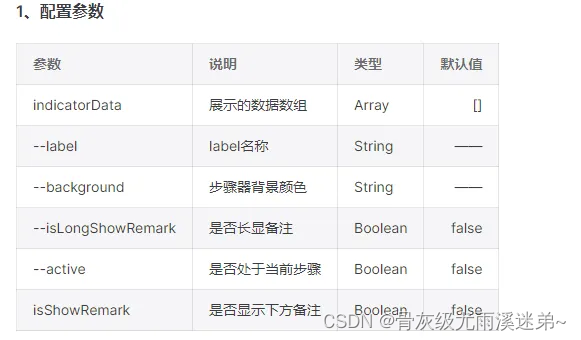
🔧 配置参数概览
接下来,一览那些让你自由定制的配置选项。只需简单的设置,即可让"鱼骨步骤条"完美融入你的界面设计中!
👷♂️ 基础使用教程
想立即上手?跟上这简单的代码步伐,轻松集成到你的Vue项目中吧!记得调整表情和标签,让你的代码也生动起来哦!
<template>
  <HIndicator :indicator-data="indicatorData" :is-show-remark="true">
   <!-- 自定义备注槽位 -->
    <template #remarks="{ scope }">
      {{ scope.row.remark }}
    </template>
  </Indicator>1
</template>
<script setup>
defineOptions({
  name: 'h-indicator'
})
// 定义数据模型
const indicatorData = [
    {
        label: '第一步',
        background: '#3188E6',
        isLongShowRemark: true,
        remark: '长显备注一'
    },
    {
        label: '第二步',
        background: '#3188E6',
        remark: '长显备注二',
    },
    {
        label: '第三步',
        background: '#3188E6',
        remark: '长显备注三',
        active: true
    },
    {
        label: '第四步',
        background: '#3188E6',
        remark: '备注四'
    },
    {
        label: '第五步',
        background: '#3188E6',
        remark: '备注五'
    },
    {
        label: '第六步',
        background: 'red',
        textColor: '#343434',
        remark: '备注六'
    },
    {
        label: '第七步',
        borderColor: '#ccc'
    }
]
</script>

<style lang="scss" scoped></style>
🛠 组件核心实现揭秘
<template>
  <div class="indicator">
    <IndicatorItem
      class="indicator-item"
      v-for="(item, index) in indicatorData"
      :item-bg="item.background"
      :key="index"
      :type="typeCmpFun(index)"
      :style="styleConfig(item, index)"
      :borderColor="item.borderColor"
      :textColor="item.textColor"
    >
      <div
        class="texts"
        :style="{
          color: item.textColor
            ? item.textColor
            : item.background
            ? item.textColor || '#fff'
            : '#343434',
        }"
      >
        {{ item.label }}
      </div>
      <div
        class="remarks"
        :class="{ remarksLong: item.isLongShowRemark, active: item.active }"
        v-if="item.remark && isShowRemark"
      >
        <slot name="remarks" :scope="{ row: item }" />
      </div>
    </IndicatorItem>
  </div>
</template>

<script setup>
import IndicatorItem from './indicatorItem.vue'

defineOptions({
  name: 'HIndicator'
})

const props = defineProps({
  // 数据
  indicatorData: {
    type: Array as unknown as any[],
    default: () => [],
  },
  // 是否显示下方备注
  isShowRemark: {
    type: Boolean,
    default: false,
  }
})
const typeCmpFun= computed(() => {
  return function (index) {
    if (index === 0) {
      return 'start'
    }
    if (index === props.indicatorData.length - 1) {
      return 'end'
    }
    return 'center'
  }
})

const styleConfig= computed(() => {
  return function (item, index) {
    return {
      background: item.background,
      zIndex: props.indicatorData.length - index,
      left: index !== 0 ? `${index * 10}px` : 0,
    }
  }
})
</script>

<style lang="scss" scoped>
.indicator {
  display: flex;
  &-item {
    font-size: 14px;
    .texts {
      width: 100%;
      height: 100%;
      display: flex;
      align-items: center;
      justify-content: center;
    }
    &:not(:first-child) {
      .texts {
        padding-left: 20px;
        position: absolute;
        z-index: 10;
      }
    }
    .remarks {
      display: flex;
      width: calc(100% + 2px);
      height: auto;
      padding: 0 6px;
      opacity: 0;
      visibility: hidden;
      border: 1px solid rgba(26, 78, 199, 0.2);
      border-top: 0;
      background: #fff;
      position: absolute;
      top: 39px;
      left: -1px;
      line-height: initial;
      transition: all 0.3s;
    }
    &:hover {
      .remarks {
        height: auto;
        padding: 12px 6px 10px 6px;
        opacity: 1;
        visibility: inherit;
      }
    }
    .remarksLong {
      height: auto;
      padding: 12px 6px 10px 6px;
      opacity: 1;
      visibility: inherit;
    }
    .active {
      border-color: #32a0ff;
    }
  }
}
</style>
🧩 IndicatorItem 组件奥秘
<template>
  <div
    class="indicatoritem"
    :class="{
      'indicatoritem-start': type === 'start',
      'indicatoritem-end': type === 'end',
      'indicatoritem-center': !['start', 'end'].includes(type),
    }"
  >
    <slot></slot>
  </div>
</template>

<script setup>
defineOptions({
  name: 'IndicatorItem'
})
const prop = defineProps({
  // 箭头类型 start center end
  type: {
    type: String,
    default: 'center',
  },
  // 整体的背景颜色
  background: {
    type: String,
    default: '#fff',
  },
  // 背景颜色
  itemBg: {
    type: String,
    default: '',
  },
  // 边框颜色
  borderColor: {
    type: String,
    default: 'transparent',
  },
  // 文字颜色
  textColor: {
    type: String,
    default: '#fff',
  },
})
</script>
<style lang="scss" scoped>
.indicatoritem {
  min-width: 13%;
  height: 40px;
  position: relative;
  background: v-bind(itemBg);
  text-align: center;
  line-height: 40px;
  border: 1px solid v-bind(borderColor);
  border-right: none;
}
.indicatoritem:after {
  content: '';
  position: absolute;
  top: 5px;
  left: -15px;
  right: auto;
  width: 28px;
  height: 28px;
  border: 1px solid v-bind(borderColor);
  border-left: 1px solid transparent;
  border-bottom: 1px solid transparent;
  transform: rotate(45deg);
  background: v-bind(background);
}
.indicatoritem:before {
  content: '';
  position: absolute;
  top: 5px;
  right: -14px;
  left: auto;
  width: 28px;
  height: 28px;
  border: 1px solid v-bind(borderColor);
  border-left: 1px solid transparent;
  border-bottom: 1px solid transparent;
  transform: rotate(45deg);
  background: v-bind(itemBg);
}
.indicatoritem-start::after {
  content: none !important;
}
.indicatoritem-end::before {
  content: none !important;
}
.indicatoritem-end {
  border-right: 1px solid v-bind(borderColor);
}
</style>
现在,你已经掌握了构建个性化"鱼骨步骤条"组件的全部秘诀!无论是为提升用户体验还是美化界面布局,这个组件都将是你不可或缺的得力助手。🚀 别忘了动手实践,让你的应用界面焕发出新的光彩!


 扫一扫
扫一扫


 18万+
18万+

 被折叠的 条评论
为什么被折叠?
被折叠的 条评论
为什么被折叠?
 到【灌水乐园】发言


