


🔥 前言
这篇文章给大家分享一个高级自定义列表组件从0到1的开发过程,这个列表组件的主要功能有,列表拖拽排序,右侧操作按钮统一使用Tooltip展示,操作表头增加自定列表icon,点击icon可以对列表展示数据进行是否显示、排序等操作,契合业务需求,增加表格美观以及复用性。
🔥关与自定义表格
随着系统业务复杂度的提高,列表需要展示的数据变得复杂,常见的El-table逐渐不能满足我们系统的日常使用,更为关键的是El-table 在使用的过程种比较复杂,需要书写大量的< ,并且不能满足我们的系统UI,所以我们决定对El-table进行高度的自定义二次封装,使得团队同学在使用的时候更加便捷、容易,同时也满足了我们系统统一页面风格的需求,下面就给大家介绍我们实现的详细过程。
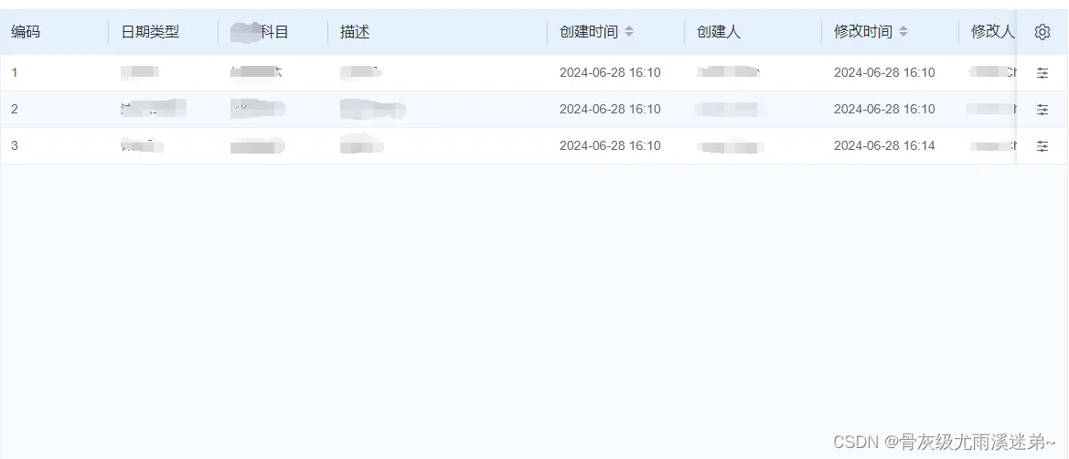
🔥效果图展示:
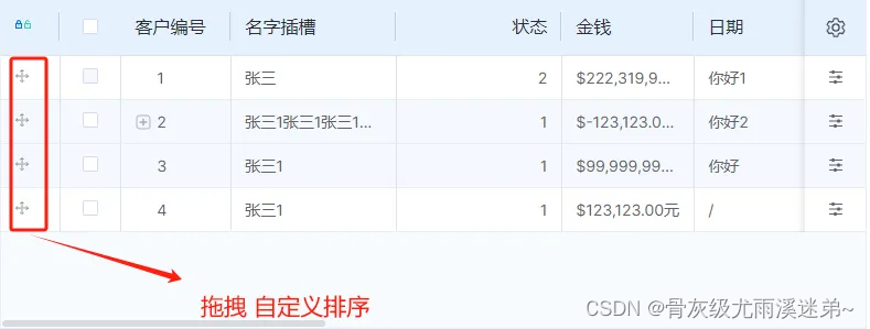
 ✨表格拖转排序
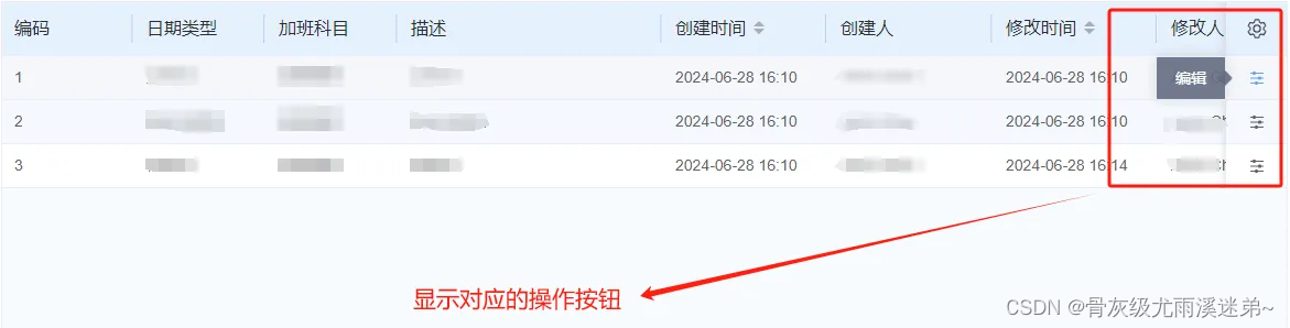
✨右侧操作按钮显示UI
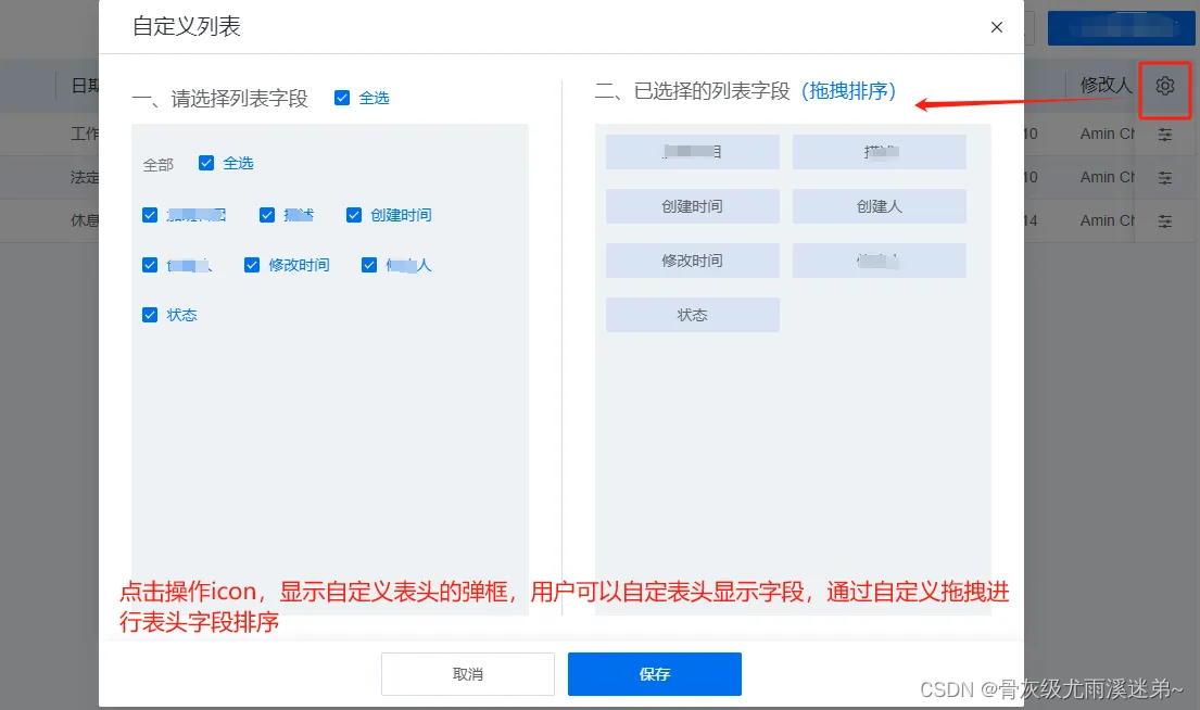
✨自定义表头字段弹框
🔥基本使用
index.vue
<template>
	<!-- 列表 -->
	<div style="height: calc(100% - 155px)">
		<h-table
		    ref="selectionTableRef"
		    v-loading="loading"
		    :border="true"
		    :columns="state.table.columns"
		    :custom-list="customList"
		    :is-custom-list="true"
		    :table="state.table"
		    operatorTheme="useless"
		    stripe
		    @saveCustomList="saveCustomList"
		</h-table>
	</div>
</template>
<script setup>
const state = reactive({
    table: {
        total: 0,
        pageNo: 1,
        pageSize: 10,
        pageSizes: [10, 20, 50, 100],
        // 接口返回数据
        data: [],
        // 表头数据
        columns: [],
        // 多选
        firstColumn: { type: 'selection', fixed: 'left' },
        // 操作列样式
        operatorConfig: {
            fixed: 'right', // 固定列表右边(left则固定在左边)
            width: 100,
            label: '操作',
        },
        operator: [
            {
                text: '查看',
                fun: (val) => look([val]),
                show: [{ key: 'status', val: ['new'] }],
            },
            {
                text: '编辑',
                style: { color: '#f56c6c' },
                fun: (val) => edit([val]),
                show: [{ key: 'status', val: ['new'] }],
            },
        ],
    },
})
// 列配置
const customList = reactive({
	//列表数据
    allColumns: [
        {
            label: '姓名',
            prop: 'name',
            key: 'name',
            width: 150,
            fixed: 'left',
        },
        {
            label: '性别',
            prop: 'sex',
            key: 'sex',
            fixed: 'left',
            minWidth: 280,
        },
        {
            label: '年龄',
            prop: 'age',
            key: 'age',
            minWidth: 100,
        },
        {
            label: '时间',
            prop: 'date',
            key: 'date',
            minWidth: 160,
        }
    ],
    //自定义表头左侧数据
    allData: [
        {
            title: '全部',
            children: [
                { key: 'name', title: '姓名'},
                { key: 'sex', title: '性别'},
                { key: 'age', title: '年龄' },
                { key: 'date', title: '时间' },
            ],
        },
    ],
    //自定义表头右侧可拖拽数据
    defaultCheckData: [
        { key: 'name',title: ['姓名'] },
        { key: 'sex', title: ['性别'] },
        { key: 'age', title: ['年龄'] },
        { key: 'date', title: ['时间'] },
    ],
})

</script>
🔥 碎碎念
看了上面的组件使用是不是觉得,使用起来非常简单,而且在模板层面可以减少很多HTML内容的书写
🔥内部实现
<template>
	<div class="h-table">
		<el-table ref="TTable" :data="state.tableData" :scrollbar-always-on="scrollbarAlwaysOn" :size="size"
			:highlight-current-row="highlightCurrentRow" :border="border || table.border || isTableBorder"
			@cell-dblclick="cellDblclick"
			@row-click="rowClick" :cell-class-name="cellClassNameFuc" :tooltip-options="tooltipOptions" v-bind="{
      ...$attrs,
      class: {
        cursor: isCopy,
        highlightCurrentRow: highlightCurrentRow,
        radioStyle: table.firstColumn && table.firstColumn.type === 'radio',
        outerBorder: !border && !(table.border || isTableBorder),
      },
      style: ''
    }" style="height: 100%;">
			<!-- 行拖拽列 -->
			<template v-if="table.lockColumn">
				<el-table-column type="lock" :width="table.lockColumn.width || 55" :fixed="table.lockColumn.fixed">
					<template #header>
						<slot :name="table.lockColumn.slotName + '_header'">
							<el-icon @click.stop="lockChange($event)">
								<Lock v-show="isLock" :style="{ 'color': table.lockColumn.lockDefaultColor || '#006ef0' }"
									class="pointCursor" />
								<Unlock v-show="!isLock" :style="{ 'color': table.lockColumn.lockActiveColor || '#3ccda0' }"
									class="pointCursor" />
							</el-icon>
						</slot>
					</template>
					<template #default="scope">
						<!-- 自定义插槽 -->
						<slot :name="table.lockColumn.slotName" :scope="scope">
							<el-icon>
								<Rank
									:style="{ 'color': isLock ? table.lockColumn.rankDefaultColor || '#8d9399' : table.lockColumn.rankActiveColor || '#006ef0' }"
									:class="{ 'pointCursor': isLock ? false : true }" />
							</el-icon>
						</slot>
					</template>
				</el-table-column>
			</template>
			<!-- 复选框/单选框/序列号 -->
			<template v-if="table.firstColumn">
				<!-- 复选框 -->
				<el-table-column v-if="table.firstColumn.type === 'selection'" :type="table.firstColumn.type"
					:width="table.firstColumn.width || 55" :reserve-selection="table.firstColumn.isPaging || false"
					:label="table.firstColumn.label" :align="table.firstColumn.align || 'center'" :fixed="table.firstColumn.fixed"
					:selectable="table.firstColumn.selectable" />
				<!-- 单选框 -->
				<el-table-column v-if="table.firstColumn.type === 'radio'" :type="table.firstColumn.type"
					:width="table.firstColumn.width || 55" :label="table.firstColumn.label" :fixed="table.firstColumn.fixed"
					:align="table.firstColumn.align || 'center'">
					<template #default="scope">
						<el-radio v-model="radioVal" :value="scope.$index + 1"
							@click.stop="radioChange($event, scope.row, scope.$index + 1)"></el-radio>
					</template>
				</el-table-column>
				<!-- 序列号 -->
				<el-table-column v-if="table.firstColumn.type === 'index'" :type="table.firstColumn.type"
					:width="table.firstColumn.width || 55" :label="table.firstColumn.label || '序号'"
					:fixed="table.firstColumn.fixed" :align="table.firstColumn.align || 'left'">
					<template #default="scope">
              			{{isShowPagination? (table.pageNo - 1) * table.pageSize + scope.$index + 1: scope.$index + 1}}
					</template>
				</el-table-column>
			</template>
			<!-- 主体内容 -->
			<template v-for="(item, index) in renderColumns">
				<template v-if="!item.children">
					<!-- 常规列 -->
					<el-table-column v-if="item.permission === falseitem.permission : true" :key="index + 'i'"
						:type="item.type" :label="item.label" :prop="item.prop" :width="item.width" :min-width="item.minWidth || 90"
						:sortable="item.sortable" :align="item.align || 'left'" :fixed="item.fixed"
						:show-overflow-tooltip="item.noShowTip === false ? item.noShowTip : true">
						<template #header v-if="item.slotHeader">
							<slot :name="item.prop + '_header'">
								{{ item.label }}
							</slot>
						</template>
						<template #default="scope">
							<!-- formatter渲染 -->
							<template v-if="item.formatter">
								{{ item.formatter({ [item.prop]: scope.row[item.prop], item: scope.row, index: scope.$index }) }}
							</template>
							<!-- render渲染 -->
							<template v-if="item.render">
								<render-col :column="item" :row="scope.row" :render="item.render" :index="scope.$index" />
							</template>
							<!-- 自定义插槽 -->
							<template v-if="item.slotName">
								<slot :name="item.slotName" :scope="scope" :index="scope.$index"></slot>
						</template>
					</el-table-column>
				</template>
			</template>
			<slot></slot>
			<!-- 操作按钮 -->
			<template>
				<el-table-column v-if="table.operator || table.operatorConfig?.onlySetting" :fixed="table.operatorConfig?.fixed"
					:width="56" :min-width="56" :align="table.operatorConfig?.align || 'left'"
					class-name="operator operator_useless">
					<template #header>
						<div class="operator-menu" :class="{ 'operator-menu-disable': !customList.allData.length }"
							v-if="isCustomList">
							<el-icon class="icons" @click="openCustomList">
								<Setting />
							</el-icon>
						</div>
					</template>
					<template #default="scope">
						<el-popover placement="left" effect="customized" popper-class="mtable_operator_useless_popover" :offset="0"
							trigger="hover" v-if="operatorList(scope).length">
							<template #reference>
								<!--@click="scope.row.popVisible = !scope.row.popVisible"-->
								<div class="useless-popover-icon">
									<el-icon>
										<Operation />
									</el-icon>
								</div>
							</template>
							<template #default>
								<div class="operator_useless_btn" v-for="(item, index) in operatorList(scope)" :key="index">
									<template v-if="!item.slot">
										<m-button @click="clickOperationBtn(item, scope.row, scope.$index)"
											:type="item.type ? item.type : 'primary'" link :style="filStyle(item)"
											:icon="item.icon ? item.icon : ''" :disabled="item.disabled"
											:size="item.size ? item.size : 'default'" :title="item.title"
											:class="{ defbtn: !item.disabled && !item.style }">
											<!-- render渲染 -->
											<template v-if="item.render">
												<render-col :column="item" :row="scope.row" :render="item.render" :index="scope.$index" />
											</template>
											<span v-if="!item.render">{{ item.text }}</span>
										</m-button>
									</template>
									<!-- 插槽 -->
									<template v-else>
										<slot :name="item.slot" :scope="{ row: scope.row }" :index="scope.$index"></slot>
									</template>
								</div>
							</template>
						</el-popover>
					</template>
				</el-table-column>
			</template>
		</el-table>
		<!-- 自定义列表弹窗 -->
		<m-custom-list ref="customlisttable" :allData="customList.allData" :append-to-body="appendToBody"
			@save="saveCustomList" />
	</div>
</template>
<script setup>
import { ElMessage } from 'element-plus'
import { get } from 'lodash-es'
import { Setting, CaretBottom, Operation, MoreFilled, Unlock, Rank, Lock } from '@element-plus/icons-vue'
import RowDrag from 'sortablejs'
defineOptions({
	name: 'HTable',
})

const props = defineProps({
	// table所需数据
	table: {
		type: Object,
		default: () => {
		},
		required: true,
	},
	// 表头数据
	columns: {
		type: Array,
		default: () => [],
		// required: true
	},
	// 表格标题
	title: {
		type: String,
	},
	// 是否复制单元格
	isCopy: {
		type: Boolean,
		default: false,
	},
	// 是否开启点击整行选中单选框
	rowClickRadio: {
		type: Boolean,
		default: true,
	},
	// 是否开启编辑保存按钮
	isShowFooterBtn: {
		type: Boolean,
		default: false,
	},
	// 是否高亮选中行
	highlightCurrentRow: {
		type: Boolean,
		default: false,
	},
	// 是否开启合计行隐藏复选框/单选框/序列
	isTableColumnHidden: {
		type: Boolean,
		default: false,
	},
	border: {
		type: Boolean,
		default: false,
	},
	// 尺寸风格
	size: {
		type: String,
		default: 'default',
	},
	// tooltip风格配置
	tooltipOptions: {
		type: Object,
		default: () => {
			return {
				effect: 'light',
				offset: 0,
			}
		},
	},
	// 是否需要自定义列表操作
	isCustomList: {
		type: Boolean,
		default: false,
	},
	// 自定义列表配置
	customList: {
		type: Object,
		default: () => {
			return {
				allData: [],
			}
		},
	},
	// 默认选中的数据
	defRadioObj: {
		type: Object,
		default: () => {
		},
	},
	// 按钮权限数组
	btnPremList: {
		type: Array,
		default: () => [],
	},
	// 是否长显滚动条
	scrollbarAlwaysOn: {
		type: Boolean,
		default: true,
	},
	// 自定义列表弹窗是否放到body下
	appendToBody: {
		type: Boolean,
		default: true,
	},
	// 操作栏样式主题 default-默认、useless
	operatorTheme: {
		type: String,
		default: 'default',
	},
})
// 初始化数据
let state = reactive({
	tableData: props.table?.data || [],
	columnSet: [],
})

// 单选框
const radioVal = ref(null)
// 判断单选选中及取消选中
const forbidden = ref(true)
// 获取ref
const TTable = ref(null)
// 抛出事件
const emits = defineEmits([
	'save',
	'size-change',
	'page-change',
	'handleEvent',
	'radioChange',
	'saveCustomList',
	'lockChange',
	'dropRow',
])
// 获取所有插槽
const slots = useSlots()
watch(
	() => [props.table?.data, props.defRadioObj],
	(val) => {
		state.tableData = val[0]
		radioVal.value = null // 重置选中下标
		if (val[0]?.length && val[1] && Object.keys(val[1]).length) {
			const obj = deepClone(val[1])
			const _key = obj.key
			const _value = obj.value
			if (_value === undefined || _value === null) {
				radioVal.value = null
			} else {
				val[0].forEach((it, idx) => {
					if (it[_key] === _value) {
						radioVal.value = idx + 1
					}
				})
			}
		} else {
			radioVal.value = null
		}
	},
	{ immediate: true, deep: true },
)
// 处理操作按钮,判断权限且整合是否展示更多
const operatorList = computed(() => {
	return function(scope) {
		// console.log('scope: ', scope);
		const _op = props.table.operator
		// 过滤掉没有不展示的数据
		const _nop = []
		_op.forEach((_opit, _opidx) => {
			if (checkIsShow(scope, _opit)) {
				_nop.push({ ..._opit, popVisible: false })
			}
		})
		let moreList = []
		if (props.operatorTheme === 'default') {
			// 处理到“更多”
			if (_nop.length <= 2) return _nop
			let newArray = {
				more: true,
				children: [..._nop.slice(2)],
			}
			moreList = [_nop[0], _nop[1], newArray]
		} else {
			moreList = _nop
		}
		return moreList
	}
})
// 点击操作按钮的回调
const clickOperationBtn = (item, scoprow, scopindex) => {
	// console.log(item, scoprow, scopindex)
	// scoprow.popVisible = false
	return item.fun && item.fun(scoprow, scopindex, state.tableData)
}
// 更多按钮展开/收起操作-选中效果
const isOpenMorebtn = ref(false)
const openMoreIndex = ref(null)
const changeMorebtn = (e, index) => {
	isOpenMorebtn.value = e
	openMoreIndex.value = index
}
// 处理按钮颜色
const filStyle = computed(() => {
	return function(item) {
		const _color = props.operatorTheme === 'default' ? 'color: #006ef0' : 'color: #fff'
		return !item.disabled ? item.style ? item.style : _color : ''
	}
})
// 判断如果有表头合并就自动开启单元格缩放
const isTableBorder = computed(() => {
	return props.columns.some((item) => item.children)
})
// 处理回显数据
const fileValue = computed(() => {
	return function(row, prop, unit) {
		const _data = get(row, prop)
		return _data || _data === 0 ? `${ _data }${ unit || '' }` : '/'
	}
})
// 合并行隐藏复选框/单选框
const cellClassNameFuc = ({ row }) => {
	if (!props.isTableColumnHidden) {
		return false
	}
	if (
		state.tableData.length -
		(state.tableData.length - props.table.pageSize < 0
			? 1
			: state.tableData.length - props.table.pageSize) <=
		row.rowIndex
	) {
		return 'table_column_hidden'
	}
}
// forbidden取值(选择单选或取消单选)
const isForbidden = () => {
	forbidden.value = false
	setTimeout(() => {
		forbidden.value = true
	}, 0)
}
// 单选抛出事件radioChange
const radioClick = (row, index) => {
	forbidden.value = !!forbidden.value
	if (radioVal.value) {
		if (radioVal.value === index) {
			radioVal.value = null
			isForbidden()
			// 取消勾选就把回传数据清除
			emits('radioChange', null, radioVal.value)
		} else {
			isForbidden()
			radioVal.value = index
			emits('radioChange', row, radioVal.value)
		}
	} else {
		isForbidden()
		radioVal.value = index
		emits('radioChange', row, radioVal.value)
	}
}
// 判断是否使用漏了某个插槽
const isShow = (name) => {
	return Object.keys(slots).includes(name)
}
// 整行编辑返回数据
const save = () => {
	emits('save', state.tableData)
	return state.tableData
}
const onMouseOver = (event, item) => {
	const { offsetWidth, offsetLeft } = event.target
	const pOffsetWidth = event.fromElement.offsetWidth
	const width = item.minWidth ? item.minWidth : pOffsetWidth
	// console.log(event)
	width < offsetWidth + offsetLeft * 2 ? (item.showSelfTip = true) : (item.showSelfTip = false)
}
/**
 * 公共方法
 */
// 清空排序条件
const clearSort = () => {
	return TTable.value.clearSort()
}
// 取消某一项选中项
const toggleRowSelection = (row, selected = false) => {
	return TTable.value.toggleRowSelection(row, selected)
}
// 清空复选框
const clearSelection = () => {
	return TTable.value.clearSelection()
}
const customlisttable = ref(null)
// 打开自定义列表
const openCustomList = () => {
	if (props.customList.allData.length) {
		customlisttable.value.open(props.customList.defaultCheckData)
	}
}
// 提交自定义列表的保存的数据
const saveCustomList = (val) => {
	emits('saveCustomList', val)
}
// 重新布局表格
const doLayout = () => {
	TTable.value.doLayout()
}
// 解锁或者锁定行拖拽
const isLock = ref(props.table?.lockColumn?.isLock || true)
const lockChange = (val) => {
	isLock.value = !isLock.value
	if (isLock.value) {
		destroyDrop()
	} else {
		rowDrop()
	}
	emits('lockChange', isLock.value)
}
const tbodyObj = ref(null)
const tbody = ref(null)
// 拖拽传参
const rowDrop = () => {
	if (isLock.value) return
	tbody.value = document.querySelector(".el-table__body-wrapper tbody")
	if (tbody.value) {
		tbodyObj.value = RowDrag.create(tbody.value, {
			animation: 300,
			onEnd: ({ newIndex, oldIndex }) => {
				emits('dropRow', {
					oldIndex: oldIndex,
					newIndex: newIndex,
					data: TTable.value,
				})
			},
		})
	}
}
// 销毁RowDrag
const destroyDrop = () => {
	if (tbodyObj.value instanceof RowDrag) {
		tbodyObj.value.destroy()
	}
}
onMounted(() => {
	rowDrop()
})
// 暴露方法出去
defineExpose({ clearSelection, toggleRowSelection, clearSort, doLayout })
</script>
🔥Style 样式
<style lang="scss" scoped>
$table-border-color: #f0f3f5;
.h-table {
	height: 100%;
	z-index: 0;

	:deep(.el-table::before) {
		background: none;
	}

	:deep(.el-table__body-wrapper) {
		background: #f7fbfe;

		.el-table__body {
			margin: 0;

			// 操作按钮部分
			.operator {
				.cell {
					height: 100%;
					display: flex;
					align-items: center;
					padding: 0 !important;
				}

				&_btn {
					height: 100%;
					display: flex;
					align-items: center;
					padding: 0 10px;

					.el-button {
						// width: 82px;
						height: 16px;
						margin: 0;
						padding: 0 10px;
						border-right: 1px solid #dadee6;

						&:first-child {
							padding-left: 0;
						}

						&:last-child {
							border: none;
							padding-right: 0;

							&:hover {
								border: none;
							}
						}

						&:hover {
							border-right: 1px solid #dadee6;
						}
					}

					.oper_mor_btn {
						width: 40px;
						height: 100%;
						padding-left: 0;

						& > span {
							width: 100%;
							height: 100%;
						}

						.morebtn {
							width: 100%;
							height: 100%;
							display: flex;
							justify-content: center;
							align-items: center;

							&-title {
								width: 100%;
								height: 100%;
								display: inline-flex;
								justify-content: center;
								align-items: center;

								& > i {
									color: #8d9399;
									transform: rotate(90deg);
									margin-left: -2px;
								}

								&:focus-visible {
									outline: none;
								}
							}
						}
					}

					.oper_mor_btn_active {

						// background: #61a3f2;
						.morebtn {
							&-title {
								& > i {
									// color: #fff;
									color: #61a3f2;
								}
							}
						}
					}
				}
			}

			// useless模式时的操作
			.operator_useless {
				.cell {
					.useless-popover-icon {
						width: 100%;
						height: 100%;
						display: flex;
						align-items: center;
						justify-content: center;
						cursor: pointer;

						& > .el-icon {
							font-size: 16px;
						}

						&:hover {
							& > .el-icon {
								color: #61a3f2;
							}
						}
					}
				}
			}
		}
	}

	:deep(.mpagination) {
		margin-top: 12px;
		background-color: transparent;
	}

	:deep(.el-popper) {
		max-width: 600px;
	}

	// 某行隐藏复选框/单选框
	:deep(.el-table) {
		.el-popper {
			font-size: 14px;
		}
		.el-table__row {
			.table_column_hidden {
				.cell {

					.el-radio__input,
					.el-checkbox__input {
						display: none;
					}

					& > span {
						display: none;
					}
				}
			}
		}
	}

	.el-table th,
	.el-table td {
		padding: 8px 0;
	}

	.el-table--border th:first-child .cell,
	.el-table--border td:first-child .cell {
		padding-left: 5px;
	}

	.el-table--scrollable-y .el-table__fixed-right {
		right: 8px !important;
	}

	.header_wrap {
		display: flex;
		align-items: center;

		.toolbar_top {
			flex: 0 70%;
			display: flex;
			align-items: center;
			justify-content: flex-end;

			.toolbar {
				display: flex;
				justify-content: flex-end;
				width: 100%;
			}

			.el-button--small {
				height: 32px;
			}

			.el-button--success {
				background-color: #355db4;
				border: 1px solid #355db4;
			}
		}

		.header_title {
			display: flex;
			align-items: center;
			flex: 0 30%;
			font-size: 16px;
			font-weight: bold;
			line-height: 35px;
			margin-left: 10px;
		}
	}

	.marginBttom {
		margin-bottom: -8px;
	}

	// 表格外边框
	.outerBorder {
		border: 1px solid $table-border-color;
	}

	// 单选样式
	.radioStyle {
		:deep(.el-table__header) {
			.el-table__cell:first-child {
				border-right: 0;

				.cell {
					display: none;
					border-right: 0 !important;
				}
			}
		}

		:deep(.el-radio) {
			&:focus:not(.is-focus):not(:active):not(.is-disabled) .el-radio__inner {
				box-shadow: none;
			}
		}

		:deep(tbody) {
			.el-table__row {
				cursor: pointer;
			}
		}
	}

	// 复制功能样式
	.cursor {
		:deep(tbody) {
			.el-table__row {
				cursor: pointer;
			}
		}
	}

	// 表格样式调整
	:deep(.el-table) {
		.el-table__header {
			margin: 0;

			.el-table__cell {
				height: 50px;
				font-size: 16px;
				background: #e5f0fd;
				border-right: 1px solid #ecf4fe;

				.cell {
					height: 26px;
					line-height: 26px;
					color: #666;
					font-weight: normal;
				}

				&:last-child {
					border-right: 0;
				}
			}

			.el-table-column--selection {
				.cell {
					border-right: 0 !important;
				}
			}
		}

		.el-table__body-wrapper {
			.el-scrollbar__view {
				height: 100%;
			}

			.el-table__body {
				.el-table__row {
					.el-table__cell {
						height: 40px;
						padding: 0;
						border-bottom: 1px solid #e7edf9;
						border-right: 0 !important;

						// 取消展开图标的旋转
						.el-table__expand-icon {
							.el-icon {
								display: none;
							}

							transform: rotate(0deg);

							&::before {
								content: '';
								display: block;
								width: 16px;
								height: 16px;
								margin-top: -1px;
								background: url('../../../images/open.png') no-repeat center top;
								background-size: 100% 100%;
							}
						}

						// 展开节点
						.el-table__expand-icon--expanded {
							&::before {
								content: '';
								width: 16px;
								height: 16px;
								margin-top: -1px;
								background: url('../../../images/up.png') no-repeat center top;
								background-size: 100% 100%;
							}
						}
					}
				}
			}

			&.el-table--default .cell {
				padding: 0 16px;
			}

			.el-table__row--striped {
				.el-table__cell {
					background: #f5f9fe;
				}
			}
		}

	}

	:deep(.el-table.el-table--border) {
		.el-table__header {
			.el-table__cell {
				.cell {
					border-right: 1px solid #bcd0f2;
					color: #282d32;
					font-weight: 500;
				}
			}

			.is-group {
				.el-table__cell {
					.cell {
						border-right: 0;
					}
				}
			}
		}
	}

	// 操作头部
	.operator {
		.cell {
			padding: 0 !important;

			// 操作样式
			.operator-title {
				display: flex;
				// justify-content: center;
				align-items: center;
			}

			.operator-menu {
				width: 20px;
				height: 20px;
				position: absolute;
				right: 16px;
				top: 15px;
				z-index: 2;
				cursor: pointer;

				.icons {
					color: #505363;
					font-size: 20px;

					&:hover {
						color: #409eff;
					}
				}
			}

			.operator-menu-disable {
				cursor: default;


				.icons {

					&:hover {
						color: #505363;
					}
				}
			}
		}
	}

	.operator_useless {
		.cell {
			.operator-menu {
				right: 18px;
			}
		}
	}

	// 页面缓存时,表格内操作栏每行高度撑满
	:deep(.el-table__fixed-right) {
		height: 100% !important;
	}

	// 选中行样式
	.highlightCurrentRow {
		tbody {
			:deep(.el-table__row) {
				cursor: pointer;
			}

			.current-row td {
				cursor: pointer;
				color: #fff;
				background-color: #355db4 !important;
			}
		}
	}

	.el-table--scrollable-y .el-table__body-wrapper {
		overflow-x: auto;
	}

	.handle_wrap {
		position: sticky;
		z-index: 10;
		right: 0;
		bottom: -8px;
		margin: 0 -8px -8px;
		padding: 12px 16px;
		background-color: #fff;
		border-top: 1px solid #ebeef5;
		text-align: right;

		.el-btn {
			margin-left: 8px;
		}
	}

	.pointCursor {
		cursor: pointer;
	}
}
</style>
<style lang="scss">
.morebtn-popper {
	.el-dropdown-menu {
		padding: 4px !important;

		.el-dropdown-menu__item {
			height: 32px;

			&:hover {
				background: #eaf3fc;
			}

			.el-button {
				width: 100%;
				height: 100%;
			}
		}
	}
}

.mtable_operator_useless_popover {
	width: inherit !important;
	display: flex;
	margin-bottom: -4px;
	padding: 11px 4px !important;
	min-width: inherit !important;

	&.is-customized {
		background: rgba(99, 108, 128, 0.9) !important;

		.el-popper__arrow::before {
			background: rgba(99, 108, 128, 0.9) !important;
		}
	}

	.operator_useless_btn {
		height: 16px;
		display: flex;
		align-items: center;
		margin: 0 12px 0;
		position: relative;

		.el-button {
			font-size: 14px;
			padding: 0;
		}

		.el-button.defbtn:hover {
			color: #52abff !important;
		}

		&:not(:first-child)::before {
			content: '';
			position: absolute;
			width: 1px;
			height: 12px;
			background: #949ba9;
			left: -12px;
			top: 50%;
			transform: translateY(-50%);

		}
	}
}
</style>


 3492
3492

 被折叠的 条评论
为什么被折叠?
被折叠的 条评论
为什么被折叠?
 到【灌水乐园】发言


