


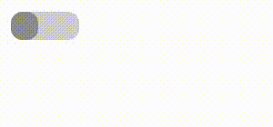
首先看看效果
主要用到以下知识
- ::after(伪元素——用它实现左右滑动效果)
- :checked(伪类选择器——用它来实现选中和不选中)
网页结构
<input type="checkbox" class="switch" />
css样式
        .switch {
            -moz-appearance: none;//选中前的input样式
            -webkit-appearance: none;
            position: relative;
            width: 60px;
            height: 25px;
            background: rgb(207, 205, 205);
            border-radius: 10px;
            outline: none;
        }

        .switch::after {
            content: "";//选中前的伪元素样式
            position: absolute;
            width: 40%;
            height: 100%;
            border-radius: 10px;
            left: 0;
            top: 0;
            background: rgb(141, 140, 140);
            transition: all 0.5s;
        }

        .switch:checked {
            background: rgb(55, 218, 136);//选中后的input样式
        }

        .switch:checked::after {
            background: orange;//选中后的伪元素样式
            left: 60%;
        }
提示:主要基于谷歌浏览器实现的效果,如果在其他浏览器效果失败,可能是css兼容性导致的。
(css兼容性文档可看)


 5460
5460


 被折叠的 条评论
为什么被折叠?
被折叠的 条评论
为什么被折叠?
 到【灌水乐园】发言


