


CSS3中背景颜色的渐变
1.线性渐变
语法:background:gradient (有兼容性问题 -moz- -webkit-)
例
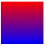
1.
    div{
      width:500px;
      height:500px;
     background:-webkit-gradient(linear,0 0,0 100%,from(#f00),to(#00f);
  background:-webkit-gradient(linear,0 0,0 100%,from(#f00),to(#00f);
  background:-webkit-gradient(linear,left top,left bottom,from(#f00),to(#00f);
    }
2.
div{
 width: 500px;
  height:500px
  background:-webkit-gradient(linear,0% 0%,100% 100%,color- stop(0.1,rgb(255,0,0)),color-stop(0.5,rgb(255,255,0)),color-stop(1,rgb(0,0,255))); }

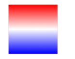
3.
div{
 width: 500px;
  height:500px;
   background: -webkit-linear-gradient(top,red,white,blue);
    background: -moz-linear-gradient(top,red,white,blue); }
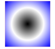
2.径向渐变
div{ width: 500px;
 height:500px;
 background: -webkit-radial-gradient(50% 50%,black,white,blue);
  background: -moz-radial-gradient(50% 50%,black,white,blue); }
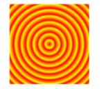
3.重复性渐变
background:repeating-radial-gradient(center,shape size, start-color, …, last-color)重复径向渐变
div{ width:200px; height:200px; padding: 20px; background:-webkit-repeating-radial- gradient(circle contain,#f00,#ff0 10%,#f00 15%) }


 扫一扫
扫一扫


 1361
1361

 被折叠的 条评论
为什么被折叠?
被折叠的 条评论
为什么被折叠?
 到【灌水乐园】发言


