


字体图标
目标:使用字体图标技巧实现网页中简洁的图标效果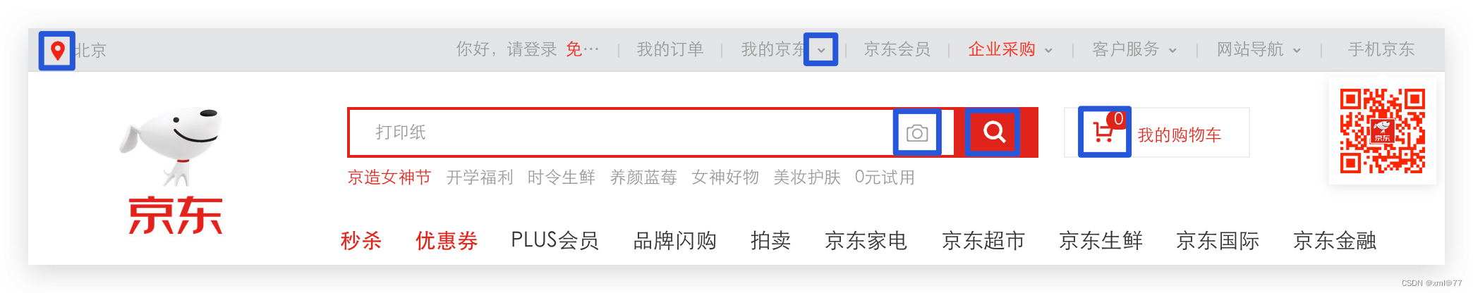
- 字体图标展示的是图标,本质是字体。
- 处理简单的、颜色单一的图片
字体图标的优点:
- 灵活性:灵活地修改样式,例如:尺寸、颜色等
- 轻量级:体积小、渲染快、降低服务器请求次数
- 兼容性:几乎兼容所有主流浏览器
- 使用方便:
- 下载字体包
- 使用字体图标
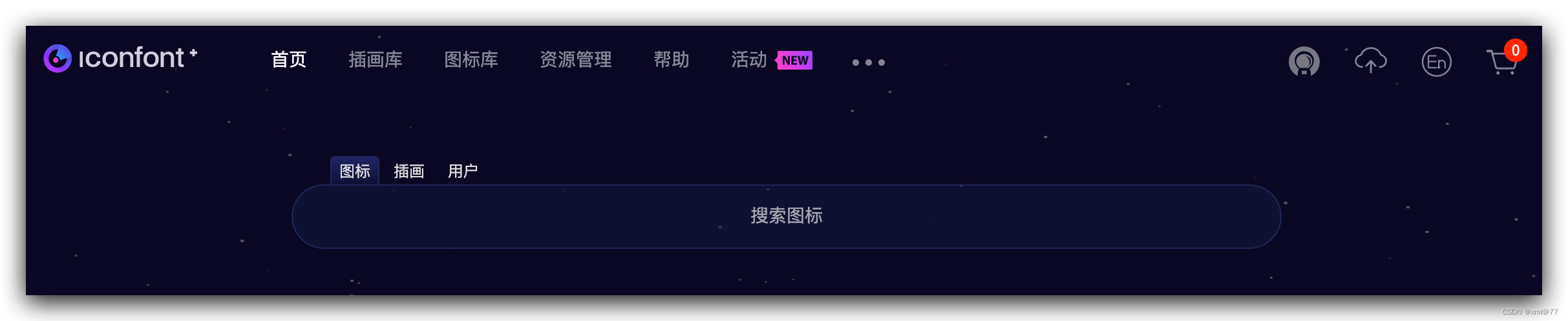
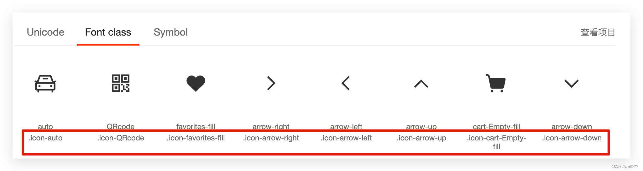
图标库
- Iconfont:https://www.iconfont.cn/
下载字体包:
- 登录(新浪微博)→选择图标库→选择图标,加入购物车→购物车→添加至项目→下载至本地
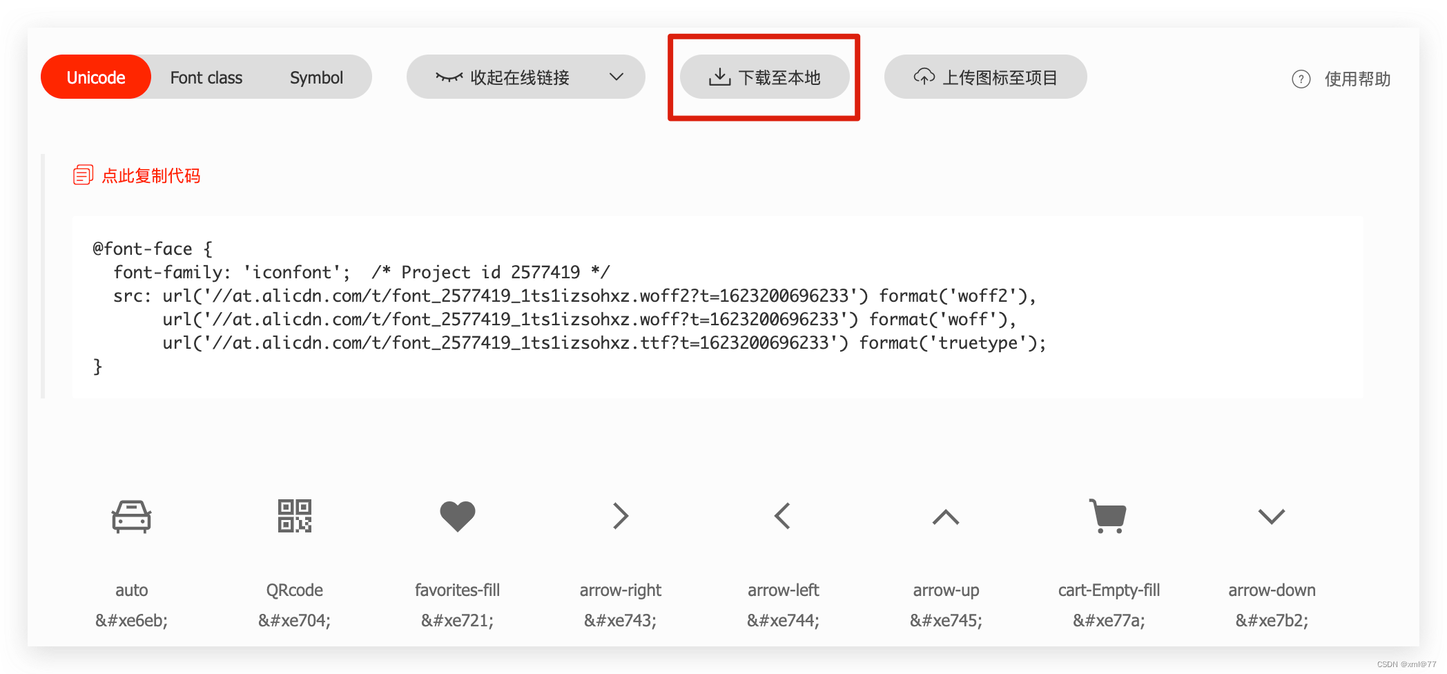
使用字体图标
-
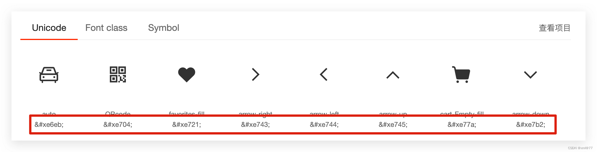
Unicode编码
-
类名
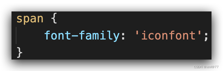
Unicode编码:
- 引入样式表:iconfont.css
- 复制粘贴图标对应的Unicode编码
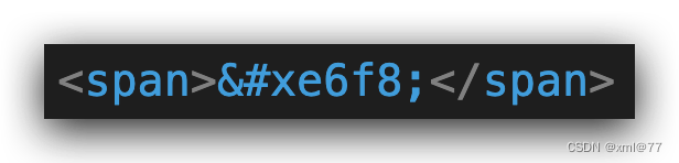
- 设置文字字体
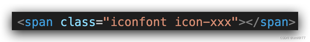
类名
-
引入字体图标样式表
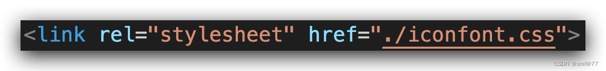
-
调用图标对应的类名,必须调用 2 个类名
- iconfont类:基本样式,包含字体的使用等
- icon-xxx:图标对应的类名
<!DOCTYPE html>
<html lang="en">
<head>
    <meta charset="UTF-8">
    <meta http-equiv="X-UA-Compatible" content="IE=edge">
    <meta name="viewport" content="width=device-width, initial-scale=1.0">
    <title>Document</title>
    <!-- 1、引入样式表  -->
    <link rel="stylesheet" href="../font/iconfont.css">
    <style>
        /* 修改字体图标的样式 */
        .iconfont {
            font-size: 30px;
            color: orange;
        }
    </style>
</head>
<body>
    <!-- 2、调用类名 -->
    <!-- iconfont 是固定 -->
    <div class="iconfont icon-arrow-down"></div>
</body>
</html>
案例:淘宝购物车
- 布局标签
- li>span* 3
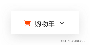
- li>span* 3
- 字体图标
- 引入字体图标样式表
- 购物车和箭头span调用字体图标类名
<!DOCTYPE html>
<html lang="en">
<head>
    <meta charset="UTF-8">
    <meta http-equiv="X-UA-Compatible" content="IE=edge">
    <meta name="viewport" content="width=device-width, initial-scale=1.0">
    <title>Document</title>
    <link rel="stylesheet" href="../iconfont/iconfont.css">
    <style>
        * {
            margin: 0;
            padding: 0;
        }
        a {
            color: #333;
            text-decoration: none;
        }
        li {
            list-style: none;
        }
        .nav {
            width: 200px;
            height: 50px;
            margin: 100px auto;
        }
        .orange{
            color: orange;
        }
    </style>
</head>
<body>
    <div class="nav">
        <ul>
            <li>
                <a href="">
                    <span class="iconfont icon-cart-Empty-fill orange"></span>
                    <span>购物车</span>
                    <span class="iconfont icon-arrow-down"></span>
                </a>
            </li>
        </ul>
    </div>
</body>
</html>
上传矢量图:
- 思考:如果图标库没有项目所需的图标怎么办?
- 答:IconFont网站上传矢量图生成字体图标
- 1.与设计师沟通,得到SVG矢量图
- 2.IconFont网站上传图标,下载使用
上传矢量图:
- 上传→上传SVG图标
- 浏览本地图标→去除颜色提交
- 加入购物车→下载使用
平面转换
目标:使用translate实现元素位移、旋转、缩放效果
-
平面转换
- 改变盒子在平面内的形态(位移、旋转、缩放)
- 2D转换
-
平面转换属性
- transform
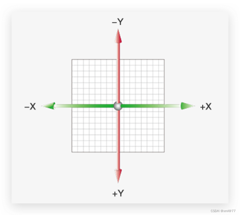
位移
-
语法
- transform: translate(水平移动距离, 垂直移动距离);
-
取值(正负均可)
- 像素单位数值
- 百分比(参照物为盒子自身尺寸)
注意:X轴正向为右,Y轴正向为下
-
技巧
- translate()如果只给出一个值, 表示x轴方向移动距离
- 单独设置某个方向的移动距离:translateX() & translateY()
<!DOCTYPE html>
<html lang="en">
<head>
    <meta charset="UTF-8">
    <meta http-equiv="X-UA-Compatible" content="IE=edge">
    <meta name="viewport" content="width=device-width, initial-scale=1.0">
    <title>Document</title>
    <style>
        *{
            margin: 0;
            padding: 0;
        }
        .father {
            overflow: hidden;
            width: 500px;
            height: 300px;
            margin: 100px auto;
            border: 1px solid #000;
        }
        .son {
            width: 200px;
            height: 100px;
            background-color: pink;
            transition: all 1s;
        }
        .son:hover{
            transform: translate(500px, 300px);
            /* transform: translateX(500px); */
            /* transform: translateY(300px); */
        }
    </style>
</head>
<body>
    <div class="father">
        <div class="son"></div>
    </div>
</body>
</html>
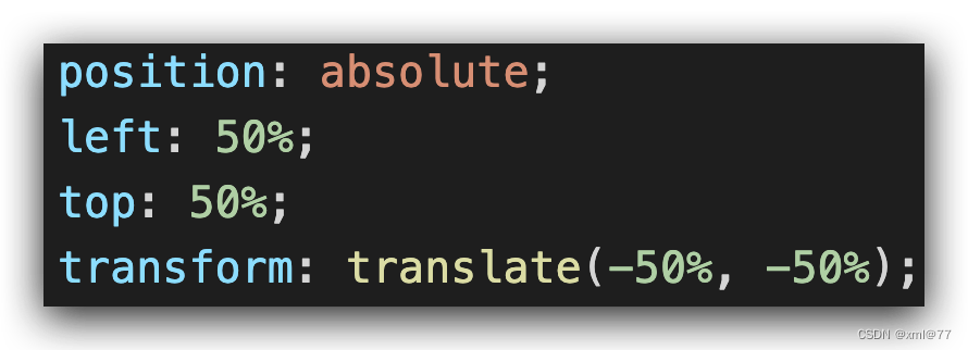
位移-绝对定位居中
目标:使用translate快速实现绝对定位的元素居中效果
- 实现方法
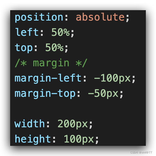
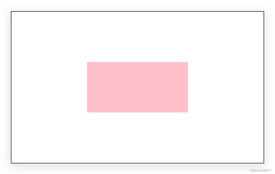
- 核心代码
<!DOCTYPE html>
<html lang="en">
<head>
    <meta charset="UTF-8">
    <meta http-equiv="X-UA-Compatible" content="IE=edge">
    <meta name="viewport" content="width=device-width, initial-scale=1.0">
    <title>Document</title>
    <style>
        *{
            margin: 0;
            padding: 0;
        }
        .father {
            position: relative;
            overflow: hidden;
            width: 500px;
            height: 300px;
            margin: 100px auto;
            border: 1px solid #000;
        }
        .son {
            position: absolute;
            top: 50%;
            left: 50%;
            transform: translate(-50%, -50%);
            width: 200px;
            height: 100px;
            background-color: pink;
            transition: all 1s;
        }

    </style>
</head>
<body>
    <div class="father">
        <div class="son"></div>
    </div>
</body>
</html>
- 原理
- 位移取值为百分比数值,参照盒子自身尺寸计算移动距离
先移动到父级盒子的一半,在移动自身的一半
案例
目标:使用translate实现元素位移效果
- 位移取值为百分比数值,参照盒子自身尺寸计算移动距离
- 右侧盒子背景图
- background-position:right;
- background-position:right;
<!DOCTYPE html>
<html lang="en">
<head>
    <meta charset="UTF-8">
    <meta http-equiv="X-UA-Compatible" content="IE=edge">
    <meta name="viewport" content="width=device-width, initial-scale=1.0">
    <title>Document</title>
    <style>
        .box{
            overflow: hidden;
            width: 1366px;
            height: 600px;
            background-image: url(./images/bg.jpg);
            margin: 50px auto;
        }
        .box::before,
        .box::after{
            float: left;
            content: '';
            width: 50%;
            height: 100%;
            background-image: url(./images/fm.jpg);
            transition: all .5s;
        }
        .box::after{
            background-position: right 0;
        }
        .box:hover::before{
            transform: translateX(-100%);
        }
        .box:hover::after{
            transform: translateX(100%);
        }
    </style>
</head>
<body>
    <div class="box"></div>
</body>
</html>
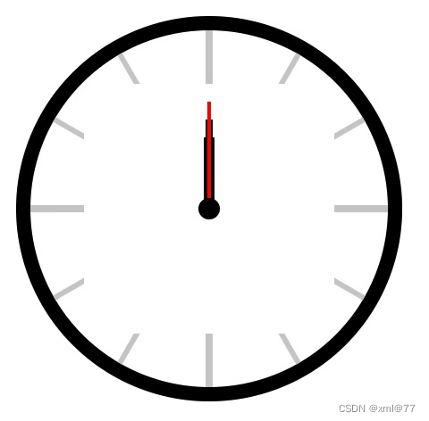
旋转
目标:使用rotate实现元素旋转效果
-
语法
- transform: rotate(角度);
注意:角度单位是deg
- transform: rotate(角度);
-
技巧:取值正负均可
- 取值为正, 则顺时针旋转
- 取值为负, 则逆时针旋转

img{
    width: 150px;
    /* 过渡写到本身上,谁做动画给谁加 */
    transition: all 3s;
}
img:hover{
    transform: rotate(360deg);
}
转换原点
目标:使用transform-origin属性改变转换原点
-
语法
- 默认圆点是盒子中心点
- transform-origin: 原点水平位置 原点垂直位置;
-
取值
- 方位名词(left、top、right、bottom、center)
- 像素单位数值
- 百分比(参照盒子自身尺寸计算)

 div{
   width: 200px;
   height: 200px;
   margin: 200px auto;
   background-color: pink;
   transition: all 1s;
   /* 可以跟方位名词 */
   /* 添加给标签本身 */
   transform-origin: left bottom;
   /* 默认是 50% 50% 等价于 center center */
}
div:hover{
   transform: rotate(360deg);
}
当点击白色背景的盒子时,粉色背景的盒子慢慢从底下占满白色盒子
<!DOCTYPE html>
<html lang="en">
<head>
    <meta charset="UTF-8">
    <meta http-equiv="X-UA-Compatible" content="IE=edge">
    <meta name="viewport" content="width=device-width, initial-scale=1.0">
    <title>Document</title>
    <style>
        *{
            margin: 0;
            padding: 0;
        }
        div{
            overflow: hidden;
            float: left;
            width: 200px;
            height: 200px;
            border: 1px solid pink;
            margin: 0 auto;
            box-sizing: border-box;
        }
        div::before{
            content: 'Hello World!';
            display: block;
            width: 100%;
            height: 100%;
            background-color: pink;
            color: #fff;
            transform: rotate(90deg);
            transform-origin: left bottom;
            transition: all .5s;
        }
        div:hover::before{
            /* 复原回 0度 */
            transform: rotate(0deg);
        }

    </style>
</head>
<body>
    <div></div>
    <div></div>
    <div></div>
</body>
</html>
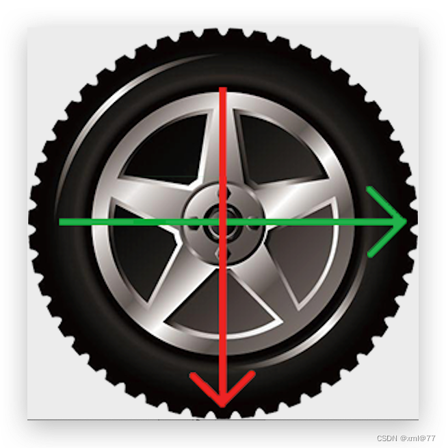
多重转换
目标:使用transform复合属性实现多形态转换
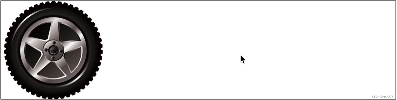
多重转换技巧
- 多重转换原理
- 旋转会改变网页元素的坐标轴向
- 先写旋转,则后面的转换效果的轴向以旋转后的轴向为准,会影响转换结果
<!DOCTYPE html>
<html lang="en">
<head>
    <meta charset="UTF-8">
    <meta http-equiv="X-UA-Compatible" content="IE=edge">
    <meta name="viewport" content="width=device-width, initial-scale=1.0">
    <title>Document</title>
    <style>
        .box{
            width: 1200px;
            height: 301px;
            border: 1px solid #000;
        }
        .box img{
            width: 300px;
            height: 300px;
            transition: all 2s;
        }
        .box img:hover{
            transform: translateX(900px) rotate(360deg);
        }
    </style>
</head>
<body>
    <div class="box">
        <img src="./tyre.png" alt="">
    </div>
</body>
</html>
缩放
目标:使用scale改变元素的尺寸
-
思考:改变元素的width或height属性能实现吗?
-
语法
- transform: scale(x轴缩放倍数, y轴缩放倍数);
-
技巧
- 一般情况下, 只为scale设置一个值, 表示x轴和y轴等比例缩放
- transform:scale(缩放倍数);
- scale值大于 1 表示放大, scale值小于 1 表示缩小
- 一般情况下, 只为scale设置一个值, 表示x轴和y轴等比例缩放

<!DOCTYPE html>
<html lang="en">
<head>
    <meta charset="UTF-8">
    <meta http-equiv="X-UA-Compatible" content="IE=edge">
    <meta name="viewport" content="width=device-width, initial-scale=1.0">
    <title>Document</title>
    <style>
        .box{
            /* 溢出隐藏 */
            overflow: hidden;
            width: 768px;
            height: 542px;
            margin: 100px auto;
        }
        .box img{
            width: 100%;
            transition: all .5s;
        }
        .box img:hover{
            transform: scale(1.1);
        }
    </style>
</head>
<body>
    <div class="box">
        <img src="../images/product.jpg" alt="">
    </div>
</body>
</html>
缩放
目标:使用scale改变元素的尺寸
- 播放按钮
- 布局
- ::after
- 样式
- 居中
- 效果
- 缩放
- 透明度(opacity)
- 布局
图片放大案例
<!DOCTYPE html>
<html lang="en">
<head>
    <meta charset="UTF-8">
    <meta http-equiv="X-UA-Compatible" content="IE=edge">
    <meta name="viewport" content="width=device-width, initial-scale=1.0">
    <title>Document</title>
    <style>
        div{
            /* 溢出隐藏 */
            overflow: hidden;
            width: 200px;
            margin: 100px auto;
        }
        div img{
            width: 100%;

        }
        div img:hover{
            transform: scale(1.1);
            transition: all .5s;
        }
    </style>
</head>
<body>
    <div><img src="./images/product.jpg" alt=""></div>
</body>
</html>
<!DOCTYPE html>
<html lang="en">
<head>
<meta charset="UTF-8">
<meta http-equiv="X-UA-Compatible" content="IE=edge">
<meta name="viewport" content="width=device-width, initial-scale=1.0">
<title>Document</title>
<style>
* {
margin: 0;
padding: 0;
}
li{
list-style: none;
}
.box{
width: 249px;
height: 210px;
margin: 50px auto;
overflow: hidden;
}
img {
width: 100%;
}
.box p{
color: #3b3b3b;
padding: 10px 10px 0 10px;
}
.box .pic {
position: relative;
}
.box .pic::after{
position: absolute;
top: 50%;
left: 50%;
/* margin-left: -29px;
margin-top: -29px; */
transform: translate(-50%, -50%) scale(5);
content: '';
width: 58px;
height: 58px;
background-image: url(../images/play.png);
opacity: 0;
transition: all .5s;
}
.box li:hover .pic::after{
opacity: 1;
transform: translate(-50%, -50%) scale(1);
}
</style>
</head>
<body>
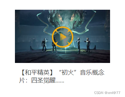
<div class="box">
<ul>
<li>
<div class="pic">
<img src="./party.jpeg" alt="">
</div>
<p>【和平精英】“初火”音乐概念片:四圣觉醒......</p>
</li>
</ul>
</div>
</body>
</html>
分页按钮案例
<!DOCTYPE html>
<html lang="en">
<head>
    <meta charset="UTF-8">
    <meta http-equiv="X-UA-Compatible" content="IE=edge">
    <meta name="viewport" content="width=device-width, initial-scale=1.0">
    <title>Document</title>
    <style>
       li{
           float: left;
           width: 30px;
           height: 30px;
           border: 1px solid pink;
           list-style: none;
           margin: 10px;
           text-align: center;
           line-height: 30px;
           border-radius: 50%;
           transition: all .4s;
       }
       li:hover {
           transform: scale(1.2);
       }
    </style>
</head>
<body>
    <ul>
        <li>1</li>
        <li>2</li>
        <li>3</li>
        <li>4</li>
        <li>5</li>
        <li>6</li>
        <li>7</li>
    </ul>
</body>
</html>
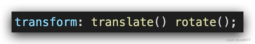
2D转换综合写法
transform: translate() rotate() scale();
transform: translate(100px, 100px) rotate(90deg) scale(1.5);
2D转换总结
- 转换 transform我们简单理解就是变形,有2D和3D之分
- 我们暂且学了三个分别是 位移、旋转和缩放
- 2D 移动 translate(x, y)最大的优势是不影响其他盒子,里面参数用%,是相对于自身宽度和高度来计算的
- 可l以分开写,比如 translateX(x) translateY(y)
- 2D 旋转 rotate(度数可以实现旋转元素度数的单位是 deg
- 2D 缩放 sale(x)里面参数是数字,不跟单位,可以是小数,最大的优势不影响其他盒子
- 设置转换中心点 transform-origin: x y; 参数可以百分比、像素或者是方位名词
- 当我们进行综合写法,同时有位移和其他属性的时候,记得要将位移放到最前
渐变
渐变背景
目标:使用background-image属性实现渐变背景效果
-
渐变是多个颜色逐渐变化的视觉效果
-
一般用于设置盒子的背景
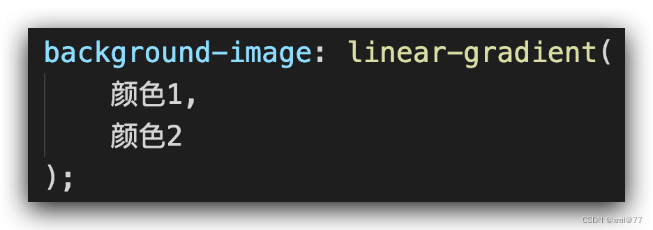
-
语法
综合案例

<!DOCTYPE html>
<html lang="en">
<head>
<meta charset="UTF-8">
<meta http-equiv="X-UA-Compatible" content="IE=edge">
<meta name="viewport" content="width=device-width, initial-scale=1.0">
<title>Document</title>
<link rel="stylesheet" href="../font/iconfont.css">
<style>
* {
margin: 0;
padding: 0;
}
a {
text-decoration: none;
}
li {
list-style: none;
}
.box {
width: 1110px;
height: 247px;
margin: 100px auto;
}
.box li {
position: relative;
float: left;
margin-right: 30px;
width: 350px;
height: 247px;
overflow: hidden;
}
.box li:last-child{
margin-right: 0;
}
.box .pic img {
width: 100%;
transition: all .5s;
}
.box .txt{
position: absolute;
left: 0;
bottom: -50px;
width: 350px;
height: auto;
padding: 20px 30px;
color: #fff;
transition: all .5s;
}
.box .txt h5 {
margin-bottom: 40px;
font-size: 18px;
line-height: 1.5em;
font-weight: 400;
}
.box .txt p{
font-size: 14px;
}
.box .txt p .iconfont {
color: #c7000b;
vertical-align: middle;
font-size: 20px;
font-weight: 700;
}
.box .mask {
position: absolute;
top: 0;
left: 0;
width: 100%;
height: 100%;
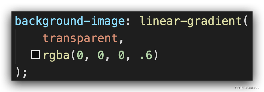
background-image: linear-gradient(
transparent,
rgba(0, 0, 0, .3)
);
opacity: 0;
}
.box li:hover .mask{
opacity: 1;
}
.box li:hover .pic img {
transform: scale(1.2);
}
.box li:hover .txt {
transform: translateY(-50px);
}
</style>
</head>
<body>
<div class="box">
<ul>
<li>
<a href="#">
<div class="pic">
<img src="./product.jpeg" alt="">
</div>
<div class="mask"></div>
<div class="txt">
<h4>产品</h4>
<h5>OceanStor Pacific 海量存储斩获2021 Interop金奖</h5>
<p>
<span>了解更多</span>
<i class="iconfont icon-arrow-down"></i>
</p>
</div>
</a>
</li>
<li>
<a href="#">
<div class="pic">
<img src="./huawei1.jpeg" alt="">
</div>
<div class="mask"></div>
<div class="txt">
<h4>产品</h4>
<h5>OceanStor Pacific 海量存储斩获2021 Interop金奖</h5>
<p>
<span>了解更多</span>
<i class="iconfont icon-arrow-down"></i>
</p>
</div>
</a>
</li>
<li>
<a href="#">
<div class="pic">
<img src="./huawei2.jpeg" alt="">
</div>
<div class="mask"></div>
<div class="txt">
<h4>产品</h4>
<h5>OceanStor Pacific 海量存储斩获2021 Interop金奖</h5>
<p>
<span>了解更多</span>
<i class="iconfont icon-arrow-down"></i>
</p>
</div>
</a>
</li>
</ul>
</div>
</body>
</html>


 247
247


 被折叠的 条评论
为什么被折叠?
被折叠的 条评论
为什么被折叠?
 到【灌水乐园】发言


