3D动画+弹性盒子
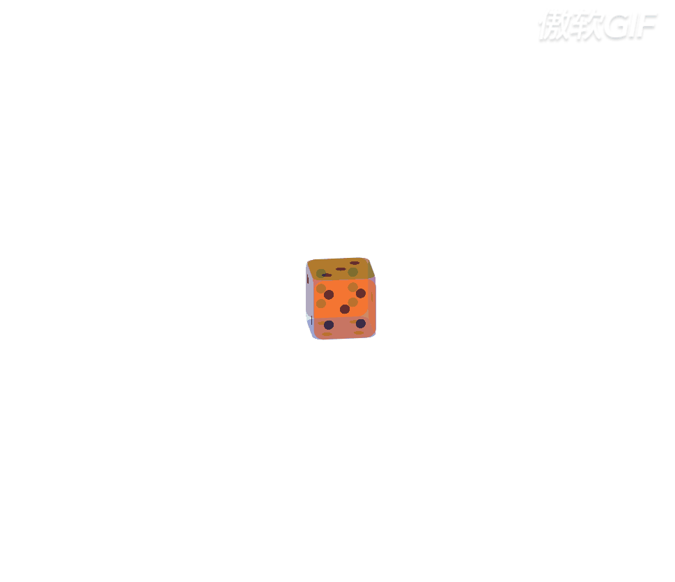
一、效果展示:
二、代码展示:
<style>
*{
margin: 0;
padding: 0;
}
.bigBox{
width: 500px;
height: 500px;
position: fixed;
border-radius: 80px;
left: 0;right: 0;
top: 0;bottom: 0;
margin: auto;
transform-style: preserve-3d;
transform: rotateX(-20deg) rotateY(30deg);
animation: bigBox 5s infinite linear;
}
.bigBox div{
width: 500px;
height: 500px;
border-radius: 80px;
font-size: 50px;
line-height: 500px;
text-align: center;
border: 2px solid gray;
position: absolute;
left: 0;top:0;
opacity: 0.6;
}
.s_box1,.s_box2,.s_box3,.s_box4,.s_box5,.s_box6{
box-sizing: border-box;
padding: 80px;
}
.s_box1,.s_box2,.s_box3,.s_box4,.s_box5,.s_box6,h2{
display: flex;
}
span{
width: 80px;
height: 80px;
border-radius: 100%;
background-color: black;
}
.s_box1{
background-color: purple;
transform: translateX(250px) rotateY(90deg);
justify-content: center;
align-items: center;
}
.s_box2{
background-color: skyblue;
transform: translateX(-250px) rotateY(-90deg);
justify-content: space-between;
}
.s_box2 span:nth-child(2){
align-self: flex-end;
}
.s_box3{
background-color: olive;
transform: translateY(-250px) rotateX(-90deg);
justify-content: space-between;
}
.s_box3 h2{
flex-direction: column;
justify-content: center;
}
.s_box3 span:nth-of-type(2){
align-self: flex-end;
}
.s_box4{
background-color: rgb(60, 15, 223);
transform: translateY(250px) rotateX(-90deg);
justify-content:space-between;
}
.s_box4 h2{
flex-direction: column;
justify-content: space-between;
}
.s_box5{
background-color: rgb(241, 121, 9);
transform: translateZ(250px);
justify-content: space-between;
}
.s_box5 h2:nth-child(2n+1){
flex-direction: column;
justify-content: space-between;
}
.s_box5 h2:nth-child(2){
align-items: center;
}
.s_box6{
background-color: rgb(248, 16, 16);
transform: translateZ(-250px) rotateY(180deg);
justify-content: space-between;
}
.s_box6 h2{
flex-direction: column;
justify-content: space-between;
}
@keyframes bigBox{
0%{
transform: rotateX(-20deg) rotateY(0deg) scale3d(0.2,0.2,0.2);
}
25%{
transform: rotateX(-20deg) rotateY(180deg) scale3d(0.6,0.6,0.6);
}
50%{
transform: rotateX(-20deg) rotateY(360deg) scale3d(1,1,1);
}
75%{
transform: rotateX(-20deg) rotateY(540deg) scale3d(0.6,0.6,0.6);
}
100%{
transform: rotateX(-20deg) rotateY(720deg) scale3d(0.2,0.2,0.2);
}
}
.bigBox:hover{
animation-play-state:paused;
}
</style>
</head>
<body>
<div class="bigBox">
<div class="s_box1">
<span></span>
</div>
<div class="s_box2">
<span></span>
<span></span>
</div>
<div class="s_box3">
<span></span>
<h2><span></span></h2>
<span></span>
</div>
<div class="s_box4">
<h2>
<span></span>
<span></span>
</h2>
<h2>
<span></span>
<span></span>
</h2>
</div>
<div class="s_box5">
<h2>
<span></span>
<span></span>
</h2>
<h2>
<span></span>
</h2>
<h2>
<span></span>
<span></span>
</h2>
</div>
<div class="s_box6">
<h2>
<span></span>
<span></span>
<span></span>
</h2>
<h2>
<span></span>
<span></span>
<span></span>
</h2>
</div>
</div>
</body>


 1006
1006


 被折叠的 条评论
为什么被折叠?
被折叠的 条评论
为什么被折叠?
 到【灌水乐园】发言


