


模仿 微信API wx.showModal 封装了自定义modal组件。参考https://blog.csdn.net/qq_37268201/article/details/85252318做了下升级。
效果如下。


定义组件
跟目录下创建一个components文件夹存放所有的组件
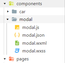
modal.wxml:
<!--components/model/model.wxml-->
<view class='modal-mask' wx:if='{{show}}' bindtap='clickMask'>
  <view class='modal-content'>
    <view class='main-content'>
      <view class="main-title">{{title}}</view>
      <scroll-view scroll-y>
        <slot></slot>
      </scroll-view>
    </view>
    <view class='modal-footer'>
      <view wx:if='{{!noCancel}}' class='cancel-btn' bindtap='cancel'>{{cancelText}}</view>
      <view class='confirm-btn' bindtap='confirm'>{{confirmText}}</view>
    </view>
  </view>
</view>
说明:
show 变量控制弹窗显示或隐藏状态,
clickMask 是点击遮罩层的事件,可控制点击遮罩是否隐藏modal弹窗(不需要可以删掉)。
scroll-view 是为了满足当内容过多时一页显示不全时可以上下滚动浏览的效果(如果内容很少直接用view标签也可以),scroll-y表示允许纵向滚动(不需要可以删掉)。
****为组件引用时的自定义内容替换掉就好了。
noCancel 变量控制底部按钮是一个还是两个。
cancel 点击取消绑定的事件。
confirm 点击确定绑定的事件。
modal.json:
{
  "component": true,
  "usingComponents": {}
}
“component”: true 表示这是一个组件文件。
usingComponents 用于引用别的组件,这里没引用其他组件空 {} 就行。
modal.wxss:
/* components/model/model.wxss */
/*遮罩层*/
.modal-mask{
  display: flex;
  justify-content: center;
  align-items: center;
  position: fixed;
  left: 0;
  right: 0;
  top: 0;
  bottom: 0;
  background-color: rgba(0,0,0,0.5);
  z-index: 999;
}
/*遮罩内容*/
.modal-content{
  display: flex;
  flex-direction: column;
  width: 80%;
  background-color: #fff;
  border-radius: 10rpx;
  text-align: center;
}
/*中间内容*/
.main-content{
  flex: 1;
  height: 100%;
  margin-top: 20rpx;
  padding-left: 20rpx;
  padding-right: 20rpx;
  overflow-y: hidden;
  max-height: 80vh; /* 内容高度最高80vh 以免内容太多溢出*/
}
/*底部按钮*/
.modal-footer{
  width: 100%;
  display: flex;
  flex-direction: row;
  height: 80rpx;
  line-height: 80rpx;
  border-top: 2rpx solid #D2D3D5;
  margin-top: 30rpx;
}
.cancel-btn, .confirm-btn{
  flex: 1;
  text-align: center;
  font-size: 32rpx;
}
.cancel-btn{
  color: #000;
  border-right: 2rpx solid #D2D3D5;
}
.confirm-btn {
  color: #09BA07
}
样式可自行修改
modal.js:
// components/modal/modal.js
Component({
  /**
   * 组件的属性列表
   */
  properties: {
    //是否显示modal弹窗
    show: {
      type: Boolean,
      value: false
    },
    //控制底部是一个按钮还是两个按钮,默认两个
    noCancel: {
      type: Boolean,
      value: false
    },
    //标题的文字
    title: {
      type: String,
      value: ''
    },
    //取消按钮的文字
    cancelText: {
      type: String,
      value: '取消'
    },
    //确定按钮的文字
    confirmText: {
      type: String,
      value: '确定'
    },
  },

  /**
   * 组件的初始数据
   */
  data: {

  },

  /**
   * 组件的方法列表
   */
  methods: {
    // 点击modal的回调函数
    clickMask() {
      // 点击modal背景关闭遮罩层,如果不需要注释掉即可
      this.setData({show: false})
    },
   // 点击取消按钮的回调函数
    cancel() {
      this.setData({ show: false })
      this.triggerEvent('cancel')  //triggerEvent触发事件
    },
    // 点击确定按钮的回调函数
    confirm() {
      this.setData({ show: false })
      this.triggerEvent('confirm')
    }
  }
})
引用组件
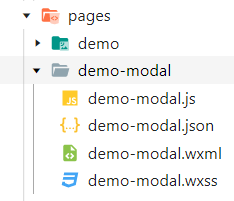
demo-modal.json
{
  "usingComponents": {
    "modalView": "/components/modal/modal"
  }
}modalView为modal弹窗的自定义标签,可自行定义
demo-modal.wxml
<!--pages/demo-modal/demo-modal.wxml-->

  <!-- modal弹窗 noCancel='{{true}}'-->
  <modalView show="{{showModal}}" title="标题" bindcancel="modalCancel" bindconfirm='modalConfirm' confirmText='自定义确定' cancelText='自定义取消'>
    <view class='modal-content'>
      <scroll-view scroll-y class='main-content'>
        <view>自定义内容</view>
        <view>自定义内容</view>
        <text>自定义内容</text>
      </scroll-view>
    </view>
  </modalView>
noCancel='{{true}}' 隐藏取消按钮,默认显示
title 标题文字,默认为空
confirmText 确定按钮的文字,默认为 确定
cancelText 取消按钮的文字,默认为 取消
demo-modal.js
// pages/demo-modal/demo-modal.js
let app = getApp();
Page({

  /**
   * 页面的初始数据
   */
  data: {
    showModal: true, // 显示modal弹窗
  },

  /**
   * 生命周期函数--监听页面加载
   */
  onLoad: function (options) {

  },
  // 点击取消按钮的回调函数
  modalCancel(e) {
    // 这里面处理点击取消按钮业务逻辑
    console.log('点击了取消')
  },
  // 点击确定按钮的回调函数
  modalConfirm(e) {
   // 这里面处理点击确定按钮业务逻辑
    console.log('点击了确定')
  }
})
OK.


 850
850


 被折叠的 条评论
为什么被折叠?
被折叠的 条评论
为什么被折叠?
 到【灌水乐园】发言


