


流式布局
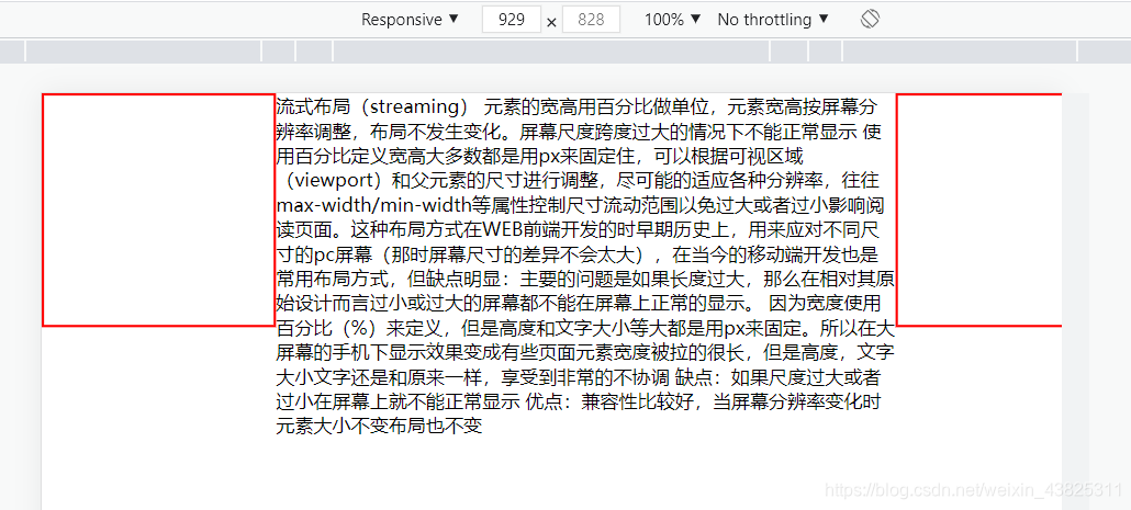
流式布局,也可说是百分比布局,常用于移动端布局,通过设置视口宽度 width:100%;让容器内部左右拉满,根据不同的屏幕宽度进行适配。效果如图:
-
实现前需要在标签中添加meta标签

-
具体代码实现:
<!-- css代码 -->
<style>
    *{

      margin: 0;
      padding: 0;
      box-sizing: border-box;
    }
    .bigBox{

      padding:0 200px;
      position: relative;
    }
    .boxLeft{

      position:absolute;
      width: 200px;
      height: 200px;
      left: 0;
      top: 0;
      border: 2px solid red;
    }
    .boxCenter{

      width: 100%;
    }
最低0.47元/天 解锁文章


 128
128


 被折叠的 条评论
为什么被折叠?
被折叠的 条评论
为什么被折叠?
 到【灌水乐园】发言


