


几个块元素之间间距问题
    //&-info是该div的父类
    &-info div:not(:last-child) {
        margin-right: 50px;
    }
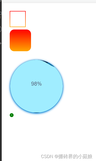
渐变边框,圆角矩形渐变背景,水球,svg
<template>
    <div class="demo-nav">
        <div class="demo1"></div>
        <div class="demo2" style="margin-top: 10px" ref="demo2"></div>
        <div class="per-content">{{per}}%</div>
        <div class="box-inner">
            <div class="inner" ref="inner">
                <svg xmlns="http://www.w3.org/2000/svg" version="1.0" viewBox="0 0 600 140" class="box-waves">
                   <path d="M 0 70 Q 75 20,150 70 T 300 70 T 450 70 T 600 70 L 600 140 L 0 140 L 0 70Z">
                    </path>
                </svg>
                <svg xmlns="http://www.w3.org/2000/svg" version="1.0" viewBox="0 0 600 140" class="box-waves">
                   <path d="M 0 70 Q 75 20,150 70 T 300 70 T 450 70 T 600 70 L 600 140 L 0 140 L 0 70Z">
                    </path>
                </svg>
                <!-- <svg xmlns="http://www.w3.org/2000/svg" version="1.0" viewBox="0 0 600 140" class="box-waves">
                   <path d="M 0 70 Q 75 20,150 70 T 300 70 T 450 70 T 600 70 L 600 140 L 0 140 L 0 70Z">
                    </path>
                </svg> -->
            </div>
        </div>
        <!-- 改后缀名为svg的icon颜色, svg中的fill为currentColor,继承的是父类color -->
        <div class="demo-svg" style="color: green">
            <svg width="16px" height="16px" viewBox="0 0 16 16" version="1.1" xmlns="http://www.w3.org/2000/svg" xmlns:xlink="http://www.w3.org/1999/xlink">
                <title>元件/组件图标/提示/面</title>
                <g id="元件/组件图标/提示/面" stroke="none" stroke-width="1" fill="none" fill-rule="evenodd">
                    <path d="M8,16 C3.581722,16 0,12.418278 0,8 C0,3.581722 3.581722,0 8,0 C12.418278,0 16,3.581722 16,8 C16,12.418278 12.418278,16 8,16 Z M7.5,11.5 C7.5,11.7762581 7.72387097,12 8,12 C8.27612903,12 8.5,11.7762581 8.5,11.5 C8.5,11.2237419 8.27612903,11 8,11 C7.72387097,11 7.5,11.2237419 7.5,11.5 Z M8,4 C7.72385763,4 7.5,4.22385763 7.5,4.5 L7.5,9.5 C7.5,9.77614237 7.72385763,10 8,10 C8.27614237,10 8.5,9.77614237 8.5,9.5 L8.5,4.5 C8.5,4.22385763 8.27614237,4 8,4 Z" id="icon换色层" fill="currentColor"></path>
                </g>
            </svg>
        </div>
    </div>
</template>

<script>
export default {
    data() {
        return {
            per: 0
        }
    },
    mounted() {
        this.getData()
    },
    destroyed() {},
    methods: {
        getData() {
            let i = 0
            let timer = null
            timer = setInterval(() => {
                if(i < 100) {
                    i++
                    this.$refs.inner.style.bottom = (-128 + i) + '%'
                    this.per = i
                } else {
                    i = 0;
                    clearInterval(timer)
                    this.$refs.inner.style.bottom = -128 + '%'
                    this.per = 0
                    this.getData()
                }
            }, 90);

        }
    }
}
</script>
<style scoped>
.demo-nav {
    padding: 30px;
}
.demo1 {
    width: 60px;
    height: 60px;
    border: 2px solid;
    border-image: linear-gradient(180deg, red, orange) 1;
}
.demo2 {
    width: 80px;
    height: 80px;
    border: 2px solid transparent;
    background-image: linear-gradient(180deg, red, orange), linear-gradient(180deg, red, orange);
    /* 前一个内容背景色,后面为边框渐变色 */
    background-origin: border-box;
    background-clip: content-box, border-box;
    border-radius: 10px;
    animation: 2s toBorder linear infinite alternate;
}
@keyframes toBorder {
    100% {
        border-radius: 50%;
    }
}

.box-inner {
    width: 200px;
    height: 200px;
    box-shadow: 0px 2px 7px 0px #238fdb;
    border-radius: 50%;
    position: relative;
    border: 2px solid transparent;
    background-image: linear-gradient(#021f40, #021f40), linear-gradient(180deg, rgba(36, 144, 220, 0.41), rgba(37, 147, 225, 1));
    background-origin: border-box;
    background-clip: content-box, border-box;
    overflow: hidden;

}
.inner {
    width: 100%;
    height: 100%;
    position: absolute;
    left: 0;
    bottom: 0%;
    background-color: #a0edff;
}
.box-waves {
    position: absolute;
    left: 0;
    bottom: 100%;
    width: 200%;
    /* fill: #a0edff; */
    stroke: none;
}
.box-waves:nth-child(1) {
    fill: #146DA1;
    transform: translate(-50%, 0);
    z-index: 3;
    animation: wave-move1 1.5s linear infinite;
}
.box-waves:nth-child(2) {
    fill: #a0edff;
    transform: translate(0, 0);
    z-index: 3;
    animation: wave-move2 2s linear infinite;
    margin-bottom: -2px;
}
.box-waves:nth-child(3) {
    fill: #9dd1f0;
    transform: translate(0, 0);
    z-index: 3;
    animation: wave-move3 1.5s linear infinite;
}
@keyframes wave-move1 {
    100% {
        transform: translate(0, 0);
    }
}
@keyframes wave-move2 {
    100% {
        transform: translate(-50%, 0);
    }
}
@keyframes wave-move3 {
    100% {
        transform: translate(-50%, 0);
    }
}
.per-content {
    /* position: absolute; */
    z-index: 10;
    position: relative;
    top: 106px;
    left: 80px;
    font-size: 20px;
}
.demo-svg {
    /* width: 200px;
    height: 200px;
    border: 1px solid red; */
}
/* .svg  {
  fill: #77809F;
  color: #dae0f8;
} */
</style>
图片旋转360deg
<img src="../assets/logo.png" alt="" class="cover-anim">
.cover-anim {
    animation: coverRoute 16s linear infinite;
}
@keyframes coverRoute {
    form {
        transform: rotate(0deg);
    }
    to {
        transform: rotate(360deg);
    }
}
让字体显示一行,超出隐藏并显示点点点
<div class="father">
    <div class="son">让字体显示一行,超出隐藏并显示点点点</div>
</div>
.father {
    width: 80px;
    overflow: hidden;
}
.son {
    white-space: nowrap;
    overflow: hidden;
    text-overflow: ellipsis;
}
显示二行,超出隐藏,显示点点点
<div class="father1">
     <div class="son1">显示二行,超出隐藏,显示点点点</div>
</div>
.father1 {
    width: 80px;
    overflow: hidden;
}
.son1 {
    text-overflow: ellipsis;
    display: -webkit-box;
    -webkit-box-orient: vertical;
    -webkit-line-clamp: 2;
    -moz-line-clamp: 2;
    -moz-box-orient: vertical;
    word-wrap: break-word;
    word-break: break-all;
    white-space: normal;
    overflow: hidden;
}
网站置灰
// 根目录标签下
.app {
  filter: grayscale(.95);
  -webkit-filter: grayscale(.95);
}
毛玻璃
backdrop-filter
backdrop-filter: none|filter|initial|inherit;
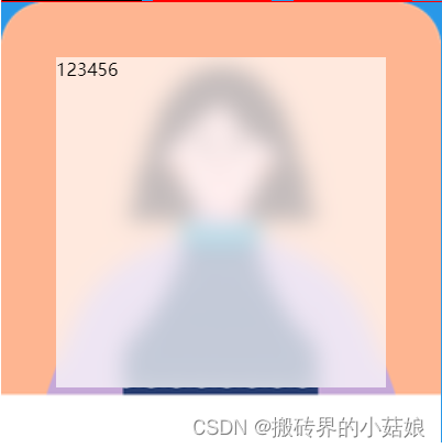
<div class="test">
	<div class="child">123456</div>
</div>
.test {
    width: 400px;
    height: 400px;
    background: url('../assets/hchunf_ctn.png') no-repeat;
    background-size: cover;
    display: flex;
    justify-content: center;
    align-items: center;
    .child {
        width: 300px;
        height: 300px;
        background-color: rgba(255, 255, 255, .7);
        backdrop-filter: blur(10px);
    }
}
data中定义得值
<div class="login">
	<div class="width-login"></div>
</div>

data() {
  return {
    uwidth: '10px'
  };
  },
.login {
	--uid-with: v-bind(uwidth);
	.width-login {
  		width: var(--uid-with);
  		height: var(--uid-with);
  		border: 1px solid red;
	}
}
css样式网址收集
https://juejin.cn/post/7164527444731363336
运动图形小特效:
https://juejin.cn/post/7166142204019228702
三角形、五角星:
https://juejin.cn/post/7114306621144039455
对话框:
https://juejin.cn/post/7124314655110987807
水球进度条:
https://juejin.cn/post/7164050832181166094
svg:
https://juejin.cn/post/6926353919333531661
动态霓虹灯:
https://juejin.cn/post/6844903493799510029


 727
727


 被折叠的 条评论
为什么被折叠?
被折叠的 条评论
为什么被折叠?
 到【灌水乐园】发言


