


推荐动画一:
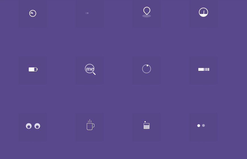
不说废话先上效果图:
html代码
<!DOCTYPE >
<html >
<head>
<meta http-equiv="Content-Type" content="text/html; charset=gb2312" />
<link rel="stylesheet" href="css/normalize.css">
<link rel="stylesheet" href="css/zzsc.css">
</head>
<body>
<div class="wrapper">
	<div class="row cf">
		<div class="span">
			<div class="timer"></div>
		</div>
		<div class="span">
			<div class="typing_loader"></div>
		</div>
		<div class="span">
			<div class="location_indicator"></div>
		</div>
		<div class="span">
			<div class="dashboard"></div>
		</div>
	</div>

	<div class="row cf">
		<div class="span">
			<div class="battery"></div>
		</div>
		<div class="span">
			<div class="magnifier"></div>
		</div>
		<div class="span">
			<div class="help"></div>
		</div>
		<div class="span">
			<div class="cloud"></div>
		</div>
	</div>

	<div class="row cf">
		<div class="span">
			<div class="eye"></div>
		</div>
		<div class="span">
			<div class="coffee_cup"></div>
		</div>
		<div class="span">
			<div class="square"></div>
		</div>
		<div class="span">
			<div class="circle"></div>
		</div>
	</div>
</div>
</body>
</html>
css代码
*{
    -webkit-box-sizing: border-box;
       -moz-box-sizing: border-box;
            box-sizing: border-box;
}
html{
    color: #fff;
    font-family: 'Source Sans Pro', sans-serif;
    background-color: #59488b;
}
h1,h2{
    color: rgba(255,255,255,0.5);
    font-size: 40px;
    font-weight: 200;
    text-align: center;
    margin: 40px 0 0 0;
}
h2{
    font-size: 18px;
    margin: 0;
    padding: 0;
    margin: 10px 0;
}
h1 span{
    font-size: 30px;
}

a{
    text-decoration: none;
}
a:hover{
    transition: all linear 0.2s;
}
::-moz-selection {
    background: #b3d4fc;
    text-shadow: none;
}
::selection {
    background: #b3d4fc;
    text-shadow: none;
}


.wrapper{
    width: 700px;
    margin: 0 auto;
}
.row{
    text-align: center;
    padding: 50px 0;
}
.span, .span_large{
    float: left;
    width: 100px;
    background-color: rgba(0,0,0, 0.02);
    height: 100px;
    vertical-align: middle;
    border-radius: 1px;
    margin-right: 100px;
}
.span:last-child{
    margin-right: 0px;
}

/* Timer*/
.timer{
    width: 24px;
    height: 24px;
    background-color: transparent;
    box-shadow: inset 0px 0px 0px 2px #fff;
    border-radius: 50%;
    position: relative;
    margin: 38px auto;/* Not necessary- its only for layouting*/
 }
.timer:after, .timer:before{
    position: absolute;
    content:"";
    background-color: #fff;
}
.timer:after{
    width: 10px;
    height: 2px;
    top: 11px;
    left: 11px;
    -webkit-transform-origin: 1px 1px;
       -moz-transform-origin: 1px 1px;
            transform-origin: 1px 1px;
    -webkit-animation: minhand 2s linear infinite;
       -moz-animation: minhand 2s linear infinite;
            animation: minhand 2s linear infinite;
}

.timer:before{
    width: 8px;
    height: 2px;
    top: 11px;
    left: 11px;
    -webkit-transform-origin: 1px 1px;
       -moz-transform-origin: 1px 1px;
            transform-origin: 1px 1px;
    -webkit-animation: hrhand 8s linear infinite;
       -moz-animation: hrhand 8s linear infinite;
            animation: hrhand 8s linear infinite;
}

@-webkit-keyframes minhand{
    0%{-webkit-transform:rotate(0deg)}
    100%{-webkit-transform:rotate(360deg)}
}
@-moz-keyframes minhand{
    0%{-moz-transform:rotate(0deg)}
    100%{-moz-transform:rotate(360deg)}
}
@keyframes minhand{
    0%{transform:rotate(0deg)}
    100%{transform:rotate(360deg)}
}

@-webkit-keyframes hrhand{
    0%{-webkit-transform:rotate(0deg)}
    100%{-webkit-transform:rotate(360deg)}
}
@-moz-keyframes hrhand{
    0%{-moz-transform:rotate(0deg)}
    100%{-moz-transform:rotate(360deg)}
}
@keyframes hrhand{
    0%{transform:rotate(0deg)}
    100%{transform:rotate(360deg)}
}

/*Typing Loader*/
.typing_loader{
    width: 6px;
    height: 6px;
    border-radius: 50%;
    -webkit-animation: typing 1s linear infinite alternate;
       -moz-animation: Typing 1s linear infinite alternate;
            animation: typing 1s linear infinite alternate;
    margin: 46px auto; /* Not necessary- its only for layouting*/
    position: relative;
    left: -12px;
}
@-webkit-keyframes typing{
    0%{
        background-color: rgba(255,255,255, 1);
        box-shadow: 12px 0px 0px 0px rgba(255,255,255,0.2),
                    24px 0px 0px 0px rgba(255,255,255,0.2);
      }
    /* 25%{
        background-color: rgba(255,255,255, 0.4);
        box-shadow: 12px 0px 0px 0px rgba(255,255,255,2),
                    24px 0px 0px 0px rgba(255,255,255,0.2);
    }
    75%{ background-color: rgba(255,255,255, 0.4);
        box-shadow: 12px 0px 0px 0px rgba(255,255,255,0.2),
                    24px 0px 0px 0px rgba(255,255,255,1);
      } */
}

@-moz-keyframes typing{
   0%{
        background-color: rgba(255,255,255, 1);
        box-shadow: 12px 0px 0px 0px rgba(255,255,255,0.2),
                    24px 0px 0px 0px rgba(255,255,255,0.2);
      }
    /* 25%{
        background-color: rgba(255,255,255, 0.4);
        box-shadow: 12px 0px 0px 0px rgba(255,255,255,2),
                    24px 0px 0px 0px rgba(255,255,255,0.2);
    } */
    /* 75%{ background-color: rgba(255,255,255, 0.4);
        box-shadow: 12px 0px 0px 0px rgba(255,255,255,0.2),
                    24px 0px 0px 0px rgba(255,255,255,1);
      } */
}

@keyframes typing{
   0%{
        background-color: rgba(255,255,255, 1);
        box-shadow: 12px 0px 0px 0px rgba(255,255,255,0.2),
                    24px 0px 0px 0px rgba(255,255,255,0.2);
      }
    25%{
        background-color: rgba(255,255,255, 0.4);
        box-shadow: 12px 0px 0px 0px rgba(255,255,255,2),
                    24px 0px 0px 0px rgba(255,255,255,0.2);
    }
    75%{ background-color: rgba(255,255,255, 0.4);
        box-shadow: 12px 0px 0px 0px rgba(255,255,255,0.2),
                    24px 0px 0px 0px rgba(255,255,255,1);
      }
}

/*Location indicator */
.location_indicator{
    margin: 30px auto;
    position: relative;
    left: -9px;
}

.location_indicator:before, .location_indicator:after{
    position: absolute;
    content: "";
}

.location_indicator:before{
    width: 20px;
    height: 20px;
    border-radius: 100% 100% 100% 0;
    box-shadow: 0px 0px 0px 2px rgba(255,255,255,1);
    -webkit-animation: mapping 1s linear infinite;
       -moz-animation: mapping 1s linear infinite;
            animation: mapping 1s linear infinite;
    -webkit-transform: rotate(-46deg);
       -moz-transform: rotate(-46deg);
            transform: rotate(-46deg);

}

.location_indicator:after{
    width: 30px;
    height: 10px;
    border-radius: 100%;
    left: 44px;
    background-color: rgba(255, 255, 255, 0.2);
    top: 24px;
    z-index: -1;
}

@-webkit-keyframes mapping{
    0% {top: 0;}
    50%{top: -5px;}
    100% {top:0; }
}
@-moz-keyframes mapping{
    0% {top: 0;}
    50%{top: -5px;}
    100% {top:0; }
}
@-keyframes mapping{
    0% {top: 0;}
    50%{top: -5px;}
    100% {top:0; }
}

/* go in*/
.dashboard{
    width: 32px;
    height: 32px;
    margin: 30px auto;
    border: 2px rgba(255,255,255,1) solid;
    border-radius: 100%;
    position: relative;
    overflow: hidden;
    z-index: 1;
}
.dashboard:after, .dashboard:before{
    position: absolute;
    content: "";
}
.dashboard:after{
    width:14px;
    height: 2px;
    top: 20px;
    -webkit-transform-origin: 1px 1px;
       -moz-transform-origin: 1px 1px;
            transform-origin: 1px 1px;
    background-color: rgba(255,255,255,1);
    -webkit-animation: dashboard_hand 2s linear infinite alternate;
       -moz-animation: dashboard_hand 2s linear infinite alternate;
            animation: dashboard_hand 2s linear infinite alternate;
}
.dashboard:before{
    width: 32px;
    height: 10px;
    background-color: rgba(255,255,255,1);
    top:20px;
    left: -2px;
}
@-webkit-keyframes dashboard_hand{
    0%{ -webkit-transform: rotate(-160deg);}
    100%{ -webkit-transform: rotate(-20deg);}
}
@-moz-keyframes dashboard_hand{
    0%{ -moz-transform: rotate(-160deg);}
    100%{ -moz-transform: rotate(-20deg);}
}
@keyframes dashboard_hand{
    0%{ transform: rotate(-160deg);}
    100%{ transform: rotate(-20deg);}
}

/*Battery*/
.battery{
    width: 28px;
    height: 14px;
    border: 1px #fff solid;
    border-radius: 2px;
    position: relative;
    -webkit-animation: charge 5s linear infinite;
       -moz-animation: charge 5s linear infinite;
            animation: charge 5s linear infinite;
    top: 40px;
    margin: 0 auto;
}
.battery:after{
    width: 2px;
    height: 7px;
    background-color: #fff;
    border-radius: 0px 1px 1px 0px;
    position: absolute;
    content: "";
    top: 2px;
    right: -4px;
}
@-webkit-keyframes charge{
    0%{box-shadow: inset 0px 0px 0px #fff;}
    100%{box-shadow: inset 30px 0px 0px #fff;}
}
@-moz-keyframes charge{
    0%{box-shadow: inset 0px 0px 0px #fff;}
    100%{box-shadow: inset 30px 0px 0px #fff;}
}
@keyframes charge{
    0%{box-shadow: inset 0px 0px 0px #fff;}
    100%{box-shadow: inset 30px 0px 0px #fff;}
}

.magnifier{
    width: 20px;
    height: 20px;
    box-shadow: 0px 0px 0px 1px #fff;
    border-radius: 50%;
    position: relative;
    margin: 34px auto;
    -webkit-animation: magnify 1s linear infinite alternate;
       -moz-animation: magnify 1s linear infinite alternate;
            animation: magnify 1s linear infinite alternate;
}
.magnifier:after, .magnifier:before{
    position: absolute;
    content: "";
}
.magnifier:before{
    content: "me";
    font-size: 12px;
    left: 2px;
    text-align: center;
    top: 2px;
}
.magnifier:after{
    width: 2px;
    height: 8px;
    background-color: #fff;
    bottom: -6px;
    left: 20px;
    border-radius: 2px;
    -webkit-transform: rotate(-45deg);
       -moz-transform: rotate(-45deg);
            transform: rotate(-45deg);
}

@-webkit-keyframes magnify{
    0%{-webkit-transform: scale(1); }
    100%{-webkit-transform: scale(1.5);}
}
@-moz-keyframes magnify{
    0%{-moz-transform: scale(1); }
    100%{-moz-transform: scale(1.5);}
}
@keyframes magnify{
    0%{transform: scale(1); }
    100%{transform: scale(1.5);}
}

/*help ��ͷ�� www.datouwang.com */
.help{
    width: 30px;
    height: 30px;
    border: 1px #fff solid;
    border-radius: 50%;
    -webkit-animation: rotation 1s ease-in-out infinite;
       -moz-animation: rotation 1s ease-in-out infinite;
            animation: rotation 1s ease-in-out infinite;
    margin: 30px auto;
}
.help:after{
    width: 5px;
    height: 5px;
    background-color: rgba(255,255,255,1);
    border-radius: 100%;
    position: absolute;
    content: "";
}
@-webkit-keyframes rotation{
    0%{-webkit-transform: rotate(0deg);}
    100%{-webkit-transform: rotate(360deg);}
}
@-moz-keyframes rotation{
    0%{-moz-transform: rotate(0deg);}
    100%{-moz-transform: rotate(360deg);}
}
@keyframes rotation{
    0%{transform: rotate(0deg);}
    100%{transform: rotate(360deg);}
}

/*eye ball*/
.eye{
    width: 20px;
    height: 20px;
    background-color: rgba(255,255,255,0.8);
    border-radius: 50%;
    box-shadow: 30px 0px 0px 0px rgba(255,255,255,0.8);
    position: relative;
    margin: 36px 26px;
}

.eye:after{
    background-color: #59488b;
    width: 10px;
    height: 10px;
    box-shadow: 30px 0px 0px 0px #59488b;
    border-radius: 50%;
    left: 9px;
    top: 8px;
    position: absolute;
    content: "";
    -webkit-animation: eyeball 2s linear infinite alternate;
       -moz-animation: eyeball 2s linear infinite alternate;
            animation: eyeball 2s linear infinite alternate;
}
@-webkit-keyframes eyeball{
    0%{left: 9px;}
    100%{left: 1px;}
}
@-moz-keyframes eyeball{
    0%{left: 9px;}
    100%{left: 1px;}
}
@keyframes eyeball{
    0%{left: 9px;}
    100%{left: 1px;}
}

/*coffee cup*/
.coffee_cup{
    width: 20px;
    height: 24px;
    border: 1px rgba(255,255,255,1) solid;
    border-radius: 0px 0px 5px 5px;
    position: relative;
    margin: 36px auto;
}
.coffee_cup:after, .coffee_cup:before{
    position: absolute;
    content: "";
}
.coffee_cup:after{
    width: 5px;
    height: 12px;
    border: 1px #fff solid;
    border-left: none;
    border-radius: 0px 20px 20px 0px;
    left: 20px;
}
.coffee_cup:before{
    width: 1px;
    height: 6px;
    background-color: rgba(255,255,255,1);
    top: -10px;
    left: 4px;
    box-shadow: 5px 0px 0px 0px rgba(255,255,255,1),
                5px -5px 0px 0px rgba(255,255,255,1),
                10px 0px 0px 0px rgba(255,255,255,1);
    -webkit-animation: steam 1s linear infinite alternate;
       -moz-animation: steam 1s linear infinite alternate;
            animation: steam 1s linear infinite alternate;
}

@-webkit-keyframes steam{
    0%{height: 0px;}
    100%{height: 6px;}
}
@-moz-keyframes steam{
    0%{height: 0px}
    100%{height: 6px;}
}
@keyframes steam{
    0%{height: 0px}
    100%{height: 6px;}
}

/*square*/
.square{
    width: 20px;
    height: 20px;
    border:1px  rgba(255,255,255,1) solid;
    margin: 36px auto;
    position: relative;
    -webkit-animation: fill_color 5s linear infinite;
       -moz-animation: fill_color 5s linear infinite;
            animation: fill_color 5s linear infinite;
}
.square:after{
    width: 4px;
    height: 4px;
    position: absolute;
    content: "";
    background-color: rgba(255,255,255,1);
    top: -8px;
    left: 0px;
    -webkit-animation: square_check 1s ease-in-out infinite;
       -moz-animation: square_check 1s ease-in-out infinite;
            animation: square_check 1s ease-in-out infinite;
}

@-webkit-keyframes square_check{
    25%{ left: 22px; top: -8px;}
    50%{ left: 22px; top: 22px;}
    75%{ left: -9px; top: 22px;}
    100%{ left: -9px; top: -7px;}
}
@-moz-keyframes square_check{
    25%{ left: 22px; top: -8px;}
    50%{ left: 22px; top: 22px;}
    75%{ left: -9px; top: 22px;}
    100%{ left: -9px; top: -7px;}
}
@keyframes square_check{
    25%{ left: 22px; top: -8px;}
    50%{ left: 22px; top: 22px;}
    75%{ left: -9px; top: 22px;}
    100%{ left: -9px; top: -7px;}
}
@-webkit-keyframes fill_color{
    0%{ box-shadow: inset 0px 0px 0px 0px rgba(255,255,255,0.1);}
    100%{ box-shadow: inset 0px -20px 0px 0px rgba(255,255,255,1);}
}
@-moz-keyframes fill_color{
    0%{ box-shadow: inset 0px 0px 0px 0px rgba(255,255,255,0.1);}
    100%{ box-shadow: inset 0px -20px 0px 0px rgba(255,255,255,1);}
}
@keyframes fill_color{
    0%{ box-shadow: inset 0px 0px 0px 0px rgba(255,255,255,0.1);}
    100%{ box-shadow: inset 0px -20px 0px 0px rgba(255,255,255,1);}
}
/*circle classick*/
.circle{
    margin: 40px auto;
    position: relative;
    width: 8px;
    height: 8px;
    background-color: rgba(255,255,255,.5);;
    box-shadow: -14px 0px 0px rgba(255,255,255,1);
    border-radius: 50%;
    -webkit-animation: circle_classic 1s ease-in-out infinite alternate;
       -moz-animation: circle_classic 1s ease-in-out infinite alternate;
            animation: circle_classic 1s ease-in-out infinite alternate;
}

@-webkit-keyframes circle_classic{
    0%{ opacity: 0.1; -webkit-transform: rotate(0deg) scale(0.5);}
   100%{opacity: 1; -webkit-transform: rotate(360deg) scale(1.2);}
}
@-moz-keyframes circle_classic{
    0%{ opacity: 0.1; -moz-transform: rotate(0deg) scale(0.5);}
   100%{opacity: 1; -moz-transform: rotate(360deg) scale(1.2);}
}
@keyframes circle_classic{
    0%{ opacity: 0.1; transform: rotate(0deg) scale(0.5);}
   100%{opacity: 1; transform: rotate(360deg) scale(1.2);}
}

/*cloud*/

.cloud{
    margin: 42px 30px;
    width: 4px;
    height: 10px;
    opacity: 0.5;
    position: relative;
    box-shadow: 6px 0px 0px 0px rgba(255,255,255,1),
                12px 0px 0px 0px rgba(255,255,255,1),
                18px 0px 0px 0px rgba(255,255,255,1),
                24px 0px 0px 0px rgba(255,255,255,1),
                30px 0px 0px 0px rgba(255,255,255,1),
                36px 0px 0px 0px rgba(255,255,255,1);

    -webkit-animation: rain 1s linear infinite alternate;
       -moz-animation: rain 1s linear infinite alternate;
            animation: rain 1s linear infinite alternate;
}
.cloud:after{
    width: 40px;
    height: 10px;
    position: absolute;
    content: "";
    background-color: rgba(255,255,255,1);
    top: 0px;
    opacity: 1;
    -webkit-animation: line_flow 2s linear infinite reverse;
       -moz-animation: line_flow 2s linear infinite reverse;
            animation: line_flow 2s linear infinite reverse;
}

@-webkit-keyframes rain{
    0%{
     box-shadow: 6px 0px 0px 0px rgba(255,255,255,1),
                12px 0px 0px 0px rgba(255,255,255,0.9),
                18px 0px 0px 0px rgba(255,255,255,0.7),
                24px 0px 0px 0px rgba(255,255,255,0.6),
                30px 0px 0px 0px rgba(255,255,255,0.3),
                36px 0px 0px 0px rgba(255,255,255,0.2);
    }
    100%{
    box-shadow: 6px 0px 0px 0px rgba(255,255,255,0.2),
                12px 0px 0px 0px rgba(255,255,255,0.3),
                18px 0px 0px 0px rgba(255,255,255,0.6),
                24px 0px 0px 0px rgba(255,255,255,0.7),
                30px 0px 0px 0px rgba(255,255,255,0.9),
                36px 0px 0px 0px rgba(255,255,255,1);
        opacity: 1;
    }
}
@-moz-keyframes rain{
    0%{
     box-shadow: 6px 0px 0px 0px rgba(255,255,255,1),
                12px 0px 0px 0px rgba(255,255,255,0.9),
                18px 0px 0px 0px rgba(255,255,255,0.7),
                24px 0px 0px 0px rgba(255,255,255,0.6),
                30px 0px 0px 0px rgba(255,255,255,0.3),
                36px 0px 0px 0px rgba(255,255,255,0.2);
    }
    100%{
    box-shadow: 6px 0px 0px 0px rgba(255,255,255,0.2),
                12px 0px 0px 0px rgba(255,255,255,0.3),
                18px 0px 0px 0px rgba(255,255,255,0.6),
                24px 0px 0px 0px rgba(255,255,255,0.7),
                30px 0px 0px 0px rgba(255,255,255,0.9),
                36px 0px 0px 0px rgba(255,255,255,1);
        opacity: 1;
    }
}
@keyframes rain{
    0%{
     box-shadow: 6px 0px 0px 0px rgba(255,255,255,1),
                12px 0px 0px 0px rgba(255,255,255,0.9),
                18px 0px 0px 0px rgba(255,255,255,0.7),
                24px 0px 0px 0px rgba(255,255,255,0.6),
                30px 0px 0px 0px rgba(255,255,255,0.3),
                36px 0px 0px 0px rgba(255,255,255,0.2);
    }
    100%{
    box-shadow: 6px 0px 0px 0px rgba(255,255,255,0.2),
                12px 0px 0px 0px rgba(255,255,255,0.3),
                18px 0px 0px 0px rgba(255,255,255,0.6),
                24px 0px 0px 0px rgba(255,255,255,0.7),
                30px 0px 0px 0px rgba(255,255,255,0.9),
                36px 0px 0px 0px rgba(255,255,255,1);
        opacity: 1;
    }
}

@-webkit-keyframes line_flow{
    0%{ width: 0px;}
    100%{width: 40px;}
}
@-moz-keyframes line_flow{
    0%{ width: 0px;}
    100%{width: 40px;}
}
@keyframes line_flow{
    0%{ width: 0px;}
    100%{width: 40px;}
}

/* Me */

.aboutme{
    width: 700px;
    padding: 50px 0;
    border-top: 2px rgba(255,255,255,0.03) solid;
}

.viduthalai{
    background: url(../img/viduthalai.png) no-repeat;
    width: 100px;
    height: 100px;
    border-radius: 0 2px 2px 0;
    float: left;
    opacity: 0.5;
}
.viduthalai:hover{
    opacity: 1;
}
.intro{
    float: left;
    width: 400px;
    padding-left: 20px;
    color: rgba(255,255,255,0.5);
}
.intro a{
    color: rgba(255,255,255,0.5);
}
.intro a:hover{
    color: rgba(255,255,255,1);
}

.intro span, p{
    font-size: 15px;
    font-weight: 200;
}
.intro h3{
    font-size: 20px;
    font-weight: 200;
    margin: 0px;
}
.git{
    color: rgba(255,255,255,0.5);
    float: right;
    text-align: right;
    padding: 10px 20px;
    border-radius: 2px;
    background-color: rgba(0,0,0,0.3);
    font-weight: 200;
}
.git:hover{
     background-color: rgba(0,0,0,0.2);
}


 1993
1993


 被折叠的 条评论
为什么被折叠?
被折叠的 条评论
为什么被折叠?
 到【灌水乐园】发言


