app.json
"tabBar": {
"custom": true,
}
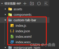
项目根目录下新建自定义组件custom-tab-bar
<view class="tab-bar" wx:if="{{showBar}}">
  <!-- <cover-view class="tab-bar-border"></cover-view> -->
  <view wx:for="{{listTab}}" wx:key="index" class="tab-bar-item {{item.diyClass}}" data-path="{{item.pagePath}}" data-index="{{index}}" bindtap="switchTab">
    <image src="{{selected == index ? item.selectedIconPath : item.iconPath}}" class="{{item.diyClass}}"  mode="aspectFit"/>
    <view wx:if="{{index != 1}}" style="color: {{selected === index ? selectedColor : color}}" class="{{item.diyClass}}">{{item.text}}</view>
  </view>
</view>
Component({
properties: {
},
data: {
showBar:true,
selected: 0,
color: "#999999",
selectedColor: "#0a9af1",
listTab: [
{
pagePath: "/pages/index/index",
text: "首页",
iconPath: "/assets/tabbar/1.png",
selectedIconPath: "/assets/tabbar/1-1.png"
},
{
pagePath: "/pages/createOrder/index",
text: "",
iconPath: "/assets/tabbar/2.png",
selectedIconPath: "/assets/tabbar/2-2.png",
diyClass: "diy"
},
{
pagePath: "/pages/my/index",
text: "我的",
iconPath: "/assets/tabbar/4.png",
selectedIconPath: "/assets/tabbar/4-4.png"
}
]
},
methods: {
switchTab(e) {
const data = e.currentTarget.dataset;
const url = data.path
wx.switchTab({url})
}
}
})
.tab-bar {
position: fixed;
bottom: 0;
left: 0;
right: 0;
display: flex;
box-shadow: 0px -2px 10px 0px rgba(0,0,0,0.05);
box-sizing: content-box;
}
.tab-bar-border {
background-color: rgba(0, 0, 0, 0.33);
position: absolute;
left: 0;
top: 0;
width: 100%;
height: 1px;
transform: scaleY(0.5);
}
.tab-bar-item {
flex: auto;
text-align: center;
display: flex;
justify-content: center;
align-items: center;
flex-direction: column;
background: #fff;
height: 120rpx;
}
.tab-bar-item.diy {
margin-top: 0!important;
position: relative;
flex: inherit;
width: 155rpx;
background: #fff;
}
.tab-bar-item image {
width: 48rpx;
height: 48rpx;
}
.tab-bar-item view {
font-size: 24rpx;
}
.tab-bar-item image.diy {
position: absolute;
width: 180rpx;
height: 180rpx;
bottom: 2%;
z-index: 100;
}
.tab-bar-item view.diy {
margin-top: 90rpx;
background: rgb(180, 60, 60);
width: 100%;
height: 100%;
padding-top: 58rpx;
z-index: 99;
}
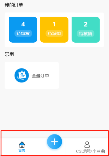
在所有tabbar页面,手动指定selected 按索引顺序——例如我的页面,首页不需要,下单不显示也不需要
onLoad(options) {
if (typeof this.getTabBar === 'function' && this.getTabBar()) {
this.getTabBar().setData({
selected: 2
})
}
},
下单页面不需要展示底部菜单;下单页面没有返回按钮,需要加一个手写一个返回按钮
 onLoad() {
    this.getTabBar().setData({
      showBar: false
    });
  },
比input 等原生组件层级更高的只有 cover-view cover-image


 534
534

 被折叠的 条评论
为什么被折叠?
被折叠的 条评论
为什么被折叠?
 到【灌水乐园】发言


