


前言
在这篇文章中,我们将对本系列项目中常用的表格组件Table进行自定义封装,以提高性能并适应项目需求。后期也可进行修改和扩展,以满足项目的需求。
Table组件
1. 功能分析
(1)定义了两种表格项组件:TableTitleItem 和 TableContentItem
(2)TableTitleItem 用于显示表格的标题,接受 width 和 title 作为属性,将标题显示在指定宽度的行内
(3)TableContentItem 用于显示表格的内容,接受 width、content 和可选的 to 属性。如果有 to 属性,则使用全局封装的Link组件显示带有链接的内容,否则直接显示内容。
(4)使用 memo 优化组件,以提高性能并避免不必要的重新渲染
(5)可自行加下排序等功能,后续本项目有需要再加上
2. 代码+详细注释
// @/components/Table/index.tsx
import { memo, ReactNode, FC } from "react";
import { TableTitleRowItem, TableContentRowItem, HighlightLink } from "./styled";

// 表格标题项组件
interface TableTitleItemProps {
  width: string; // 宽度
  title: string; // 标题
}

const TableTitleItem: FC<TableTitleItemProps> = ({ width, title }) => (
  <TableTitleRowItem width={width}>
    <div>{title}</div> {/* 显示标题 */}
  </TableTitleRowItem>
);

// 表格内容项组件
interface TableContentItemProps {
  width: string; // 宽度
  content: string | ReactNode; // 内容
  to?: string; // 链接地址
}

const TableContentItem: FC<TableContentItemProps> = ({ width, content, to }) => {
  return (
    <TableContentRowItem width={width}>
      {/* 如果有链接地址,则显示高亮链接,否则显示内容 */}
      {to ? <HighlightLink to={to}>{content}</HighlightLink> : content}
    </TableContentRowItem>
  );
};

// 表格标题项组件添加memo性能优化
export const MemoizedTableTitleItem = memo(TableTitleItem);
// 表格内容项组件添加memo性能优化
export const MemoizedTableContentItem = memo(TableContentItem);

--------------------------------------------------------------------------------------------------------------

// @/components/Table/styled.tsx
import styled, { CSSObject } from "styled-components";
import Link from "../Link";
import variables from "@/styles/variables.module.scss";
interface ITableTitleRowItemProps {
  width: string;
}
interface ITableContentRowItemProps {
  width: string;
}
export const TableTitleRow = styled.div`
  background: white;
  display: flex;
  min-height: 65px;
  border-radius: 6px 6px 0 0;
  padding: 0 20px;
  margin-bottom: 4px;

  @media (max-width: ${variables.mobileBreakPoint}) {
    flex-flow: row wrap;
    min-height: auto;
    padding: 5px 20px;
  }
`;

export const TableTitleRowItem = styled.div<ITableTitleRowItemProps>`
  display: flex;
  flex-direction: row;
  justify-content: center;
  align-items: center;
  width: ${({ width }) => width};
  min-height: 65px;

  div,
  button {
    border: none;
    outline: none;
    background-color: transparent;
    color: #333;
    font-size: 18px;
    font-weight: 450;
    text-align: center;

    @media (max-width: ${variables.largeBreakPoint}) {
      font-size: 16px;
    }
  }

  @media (max-width: ${variables.mobileBreakPoint}) {
    margin: 10px 40px 10px 0;
    min-height: auto;
  }
`;

export const TableContentRow = styled.div`
  position: relative;
  display: flex;
  min-height: 60px;
  background-color: white;
  padding: 20px;

  ::after {
    content: "";
    position: absolute;
    display: block;
    width: auto;
    height: 1px;
    left: 20px;
    right: 20px;
    bottom: 1px;
    background: #d8d8d8;
    transform: ${(): CSSObject => ({
      scaleY: `${Math.ceil((1.0 / window.devicePixelRatio) * 10.0) / 10.0}`,
    })};
  }

  :hover {
    background: #f8f9fa;
  }
`;

export const TableContentRowItem = styled.div<ITableContentRowItemProps>`
  width: ${({ width }) => width};
  color: #000;
  display: flex;
  align-items: center;
  justify-content: center;
  text-overflow: ellipsis;
  font-size: 16px;

  a {
    color: ${({ theme }) => theme.primary};
    &:hover {
      color: ${({ theme }) => theme.primary};
    }
  }
`;

export const HighlightLink = styled(Link)`
  color: ${({ theme }) => theme.primary};
  text-decoration: none;
`;
3. 使用方式
注:这个组件我们模拟一些假数据来演示,可直接复制代码看效果
// @/pages/Nav1/styled.tsx
// 引入组件
import { MemoizedTableContentItem } from "@/components/Table";
// 使用
import { FC, useMemo, useState } from "react";
import { useTranslation } from "react-i18next";
import Content from "@/components/Content";
import { TableTitleRow, TableContentRow, TableTitleRowItem } from "@/components/Table/styled";
import { BlockListPanel, ContentTable } from "./styled";
import { useMediaQuery } from "@/hooks";
import { localeNumberString } from "@/utils/number";
interface TableTitleData {
  title: string; // 表头名称
  width: string; // 表头宽度
}
interface Block {
  number: number; // 块高
  row1Content?: string; // 第一行内容
  row2Content?: string; // 第二行内容
  row3Content?: string; // 第三行内容
  row4Content?: string; // 第四行内容
  width: string; // 表行宽度
  to?: string; // 链接
}
interface TableContentData {
  width: string; // 表格列宽度
  to?: string; // 链接
  content: string; // 表格内容
}
const Nav2Page: FC = () => {
  const [t] = useTranslation();
  const isMaxW = useMediaQuery(`(max-width: 1200px)`);
  const TableTitles: TableTitleData[] = useMemo(
    () => [
      {
        title: "Row1",
        width: isMaxW ? "16%" : "14%",
      },
      {
        title: "Row2",
        width: isMaxW ? "18%" : "11%",
      },
      {
        title: "Row3",
        width: "20%",
      },
      {
        title: "Row4",
        width: isMaxW ? "33%" : "40%",
      },
      {
        title: "Row5",
        width: isMaxW ? "13%" : "15%",
      },
    ],
    [t, isMaxW]
  );
  // 表格数据
  const [tableData] = useState([
    {
      number: 99663.6333663333,
      row1Content: "row1内容",
      row2Content: "row2内容",
      row3Content: "row3内容",
      row4Content: "row4内容",
      width: "16%",
      to: "/Nav3",
    },
    // ...
  ]);
  // 当前页
  const currentPage = 1;
  // 每页数据
  const transferToRowData = (block: Block, page: number, isMaxW: boolean) => {
    return [
      {
        width: isMaxW ? "16%" : "14%",
        to: `/block/${block.number}`,
        content: localeNumberString(block.number),
      },
      {
        width: isMaxW ? "18%" : "11%",
        content: block.row1Content,
      },
      {
        width: "20%",
        content: block.row2Content,
      },
      {
        width: isMaxW ? "33%" : "40%",
        content: block.row3Content,
      },
      {
        width: isMaxW ? "13%" : "15%",
        content: block.row4Content,
      },
    ] as TableContentData[];
  };
  return (
    <Content>
      <BlockListPanel className="container">
        <ContentTable>
          {/* 表头 */}
          <TableTitleRow>
            {TableTitles.map((data: TableTitleData) => (
              <TableTitleRowItem width={data.width} key={data.title}>
                <div>{data.title}</div>
              </TableTitleRowItem>
            ))}
          </TableTitleRow>
          {/* 表内容 */}
          {tableData.map(
            (item: Block) =>
              item && (
                <TableContentRow key={item.number}>
                  {transferToRowData(item, currentPage, isMaxW).map((data: TableContentData) => {
                    return <MemoizedTableContentItem width={data.width} content={data.content} to={data.to} />;
                  })}
                </TableContentRow>
              )
          )}
        </ContentTable>
      </BlockListPanel>
    </Content>
  );
};
export default Nav2Page;

--------------------------------------------------------------------------------------------------------------

// @/pages/Nav1/styled.tsx
import styled from "styled-components";
import variables from "@/styles/variables.module.scss";
export const BlockListPanel = styled.div`
  @media (min-width: ${variables.mobileBreakPoint}) {
    margin-top: 25px;
    margin-bottom: 40px;
    border-radius: 6px;
    overflow: hidden;
    box-shadow: 0 2px 6px 0 rgb(77 77 77 / 21%);
  }

  @media (max-width: ${variables.mobileBreakPoint}) {
    margin-top: 0;
    padding: 0 20px;

    .blockGreenBackground {
      margin-left: -20px;
      height: 61px;
      width: calc(100% + 40px);
      z-index: 1;
    }
  }
`;

export const ContentTitle = styled.div`
  font-size: 50px;
  color: black;
  margin: 0 auto;
  text-align: center;

  @media (max-width: ${variables.mobileBreakPoint}) {
    font-size: 26px;
  }

  &::after {
    content: "";
    background: ${({ theme }) => theme.primary};
    height: 4px;
    width: 197px;
    display: block;
    margin: 0 auto;

    @media (max-width: ${variables.mobileBreakPoint}) {
      width: 80px;
    }
  }
`;

export const ContentTable = styled.div`
  @media (max-width: ${variables.mobileBreakPoint}) {
    margin-top: -41px;
    z-index: 2;
  }
`;
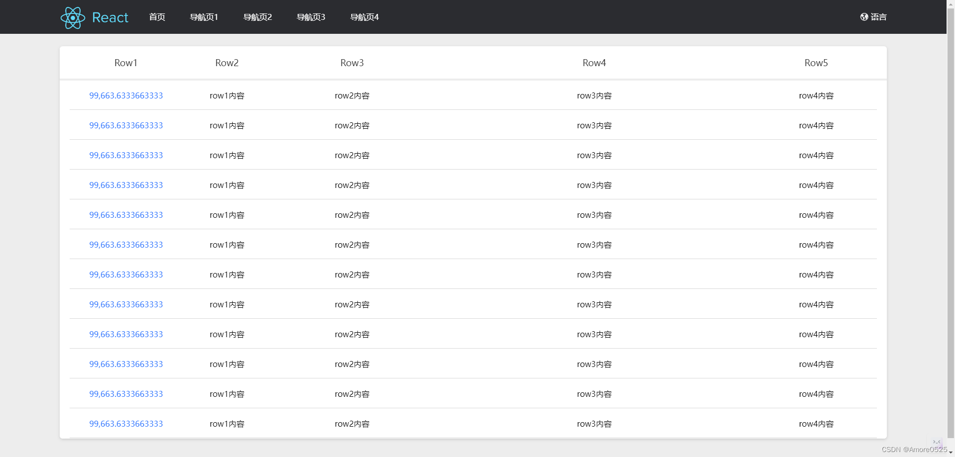
4. 效果展示
总结
下一篇讲【全局常用组件Pagination封装】。关注本栏目,将实时更新。


 889
889

 被折叠的 条评论
为什么被折叠?
被折叠的 条评论
为什么被折叠?
 到【灌水乐园】发言


