


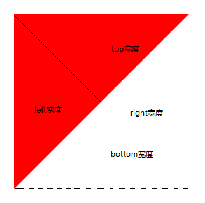
利用border属性画三角形
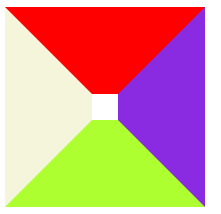
1 border长什么样
div{
    width: 20px;
    height: 20px;
    border-top: 70px solid red;
    border-left: 70px solid beige;
    border-bottom: 70px solid greenyellow;
    border-right: 70px solid blueviolet;
}
1.1 放大border之后,可以看到每条border近似于三角形,只是其中一角被div抹平了
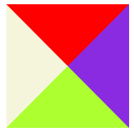
1.2 那么将div的宽高设置为0,就可以看到三角形了
div{
    width: 0px;
    height: 0px;
    border-top: 70px solid red;
    border-left: 70px solid beige;
    border-bottom: 70px solid greenyellow;
    border-right: 70px solid blueviolet;
}
2 画三角形
2.1 去掉border-top
div{
    width: 0px;
    height: 0px;
    border-left: 70px solid beige;
    border-bottom: 70px solid greenyellow;
    border-right: 70px solid blueviolet;
}
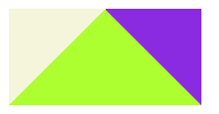
2.2 将border-left和border-right的颜色设置transparent
div{
    width: 0px;
    height: 0px;
    border-left: 70px solid beige;
    border-bottom: 70px solid greenyellow;
    border-right: 70px solid blueviolet;
}

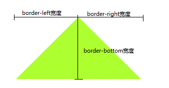
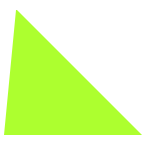
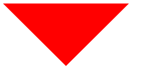
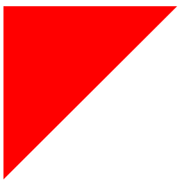
3 其他例子
div{
    width: 0px;
    height: 0px;
    border-left: 10px solid transparent;
    border-bottom: 100px solid greenyellow;
    border-right: 100px solid transparent;
}
div{
    width: 0px;
    height: 0px;
    border-top: 100px solid red;
    border-left: 100px solid transparent;
    border-right: 100px solid transparent;
}
div{
    width: 0px;
    height: 0px;
    border-top: 100px solid red;
    border-left: 100px solid red;
    border-bottom: 100px solid transparent;
    border-right: 100px solid transparent;
}


 1003
1003


 被折叠的 条评论
为什么被折叠?
被折叠的 条评论
为什么被折叠?
 到【灌水乐园】发言


